

The Focus
Revamping the shopping experience for one of the biggest brands in the Indian fashion industry: Anita Dongre’s signature label, AND
Differentiating AND through distinctions in UI and UX design
Adding intuitive features which in turn would increase user engagement on AND’s e-commerce platform
The Design
This revamp meant making design changes from the micro level, and scaling them up as per requirement:
A holistic design overhaul that begins with UI/UX changes
The addition of several new features to enhance brand communication and user experience
Transformed the website into a minimalistic, subtle and intuitive portal for shoppers
The Story

AND label was launched in early 2000 and immediately made an impact for one principal reason: It provided not just fashionable, but also immensely practical clothing for the modern Indian woman. She is constantly evolving, and her changing lifestyle demands clothes that make her feel comfortable – no matter the activity at hand – be it work, leisure or play. Today, AND is retailed through 250 points of sale, which include 41 exclusive stores and over 200 other established multi-brand lifestyle formats.
“The AND woman is constantly evolving, and her changing lifestyle demands clothes that make her feel comfortable – no matter the new activity at hand – be it work, leisure or play.”
This reputed giant in the world of Indian fashion came to us with a very crucial set of challenges regarding their e-commerce website. Since their target users encompassed working women with busier schedules, their shopping experience needed to be highly streamlined – while also engaging them to browse and make purchases without any hesitation or hurdles.
The brand needed to be well portrayed through the website. It needed not just good design, but also a virtual expression of the brand’s proposition.
Clearing The Clutter
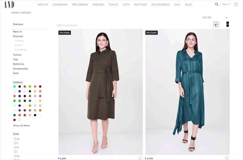
AND’s earlier website had certain issues when it came to providing information in a systematic, hierarchical manner. Information hierarchy is perhaps one of the most important elements when it comes to enhancing user experience.
So, Elephant began by making the website look a lot more mature and elegant while adding subtlety to it. Whites and greys were chosen over flashy and bubbly colors. Text was kept to a minimum.

The homepage also focused more on showcasing the latest and discounted products – catering to discount seekers and casual surfers. For those who like to browse as per highly specific criteria, it also provides instant accessibility to buying options (focused buyers).
Streamlined Buying Decisions

To ensure that there were absolutely zero hurdles when it came to making buying decisions, Elephant made certain changes in the shopper’s journey. This was done at every step : from the landing page to purchasing products by adding elements like more product information, quick ‘Add to Cart’ option and making the search bar more intuitive. Lastly, we provided easy accessibility to loyalty program components to increase the number of user registrations.
“To ensure that there were absolutely zero hurdles when it came to making buying decisions, Elephant made certain changes in the shopper’s journey – from the landing page to the purchasing products.”
Enhancing User Engagement
While User Interface was the first challenge to be tackled, our team had to give equal focus on improving user engagement. This called for smarter content additions, which would then drive design.
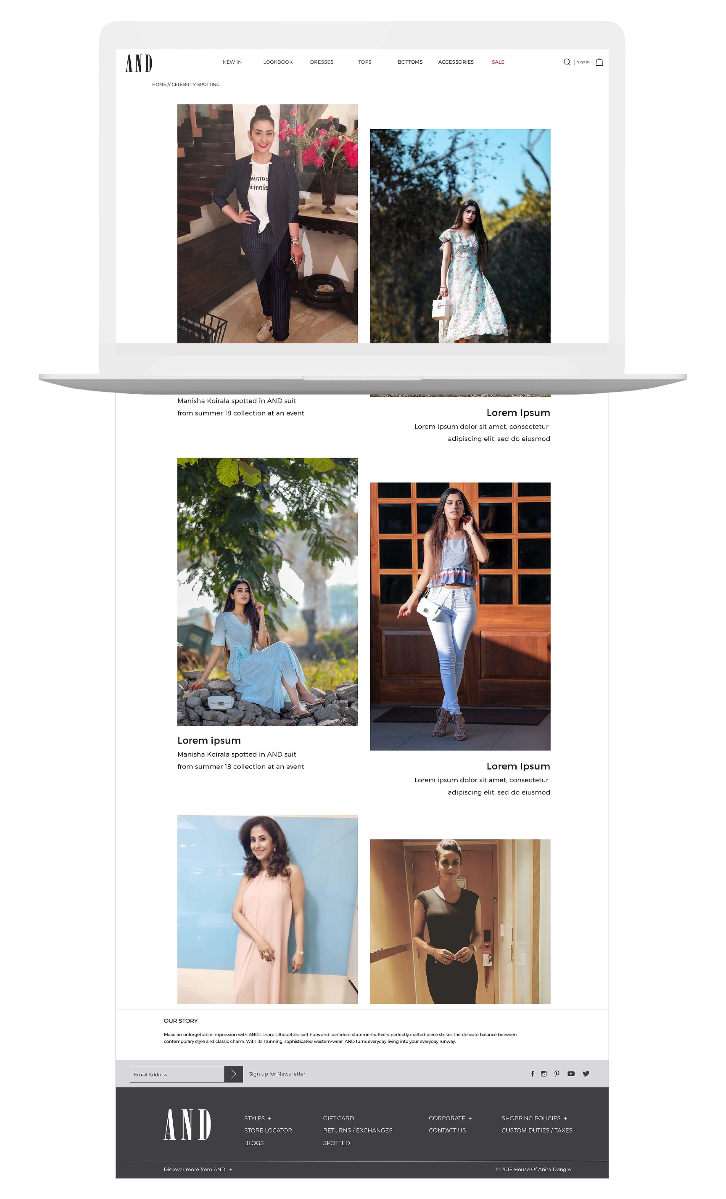
The first addition was the ‘Celebrity Spotting’ page. AND already has a massive appeal amongst celebrities. We leveraged this to showcase photos of them using AND products in public for our users. This gave users lucrative ‘use-case’ scenarios and served as great non-verbal testimonials.
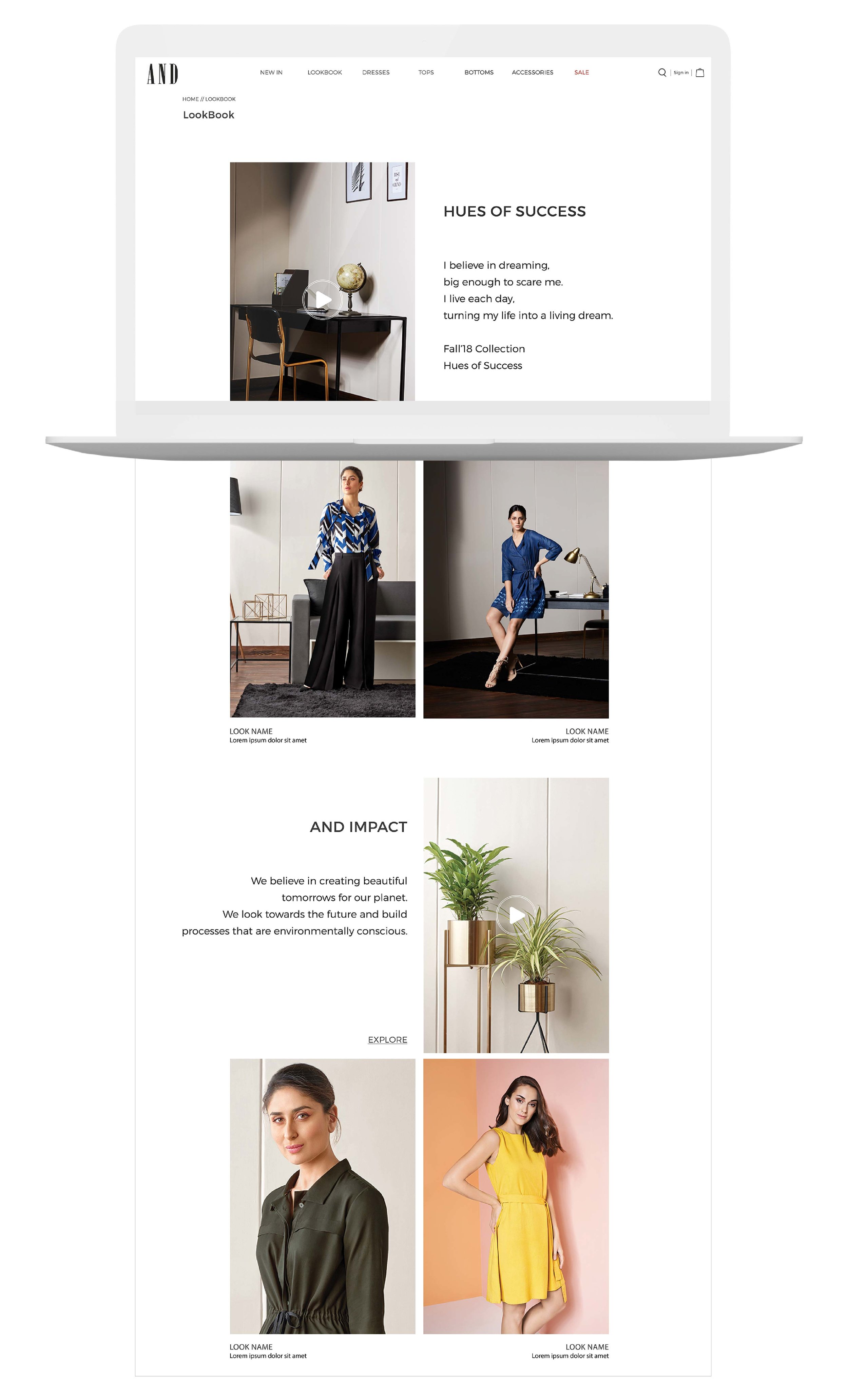
The second addition was making a ‘LookBook’, which would function as a fashion catalogue for regular and/or fashion-conscious users alike.

We combined this with the ‘Style With’ display. Users could now envisage a complete outfit while also being motivated to buy other products.
A dedicated section was provided on the landing page for AND’s social campaign - ‘ANDiRise’ to enhance the brand value.
While improvising on the footer section, we simplified the content, to prioritise social media synergy, along with the newsletter. This would make users engage with value-driven content that was highly relevant to the brand on the website.

Our extensive fine-tuning ultimately paid off! The AND website is now incredibly easy to navigate. Busy professionals and casual shoppers alike will find the buying process much more streamlined – regardless of whether they want to make a quick purchase, find matching attire – or more. Users have reportedly begun engaging much more with the online portal, while also feeling like this is an extension of the brand on the whole.
“It’s art if can’t be explained. It’s fashion if no one asks for an explanation.
It’s design if it doesn’t need explanation.”