

The Focus
Asian Paints wished to address usage scenarios of home and school environment when it came to their glue product, TruGrip
The pack structure was required in two formats, first: Evolutionary, which didn’t mark a radical departure from their branding and second, Innovative, which went beyond convention to generate impact and usability
Focus was on the element of ‘quantity’ and ‘single-use’ for the pack design in order to design disruption
The Design
After exhaustive research, the team at Elephant created options pertinent to both types
For the evolutionary design, a fluid, soft and playful style of structure was utilised. The team also added some exclusive elements that would help with differentiation and give an extra edge despite being within convention
The team at Elephant opted for consumer usability while designing for innovation, where a single-use, spherical glue pen model was the highlight. The bold, unconventional shape required new retailing strategies to be put into place for smooth distribution and dissemination
The Story
As India’s largest, and Asia’s third largest paint company, Asian Paints needs no hefty preamble or introduction. The fact that it is about 78 years old is in itself a statement: it possesses the will to withstand the test of time while continuously growing and adapting to the changing landscape. The company embodies this spirit of adaptation through the sheer length and breadth of products and services it provides, be it paints, home décor, adhesives, tools, implements or otherwise.
Asian Paints approached the Elephant team with the aim of designing packaging structures for their stationary adhesives. Their earlier products in this category were tailored for industrial, or purely professional use (carpenters, for example). But now, they wished to foray into the commercial segment: the world of arts and crafts, of classrooms, the colourful realm of a child’s imagination, or even the brisk office space.
For this purpose, the combined team undertook two distinctly divergent path to design. One was evolutionary in nature, where the product would adhere to category codes and other conventions within its segment – but also have some edge over other products within its ambit. Here, nuanced, appropriate design was needed.
The second type was purely innovative, where innovation would revolve around consumption patterns, ease of use and creative stimulus. Radical design needed to balance out usability in this particular case.
“The combined team undertook two distinctly divergent path to design. One was evolutionary in nature, where the product would adhere to category codes and other conventions within its segment – but also have some edge over other products within its ambit. Here, nuanced, appropriate design was needed.”
Boundaries of Convention

The principles of evolutionary design dictate that minimum tweaks be made so that growth and development of an idea are incremental – and not drastic and exponential. Keeping this in mind, the team at Elephant devised a fluid bottle, a shape that users were comfortable and familiar with.
The bottle also had increased grip, soft, playful graphics and a crucial departure from other products in the segment: a non-transparent, bright bottle cap that would be extremely easy to spot and hard to misplace.
The idea solved a twofold problem, where the adhesive would not remain exposed for long periods of time because the cap was easily lost and secondly, would also help in differentiating the product on the shelves since its structure didn’t stand out by itself.


“The principles of evolutionary design dictate that minimum tweaks be made so that growth and development of an idea are incremental – and not drastic and exponential – which was what was used when designing the first variant.”
The Orb of Bright Futures
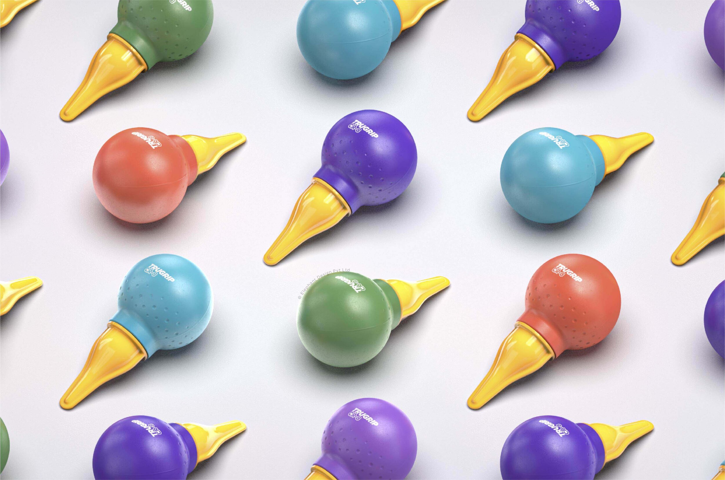
A meticulous research was undertaken to understand user habits with the glue. While observing the young user group, it became evident that only a small amount of glue is consumed to complete one craft project. Hence a single usage scenario became the primary premise for the concept ORB.


A spherical, colourful orb was finally chosen as the ideal structure to hold the glue in this ‘glue-stick’ category. The shape in itself is quite unconventional, but also extremely easy to manipulate, hold and operate without any hitches. The nozzle allows for the precise application of glue in a variety of formats: dots and lines, on uneven and smooth surfaces and varied angles.
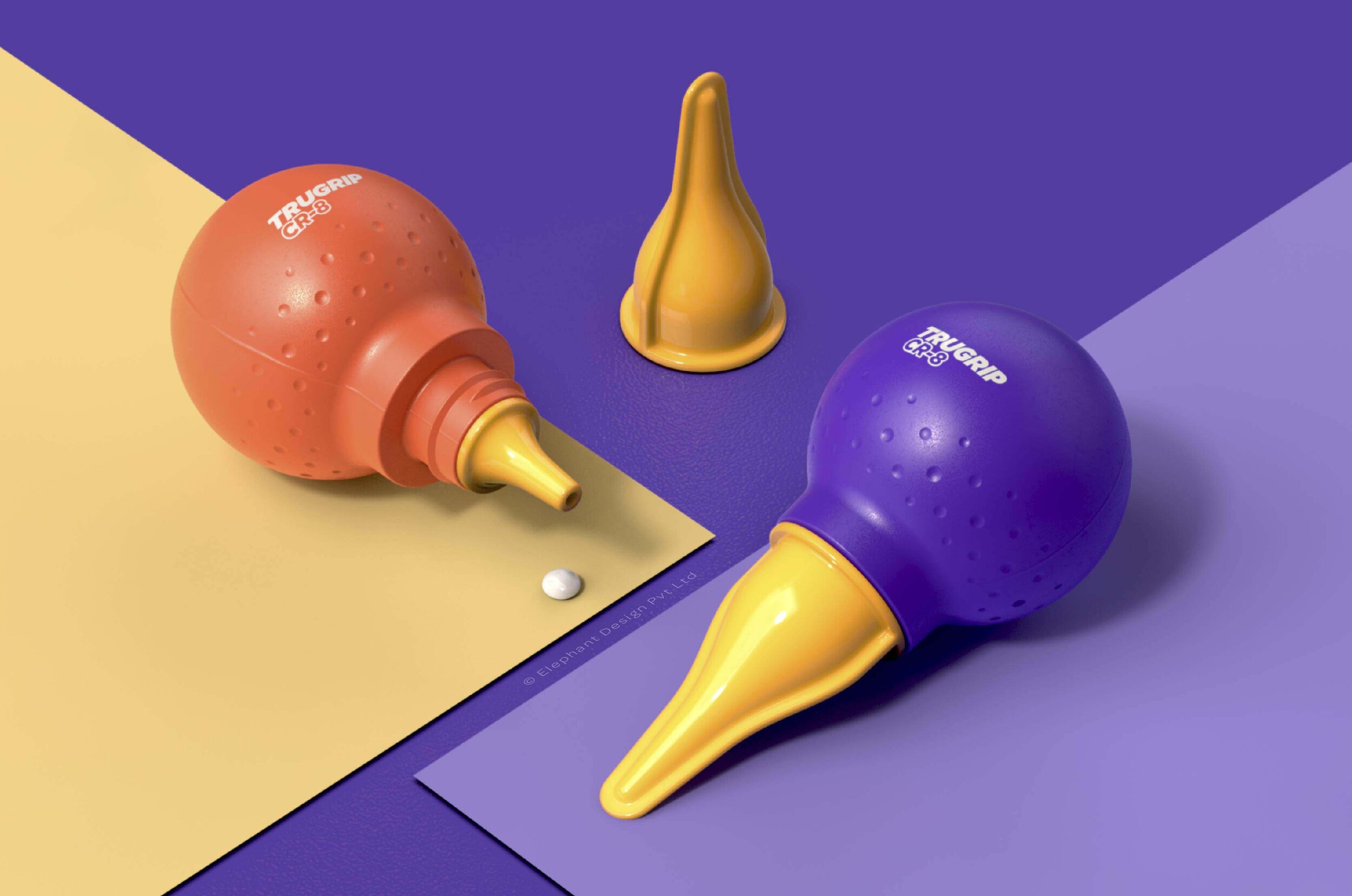
Elephant also kept manufacturing constraints in mind when designing the product. It could not be so unconventional that finding the right manufacturer became a difficult and expensive proposition. This becomes altogether more important for a product like this, which is supposed to be highly affordable while maintaining competitive prices. The orb, in this respect, was ideal.
The shape has immensely high recall, since it embodies a sense of playfulness and colour – making it eye-catching for children and adults alike.
One of the more challenging elements of the orb was the fact that it could not stand up on its own, making it hard to sell as an individual unit. To remedy this for retailing purposes, cartons made of corrugated cardboard (the see-through variety) were chosen. Since the orbs themselves are colourful, the packaging attracts the child’s eye, while also being a meaningful, interesting alternative in the mind of the teacher/facilitator buying craft supplies.


“A spherical, colourful orb was finally chosen as the ideal structure to hold the glue in this ‘glue-stick’ category. The shape in itself was quite unconventional, but also extremely easy to manipulate, hold and operate without any hitches. The nozzle allowed for the precise application of glue in a variety of formats: dots and lines, on uneven and smooth surfaces and varied angles.”
Two-Pronged Strategy

Ultimately, Asian Paints benefitted from a two-pronged strategy when it came to the packaging structure for the Trugrip CR-8. On one hand, the evolutionary design-centric structure, which is more conventional, catered to those who did not make radical choices when purchasing, while also adding useful features like an easy-to-find cap.
On the other hand, the orb, which is a bold departure from convention, is aimed at captivating the minds of children on the shelf while being functionally superior in terms of size, glue dispensing ability and grip, which gave it an added advantage in the ‘arts-and-crafts’ environment.
“Get rid of everything that is not essential to making a point.”