
Bennett University
New Expression of A Strong Foundation

When Times of India, a media giant, approached us for creating an identity for their new entrant into the education space, the challenge was massive. We needed to maintain the stature and gravitas of the mother brand and educational institute, while lending it a contemporary look which would appeal to the youth.
Bennett University aimed to become a centre of excellence, creating “life and career ready” professionals, they had to appear wise, yet approachable, credible, yet new age.
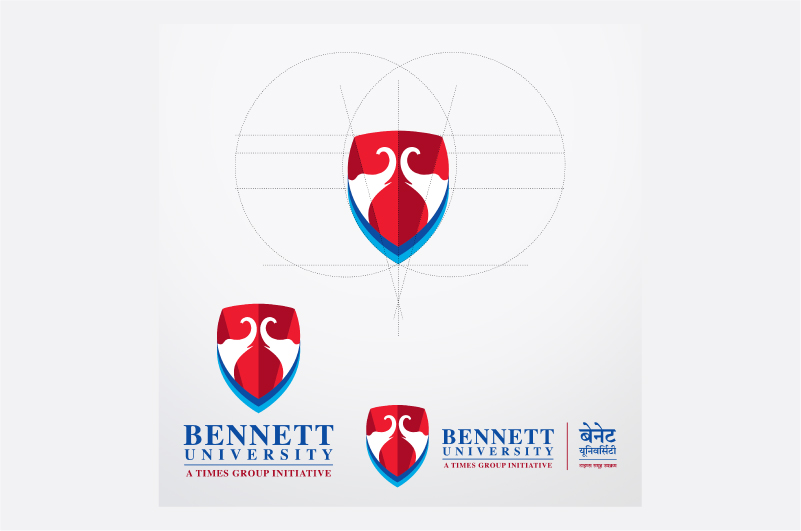
We built on the TOI emblem, associated with leadership and a progressive India, adding a contemporary take. The trunks of the elephants from the emblem raised, as if seeking knowledge with renewed energy. Their symmetry and negative space allowed us to create a temple of knowledge and together everything was neatly enclosed in a shield that stood for strength, credibility and timelessness.
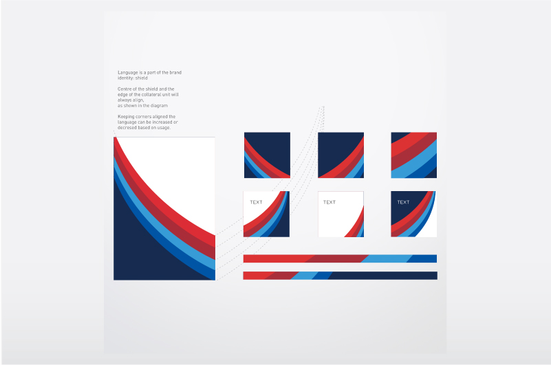
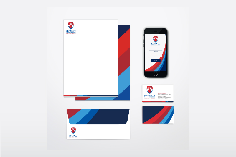
For the brand colours, we picked red from TOI app and added blue for international appeal. The TOI typeface was used to bring forth the legacy.
Bennett University has emerged as a benchmark in professional and higher education, standing tall as a homegrown force to reckon with.