

The Focus
Reliance Consumer Products (RCPL) recently acquired the legacy Indian soft-drink brand Campa Cola after its decline amidst stiff multinational competition in the 90s
Desired to bring back Campa to the contemporary Indian market, where an evolving market is replete with options
A rebranding exercise was an immediate priority, with differentiation and legacy-preservation being the cornerstones of Campa’s new avatar
The Design
The team at Elephant designed a brand-new visual identity for Campa with a central element: A dynamic swoosh of colour across a contemporary, casual yet confident logotype with ownable background hues
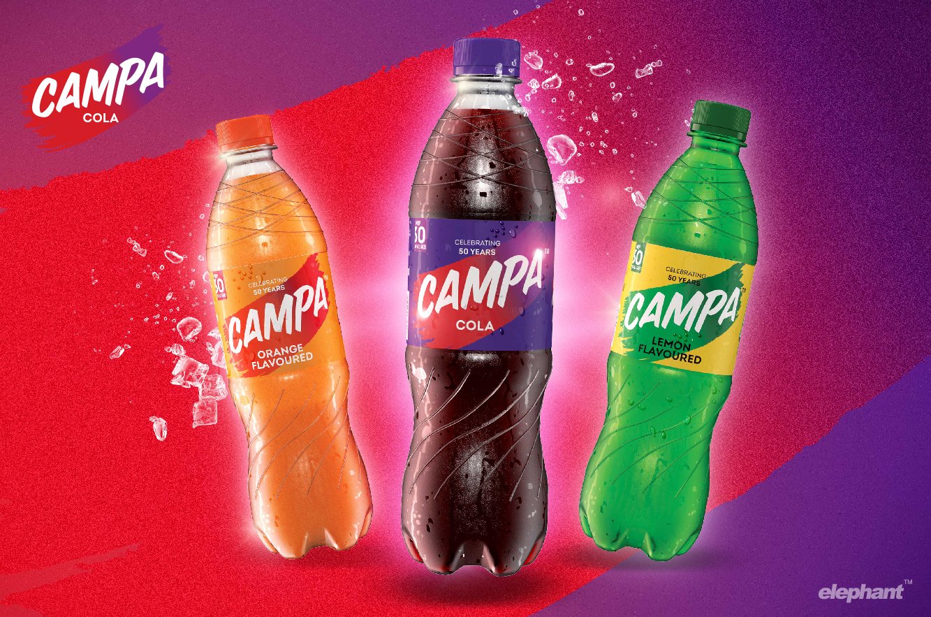
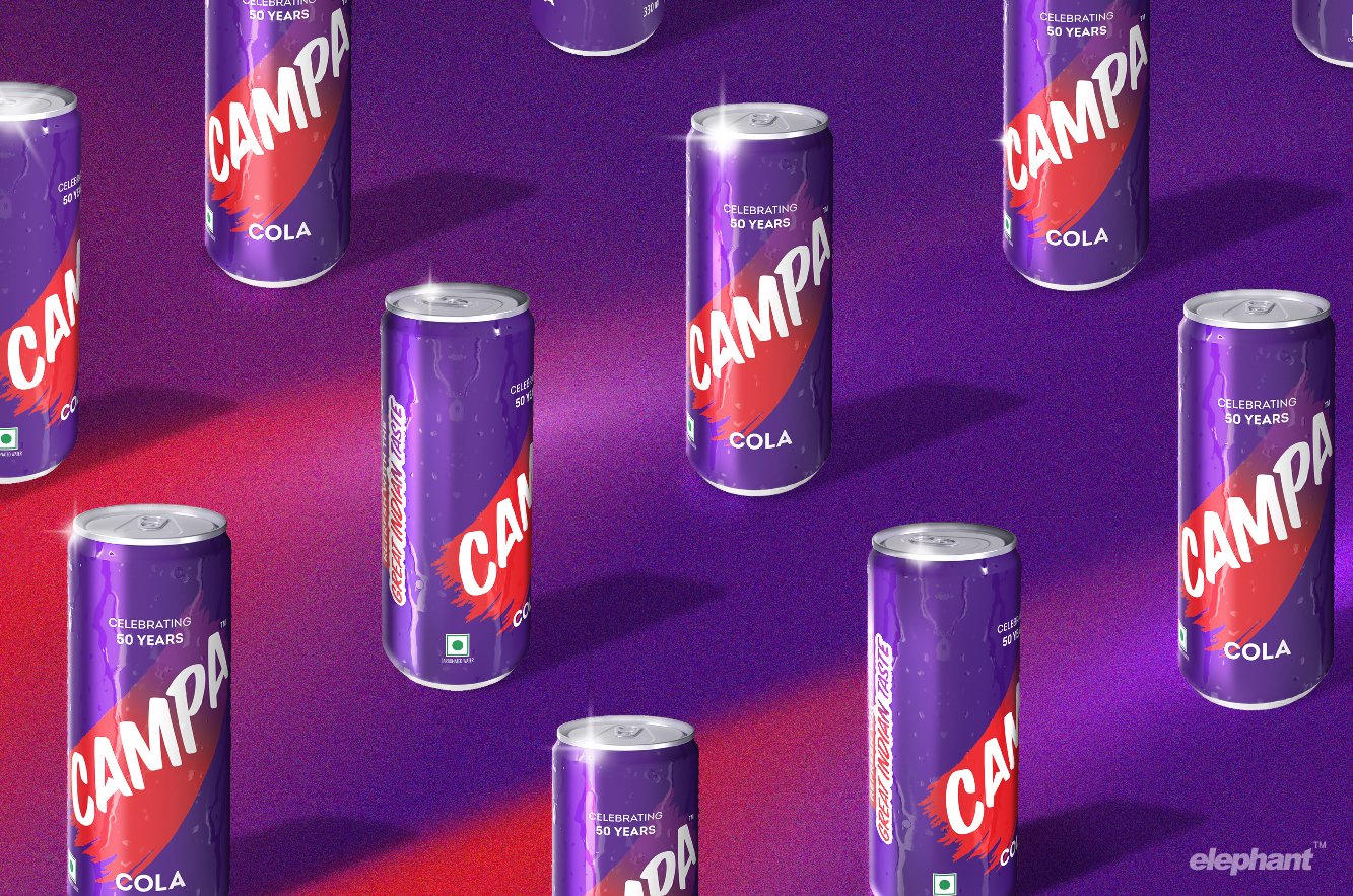
Purple complimented by red stole the spotlight for the core cola product, while allowing for other dynamic combinations to be used for an expanding portfolio of other flavours and variants in an adaptive, cohesive system
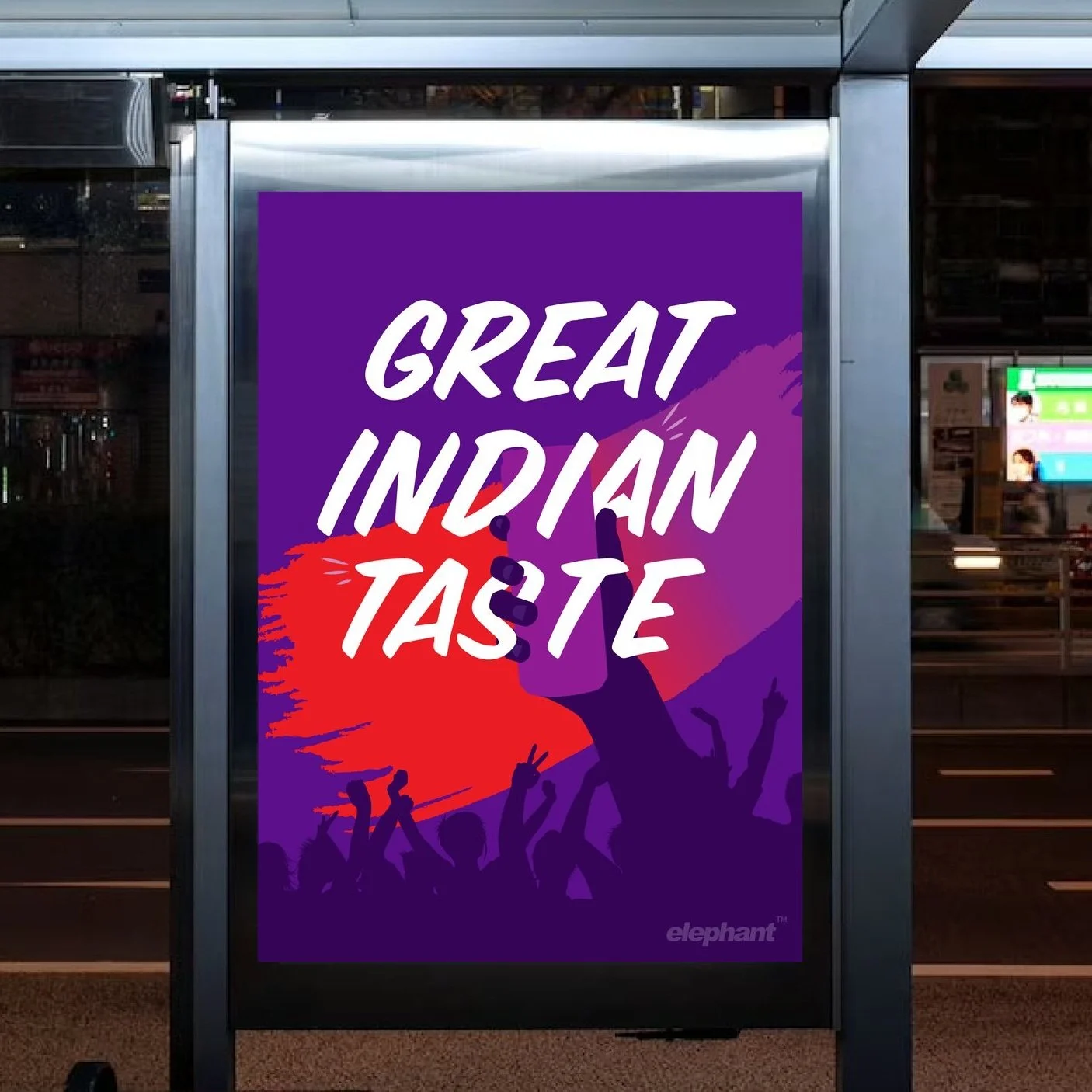
The team achieved a fine balance of legacy and modernity, where Campa’s legacy was given prominence, highlighting 50 years of serving the ‘Great Indian Taste’ amidst extremely positive reception
The Story
The Campa Cola story is firmly tied to India’s recent history, replete with twists and turns that often accompany the passage of time.
The Indian government expelled multinational giant Coca-Cola due to their proprietary policies. This was when the Pure Drinks Group provided a potent alternative: the iconic soft drink brand, Campa Cola. It quickly gained popularity and was known for its unique taste, often described as having a fruity, spicy flavour.
Campa Cola's distinctive red and white logo, along with its catchy advertising slogans like "The Great Indian Taste," made it a cultural icon in India. The brand was particularly popular in the 80s and was often associated with memories of childhood and youth.
Campa Cola faded in the background with the rise of multinational cola brands after liberalization in the 90s.
So, when RCPL acquired the brand and invited the Elephant team to develop a robust branding and packaging system, we couldn’t be more excited. This wasn’t another re-design project: it was the revival of an iconic brand, no less.
“When RCPL invited the Elephant team to develop a robust branding and packaging system for Campa, we couldn’t be more excited. This wasn’t another re-design project: it was the revival of an iconic brand, no less.”
A Cola for Contemporary India!
Our first challenge was to revamp the visual identity for the next era – a markedly different time. The target consumer – primarily young, resourceful and ambitious Indians wanting better lives opted for brands that resonated with their sense of drive and purpose.
Our rebranding echoes the brand’s hero archetype, where the use of unconventional deep purple is complemented by a streak of bold, category-defining red – something we call the ‘swoosh’. This element connects to the prevalence of wiping a chilled can or bottle to reveal the brand, or even swiping motions on smartphone screens that serve to express, reveal or invite.
The use of purple strikes a balance between category-dominant blues and reds, while its transition toward red is to connect with the young cola consumers familiar with the category. Purple’s associations with power, ambition, creativity and magic tie into the theme, while giving the brand an aspirational look-and-feel.
“The use of an unconventional deep purple is complemented by a streak of bold, category-defining red – something we call the ‘swoosh’. This indicates iconic yet everyday interactions: wiping a chilled can or bottle to reveal the brand, or even swiping motions on smartphone screens that serve to express, reveal or invite.”

The team chose marker font for the logotype, which solidifies Campa’s image of a confident, unconventional brand creating a league of its own. The arrowhead element on the ‘A’ also evokes this feeling of a rising, uplifting beverage that goes above and beyond the status quo.
All of these design choices when developing the visual identity create an inspiring brand and challenges existing branding conventions, claiming its own space with a promise of ‘The Great Indian Taste’.
Allusions to Legacy and Beyond
While the visual identity aligns with the transformation of the brand, key messaging on packaging ties it firmly into the story of an emergent India. Campa’s revival shows Indian consumers the power of home-grown brands and why they’re loved, illustrated by the reminder of ’50 years of celebration’ and ‘great Indian taste’ in the same confident style.
Our rebranding exercise for Campa, thus, looks at Indianness as a constantly evolving idea. Here, Indians are unapologetic, comfortable in their own skin and ambitiously carve a place for themselves on a global stage through authentic self-expression.
“By incorporating elements that represent the young, ambitious Indians, while also paying homage to the brand’s legacy, the re-designed Campa packaging system creates a compelling and inspiring brand for the years to come.”
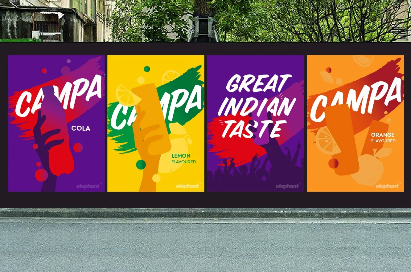
The visual language gives the packaging system a flexibility like never before, where an assortment of new flavours and variants can be seamlessly included. Campa Orange (yet another signature legacy drink) and Lemon, for instance, have differently coloured swooshes that distinguish them, yet tie them into the brand’s visual architecture.
The system makes room for healthy or sporty variants of the same flavours – a necessity in today’s beverage landscape – while also allowing for ‘special edition’ variants, if any.
“Every great design begins with an even better story.”
The Campa Cola story as envisioned by us is a testament to the power of nostalgia and the enduring legacy of iconic brands in India. The rebranding of Campa and fresh new packaging system by the Elephant team resonates with a new generation of consumers. By incorporating elements that represent the young, ambitious Indians, while also paying homage to the brand's legacy, the re-designed Campa packaging system creates a compelling and inspiring brand for the years to come.