

The Focus
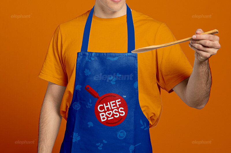
Chef Boss, an upcoming brand ready to disrupt the ready-to-cook market, wanted the team at Elephant to help with branding, visual identity and packaging
Reinforced the importance of the virtual space in mind for seamless adaptation
Needed to ‘handhold’ the consumer through the process of cooking and subsequent consumption, while possessing the right cues for catching their attention
The Design
The team designed a highly approachable, youthful logo that was especially tailored for social media migration and online brand presence
Conceptualized the packaging to echo the concept of ‘a burst of flavors’, while addressing each and every typical consumer concern when it comes to readymade products
Created a visual identity system that is highly adaptive, with different colors denoting different ranges; with some constant elements that are retained for recall and cohesion.

The Story
The Covid-19 pandemic is a universal phenomenon. Not a single day goes by when we don’t experience its effects on our immediate and distant realities alike. One of the most profound effects in that department can be observed in the activity of cooking at home.
With social distancing being the norm, eating out is virtually impossible without us compromising ourselves, and more importantly, other hapless people. We notice the rise of cloud kitchens and take-out food, but somewhere, it’s still not the safest food despite all the assurances we might get.
This brings us to home-cooked food. Often associated with nutritious goodness and wholesomeness, its healthy quotient cannot be overlooked, especially in the Indian context where ‘apne haathonse banaya hua khaana’ is considered sacrosanct.
“So, for those of us who aren’t as adept at navigating the culinary space, what do we do? This is precisely where Chef Boss comes in. Chef Boss aims to remedy the stereotypes around Ready-to-Cook products, and when they approached Elephant, they wished that their visual identity and packaging would make their brand identity extremely distinct and transparent. ”
However, managing one’s kitchen to churn out meals regularly is a task. It involves more than just the act of cooking. From the procurement of ingredients, spices, vegetables and meat, storing them properly, consuming things before they perish, keeping a track of what is needed, making trips to the markets of your choice, to even deciding what comprises of a wholesome meal – it’s not as easy as your favorite Insta influencer might make it look like!
The pandemic has now compromised several aspects of home cooking. You cannot keep going out frequently to buy supplies. You cannot hire a cook to outsource everything, unless you can absolutely guarantee your collective safety. You cannot get an abundant supply of all the ingredients you want as supply chains are compromised. So, for those of us who aren’t as adept at navigating the culinary space, what do we do?
This is precisely where Chef Boss comes in. Earlier, the ready-to-cook wasn’t a consideration by home-makers as they can whip something up quickly or create something from scratch depending upon the time at hand. Even an occasional cook would take that opportunity to cook a complete meal right from the prep to everything else. However, things, as you can see, have changed.
Chef Boss team hopes to bust the stereotypes around Ready-to-Cook products. They approached Elephant with a single minded focus around creating a fresh, distinct & new-age brand.

Digital Design, Revamped
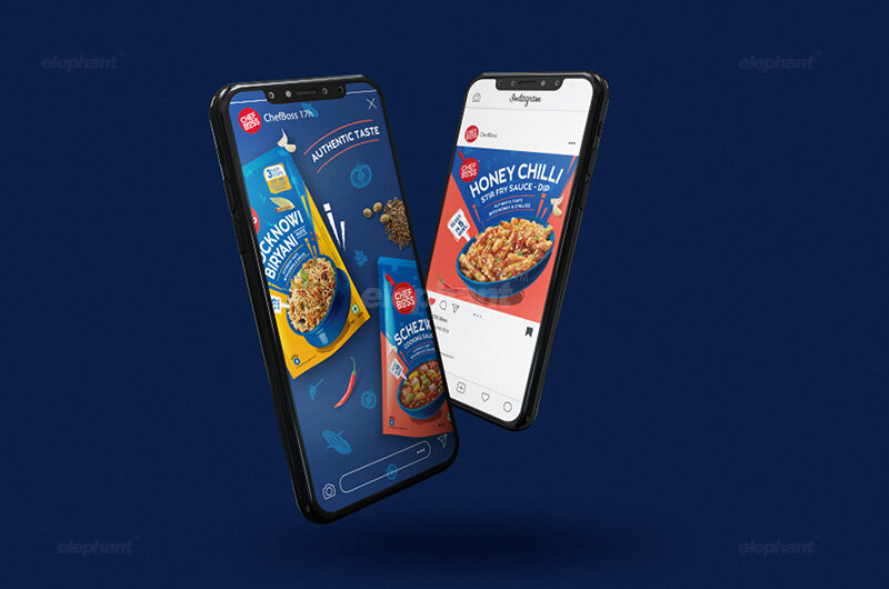
The name ‘Chef Boss’ comes from the Instagram hashtag trend, #likeaboss, which represents the feeling of efficiency, flair, ease and above all, a command over a certain skill, or act – which is what is shown in the visual, or the video in question where the tag is used.
“As one can observe, the logo has social media cues built in, with emoji-like iconography and text interspersed. We highlight the fact that this is a friendly, accessible brand especially when it comes to the younger generation who are trying to sustain themselves during the pandemic. This demographic often lives by themselves with minimal experience in the cooking department.”
However, the brand persona needed to echo the sentiment of the brand being an ‘expert friend’, who was accessible and modern – which is when we worked around the aggressive impact of original hashtag and refined it into the name, ‘Chef Boss’. The visual identity was conceptualized around the core emotion of love that goes into cooking for the family.
The logo is designed to score well in social media, with emoji-like iconography and text interspersed. We highlight the fact that this is a friendly, accessible (and all heart) brand especially when it comes to the younger generation who are trying to sustain themselves during the pandemic. This demographic often lives by themselves with minimal experience in the cooking department.
New-age brand also necessarily means digital first. The logo is designed in such a way that it has great visibility in all sizes of screens, especially with role of e-commerce gaining higher importance in the life of a brand. We considered how this would appear on phone screens, in particular. When it comes to circular app icons, to Instagram profile frames to even ecommerce portals this logo can be applied anywhere without any loss of clarity in communication.

Defragmenting the myth of Ready-To-Cook Preparations
The second challenge was perhaps more profound. As we’ve observed, consumers turn away from RTC products because of certain notions. How fresh is this going to be? How authentic are the ingredients? Is the recipe tried & tested?
Additionally, there are questions to do with the cooking in itself, which are to the tune of: What else do I need to add to this? How much time does this take? How many servings does it provide? How easy is this to make?
“We considered how this would appear on phone screens, in particular. When it comes to circular app icons, to Instagram profile frames to even ecommerce portals this logo can be applied anywhere without any loss of clarity in communication. ”
To reassure the user about freshness, we designed the packaging system around the concept of ‘A Burst of Flavors’, with the dish and its ingredients in question being represented in all its glory, replete with cues of freshness and authenticity.
The design system is highly adaptive, since Chef Boss offerings will be constantly evolving across cuisines & preferences. The blue of the container, and the top would remain constant for consistency and recall, while the shape of the vessel changes from cuisine to cuisine. For example, we use the Handi for Indian cuisine and a wok for Chinese.
The Back of Pack is replete with mnemonics, unique preparation tips, step-by-step instructions on how to prepare the dish, and basically everything one wants to know. We’ve even added a spice meter to help people make a choice before they buy. Lastly, within the system lies another convention for transparency: the core ingredients are in the form of photorealistic images, while the other ingredients are in the form of textures. This is, of course, to indicate what ingredients are abundantly in the dish and what is subsidiary, so as to not mislead the consumer.
All of these design choices serve to answer each and every question that the potential consumer may have when it comes to making their decision to buy Chef Boss products, which augments the brand image, especially providing highlighted cues of accessibility and ease of use.
““Design is intelligence made visible.””