

The Focus
Designing a bottle for Epigamia’s newest product: the yoghurt smoothie
‘Potency’: The watchword for designing the smoothie bottle
Making a bottle that echoes the smooth, liquid nature of the product, in addition to other factors like wholesomeness and health
The Design
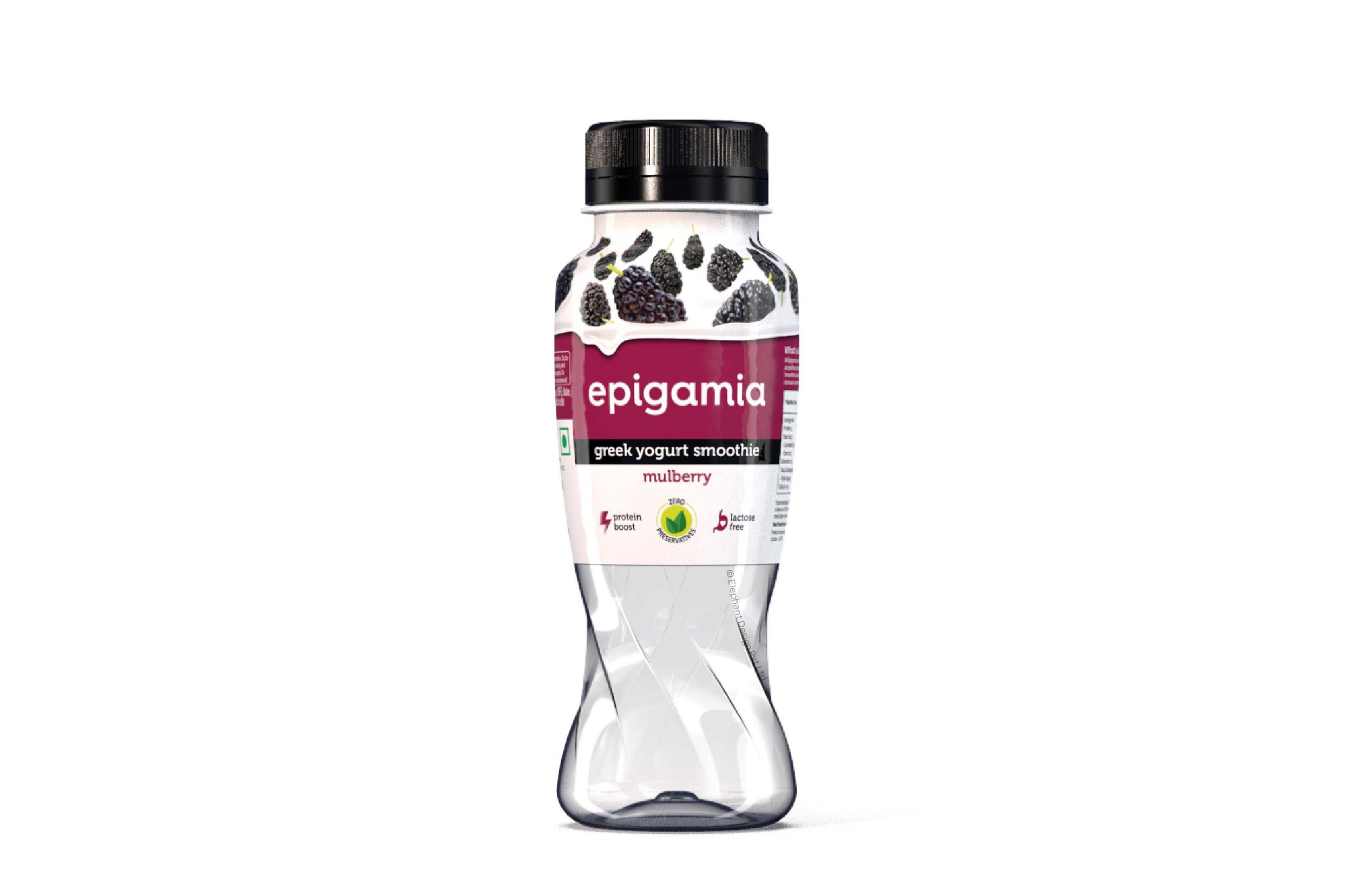
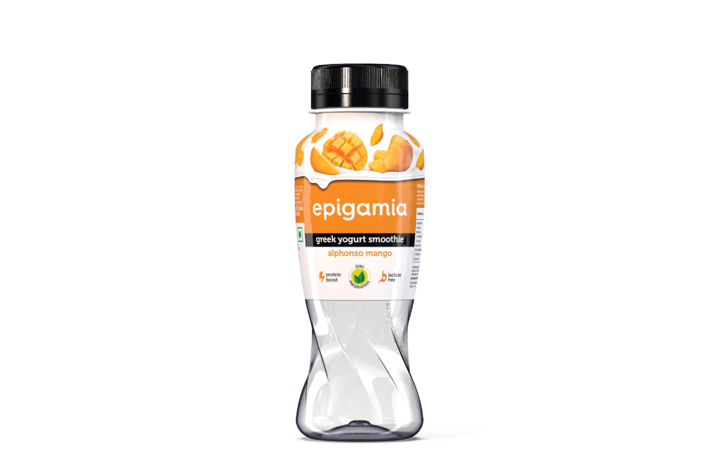
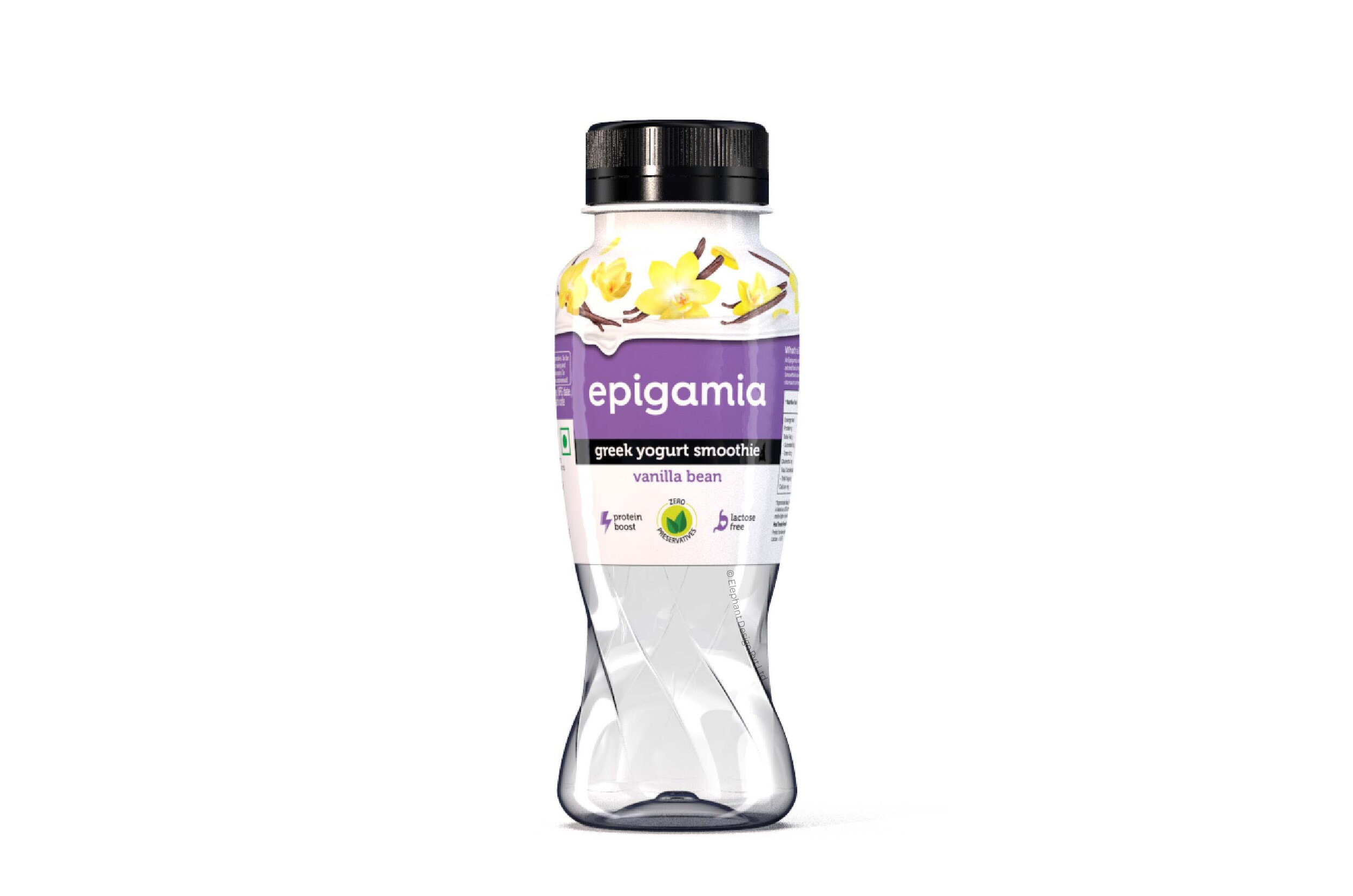
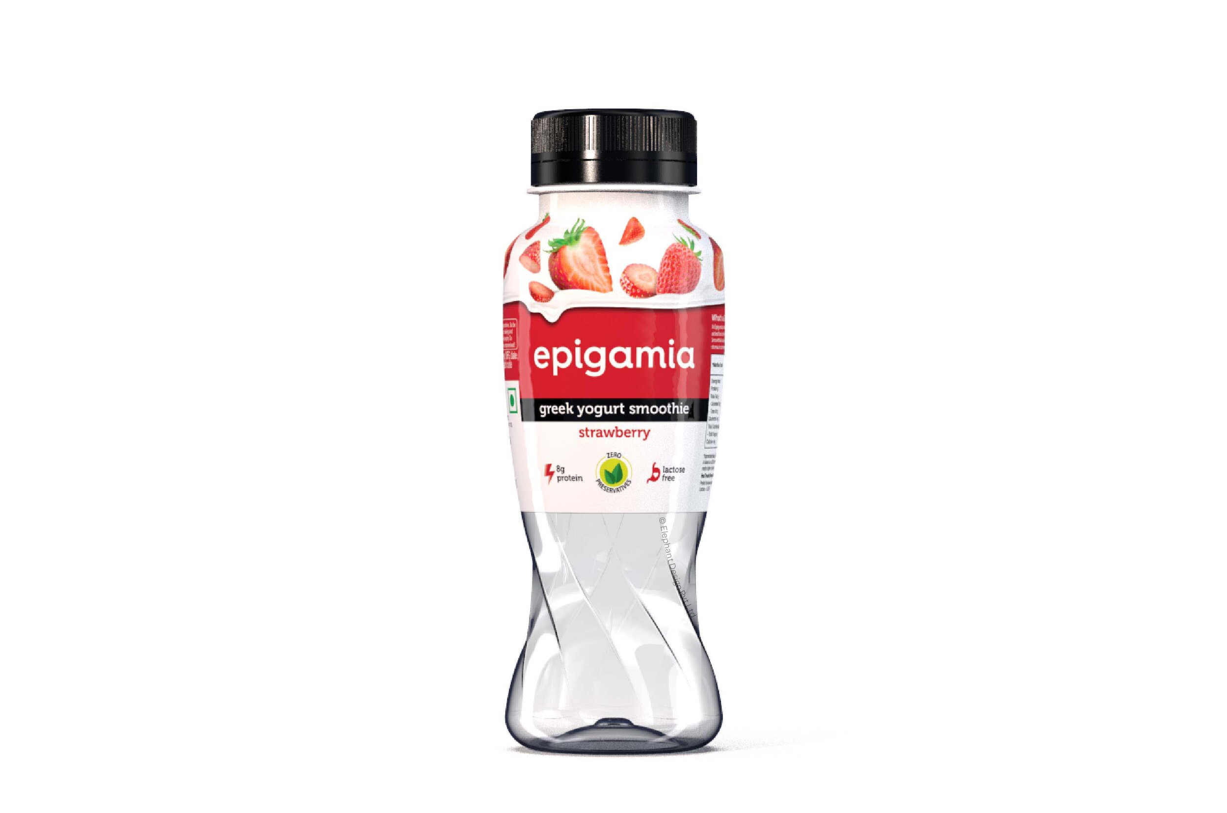
Elephant created a swirling, contemporary shape to contain this newly launched product
The bottle was designed to be easy to grip, use and take for on-the-go consumption
The bottle also encapsulates Epigamia’s overall fun and approachable brand qualities
The Story
Epigamia is a considerably new entrant in the highly competitive Indian FMCG landscape, and has been nothing but a hotshot when it comes to performance. In as little as four years, Epigamia is now selling over 3 million cups of Greek yoghurt in a month. Their authentic, fresh flavours combined with the undeniable health factor has now enabled them to diversify even further.

“Epigamia wanted this bottle to represent ‘potency and intensity’, but not the kind that is normally found in health drinks.”
Epigamia wanted us to design the bottle for their newest product, the Epigamia yoghurt smoothie. In the Indian market, there are no other equivalents, so this was bound to make a splash. We titled it ‘Twist’, which fit the bill because not only is it a fun, exciting product – it also shows the churning process milk has to undergo to produce this yummy, health-filled drink. The package was to represent ‘potency and intensity’, but not the kind that is normally found in health drinks. This would be closer to ‘wholesomeness’ and represent the intensity of the flavour.
The Shape of a Smoothie

What’s the ideal crucible for something like a smoothie? Over that, how would potency factor into this? ‘Twist’ can be a very versatile term. Many permutations and combinations of design can be used to showcase that – but we determined the most effective one, considering that fluidity, motion and churning – all had to be encapsulated on the package.
“Since the ‘Twist’ came from the idea that something had been churned thoroughly, the bottle needed to have spiraling elements.”
This also lends a certain grace to the bottle, while providing a peek at the contents – thick, smooth and flavourful goodness within. We made sure that this ‘grace’ did not appear fragile in any way, but maintained a certain rigidity and integrity.
Apart from aesthetics, the lines serve the ergonomic function of increasing grip, making the bottle very easy and fun to hold – hinting at an ‘on-the-go’ kind of appeal. It makes the bottle inviting and friendly – much like Epigamia’s other products.
“While it may seem simplistic, Elephant made sure that this ‘grace’ did not appear fragile in any way, but maintained a certain rigidity and integrity.”

Graphical Enhancement
The top was designed in a more contemporary manner, where the bottle flows out into a broad surface to accommodate the label. We wanted the graphics to be in tune with the entire feel of the bottle, which came through in the design. We took certain measures to ensure that the visual language of the bottle borrows from the core brand (Epigamia Yogurt) and infused it with the codes of the new product – which is the yogurt smoothie.
Overall, Epigamia’s new yogurt drink bottle was very happily accepted in their ever-growing family of products; and we expect to see it flying off the shelves with its promise of health, flavourful potency, and wholesomeness.
“Behavioural design is all about feeling in control. Includes: usability, understanding, but also the feel.”