

The Focus
Flite, a very popular sub-brand under the umbrella footwear brand Relaxo, needed to reflect the changing consumer trends
Illustrated the need to adapt to the ‘New Indian’ consumer, full of hope and aspirations
Needed to toe the fine line between functionality and fashion, but the familiarity with the existing logo also needed to remain intact
The Design
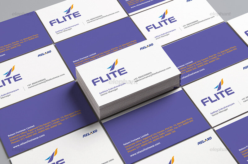
The team at Elephant decided to create a brand emblem, which is a striking feature of higher order brands that could represent the essence of the brand
The brand emblem was especially tailored to be versatile, minimalistic and easy to reproduce in a variety of ways across the product range.
The visual identity was suitably adjusted to incorporate the nuances of contemporariness, new-age aspirations and youthfulness while retaining that element of familiarity.

The Story
From the parent company Relaxo, Flite is a mass premium brand of footwear in the Indian subcontinent. It has also undergone some changes since its first avatar appeared on the shelves.
Founded in 1976, Relaxo has long since realized its dream of holding the position of the largest manufacturer of affordable, stylish footwear in India to the point where it is a household name. With ten brands under its ambit, it has also signed on the most famous Indian celebrities to highlight brand recall, while making it extremely relatable to the Indian population at large.
Flite brand within the Relaxo family is semi-formal yet chic in nature, appealing to the college-going young audience. From being a functional, light and colorful brand in its 2012 “Walk with Me” campaign, they now wished to turn to higher order achievements, aspirations and the realization of dreams by a youthful, hopeful India.
They invited Elephant with the mandate of adapting to a changing consumer base, which the old logo could not accurately reflect. There was a need to make it more contemporary, while not losing connect with its existing logo and presentation.
“Flite brand within the Relaxo family is semi-formal yet chic in nature, appealing to the college-going young audience. From being a functional, light and colorful brand in its 2012 “Walk with Me” campaign, they now wished to turn to higher order achievements, aspirations and the realization of dreams by a youthful, hopeful India.”
The Emblematic Method
Given that higher order brands often tend to adopt emblems, or alternatively, wordmarks to represent their logos on their merchandise, Elephant team proposed a strategy to create an emblem for Flite to reflect its revamp and premium positioning.

“Consequently, the new Flite emblem was born in our workshops. Minimalism is the essence of this emblem, with a three-stroke symbol representing a bird, the quintessence of elevation, aspiration and ambition. The bird is taking flight, with its wings bearing witness to its capability to do so.”
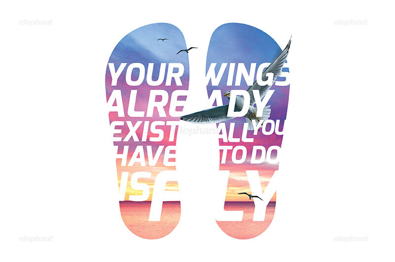
One of the key areas to focus on was the shift from pure functionality to fashion-consciousness, which is not only an aesthetic choice but also appeals to aspirations that go beyond utility. To be concerned with style is to go beyond the baseline.
Consequently, the new Flite emblem was born in our workshops. Minimalism is the essence of this emblem, with a three-stroke symbol representing a bird, the quintessence of elevation, aspiration and ambition. The bird is taking flight, with its wings bearing witness to its capability to do so.
Continuity and Contemporariness
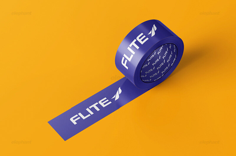
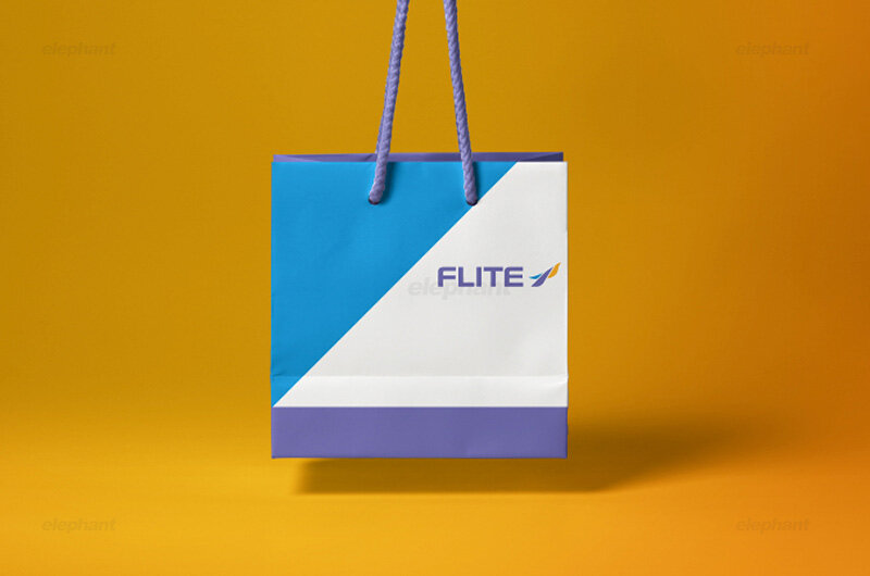
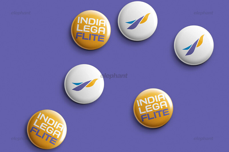
In order to maintain familiarity with a very large consumer base, the strategy was to continue the earlier colour palette of blue, gold and purple hues, but in a more streamlined and contemporary fashion. Here, the new symbol is the core focus for the shift in consumer perception as this emblem itself has a plethora of applications – from it being printed, being embossed on surfaces and so on.
This can be adapted easily to accommodate for their ever-increasing range of products within this brand. From slipper straps to sandal surfaces, this emblem can be used independently, or along with other logotypes.
In addition, the typography itself matches the new logo, with its elegant, streamlined appearance.
“The identity revamp was met with satisfaction from all stakeholders involved. It also snugly fit within its existing ecosystem, where brand ambassador Ranveer Singh has been long since representing youthful zest in tandem with cutting-edge style. The consumers, in turn, have also changed from those who merely had childish fantasies to those who are now equipped with the right tools and practical ambition needed to actualize their goals. ”
The identity revamp was met with satisfaction from all stakeholders involved. It also snugly fit within its existing ecosystem, where brand ambassador Ranveer Singh has been long since representing youthful zest in tandem with cutting-edge style. The consumers, in turn, have also changed from those who merely had childish fantasies to those who are now equipped with the right tools and practical ambition needed to actualize their goals.
This transformation is a classic example of brand metamorphosis without alienating it from its roots. Our work here was aimed very specifically at making the new logo strike a perfect balance between continuity and contemporariness, which can be witnessed clearly.
““Leave it better than you found it.””