

The Focus
Floryo intended to break into the Indian atta (flour) market with its wide range of made-to-order, customized flours.
Catered to homemakers seeking fresh, minimally processed flours that could satisfy the nutritional needs of their family members.
Desired an identity and packaging system that would communicate the brand’s key propositions (sustainable, healthy and nourishing), working as an extension of the core product and its promise.
The Design
The team built the brand identity and packaging system with optimism, simplicity and assurance as the main themes.
A handcrafted typeface and elements are juxtaposed with a modern colour scheme to ensure that the identity appeals to various consumers. The ‘O’ with the arrow in the logo indicates new, positive beginnings that come with the rising sun.
The packaging system was adaptive, perfect for a budding brand with an expanding portfolio. As intended, the packaging works with the product, catching the consumer’s eye on online and offline shelves while educating them about their unique propositions.
The Story
While ‘superfoods’ like barley and millet have recently been in the spotlight due to their historicity, wheat flour (atta) claims an equally ancient heritage. A mixture of archaeological and textual evidence shows that the civilizations of Harappa and Mohenjodaro cultivated wheat around 5000 years ago! The Green Revolution, while doing away with some rare varietals of wheat, introduced other hybrid strains. Today, India happens to be the 2nd largest producer of wheat in the world.
We provide this context to prove how integral wheat and atta are in Indian households. Despite that, the packaged flour market remains fragmented and undifferentiated. India is dotted with large and small mills, with only some possessing a registered trademark. Most players rely on pricing and discounting as customer value drivers, resulting in lower margins.
Floryo founders saw the gap in demand & availability of clean, trustworthy & nourishing flours that form the primary ingredient in an Indian household's meal. They used tech to emulate the traditional chakki – a small stone grinder/mill – that enabled the milling of customized, made-to-order flours in scalable quantities. This gave customers the choice to opt for freshly milled, stone-grinded atta that also catered to their specific nutritional requirements. Every Floryo package is personalized and home-delivered, where traditional production methods and modern conveniences go hand-in-hand.
The topic of packages leads us to why Floryo approached the team at Elephant. They wanted us to design an identity for their new brand while developing a packaging system for their range of flours. The identity needed to embody the persona of a happy, optimistic, nourishing brand. On the other hand, the packaging would be an extension of the brand’s persona, communicating its unique propositions and completing the story of eco-consciousness, sustainability and informed choices.
Merging Tradition and Modernity
The team worked closely with Floryo to create a contemporary, fresh visual identity. The bright colour palette was decidedly new-age, intending to evoke optimism, nourishing goodness and happiness.
Conversely, the team chose a handcrafted typeface that went well with Floryo’s promise of providing a customized experience and hinting at their inspiration – the local stone mill, rooted in antiquity.
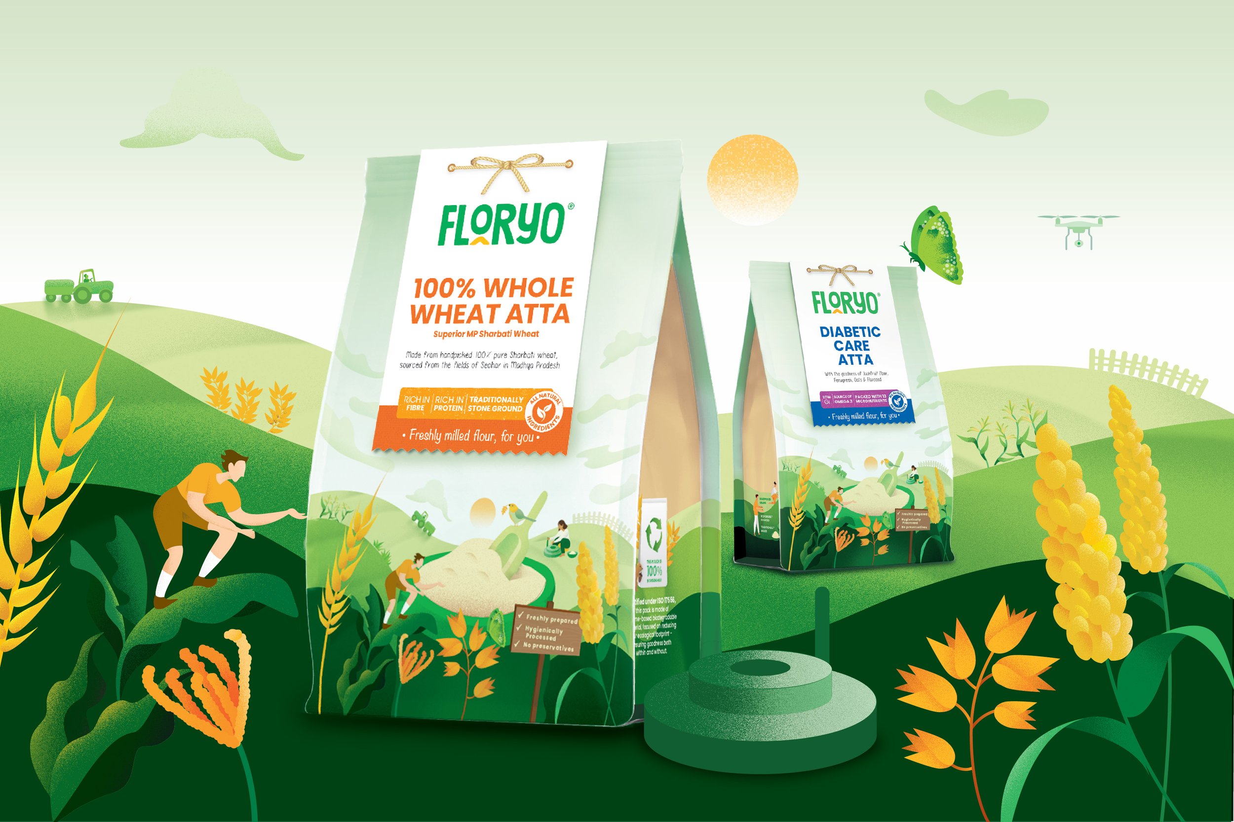
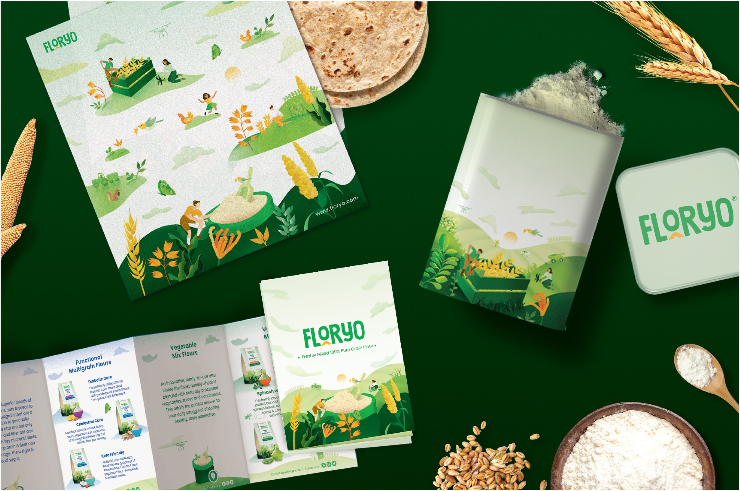
Both choices create a union of tradition and authenticity, which lies at the heart of Floryo’s business. The team ensured that the packaging also narrated another crucial story: harnessing the goodness of nature in the ‘farm to plate’ model. Specifically-crafted illustrations indicate the vastness of nature and Floryo’s commitment to forming a mutually beneficial, harmonious relationship with it.
The ‘O’ and ‘arrow’ elements within the logotype suggest a new beginning – the rising sun – which mirrors the consumer’s choice to opt for a new, improved type of flour. Lastly, the identity suggests the aspirational, healthier, lighter lifestyle in store for the potential customer.
Sustainable, Informed Choices
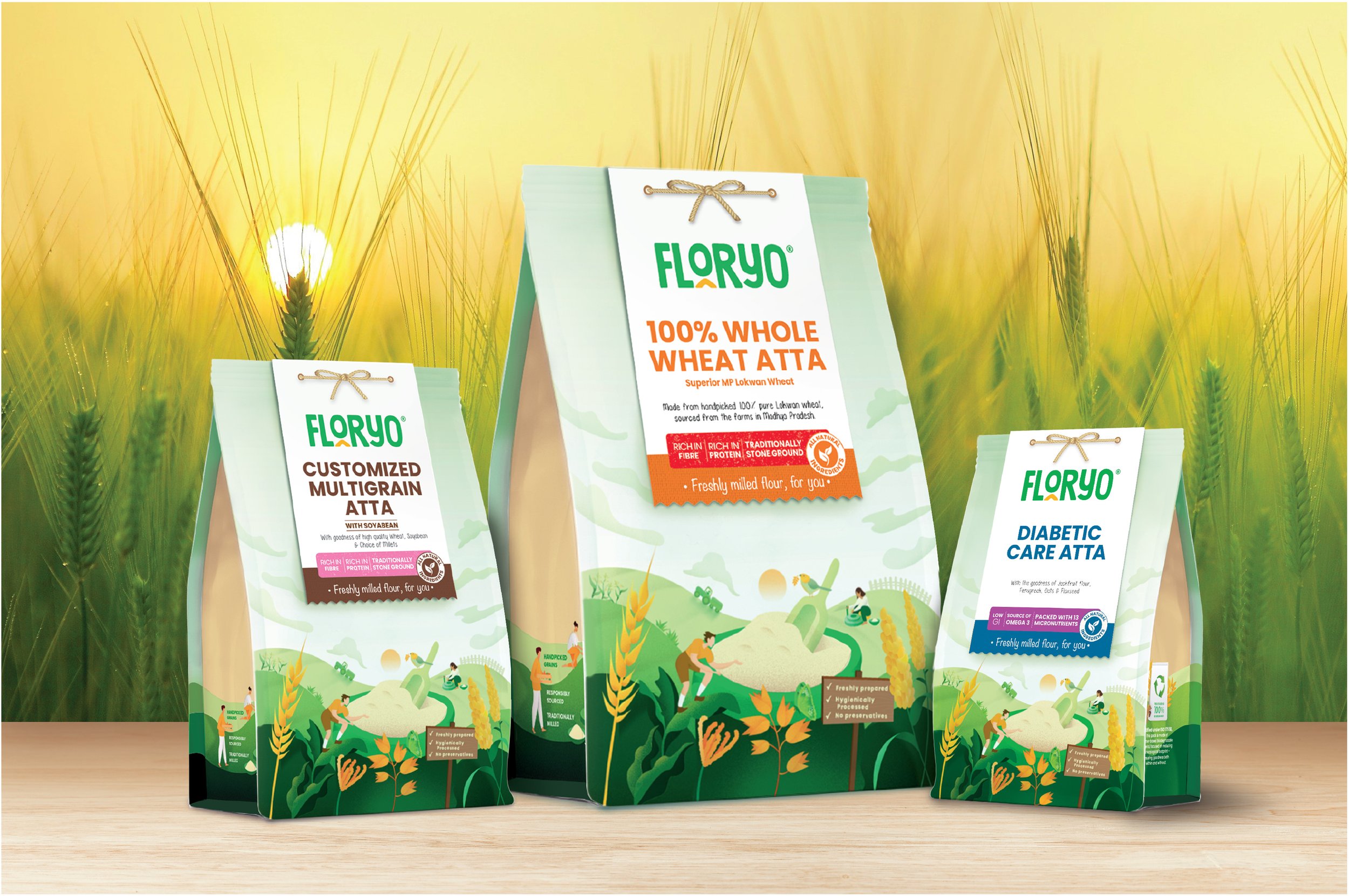
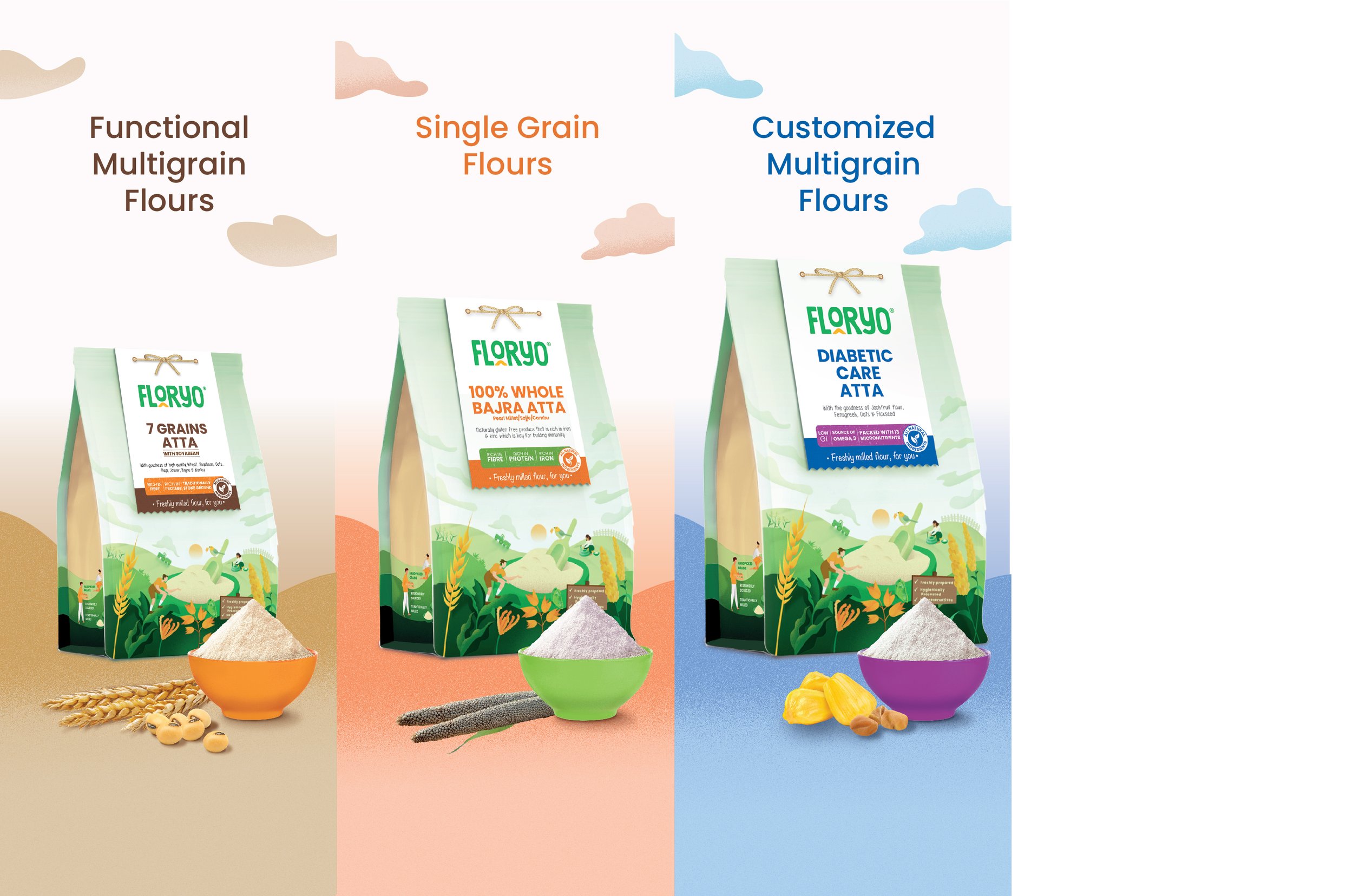
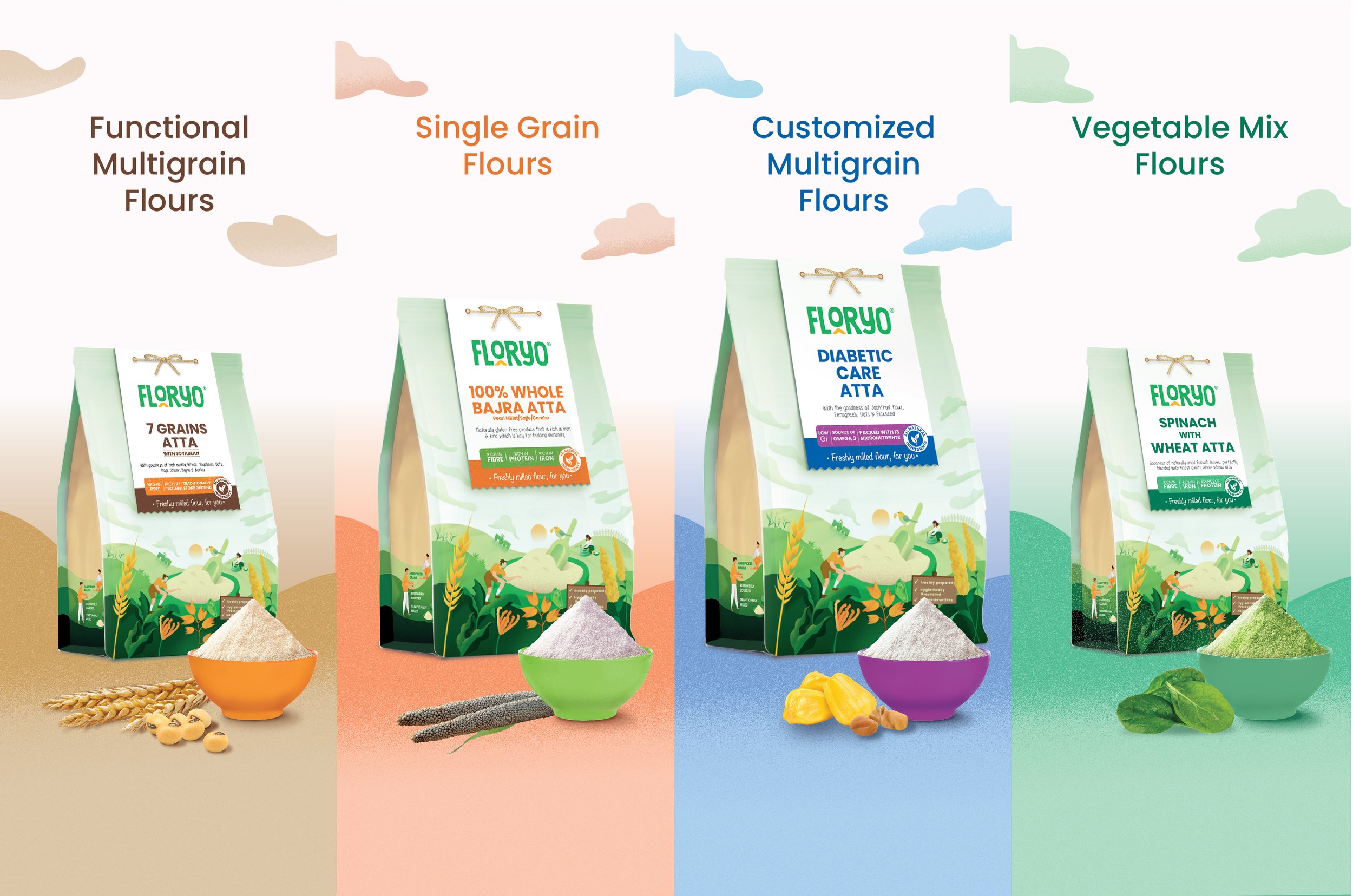
The packaging works with the identity and enhances it. We used its flour-sack-like structure to build on the fresh, hand-made story. An illustrative panel-tag takes centre stage, where a rope-ribbon element adds to the ‘handcrafted’ nature of the flour within. Customers will inevitably find the coloured band at the end of the panel, where the text ‘freshly milled for you’ is highlighted.
Crucial information and the brand’s key propositions (nutritional richness, milling method and sourcing) are laid out on this tag. This design choice gives the entire package a clean, minimalist feel that draws in and educates customers in one stroke.
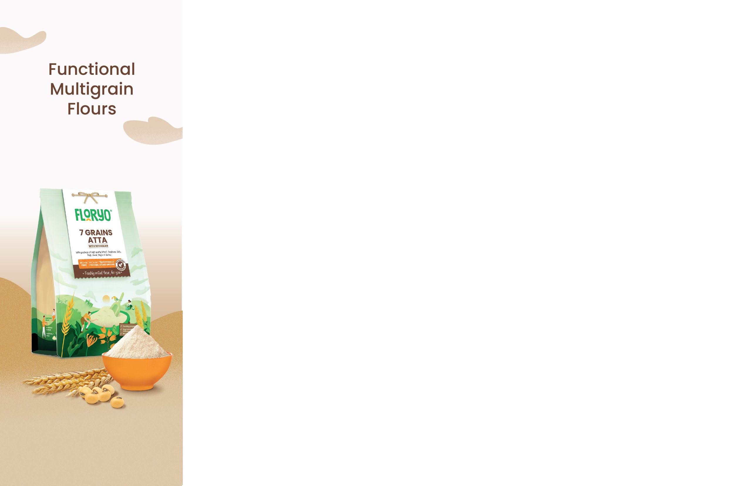
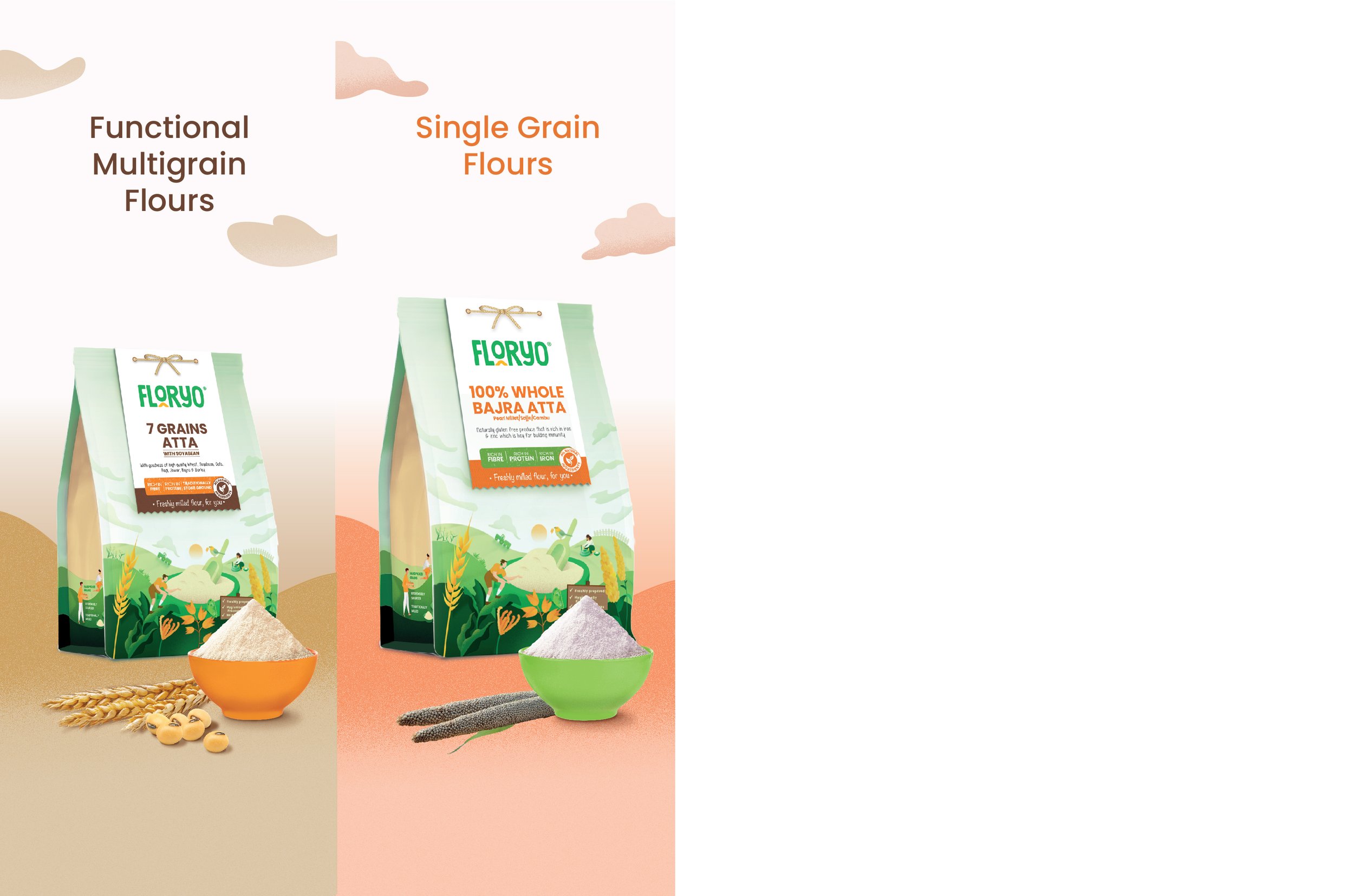
The tag also allows for a more extensive, versatile packaging system. With Floryo rolling out vegetable flours, flours for diabetics, and multigrain options, the panel makes room for various colours and text-based treatments that help customers differentiate between variants.
Lastly, the tag makes the package adapt to different packaging sizes, cutting production costs. Since the tag can be separately attached to the pouches, additional pouch sizes can be included in the range without a hitch. This plays into Floryo’s made-to-order promise, where the flour can be freshly ground and packaged on the fly without needing overhauls.
The BOP leverages the back of the same panel to convey the brand’s story. It reassures customers that they are making an informed choice that isn’t just good for their health but the planet’s health too! Information about the packaging – which is sustainable – as well as the practices Floryo utilizes for a better, healthier tomorrow completes the narrative.
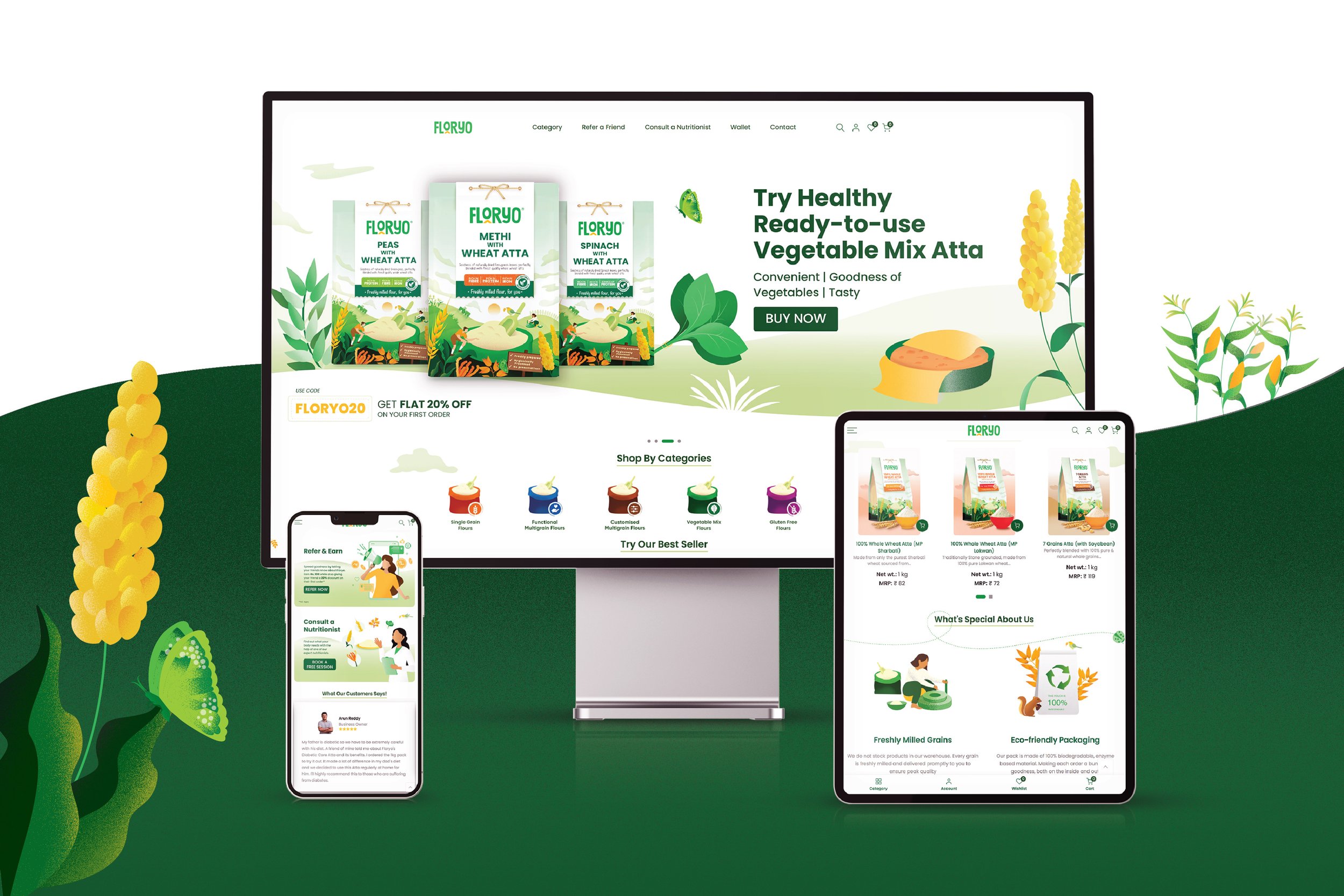
Optimizing for Online Shelves
Personalization and convenience are key pillars for Floryo’s differentiated proposition. Since customers can only purchase these items on online shelves, it was important to optimize their browsing experience. The team worked on the look and feel of the website, where it became an extension of the brand’s personality and packaging system because of the illustrations and other design language elements. Overall, Floryo’s visual identity, packaging and packaging system all work together to distinguish the brand from various players in a stagnant market ripe for disruption. These offerings also help educate customers about the brand and the product in tandem. They help them make an informed decision about how they consume their flour, which the team helped achieve!