
Health Sutra
Bringing Millets back to The Contemporary Indian Diet

The Focus
Making consumers aware of Health Sutra’s offerings and brand benefits
Establishing the brand’s edge when it comes to bringing back millets to the Indian diet
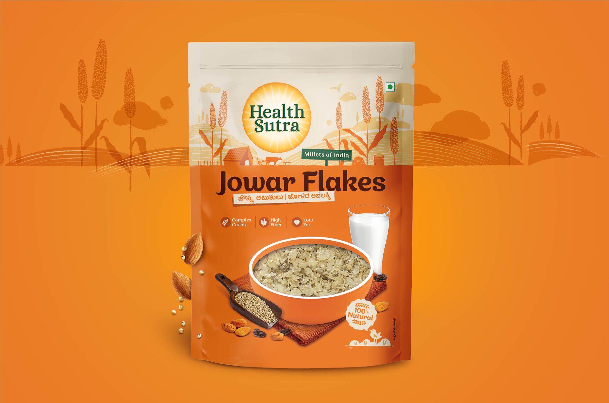
The Design
Elephant’s packaging for Health Sutra focused on two things:
Increasing transparency so that consumers knew exactly what they were getting
Adding a rustic feel in order to indicate its natural, unprocessed aspects
We also added purpose-driven design elements, singling farm-freshness and a blend of traditional goodness on the modern breakfast table
The Story

Health Sutra is a relatively fresh player in India’s nutritional brand scenario and has its own appeal when it comes to helping the modern Indian consumer rediscover traditional superfoods like millets, helping them incorporate that in their everyday diet.
The challenge posed by Health Sutra to us was: Design the packaging in such a way that consumer intuitively began thinking that the product was more versatile than just a substitute for breakfast bowl cereals. In addition, the brand needed to focus on the rustic, farm-fresh and traditional aspects of their product.
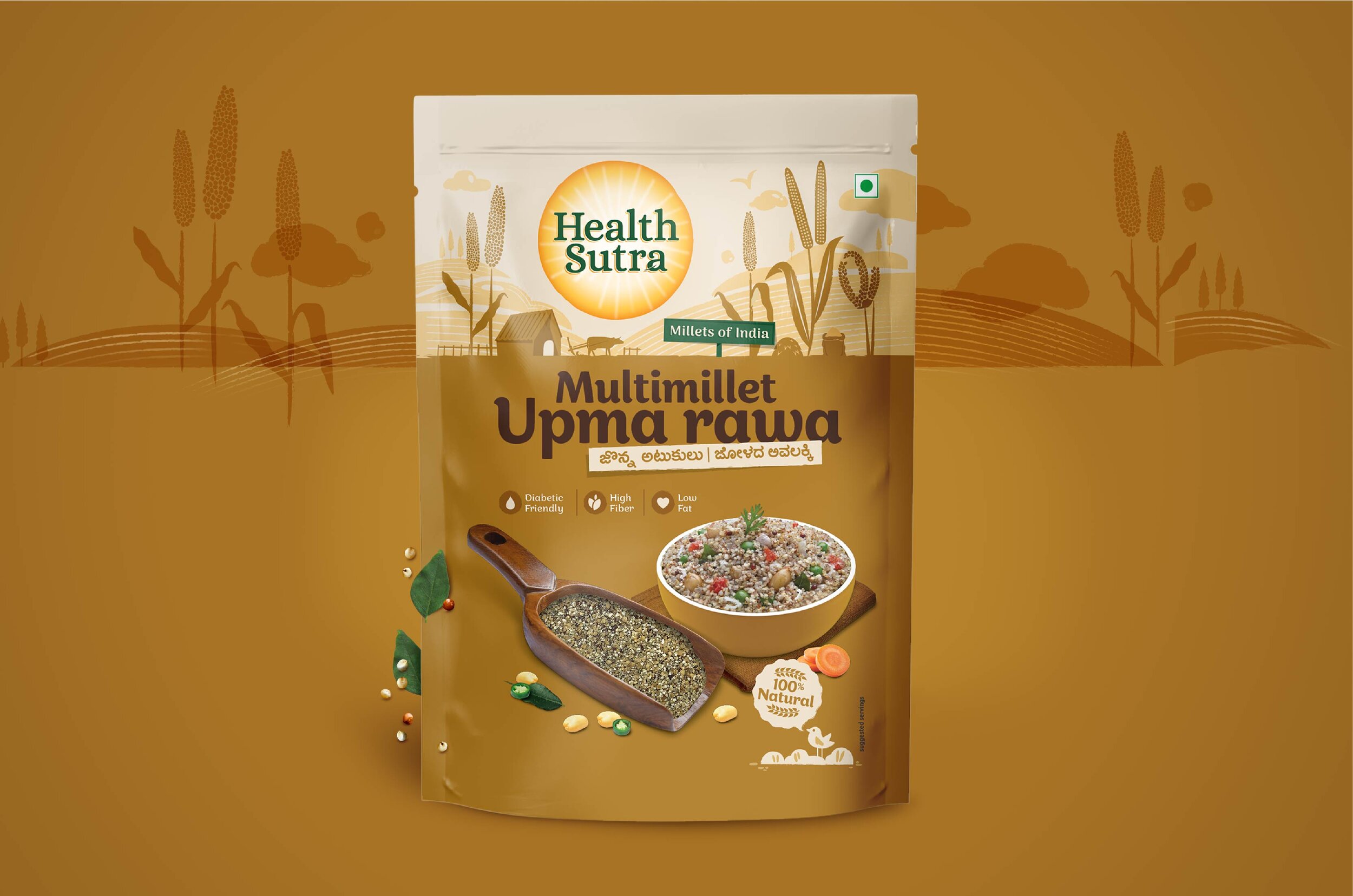
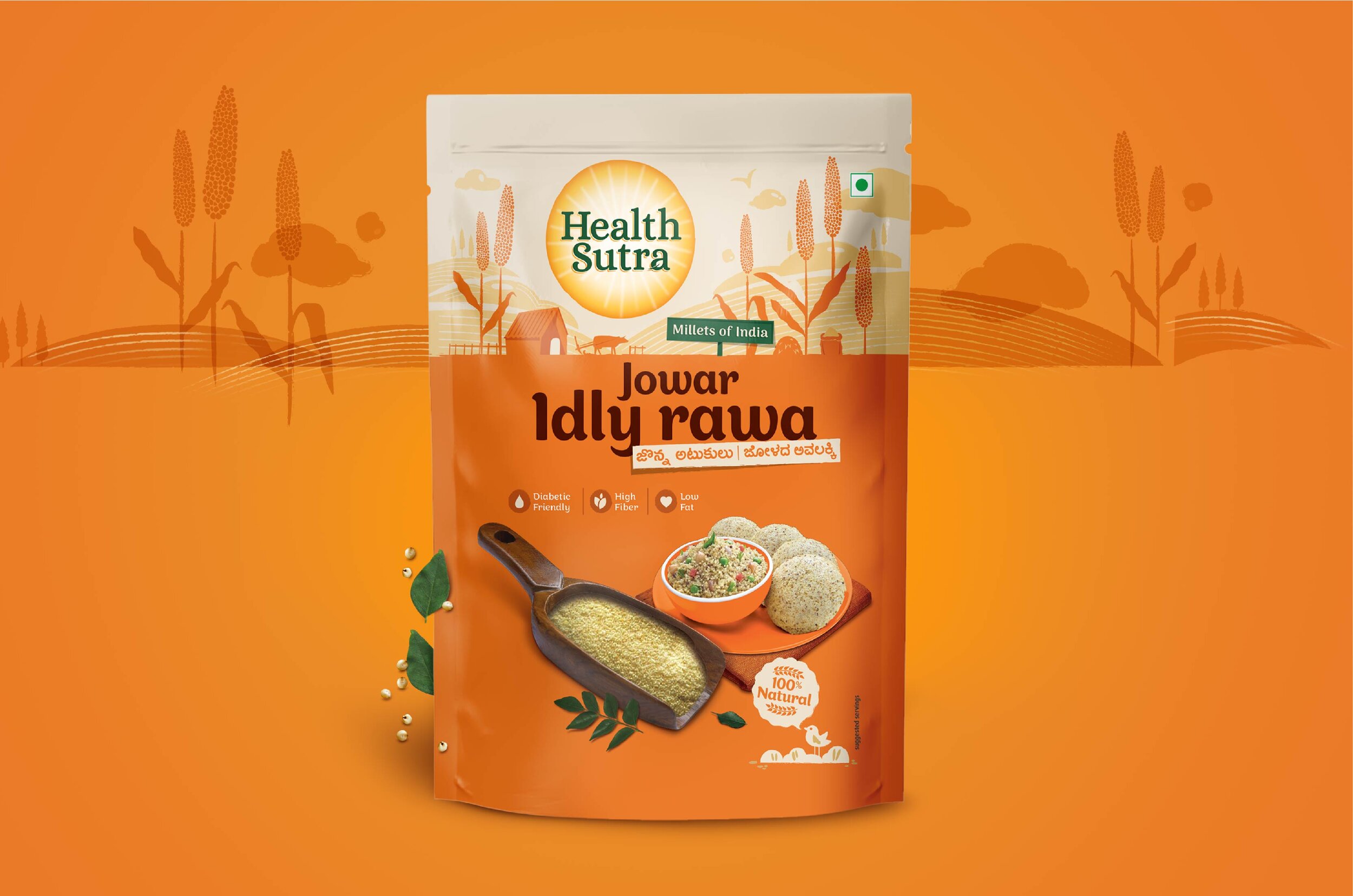
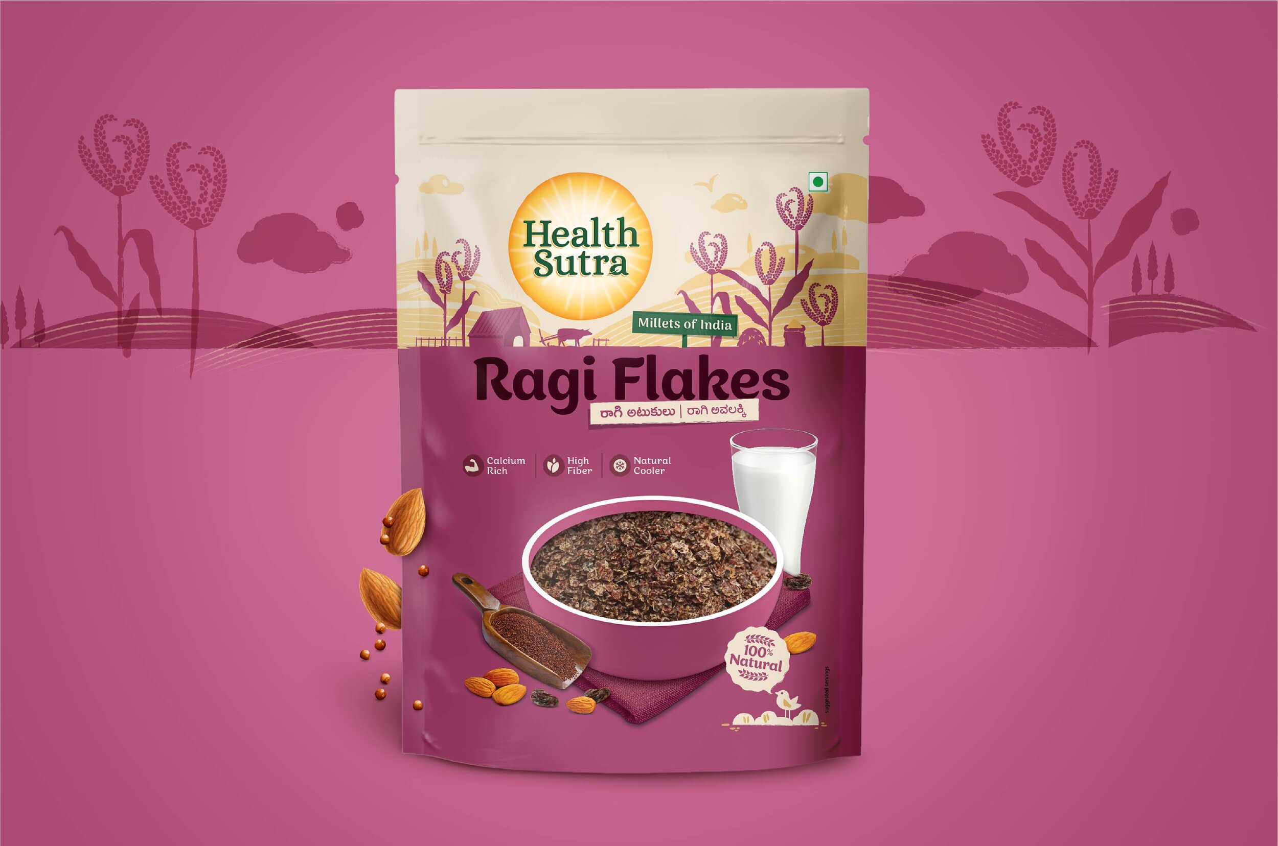
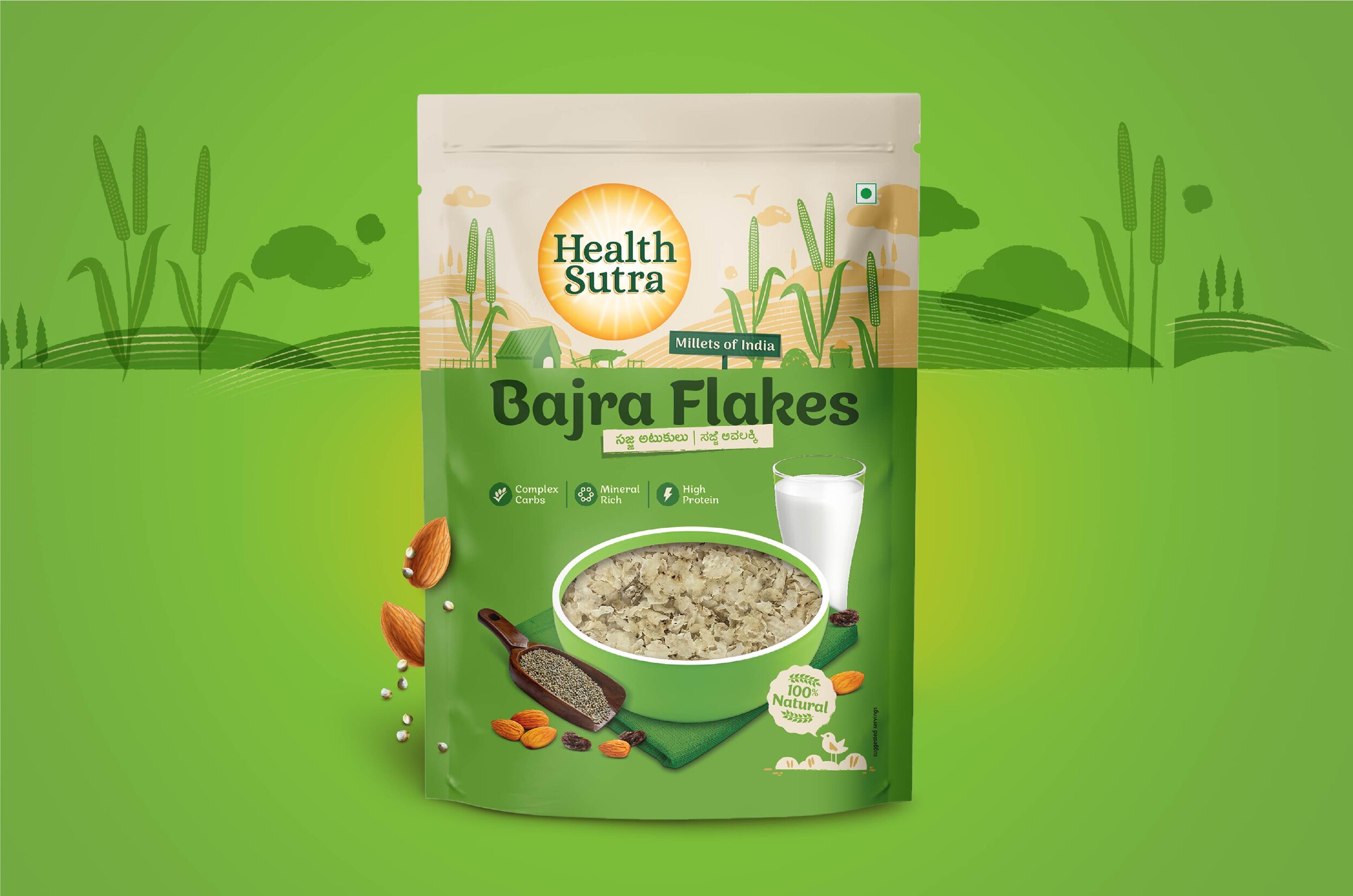
Prehistoric Goodness
Health Sutra’s range of products are derived from the simple understanding that the less processed the food is, the better it is for your health and nourishment. It focuses on millets – a food that has existed since time immemorial, especially in the Indian diet. We now know that the health-conscious shopper knows the importance of this ancient food, especially in today’s world of processed food grains.
We added a transparent window to the package in order to showcase the unprocessed nature of the millets within. The shopper can see what they’re buying in its glorious, unprocessed, nutritious form.

“Millets have been an essential part of the Indian diet since antiquity. While modern food habits did away with them, HealthSutra is on a quest to bring them back.”
Versatility

Consumers simply didn’t know how else millets could be used. Thus, we needed to concretely portray the versatile nature of their core ingredient. Our packaging incorporated all kinds of serving suggestions in a clear, concise format to remedy this.
The result? Consumers now know exactly how and when the products can be used – be it for snacking, breakfast, or alternative preparations.
“The modern Indian mother, when it comes to breakfast, likes relying on less processed options either way. She is also familiar with jowar, ragi, and bajra, but doesn’t always connect them to basic food preparations like poha, Idlis and so on.”
Enabling Trust and Pickup Potential
Pickup potential for the product was enhanced using different color palettes for different grains, so that consumer choices could be instinctive. Plus, we gave a rustic, minimal packaging feel in order to make it known that this was as pristine as it was when picked straight from the farm. The morning sun combined with the breakfast bowl made the package simple and honest.
We added custom illustrations for different variants in order to give it a more personalized feel. Lastly, we also added the “Millets of India” signpost to signal the authenticity of the food grain’s source.
The result? The appeal, versatility and homegrown nature of Health Sutra products could be viewed and understood better – leading to an increased number of customers picking them up and incorporating them in their everyday intake!
“Good design is obvious. Great design is transparent.”