
The Focus
Refreshing the packaging for the universally loved cereal: Kellogg’s Chocos
Adding cues of nutritional goodness to the existing, familiar elements (chocolaty goodness)
De-clutter the package in terms of elements, without losing the familiarity it already had
The Design
Elephant identified this to be a balancing act in terms of design – which resulted in:
Using familiar, vibrant colors while standardizing the mascot
Re-directed attention towards the nutritional aspects for mothers
Created a refreshing makeover that could evolve across the range
The Story
Almost every growing Indian child, teenager and adult knows about some Kellogg’s product – and Chocos has a special place in their heart. Why, you ask? The answers are pretty simple, almost self-evident. As a child, you want to make the most of the tiny little joys you get, and the ‘milk occasion’ is one of them.

“We had to basically make casually unseen yet important changes that made the customer approach it like an old friend, but with newer, more desirable personality changes.”
While milk is healthy, making it enjoyable can be a tad bit challenging. Chocos promises chocolaty goodness, transforming the humble milk-based breakfast into a treat.
Parents use it as a lure. Teenagers snack on it nonchalantly. Children go nuts over it. Chocos was already pretty versatile and popular when they came to us. We had a tricky yet exciting set of tasks ahead, but it all came down to one great big balancing act: Combining nutrition with taste, the old with the new.
The tricky part for us here actually turned out to be a brilliant creative exercise for our team: we succeeded in using the blind spots within the packaging itself to convey the key qualities of Kellogg’s Chocos. This made the customer approach it like an old friend – but with a revamped outfit. We wanted to make this transition pleasant, comfortable and familiar at the same time.
The Palette
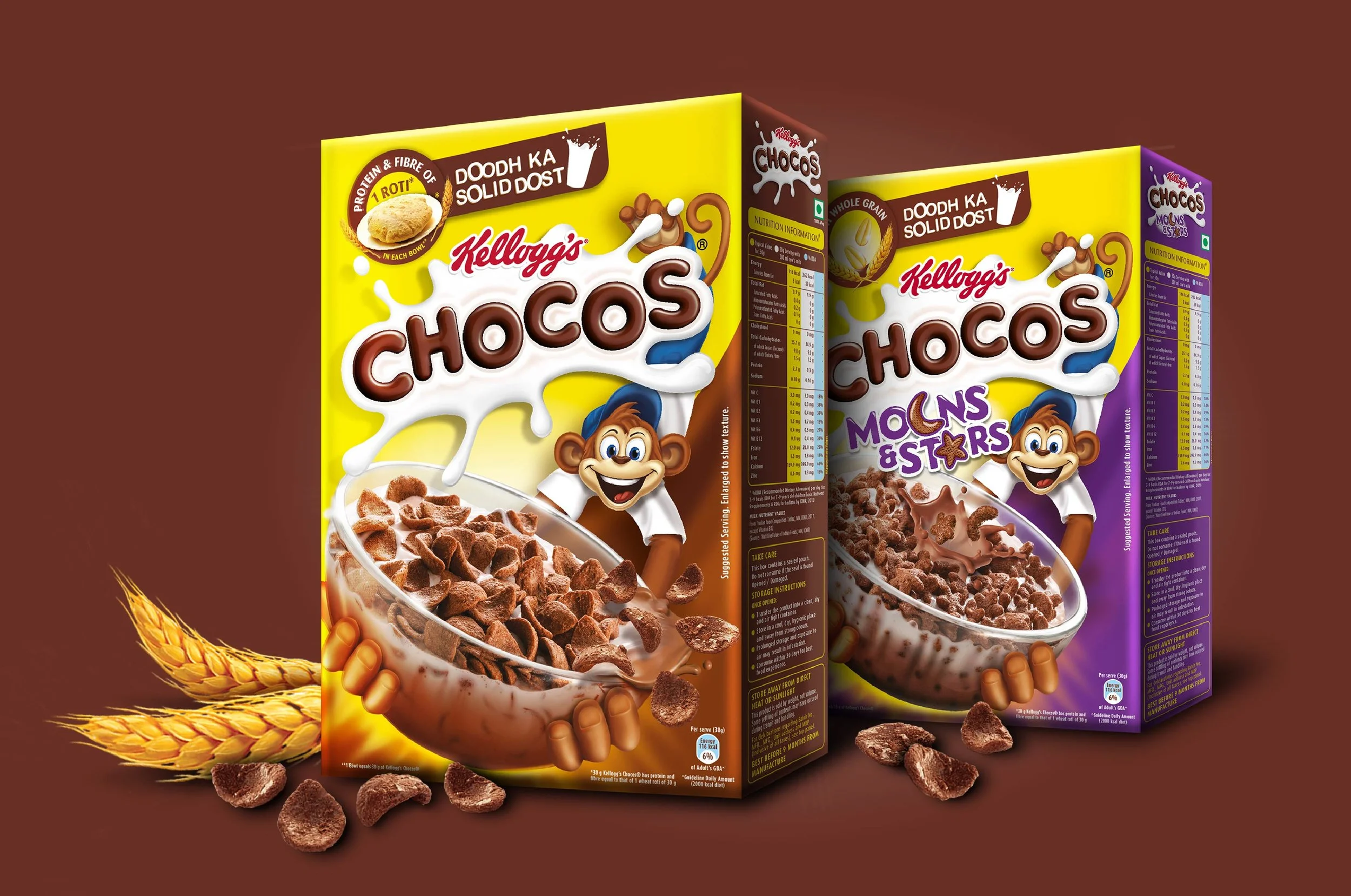
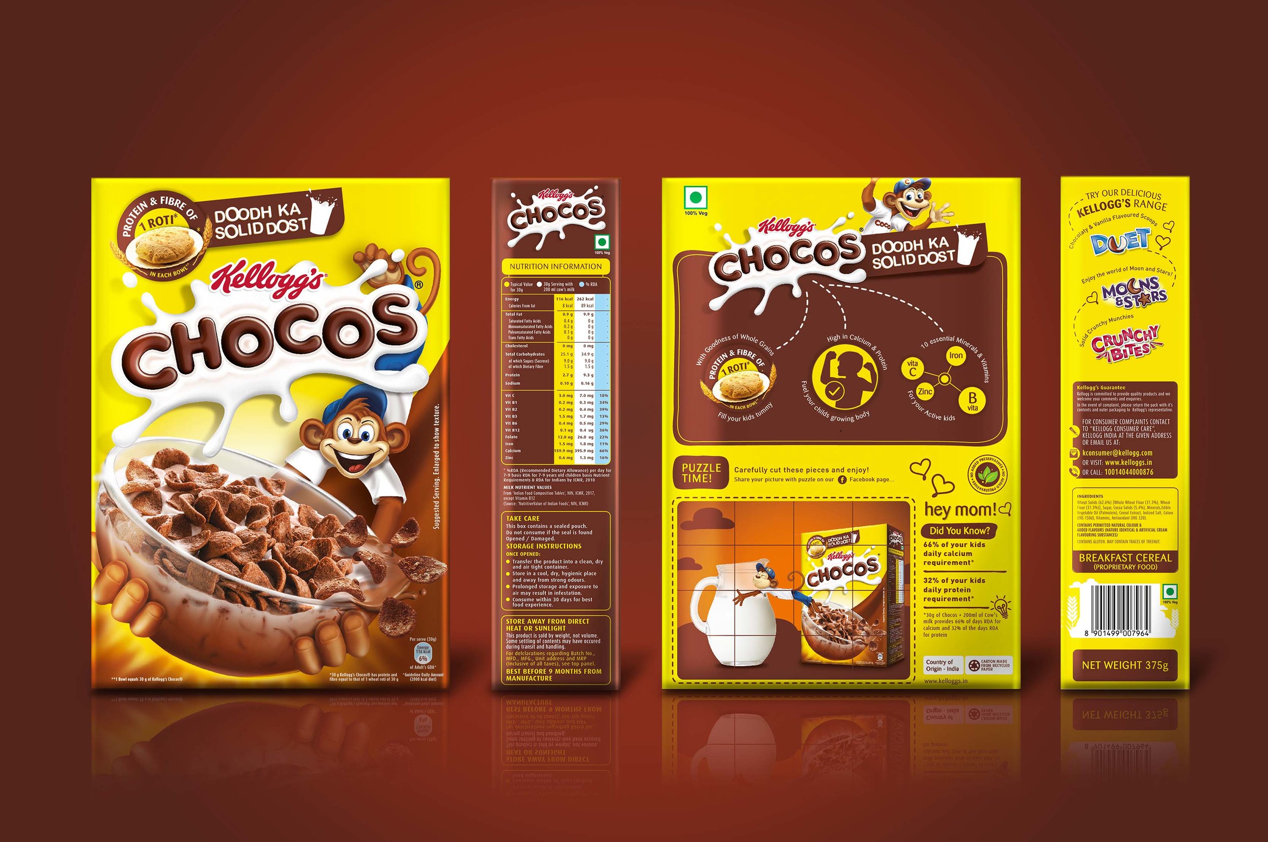
The vivid yellow and brown colour palette was too iconic to see any changes. For children, it was that familiar anchor that promised the chocolaty, crunchy treat. We decluttered the front of the packaging by removing the spoon found on the earlier variants, while tilting and changing the angle of the bowl to make the cereal look more enticing. We also standardised the package for all sorts of variants to give it a crisper, fresher feel.

Nutrition Redux
Children, through hearsay or personal experience, know how yummy and promising Chocos is. How could we get through to the mother? The modern mom is willing to provide her children with tastier options for breakfast, but those options also need to be geared up with the right nutrients.
We used a redesigned mnemonic with Chocos’ tagline ‘Doodh ka solid dost’. Another element that had always worked well with moms was the humble roti being equated with the nutrition that a serving of chocos provides. We standardised this graphic, while also making it more eye-catching for the nutritional aspect.

“The goodness of ‘one roti per serving’ became an ideal substitute – and hence, built the connection between the mother and Chocos itself.”
Refreshing Coco
Coco, the iconic fun mascot for Chocos, has become synonymous with the pack.
While Coco’s pose is now more energetic, he also blends in with the other elements of the pack – making it more fluid and cleaner. He still holds the familiar bowl, brimming with the signature promise of everything that Chocos represents.
“As we preserve that delicate balance between what makes us comfortable, and between what we want to see – the evolution of the pack is a much desirable result.”

Result? The new Chocos is sleeker, cleaner, and guess what – it still feels familiar and lovable!
As we move towards a world of more informed, research-based shopping, our products need to evolve too. Chocos is no exception, and echoes this change by widening its focus to the shoppers (mothers), apart from children, where it’s already popular. As we preserve that delicate balance between what makes us comfortable, and between what we want to see – the evolution of the pack is a much desirable result.
“Design trends online change more often than the wind, and slightly less often than my socks.”