
Organic India
Contemporising Perceptions of an Established Organic brand
If you’ve ever tried turning towards a healthier, conscious lifestyle, Organic India is probably on the top of your list of go-to brands. They offer a range of products to help you lead a better life, while creating a sustainable chain between nature, farmers and consumers. Their aim is to raise the standards of the organic industry by setting an example for other brands.
With new entrants, both national and global, Organic India needed to stay relevant to the times in order to compete. As a decades old brand with a huge range of products, they lacked cohesiveness in the product family. We were called in to shape their packaging and identity, in order to relate to younger consumers. With a strong value system to work with, we were given the task of putting Organic India at par with contemporary brands.
After an internal workshop with the client, we found different aspects of what it means to be Organic in today’s world. For a purpose driven brand like this, the core values of total integrity, commitment to quality and respect and devotion to nature needed to be highlighted in the packaging.
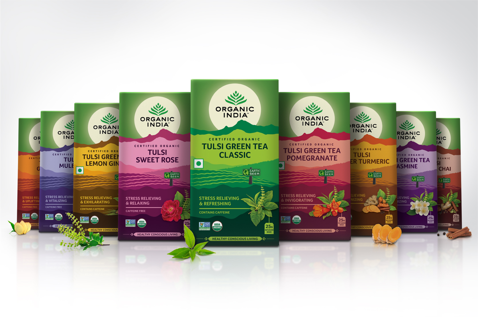
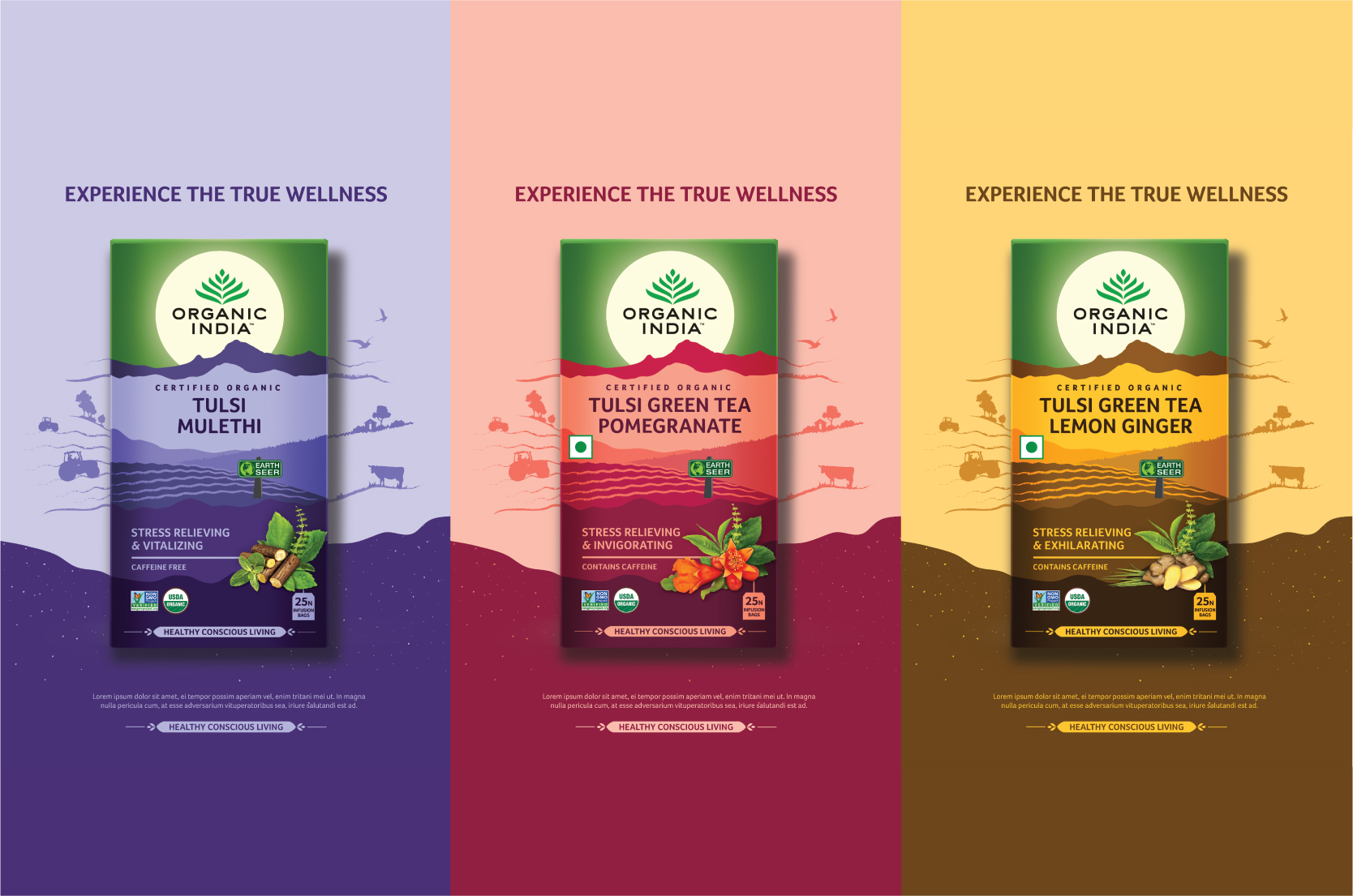
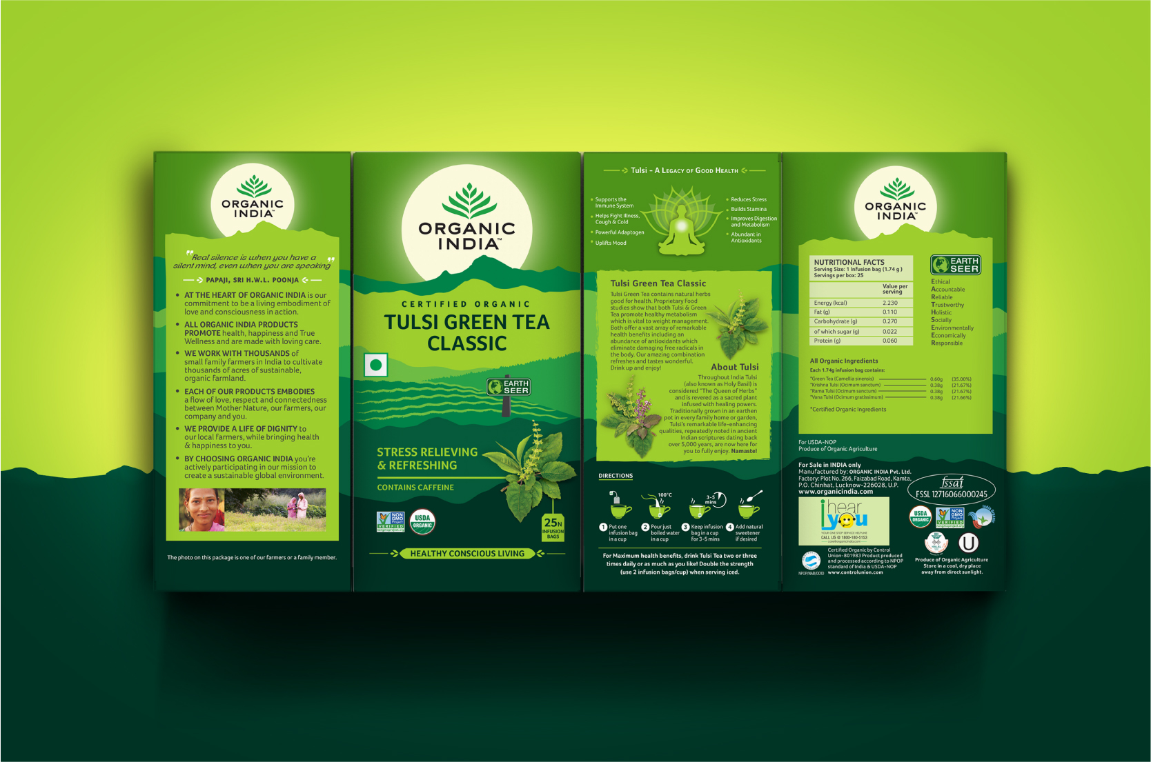
The Arunachalam Mountains were used as inspiration and reimagined from the existing packs. We used this to create the visual language for the brand, signifying the purity of being directly sourced from nature. For each product range, the landscape changes to match its source keeping the Arunachalam intact with a rising sun in background that holds the brand identity as a beacon of well-being.
The packaging was made cleaner, less cluttered and followed a standard system throughout the varied range of products. The colours of the packs were devised in way to appear a lot more vibrant and contemporary, and the entire range now looked like part of the same family.
Organic India is in the process of converting its entire range to the new packaging system, with some variants already launched in markets worldwide.