The Focus
Designing the right packaging for Organic India’s new category of products in the Personal Care domain.
Keeping the tone in line with the brand’s original mission of promoting wellbeing and happiness with a dash of home-made love and care.
Showcasing the differentiating factor: purely organic sourcing and manufacture of ingredients.
Devising suitable nomenclature for the new brand
The Design
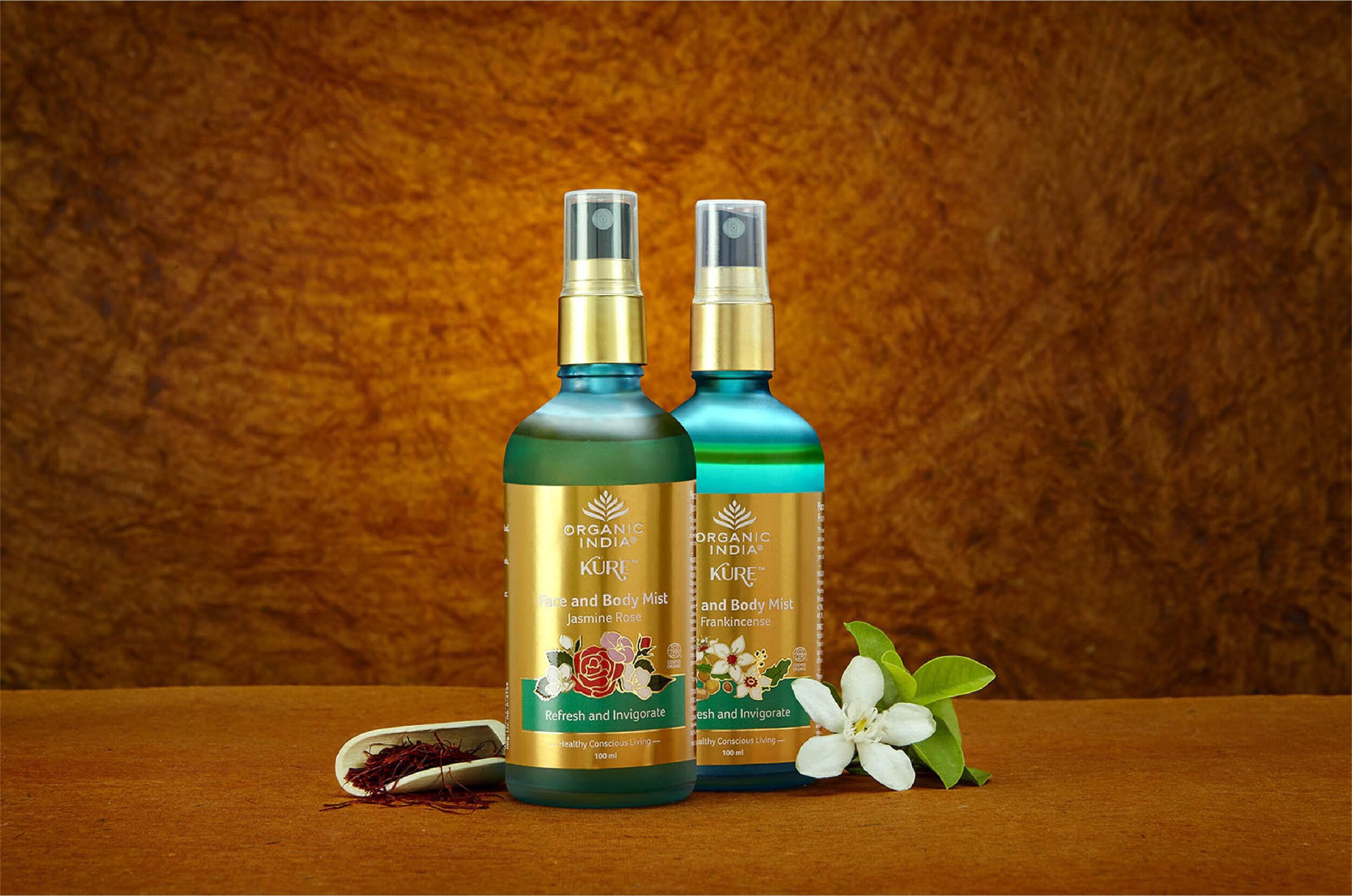
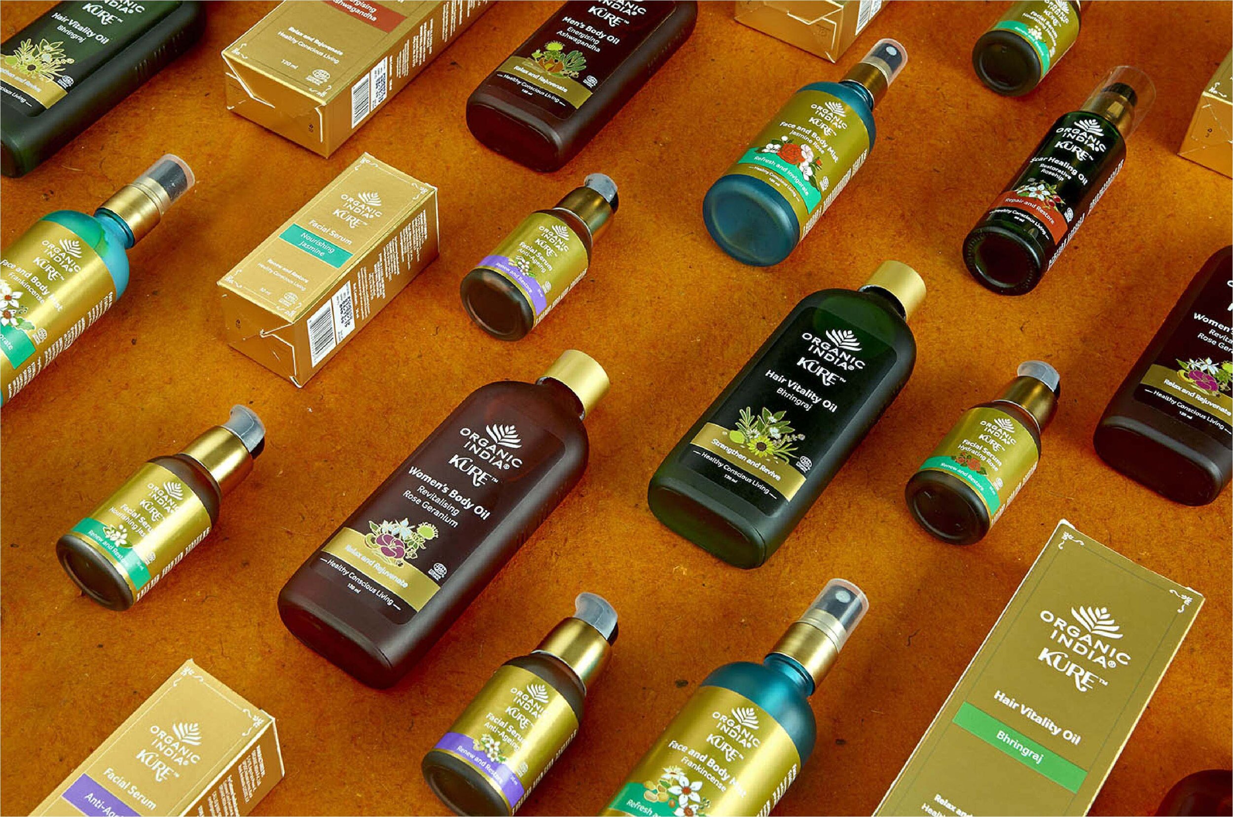
Elephant packaged their new, exquisite carafe-style bottles for Organic India’s herbal cosmetics range, amplifying the ‘made with care’ aspect.
The intent was to capture Organic India’s distinctiveness, while putting minimum focus on sales-driven design language.
“Kure” was finalised to be the appropriate nomenclature, positioning these products to be natural, holistic solutions or remedies.
The Story
At a glance, Organic India seems to be one of the many names dotting the herbal, sustainable, organic business landscape. However, their mission began in 1990 in India, when it wasn’t savvy to adopt these labels – and therein lies their genuineness.
They successfully demonstrated that abundance and sustainability can go hand in hand with thousands of acres of sustainable organic farmland under their belt. In tandem, they have also enriched the lives of all their farmer partners. Sales and success were simply byproducts of a larger goal.
Elephant was to design the packaging for Organic India’s latest product range in the personal care sector domain – and to also devise suitable nomenclature for them, in line with their brand ethos.
“Organic India has enriched the lives of all their farmer partners. For them, sales and success were simply byproducts of a larger goal.”

Sales driven communication was not the priority – the packaging simply needed to echo three things:
One, Organic India’s intent to be a one-stop solution for all wellness-oriented concerns – multifunctionality, in short.
Two, that the product was mild, natural and crafted with love and care.
Three, the absence of synthetic ingredients or chemicals in line with social consciousness and ecological harmony.
A Remedy for all Seasons

Elephant decided on ‘Kure’ to be the ideal brand name for this product range. The reason was simple: Organic India did not want its products to simply enhance the aesthetic component of one’s wellbeing, but rather, focus on a holistic, remedial solution that would take care of all kinds of hidden ailments and afflictions too.
Nature, it turns out, has the cure for everything – so why not utilize that emotion for this purpose?

“Kure came from the fact that Organic India did not want its products to simply enhance the aesthetic component of one’s wellbeing, but rather, focus on a holistic, remedial solution that would take care of all kinds of hidden ailments and afflictions too.”
Crafted to Perfection
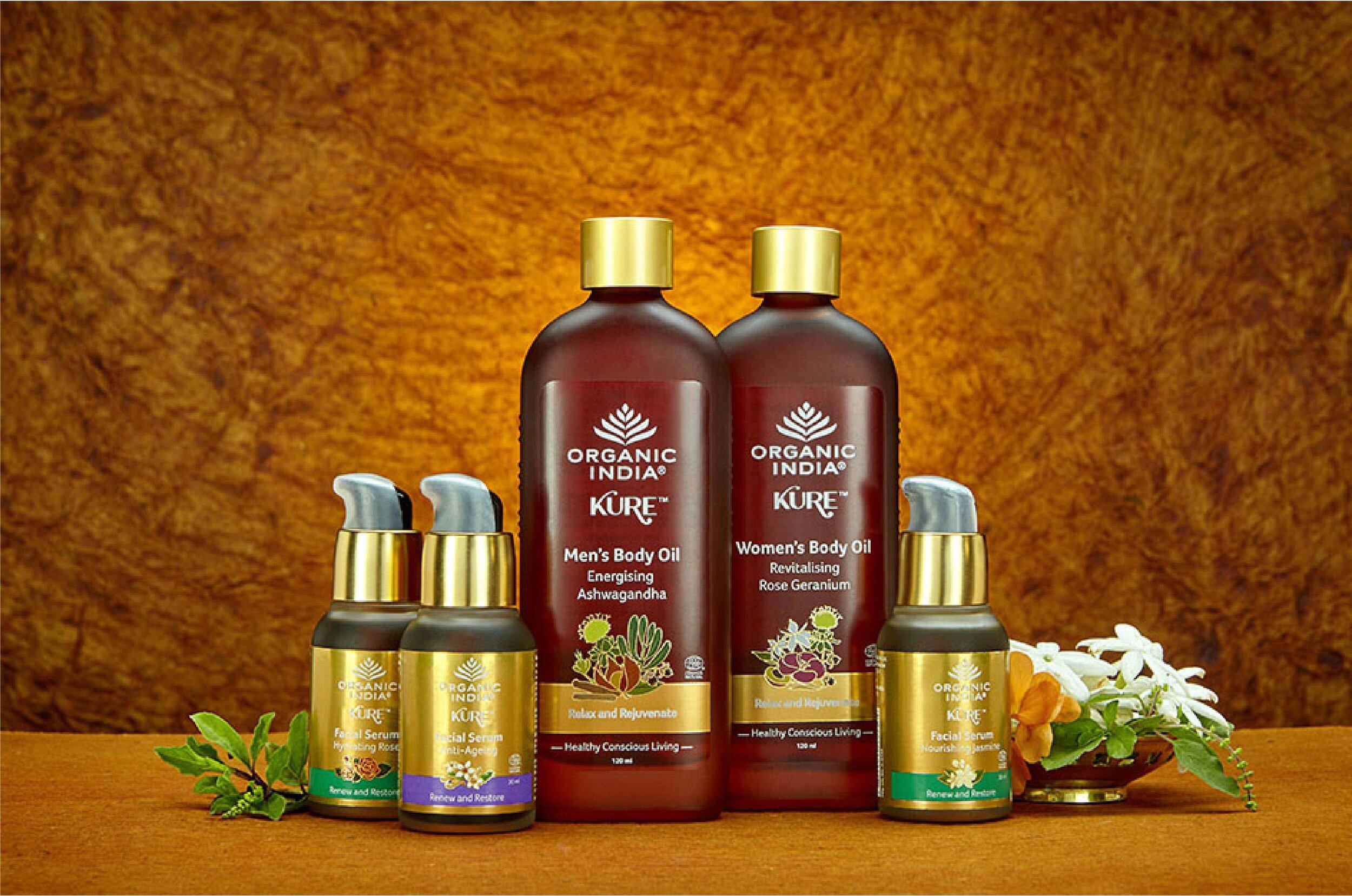
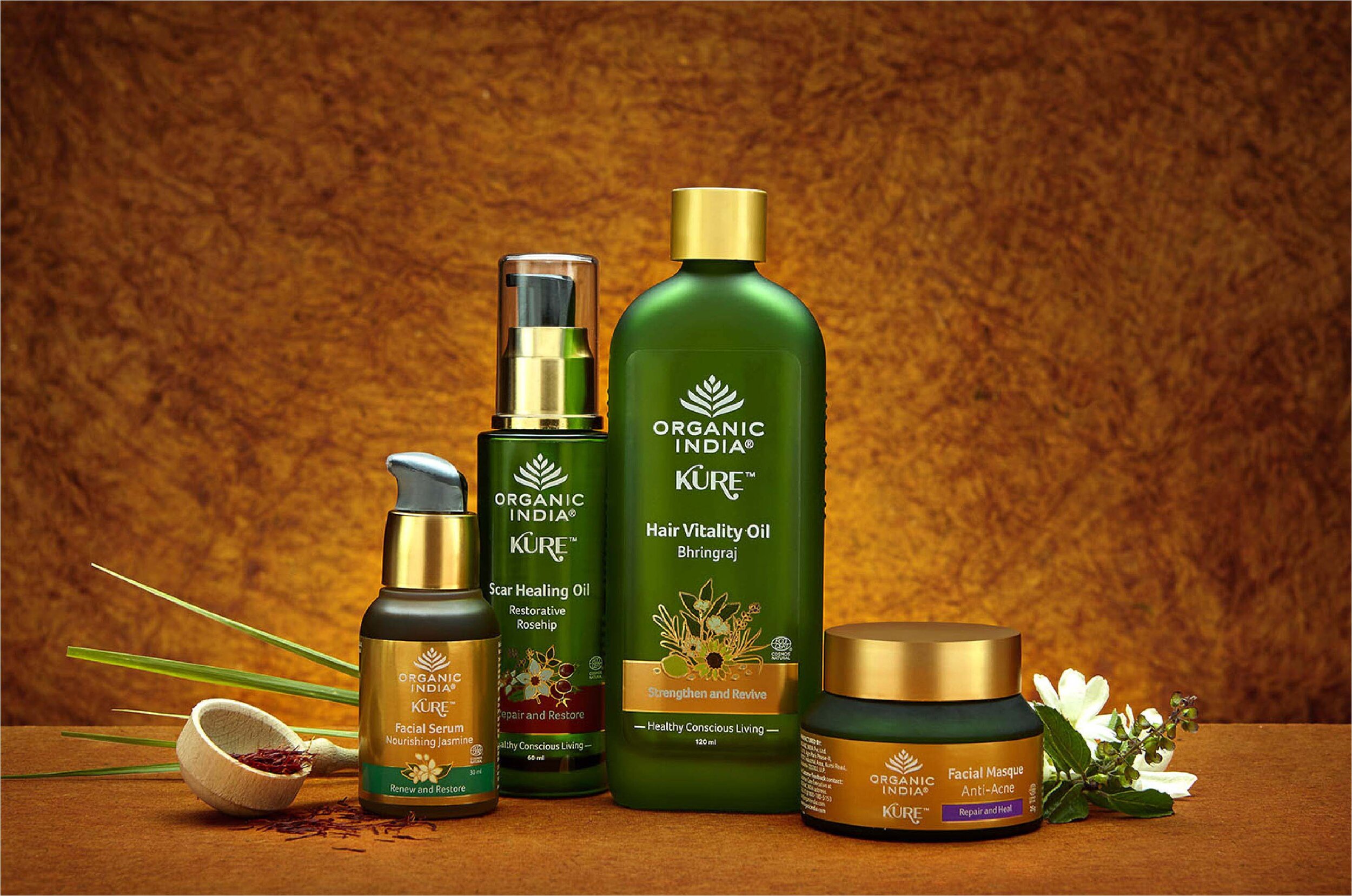
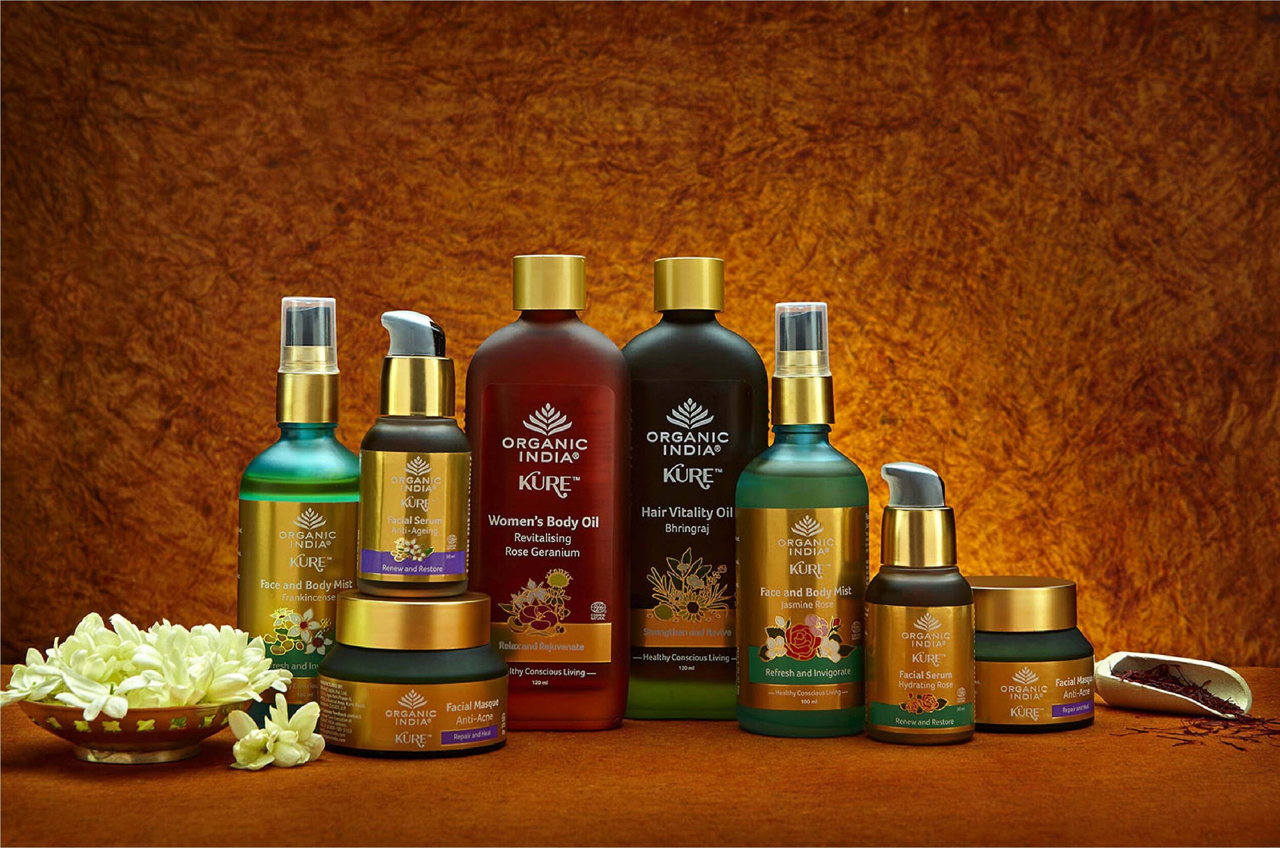
Organic India presented Elephant with exquisitely crafted glass bottles, which were ideal for their contents. They also formed a solid bedrock for the packaging design system that followed.
We liberally used a burnished gold on the packaging to hint at the purity of the contents within, while also giving it a premium feel.
Subdued, soft touches were given which encouraged the consumer to explore the story behind the bottle, and revel in its look and feel. The fact that it was handmade, and crafted to perfection naturally came through with this treatment.

“We liberally used a burnished gold on the packaging to hint at the purity of the contents within, while also giving it a premium feel. Subdued, soft touches were given which encouraged the consumer to explore the story behind the bottle, and revel in its look and feel.”

Quintessentially Natural
The design language focused on the ingredients within, which led to core ones in each product (like Bhringaraj, for example) being the center of attention. Other elements revolved around it.
The farm to face concept has long since been in vogue with the slew of new brands in this category. Despite promises of naturalness, many companies still use synthetic components in their mixtures.
This is where Organic India has the edge – and which is what we wished to show with a mixture of innovation and subtlety in the design language.