Petals Sanitary Pads

Packaging Graphics for Affordable Sanitary Pads

Petals Sanitary Pads_Packaging_Elephant Design 1.jpg

The Focus

Creating appropriate packaging graphics for Petals Sanitary pads, aimed at women looking for affordable sanitary napkins with good, trustworthy quality. 

Packaging needed to help product stand out on shelves and have a proper entry point where women could overcome barriers regarding them

The Design

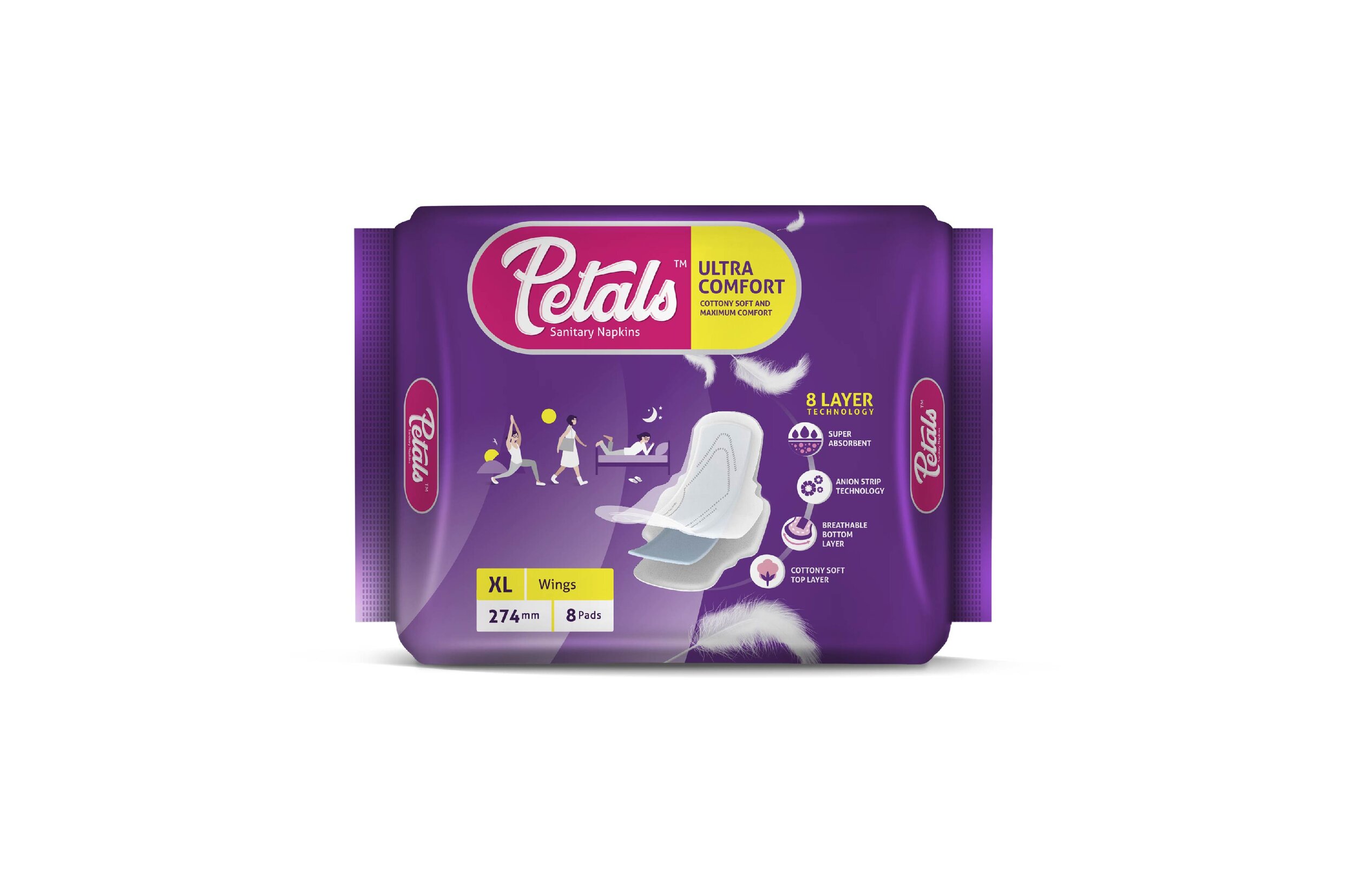
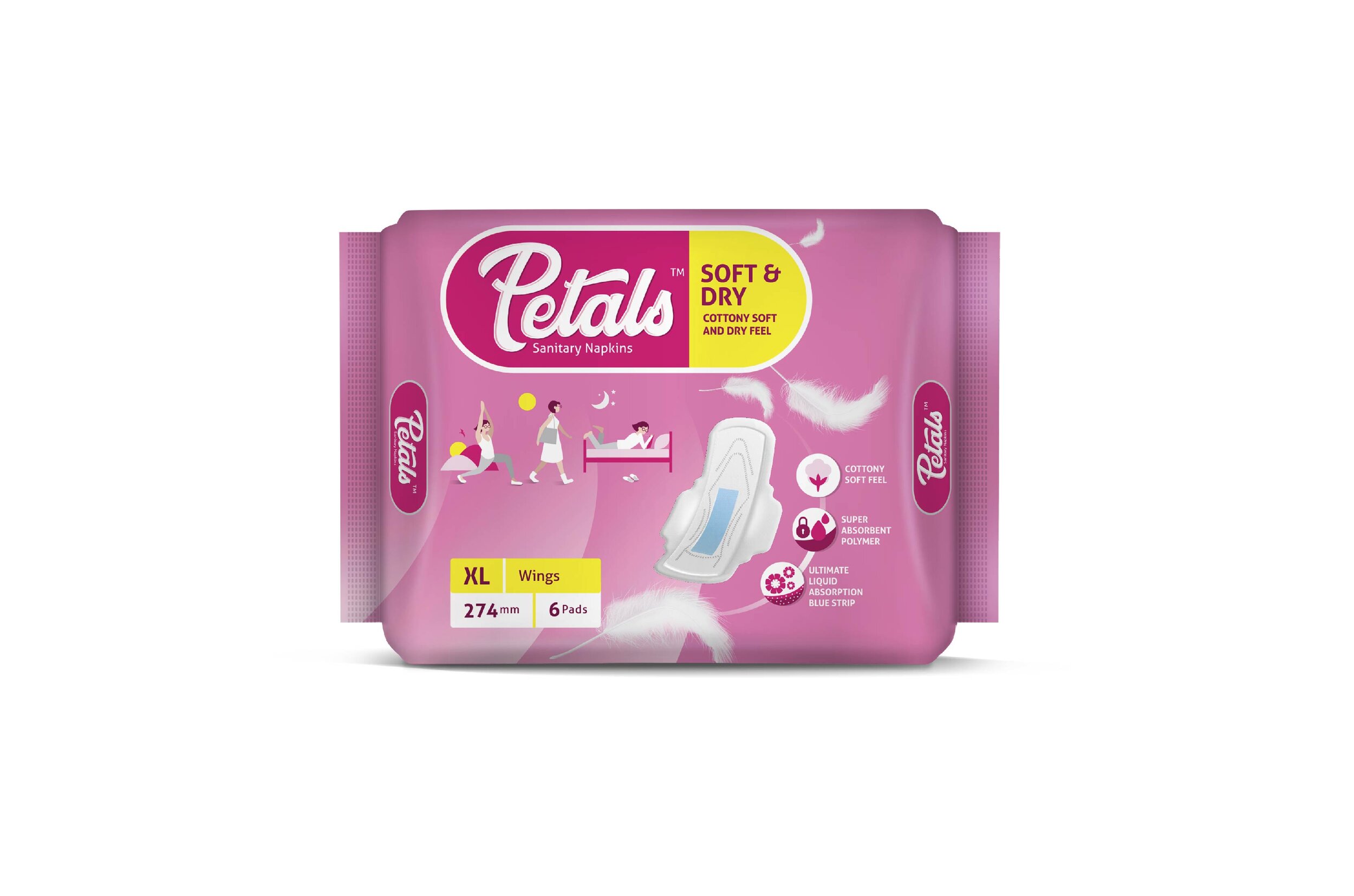
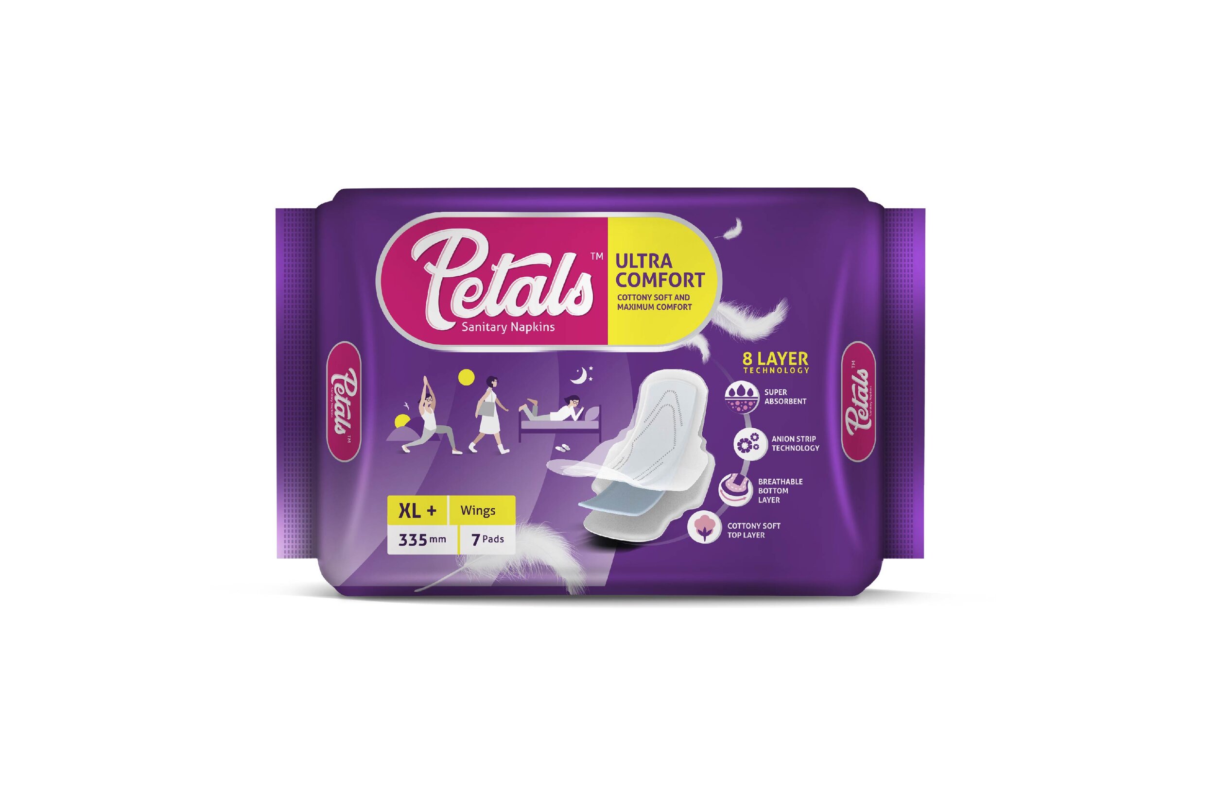
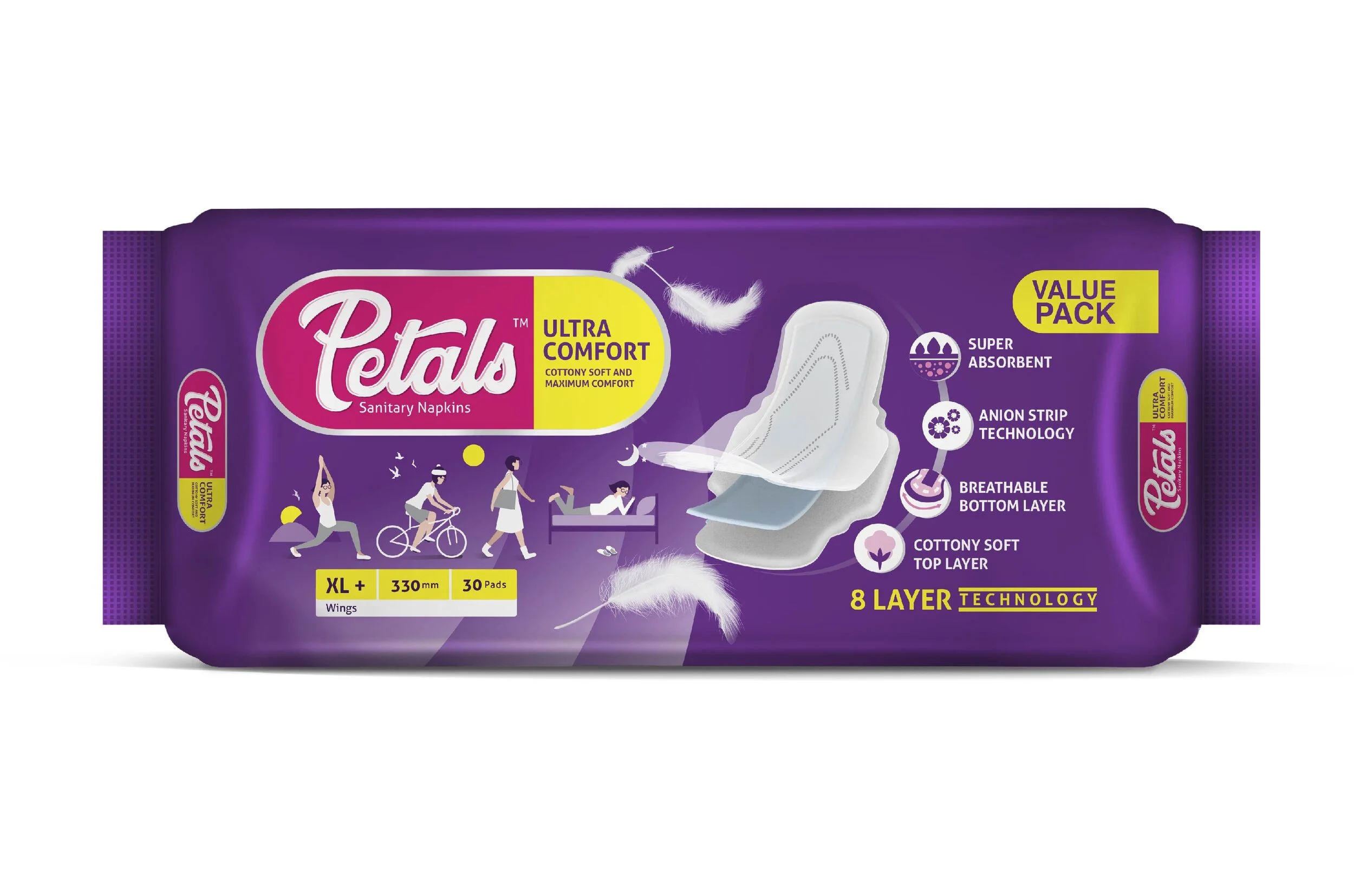
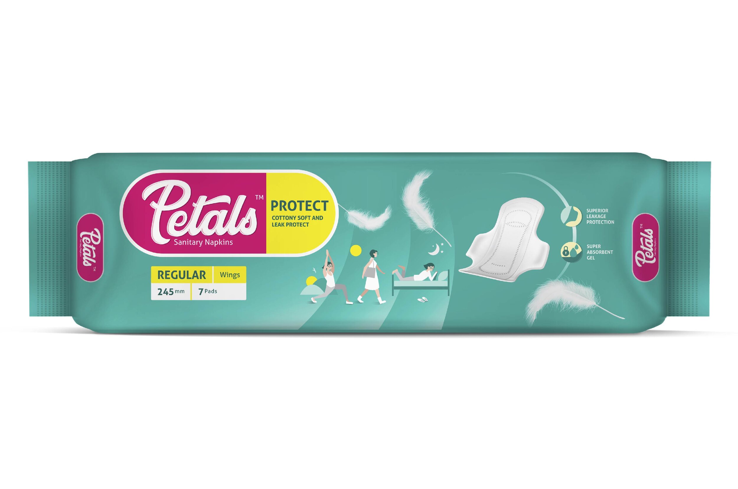
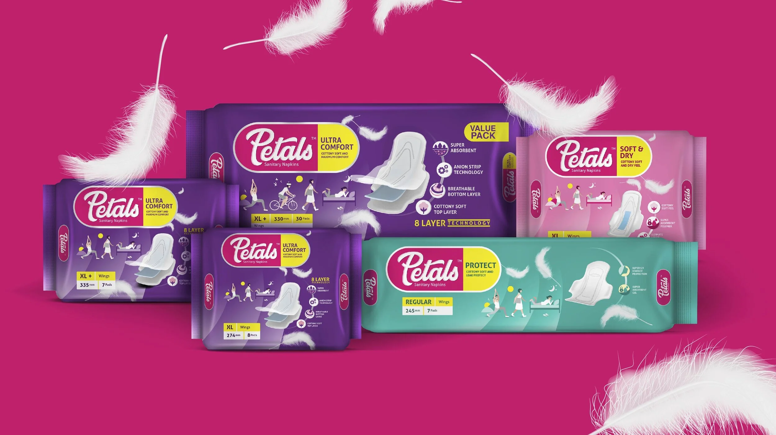
Elephant created packaging graphics that aimed to break the barriers surrounding the usage of sanitary pads by inscribing the various scenarios where sanitary pads are used as part of a woman’s essential daily routine

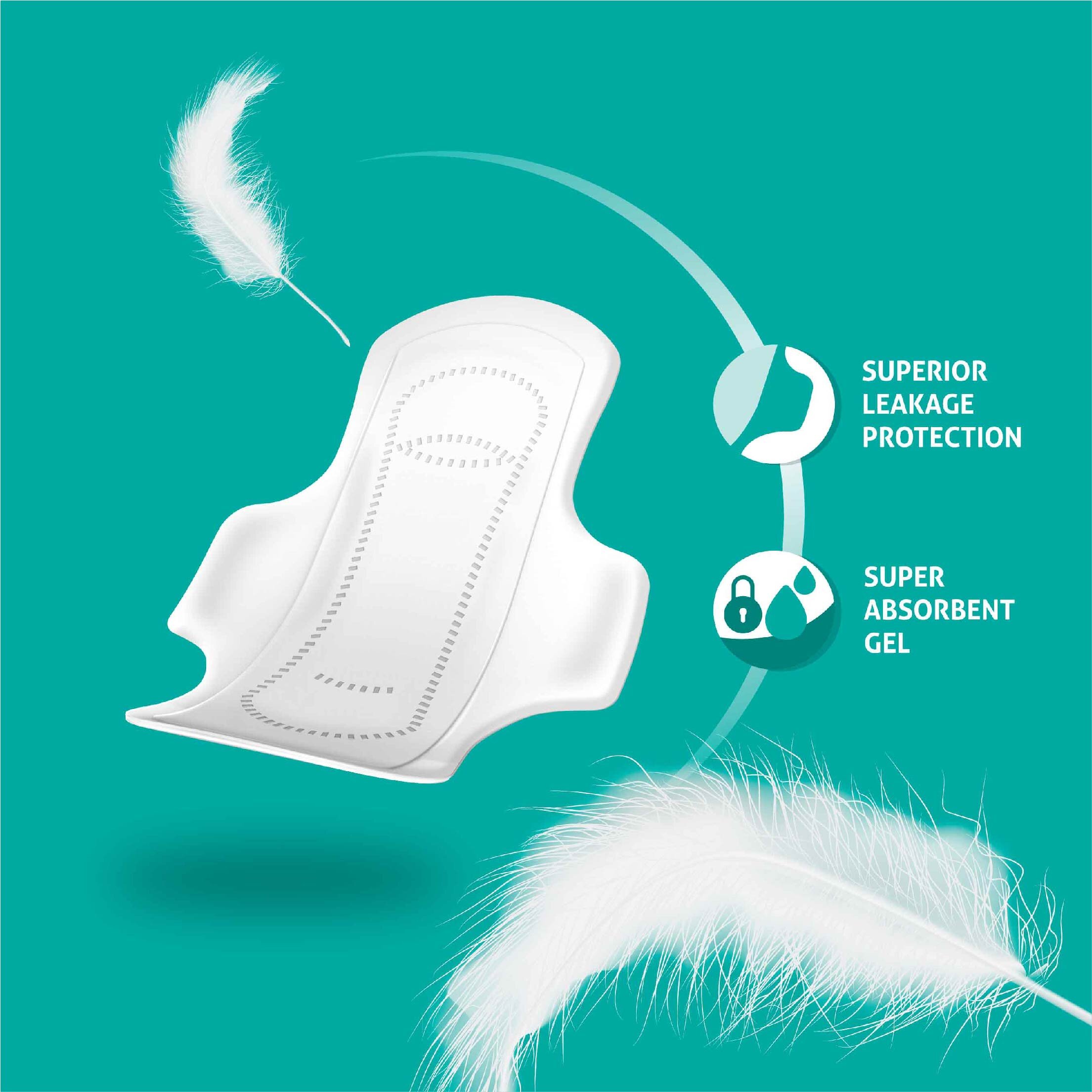
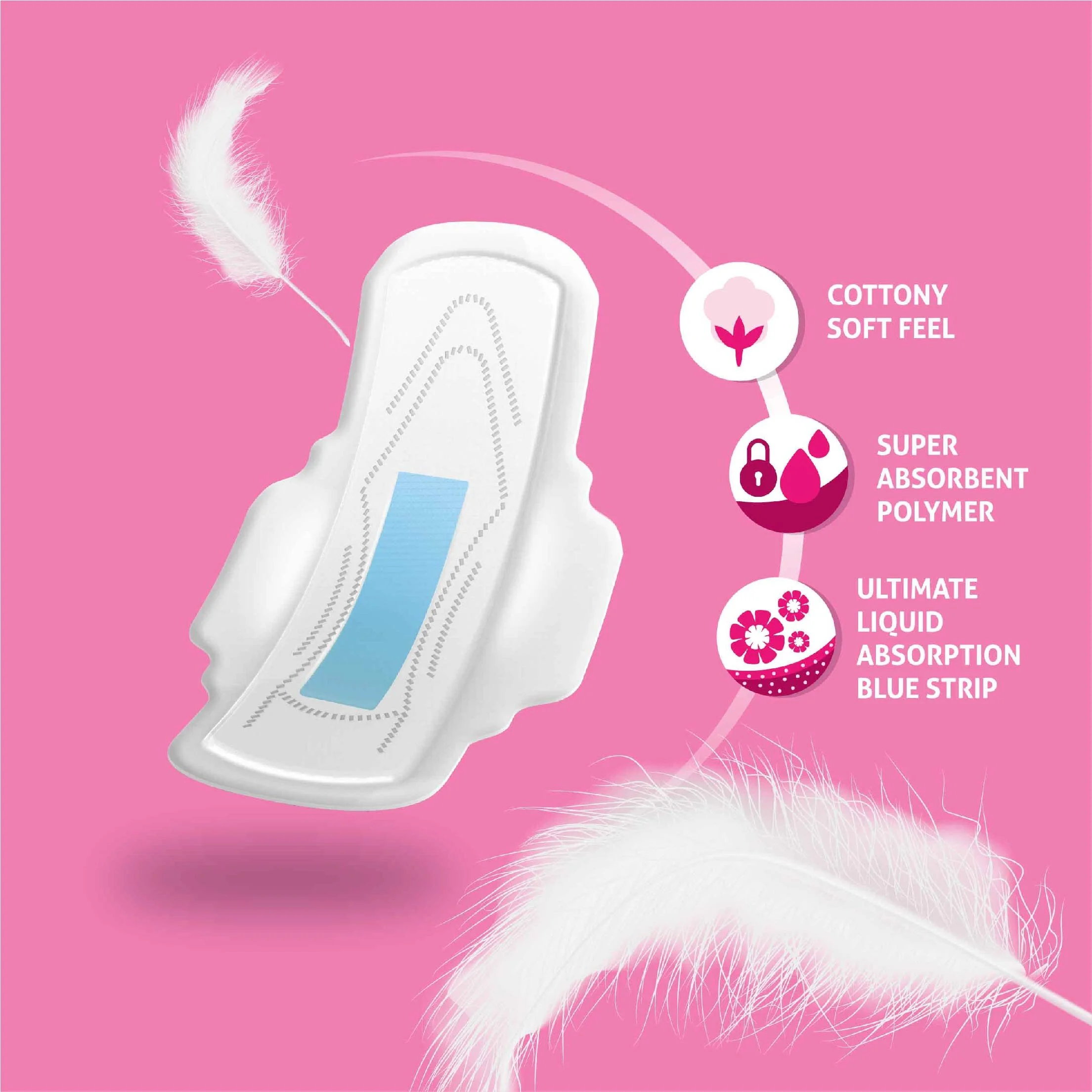
Played on the features of softness and comfort as opposed to pointing out obvious clinical benefits 

Developed a visual packaging system that encapsulated all the variants of the product, with benefit mnemonics clearly depicted 


The Story

Petals Sanitary Pads_Packaging_Elephant Design 11.jpg

In India, public sanitation and hygiene remain one of the most pressing pain points in the grand scheme of development. The fact that entire election campaigns revolve around the promises of better sanitation, cleanliness and hygiene indicates their pressing need. Within this ecosystem, the sanitary pad has a special significance. The market itself reached a value of 511.5 million USD in 2018 and the government has taken definitive steps to popularise their use. Films, ad campaigns, awareness drives – the works – have been put into heightening awareness.

That being said, there is further potential. The latest National Family Health Survey (NFHS) 2015-16 report shows that the use of Sanitary Napkins among Indian women is 48.5% in rural, 77.5% in urban and 57.6% total. In India, most of the urban market is already saturated with big players like Stayfree and Whispers. But as we can observe, there are women who are still utilising alternatives like cloth for the same purposes. There are several reasons for this: A lack of awareness, the perception that pads are expensive commodities and that pads are decidedly ‘refined’ in their product category. 

This is where Reliance’s Petals decided to step in. They wanted to target these women who were using unbranded, or cheaper products and were looking for more comfortable yet affordable solutions for intimate feminine hygiene. Petals also approached Elephant with the same concerns. They wanted our team to design packaging graphics for their sanitary pads, i.e. Petals, so that their product would be accessible to these women.

Petals also approached Elephant because they wanted our team to design packaging graphics for their sanitary pads, i.e. Petals, so that their product would be accessible to women looking for affordable yet trustworthy solutions.

A Way of Life

Predominantly, awareness campaigns utilise clinical terminology, which is, pointing out certain healthcare benefits of Sanitary Napkins in the hope that this will nudge women to start utilising them. This isn’t always effective.       

For Petals, Elephant decided to go with an approach that was more subtle. We showcased certain scenarios on the packaging itself: A woman, going about her daily routine, while also utilising pads naturally, as if it fit right in her everyday affairs. Scenarios for work, home and other public environments were added. 

We also added experiential cues by emphasising on their softness and comfort. This is showcased by the presence of feathers on the packaging.

This created a sense of familiarity while also saying that pads indeed were a way of life, there was no hesitation needed in order to go ahead and use them. More importantly, Petals was the right partner when it came to making a choice.

Elephant decided to go with an approach that was more subtle. We showcased certain scenarios on the packaging itself: A woman, going about her daily routine, while also utilising pads naturally, as if it fit right in her everyday affairs. Scenarios for work, home and other public environments were added.

3-Tier System

Petals Sanitary Pads_Packaging_Elephant Design 2.jpg
Petals Sanitary Pads_Packaging_Elephant Design 3.jpg
Petals Sanitary Pads_Packaging_Elephant Design 4.jpg

Within the main sanitary pad offering, there were also other types, which we distinguished via colour codes. Teal was chosen for the most affordable variety, pink for the mid-premium range and purple, giving an aspirational look, for the premium range.

Depending on the tier, the pack’s respective features were clearly stated on the packaging graphics.  

The benefit mnemonics were neatly arranged around the product depiction, where the depiction changed to reflect the variant. Additional product information can also be easily found on the bottom right, which was a part of the system design. 

The brand enclosure reinforces the packaging system by highlighting the brand name and the subsequent variant in a capsule format, allowing the consumer to navigate all the products in a seamless manner. 

Moreover, the brand colour and cursive script treatment for the font: all serves to echo the gentleness that is inherent within the brand name, Petals. 

All in all, packaging design systems like these illustrate the sheer diversity of perspectives that can be incorporated for the same product. 

The issue of intimate feminine hygiene is often the subject of needless stigma and orthodoxy in India. Thus, making products like these more accessible to women who might be utilising unhealthy (if not downright dangerous) alternatives through design was something the team at Elephant really enjoyed doing.