

The Focus
Creating a distinct container for Prabhat Ghee while keeping practical and ideal aspects intact
Highlighting key uses of Ghee: Purity, Daily Habits and Medicinal Uses through the container itself
Design that echoes wholesomeness; while differentiating it from other giant competitors
The Design
Elephant designed a highly practical, yet attractive container for Prabhat Ghee’s mass premium range.
Balanced modernity, traditionalism and bold distinction while communicating one emotion: Wholesomeness.
Managed to convey the texture, aroma, colour and taste through suggestive design architecture.
The Story

The Prabhat story has been that of slow, steady growth since 1998. Their offerings have only increased in the last decade – from selling only milk, they diversified to ghee, ice-cream, cheese, paneer, shrikhand and so on.
Prabhat Dairy came to us with a product design conundrum: Could we help them design a container for their ghee? In addition, could that product also echo the company tenets of wholesomeness and quality when it came to their ghee, which has its own implications?
We wanted to understand what the significance of ghee itself is to the consumer. Ghee represents wholesomeness and goodness in terms of nutrition in India. Here, nothing but the purest ghee will do!
The addition of ghee to food is the dollop of love that a mother provides. Ghee is also used in pujas (religious rituals), and has many medicinal properties. Thus, if ghee is wholesome, then the container needed to echo that multifaceted wholesomeness.
Wholesome Packaging
The smooth, rounded edges of the container become more apparent. We also did not utilize glass for the sake of practicality, since slippery, heavier surfaces can be very dicey – opting for a PET bottle instead.
The container semi-transparent nature allows for a glimpse of the true product. The golden-yellow cap characteristically evokes images of pure and sacred ghee and adds to its legitimacy.


“Could we help them design a container for their ghee that managed to echo the company tenets of wholesomeness and quality?”
Fine Balance

Packaging for ghee has varied from traditional to modern – with the modern featuring unconventional shapes, sharper edges and other ergonomic considerations.
We understood that designing the ghee container and making it more contemporary in shape would definitely help in differentiating it. However, since ghee has traditionalist overtones, we needed to walk the tightrope and balance out the elements.
As a result, you see the traditional jar shape with modern, practical elements in our design.
Prabhat’s signature ‘sunrise’ has been incorporated on the neck while providing a groove for the label and added grip. A proper grip is essential since ghee is a messy substance. This way, we also retain its ‘wholesome’ imagery since curvilinear shapes are more likely to evoke that sentiment.
“A fine balance of modernity, traditionalism and distinctiveness was what ultimately played a key role in highlighting the practical and ideal aspects of this product.”

Colors Galore
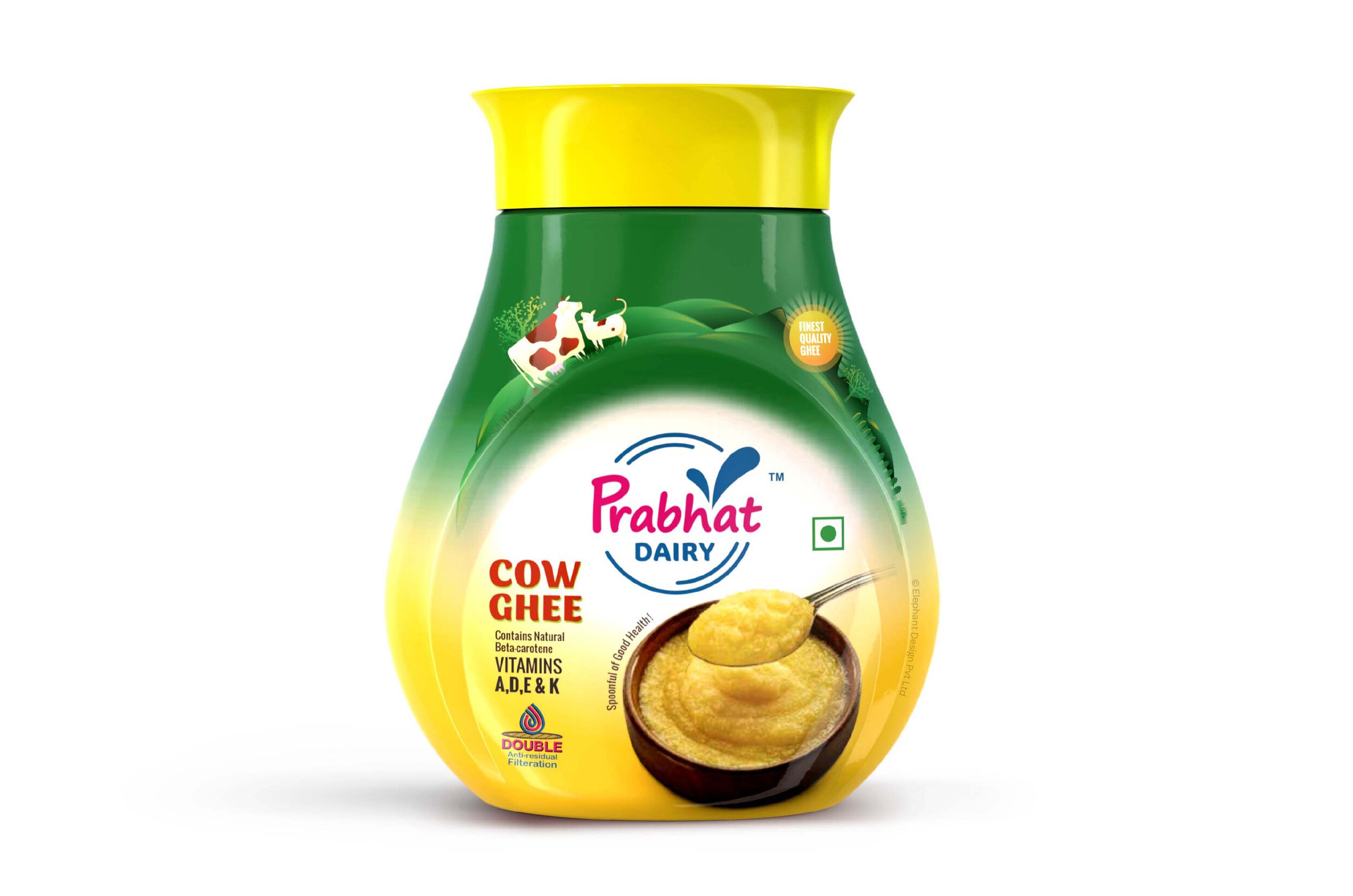
The Prabhat Ghee container also needed some distinction when it came to the colour palette in order to round off the structure. The sunrise, symbolising both brand identity and the golden, pure promise of ghee was the central focus of this jar.
The cow, signaling the pure origins of the ghee was a natural addition; while nutritional elements dotted the fringes of this label. Making a caricature-type format added to the contemporaneity of the labeling, while also making it more approachable on the shelves.
Green and gold have always harmonized well when it comes to giving an impression of plenitude and purity; both of these emotions are essential for a product like ghee, and have been incorporated.
The new container for Prabhat, hence, is not only aesthetically appealing – but also serves as the frontrunner for everything that the brand represents. Our understanding of how structures can effectively reflect emotions and decision-making worked in our favor and helped us tackle the challenge without any hitches!
“Design is a plan for arranging elements in such a way as best to accomplish a particular purpose.”