
Relaxo
Rebranding a legacy
The pioneer of flip flops in India, Relaxo has led the way for footwear in India over the last four decades! However with changing Indian aspirations, higher exposure to style & fashion and growing disposable incomes, it was time for the brand to align itself to the new age consumers.
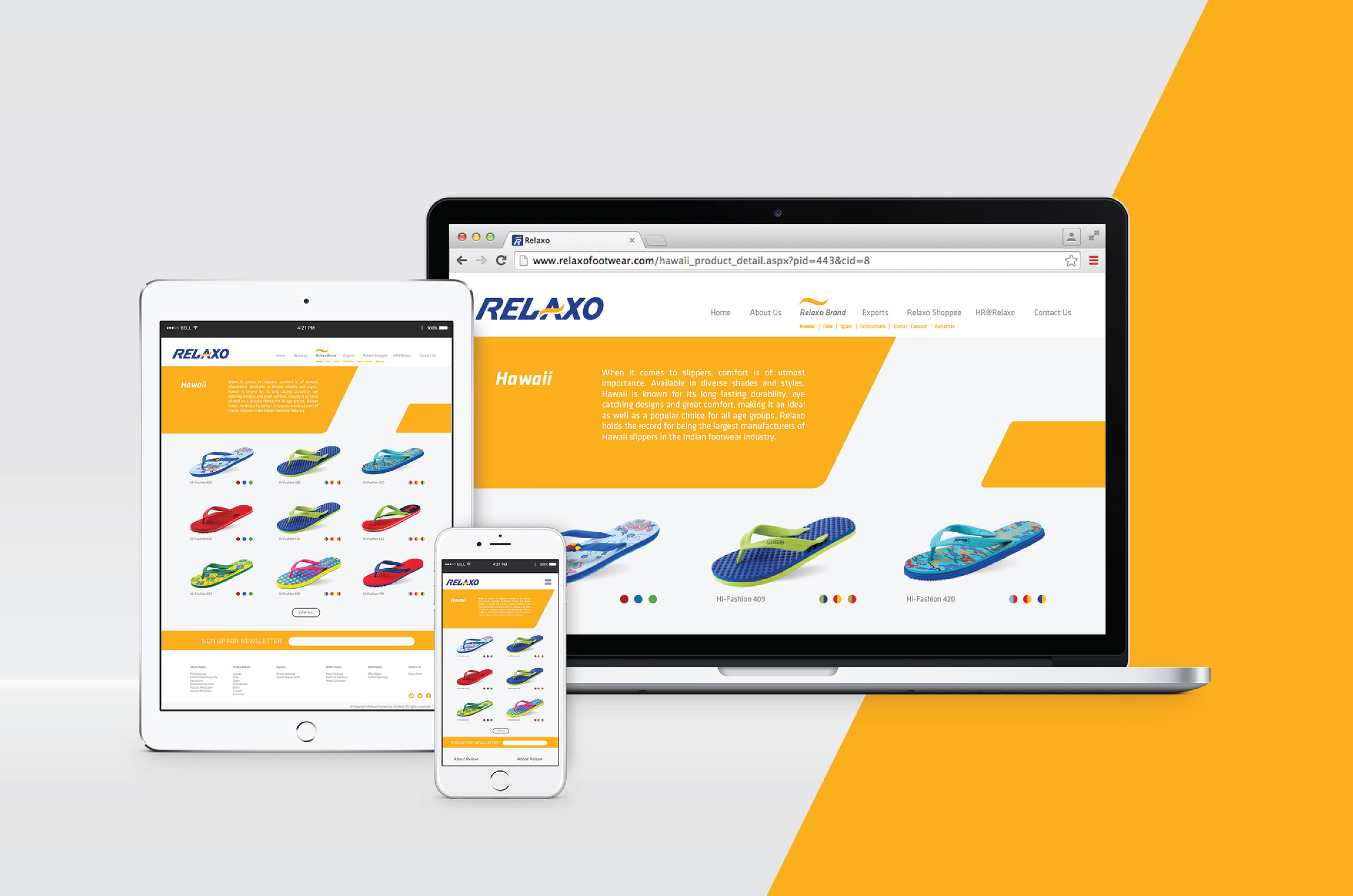
We were invited to make the brand future-ready, in keeping with brand values of bring reliable and approachable. After scanning the footwear markets and several consumer conversations across strong Relaxo markets we got insights into the degree of evolution necessary for the brand. We decided to add the positive and an optimistic tone of India to create a contemporary visual language, making it relatable to younger consumers who may have once considered it dated.
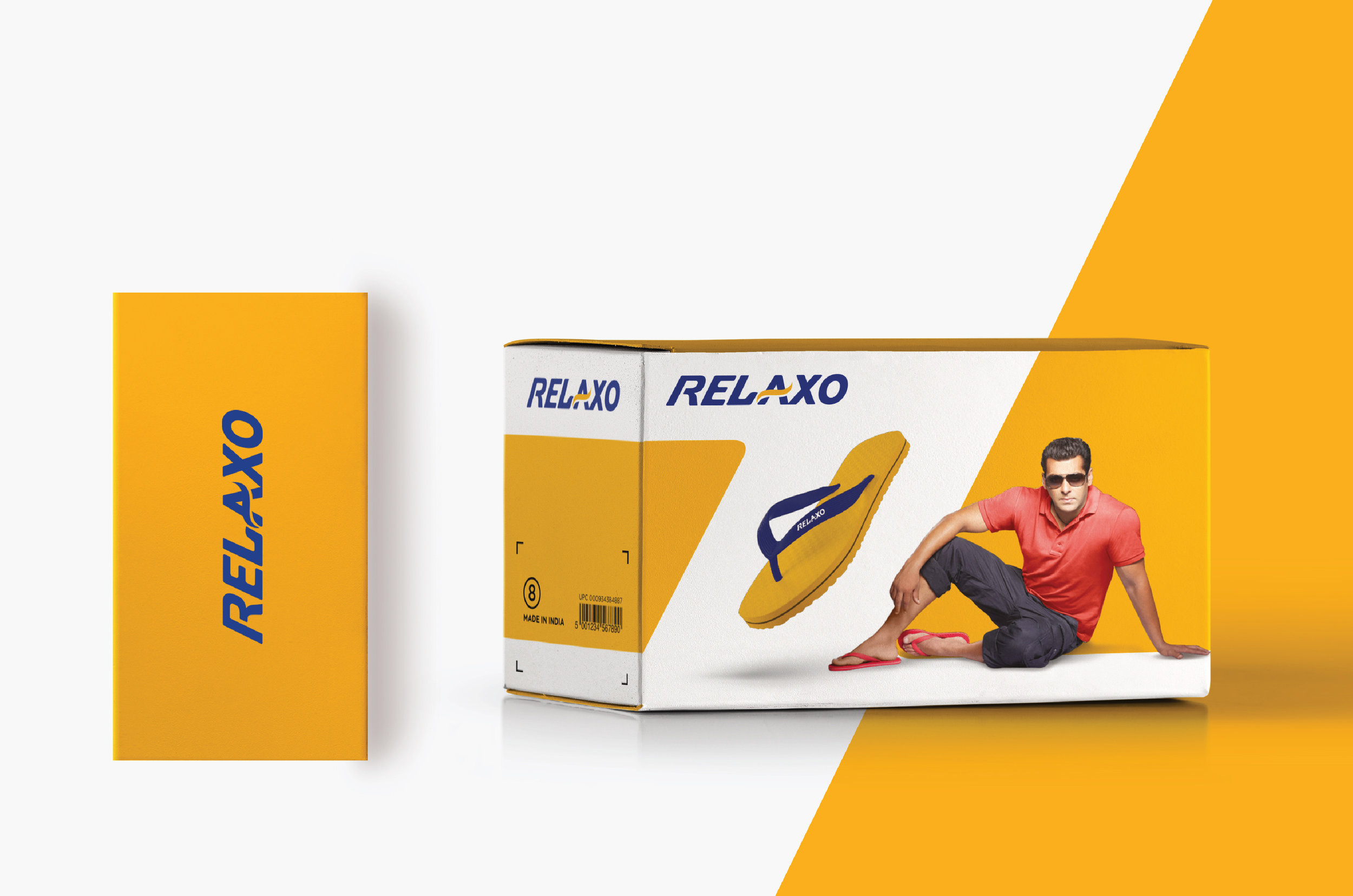
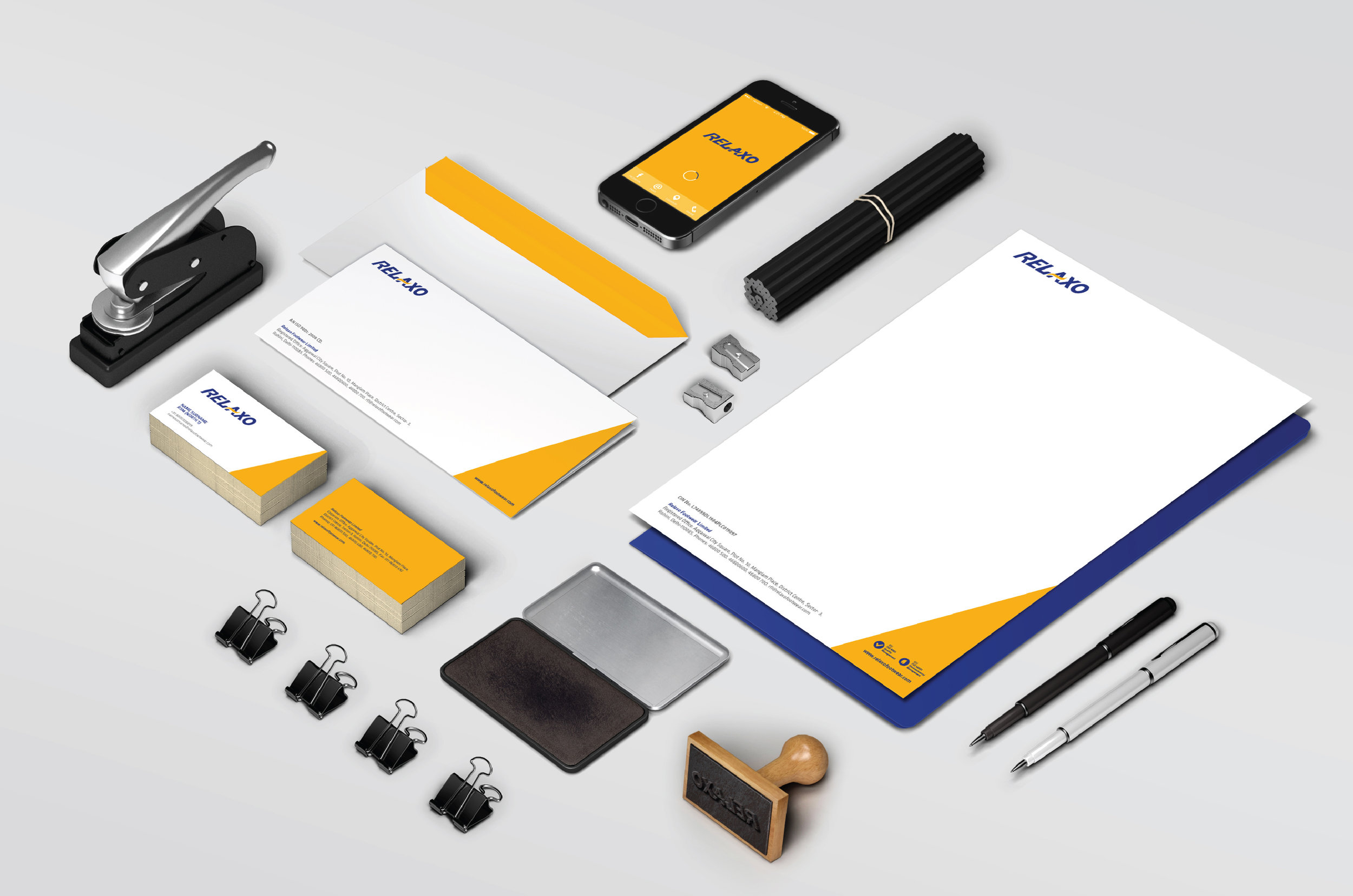
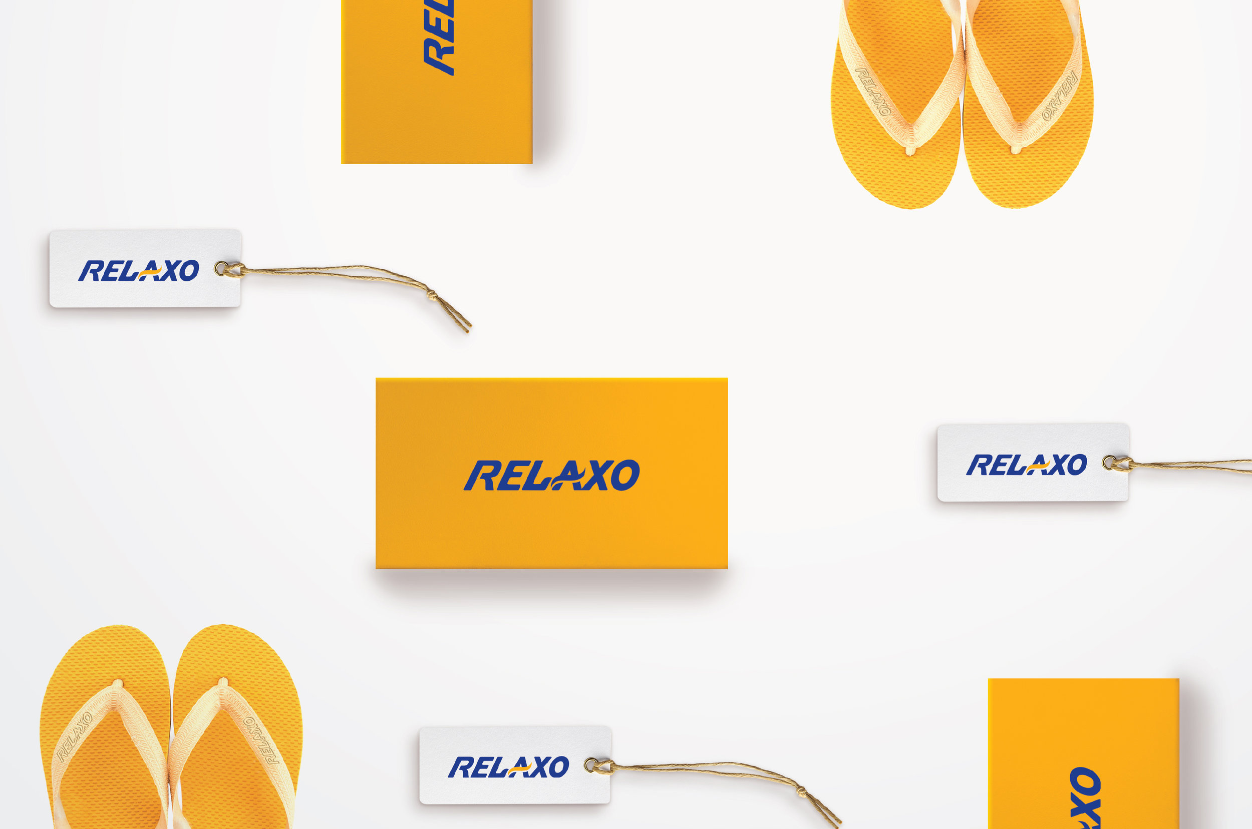
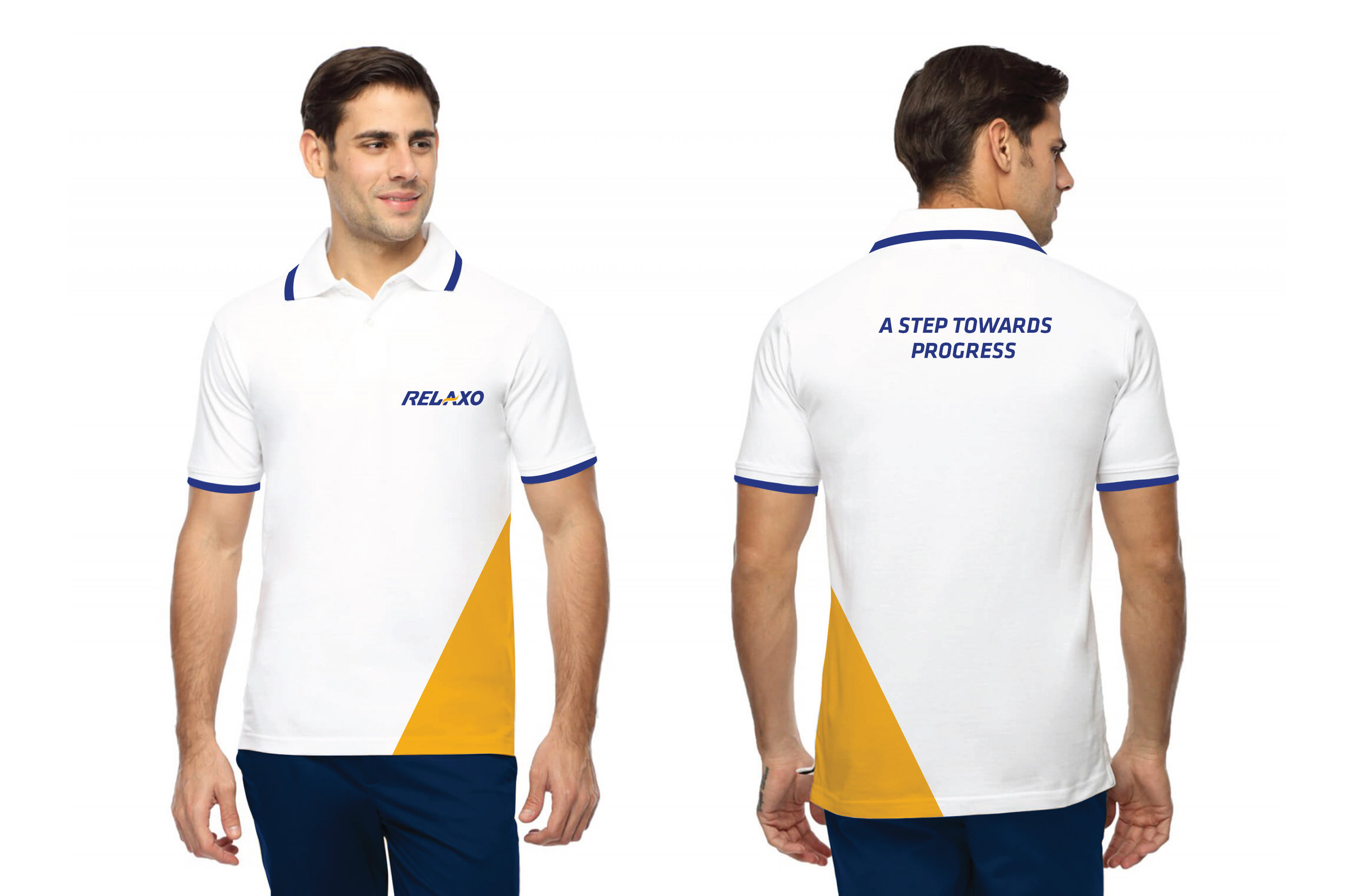
Seeking newer dimensions to reiterate the brand’s leadership, we worked on building the new Relaxo visual identity with a wave of positive transformation. The dynamism of Relaxo was embodied by forward slanting letters in a Berry Blue. The yellow wave flowing across stands for transformation, optimism and positive growth, projecting the brand’s new values.
The refreshed visual identity was launch on 1st January 2017 across India and has received a phenomenal positive acceptance.