
The Focus
Position Sirona as a complete ecosystem of solutions for every type of feminine hygiene need
Rebrand Sirona through a vibrant visual language and packaging design system, tailored for the modern woman who balances her feminism with freedom & responsibility in equal measures.
Make the brand more approachable and relevant in addition to making a homogenous, streamlined system to facilitate entry into multiple categories & touch-points
The Discovery
With a perfect gender ratio within our teams, it was not difficult to have conversations around evolving needs of new age femininity.
There were three highlights that marked large mindset shifts between millennials & earlier generations.
Open acceptance to biological challenges
Ability to seek solutions
The will to explore new age possibilities due to changing mindset towards intimate hygiene & menstruation landscape in India.
This helped the team to carve a positive, vibrant & unapologetic identity for the brand.
The Design
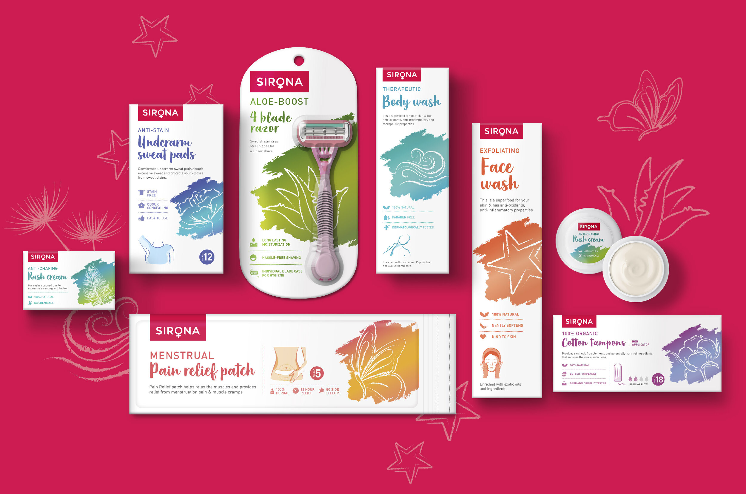
Though “Sirona” was the goddess of healing as per Celtic mythology, it wasn’t necessarily a well-known fact. So the first step was to add meaning to the word by creating a visual identity that would bring category to the forefront. This was done by simply integrating the symbol of feminism within wordmark of Sirona.
Brand’s visual language was completely changed using fresher and spontaneous cues, signalling the new type of femininity – direct, bold and unabashed while also being responsible and nurturing.
Visual system involved distinctive colour coding, youthful imagery and lively vibrancy to the brand portfolio, with distinct call-outs for flagship products
Mnemonics were used to convey product information in a friendly manner and strong design system was followed to create a habit of easy and easy navigation.
“Sirona wished to establish a strong & relevant suite of solutions. They came to the team at Elephant, seeking to reposition themselves as ‘The Go-To’ choice for women, the alpha and the omega of the intimate feminine hygiene space in India.”
The Story

Sirona was founded in 2015 and hailed as one of the most disruptive startups on the Indian landscape. It offers women’s hygiene and intimate care products to enhance the quality of life for women across the country. Primarily an ‘online first’ company, Sirona makes its products available via its e-commerce website and leading online marketplaces.
It has met with repeated success with each product launch in the Indian market, indicating a dire need for products that can comfortably address the issues plaguing intimate feminine hygiene. PeeBuddy, Sirona’s flagship female urination device, has sold few million units in a short span and has won several industry recognitions for its avant-garde approach towards a wicked problem.
Sirona wished to establish a strong & relevant suite of solutions. They came to the team at Elephant, seeking to reposition themselves as ‘The Go-To’ choice for women, the alpha and the omega of the intimate feminine hygiene space in India.
“Elephant team began remedying the problem of inconsistent packaging design across multiple categories by creating an adaptive brand architecture & flexible yet distinct design system for the products …made the portfolio appear conversational, vibrant and colourful, helping customers distinguish between products and navigate the information based on specific needs.”
New Solutions for the New Woman
Since Sirona was a brand that catered to the new Indian woman, we took the time to deconstruct what her identity was, especially in a country like India where patriarchal norms still prevail. In that context, the modern woman is very much out and about and is increasingly visible in the public sphere. She brings her own share of talents to the table – be it at home, at work or otherwise. She has a lifestyle that transcends the conventional boundaries that a ‘house’ confers on her, and she’s at the forefront of things in every field.
Keeping these things in mind, Sirona’s brand communication was molded so that we struck a balance between the timeless tenets of femininity (care, nurturance, love) and the contextually new ones (freedom, rebellion, achievement, directness and an unapologetic attitude). This was implemented by complementing a prominent emotional visual with a functional visual that indicates what problem is going to be solved.
Another crucial issue is that feminine hygiene in India seems to begin and end with sanitary pads, with little-to-no acknowledgement of a host of other issues that also plague them.
All Things Feminine Hygiene

There are a host of independent, niche solutions that cater to individual problems, there’s definitely no umbrella brand that can address a host of them.
So, the team at Elephant began remedying the problem of non-homogenous design, creating an adaptive brand architecture for the company. The consumer could now navigate its range of products without confusion, with each solution being given unique colour codes.
Since their products would initially appear online, this made the portfolio appear very vibrant and colourful, helping customers distinguish between each of them and picking out exactly what was needed.

Cultivating Intimacy and Comfort
Sirona’s products are non-indulgent in nature. They do not aim at cosmetic/aesthetic enhancement, but rather, are practical solutions to common problems that plague the contemporary Indian woman.
However, their earlier visual architecture was making the products appear highly specialised and pharmaceutical in nature, giving off the aura of a sterile, medical service. This needed immediate remediation. In addition, there was also a lot of information presented in an inaccessible manner.

All of these were making the brand more distant to prospective consumers. The first step to address these concerns was to revamp the visual architecture. Sans-Serif was the optimal font to convey a sense of ‘expertise’ and in turn, trust for the products themselves.
We also used overt symbology in the logo, by utilising the femininity icon and integrating it with the brand name. Burgundy was used as an alternative to the typical pink that often defines these product categories to reflect the radical change in femininity that manifests itself in the current era.

We also decided to keep white as the base template, given its associations with care, nurturance, gentleness and purity of purpose. This was balanced with other bold colours and youthful, fresh images to help consumer interactions with the brand, putting them at ease.
For certain flagship products like the black sanitary pad we used black packaging to highlight its uniqueness which is rare to have as a colour of choice to begin with – but also helps it stand out from other products within the portfolio and across the product category.
This is especially visible in Sirona’s sub-brand, Pee Buddy. As a product, it caters to the modern woman who’s ‘on-the-go’ and also wishes to prevent hygienic issues that accompany public toilets, exacerbated by the act of ‘sitting’.
“Elephant used overt symbology in the logo, by utilising the femininity icon and integrating it with the brand name. Burgundy was used as an alternative to the typical pink that often defines these product categories to reflect the radical change in femininity that manifests itself in the current era.”

So, for Pee Buddy, the team at Elephant decided to opt for Bright Green as the color of choice because of its vibrancy. The emotional-functional combination of illustrations was also retained, with ‘Stand and pee’ being showcased as the main benefit. The entire range gets this green as the house colour where the colour patches change according to the product in question. Green also echoes the commitment made by Sirona to be 100% sustainable and eco-friendly.
Since Pee Buddy is also tailored for a younger audience, we use the “Pee Buddy” font to distinguish the brand with the upper and lower case interspersed, in order to subtly lighten the mood and make it a fun, engaging product of choice.
Thus, Elephant managed to reposition the brand by systematising its visual architecture, creating flexible templates that could enhance core brand recall, while showcasing a diverse, vibrant portfolio. With this vibrancy, we also managed to make the product more accessible and enhance its pickup potential on shelves – offline and online.

“Sirona’s brand communication was molded so that we struck a balance between the timeless tenets of femininity (care, nurturance, love) and the contextually new ones (freedom, rebellion, achievement, directness and an unapologetic attitude). This was implemented by complementing a prominent emotional visual with a functional visual that indicates what problem is going to be solved.”