

The Focus
Developing a packaging system for every snacking range under the umbrella of Tasty Treat – a snacking brand created for people who favour joy of eating & heightened taste experience over everything else.
Creating the snacking impulse through exciting & delightful design elements for quick shelf pickups.
The Design
After internalising the brand’s ambition, team started by creating brand identity guidelines for smooth & consistent execution across print, online, packaging & other media such as perimeter branding at Indian Premier League.
This was followed up by a design strategy that led to prioritisation of categories in order to achieve maximum & immediate impact for the transformation exercise.
The categories we have transformed include Biscuits, Snacks, Namkeens, Ketchups & Sauces, Candies, Instant Foods, Pasta & Noodles, Juices, Jams, Breakfast Cereals, Frozen Snacks etc.
The Story

Tasty Treat is a snacking brand created by the Future Group. Who isn’t aware of new-age perceptions regarding snacking? The health angle is often touted to be paramount and snacking is often perceived to be a guilty act.
Tasty Treat, however, is different. It is simply unapologetic when it comes to their creations, where they cater exclusively to ‘Maha-Rasiks’ – an indigenous term for those who place enjoyment above all else. Their products blend all the intense flavours of Indian ‘Chaat’ with modern, convenient snacking formats.
The idea, hence, is to not stigmatise snacking. Moreover, Tasty Treat highlights the fact that Indian snacks were never considered unhealthy in the first place, given that they were home-cooked and prepared with loving care.
Our strategy led us to design a packaging system that could highlight these aspects, engendering this impulse of intense snacking while on the shelf. Since they also have a wide portfolio of yet other snacks within their ambit, the packaging system also needed to be flexible and adaptive to suit multiple formats.
For The Ardent Hedonist
Hedonism is a luxury – and not just in a monetary sense either. Society is quick to judge those who seek pleasure, when ironically, we are all individually hedonistic in our own way.
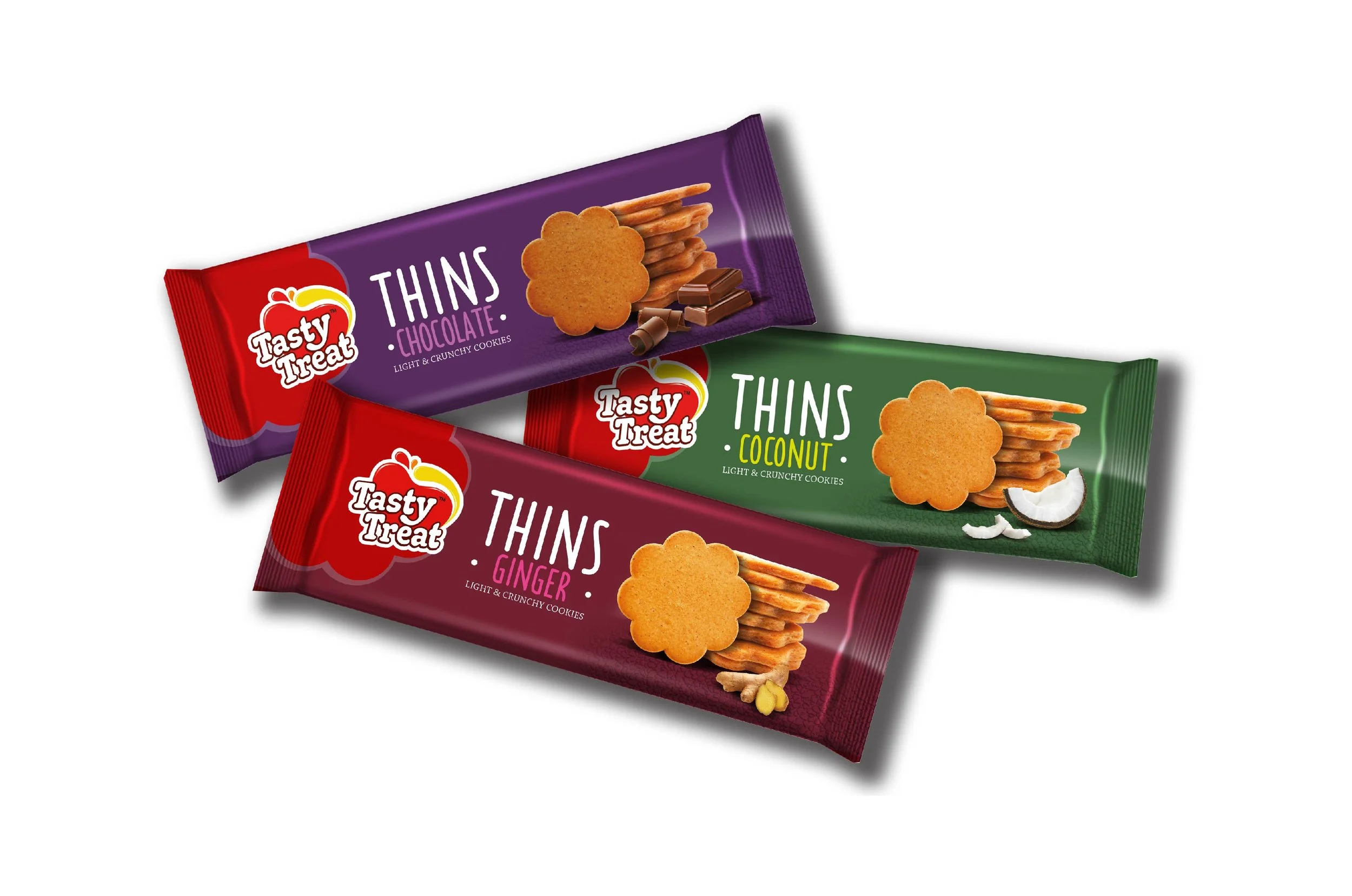
Tasty Treat’s bold packaging takes its inspiration from those cues – catering to those whose snacking impulses cannot be suppressed by societal concerns. The tongue always wins the battle with the brain when it comes to snacking, which is why it takes such a prominent place in the logo design.
Reds and yellows are obvious choices with this bold profile due to their eye-catching nature. Packaging across the range is also liberally peppered with other bold colours that align with flavours & ingredients.


“Tasty Treat, however, is different. It is simply unapologetic when it comes to their creations, where they cater exclusively to ‘Maha-Rasiks’ – an indigenous term for those who place enjoyment above all else.”
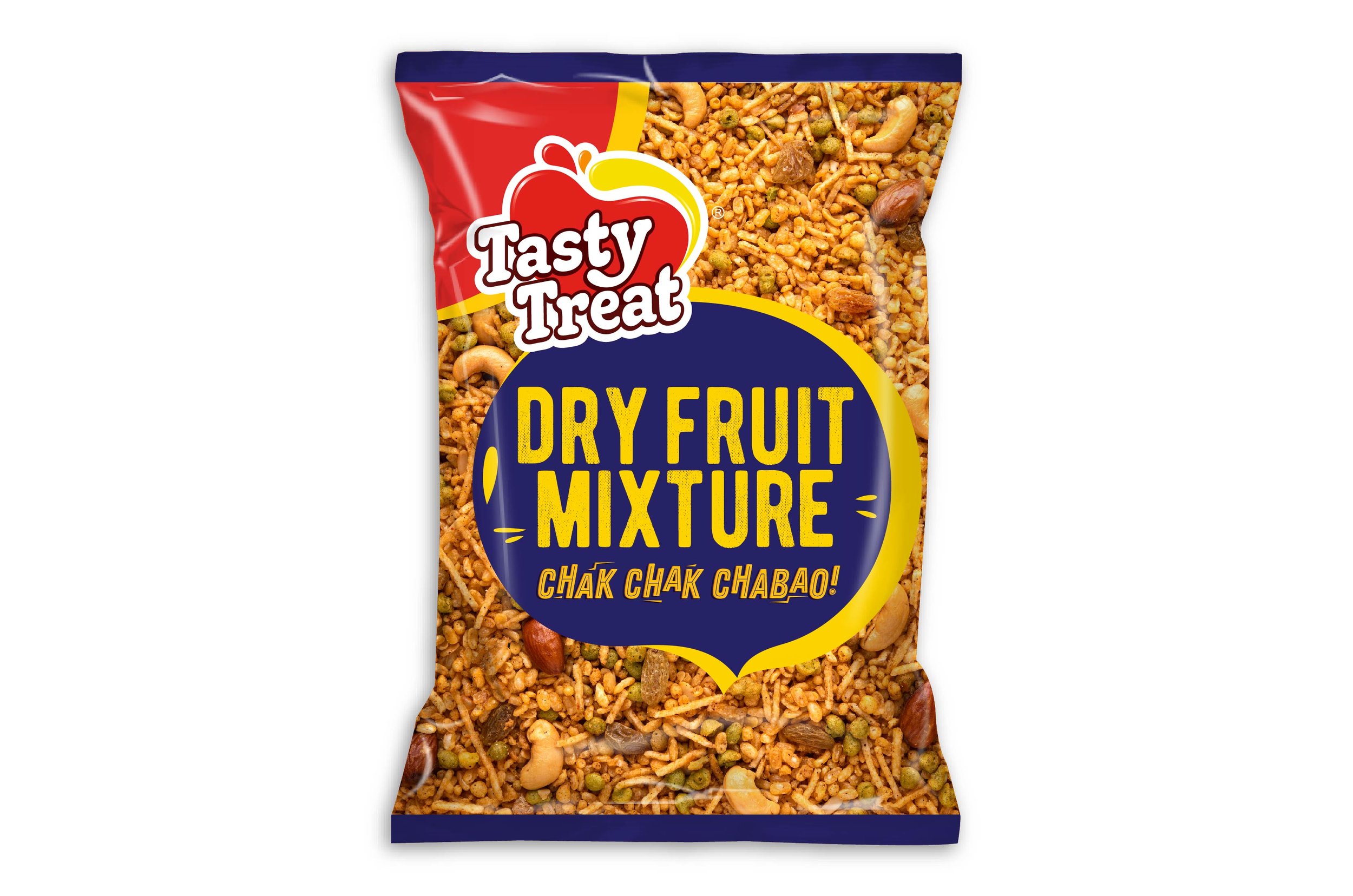
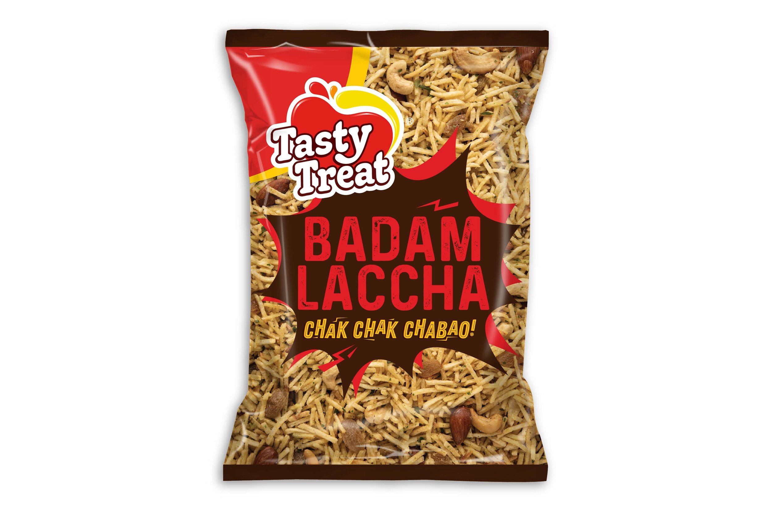
The Drool Factor
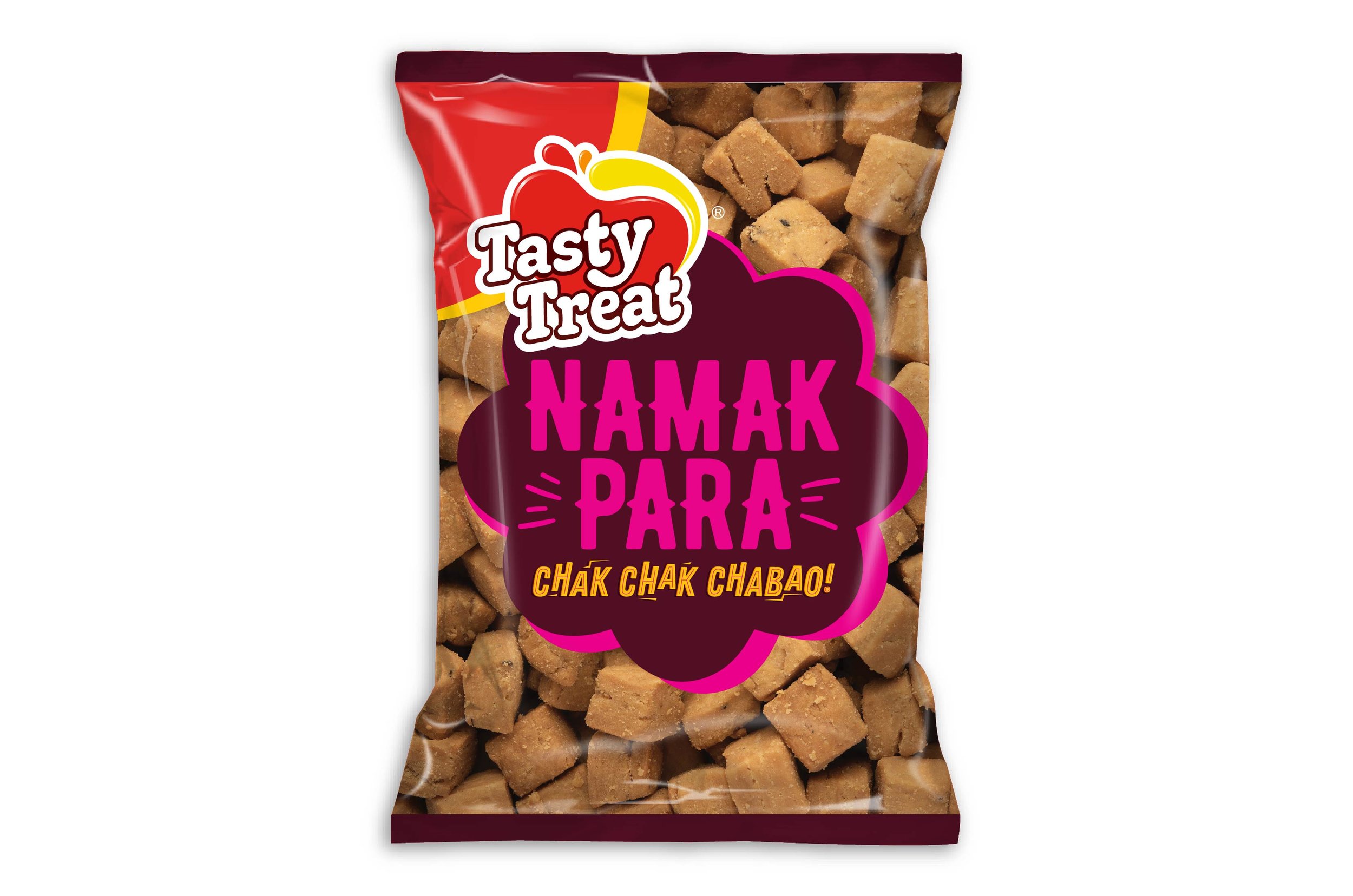
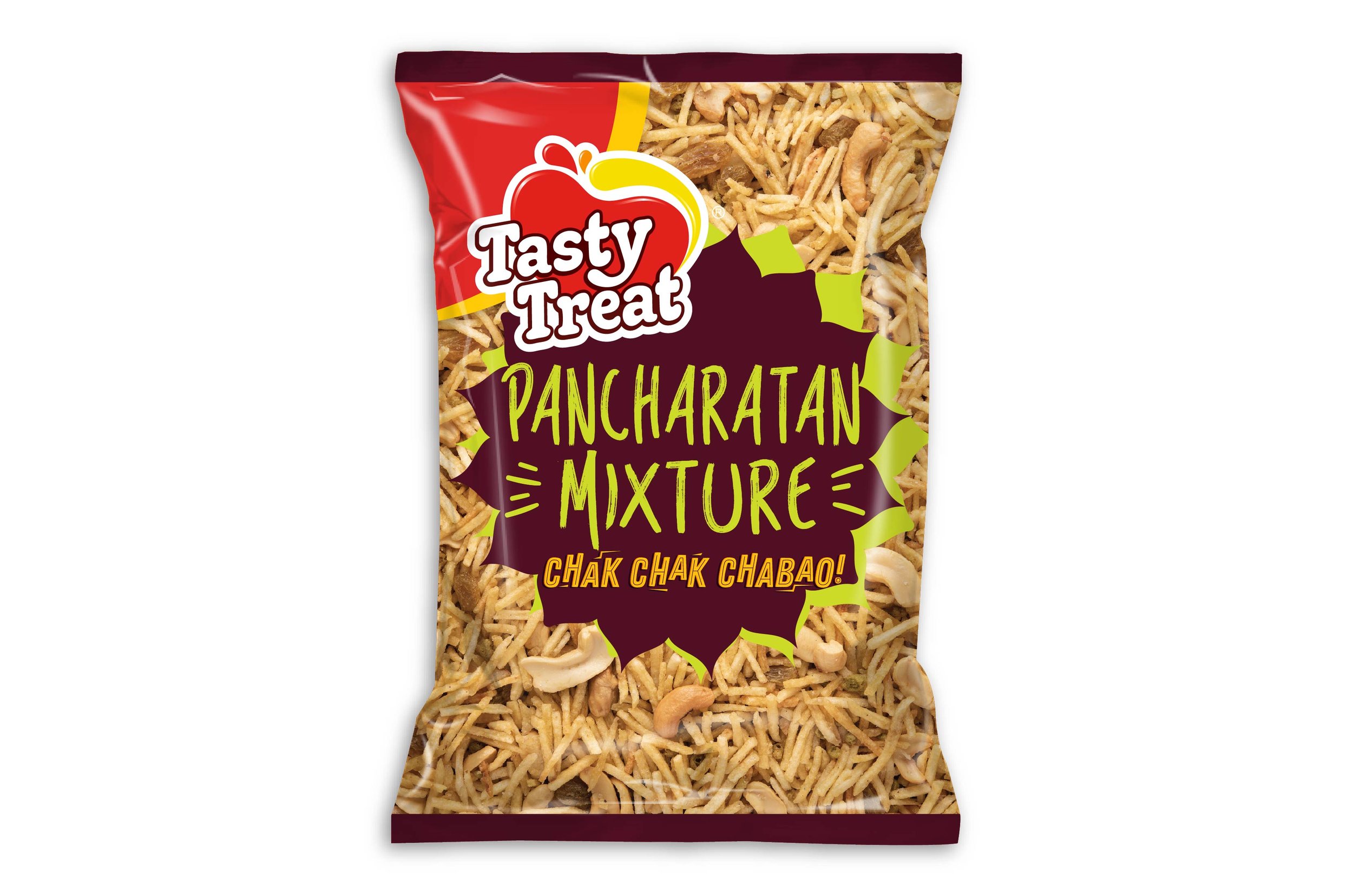
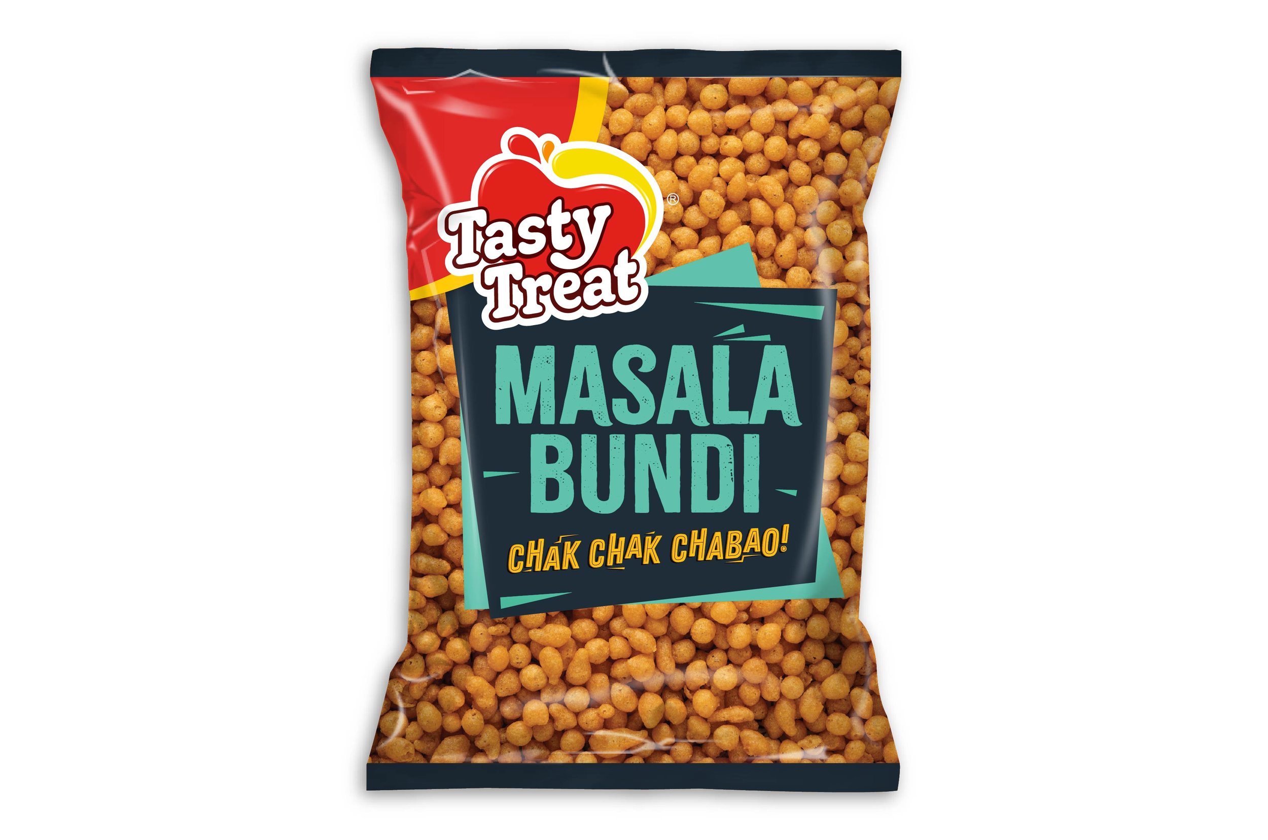
To create involuntary salivation, one can either use graphical representations – or showcase the real product itself. Elephant went with the more photorealistic approach, where the representation of each product was given centre stage.
Close-ups, dramatic angles and magnified shots of snacks were interspersed with ample graphical cues. Each texture and the promise of strong, intense flavour was given precedence. This created a potent differentiating factor for the product, given the highly competitive environment that is the Indian snacking shelf.
“The packaging system now gives the consumer ample visual and sensorial cues that makes it irresistible for those who heed their taste buds – while delighting their versatile sensibilities with a wide range of offerings.”
Innate Flexibility
Since the brand has over 20 categories under its umbrella, one of the requirements was that of an adaptive packaging system since it would apply to a vast array of products across the ready-to-eat segment.
Elephant hence created a malleable packaging system to suit multiple representations, keeping as many ‘blank slate’ elements as possible to create more permutations and combinations.
Keeping a flexible palette of colours also added versatility when it came to designing a system for multiple product portfolios. In turn, this helped in bringing out each category under one brand proposition.
Overall, Tasty Treat’s new packaging system draws in its target audience with ample visual and sensorial cues. It is irresistible to those who heed their taste buds – while delighting their versatile sensibilities with a wide range of offerings.

“Keeping a flexible palette of colours also lent flexibility when it came to designing a system for multiple product portfolios. This also helped in bringing out brand propositions across every category.”