
Tata Salt
Shouldering responsibility of the country’s favourite condiment
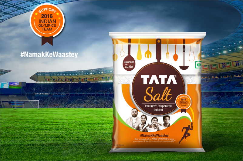
We were more than excited when we were asked to redesign the packaging for a legacy brand that is present in almost every single kitchen in the country.
Designing the packaging for Tata Salt was a big responsibility since the brand recall was incredibly high. A Tata Salt package had some very strong elements of familiarity in the consumers mind. We had to be mindful of those and yet infuse a new personality to make it more relevant to the times and consumers.
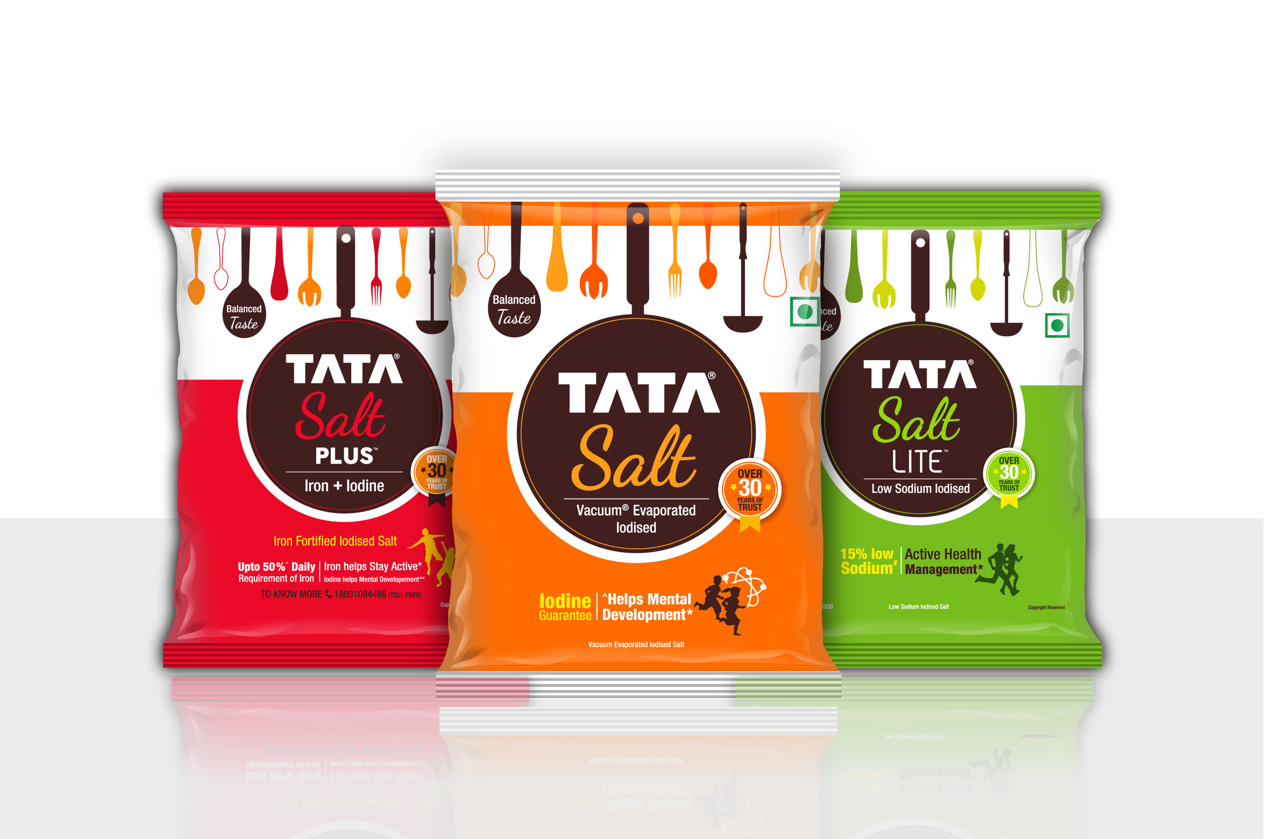
Contemporising without distorting the identity, we wanted to capture the consumer mindset change. We partially changed the typeface of the brand, making it approachable to the consumers. The word “salt” was humanised with a handwritten typeface while the Tata logo was maintained.
We needed to find a solution that would be a fit with every segment of consumers and yet not alienate the current set. A simple and effective solution was to represent in a minimalistic way what every kitchen looks like. We used simple graphics to connote kitchen tools while enclosing the identity in a pan.
This formed a cohesive system for the whole salt portfolio.
Each variant has a different treatment, with the same concept. The entire range is bound within a family, keeping the recall value high while modernising the brand.