

The Focus
Titan Skinn, launched by Titan in 2013, is a mid-premium range of perfumes that generally was met with positive reception and appreciation
However, their packaging for the Escapade collection was not fully being engaged with by their target audience – leading to lower units being purchased as opposed to their other offerings
Product Pack had to appeal to the rugged, outdoorsy man who retreats to the woods after being involved in the other vagaries of the civilized world because
of necessity
The Design
The team at Elephant experimented with several design templates that would draw in the outdoorsy man, while also echoing the quality of the product within
Played on different aspects of the same overall emotion: the desire to be at peace, at harmony with nature while donning its characteristics
Urbane smoothness met energetic toughness and was echoed differently across product sub-types
The Story
Launched in 2013 by the house of Titan, Skinn is a mid-premium range of fine
French perfumes. Since its launch, the brand has received a considerable amount of positive reception, with it being the number one brand by value with the climes of Shoppers Stop, Lifestyle, and Central. The brand also has a 14% repeat purchase rate, indicating its success.
“The team at Elephant quickly drew up a mood board with elements that represented the urban yet outdoorsy man: wolves, forests, leather, wood, alpines, and the works. This was used as a foundation to create the ideal packaging for those men in the age group of 25-35 years of age who were rugged, outdoorsy, and very much at home within its otherwise difficult and challenging environment.”
However, within the entire range, Titan saw a weak link with their Escapade collection. The crucial elements of the
packaging – i.e., the Bottle, the Cap, and the Carton – were not drawing in their intended audience successfully. Thus, they approached the team at Elephant to ensure that a packaging relaunch would help set things in order.
Here Be Dragons
The spirit of adventure, while being coveted, is not something that’s everybody’s cup of tea. “Escapade”, Titan Skinn’s collection for the outdoor man, is for those who truly embody that adventurous spirit. But this is a very specific kind of adventure. This is not a feeling that comes from being confined to urban climes and concrete walls – this comes from a break from civilization at large.
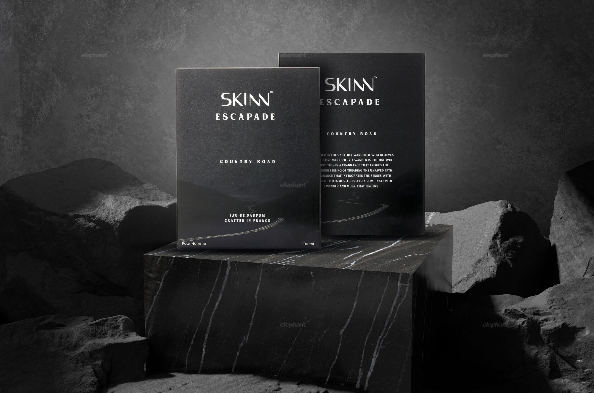
“Color changes occur with changes in the sub-brands, but a clean, minimalistic treatment dominates the entire collection. The color palette is subdued, not striking or gaudy: greys, olives, browns
are utilized liberally.”
The team at Elephant quickly drew up a mood board with elements that represented the urban yet outdoorsy man: wolves, forests, leather, wood, alpines and the works. This was used as a foundation to create the ideal packaging for those men in the age group of 25-35 years of age who were rugged, outdoorsy and very much at home within its otherwise difficult and challenging environment. Here be Dragons indeed.


Balancing the Extremes
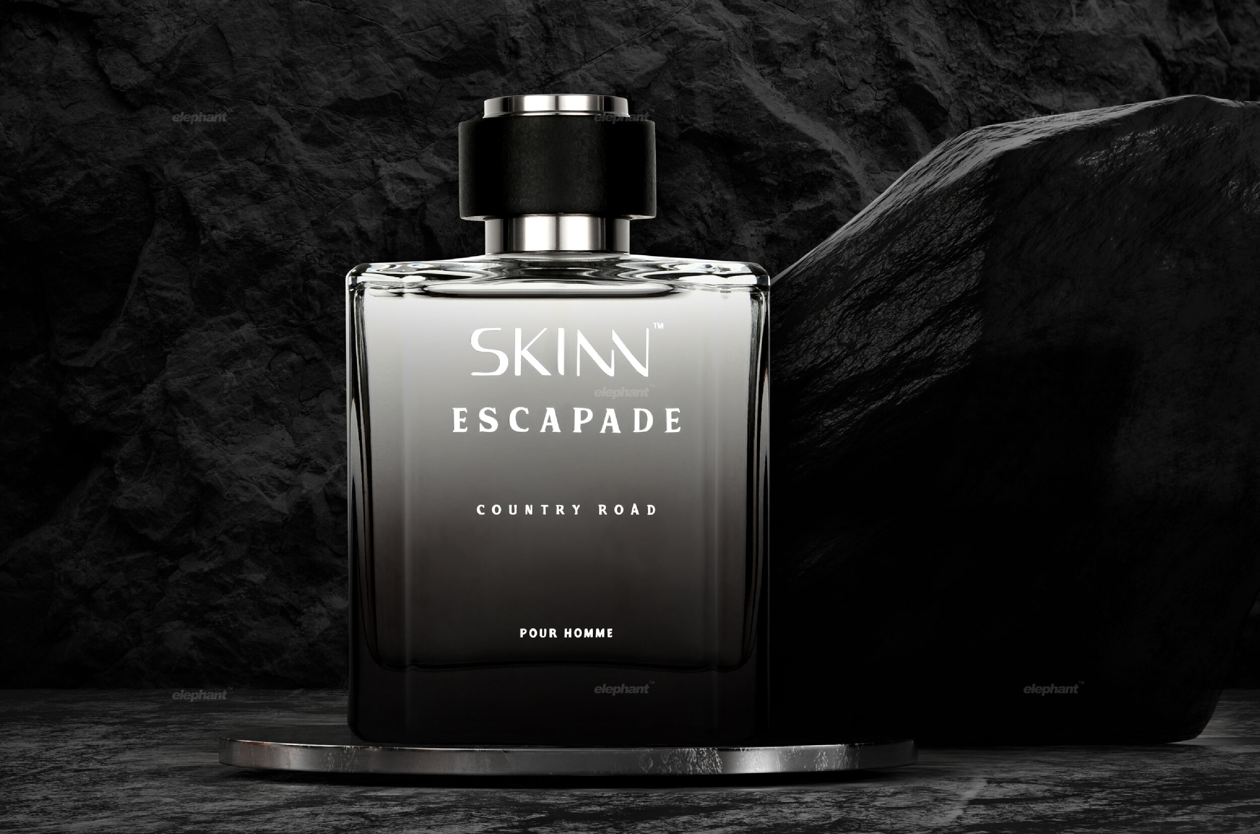
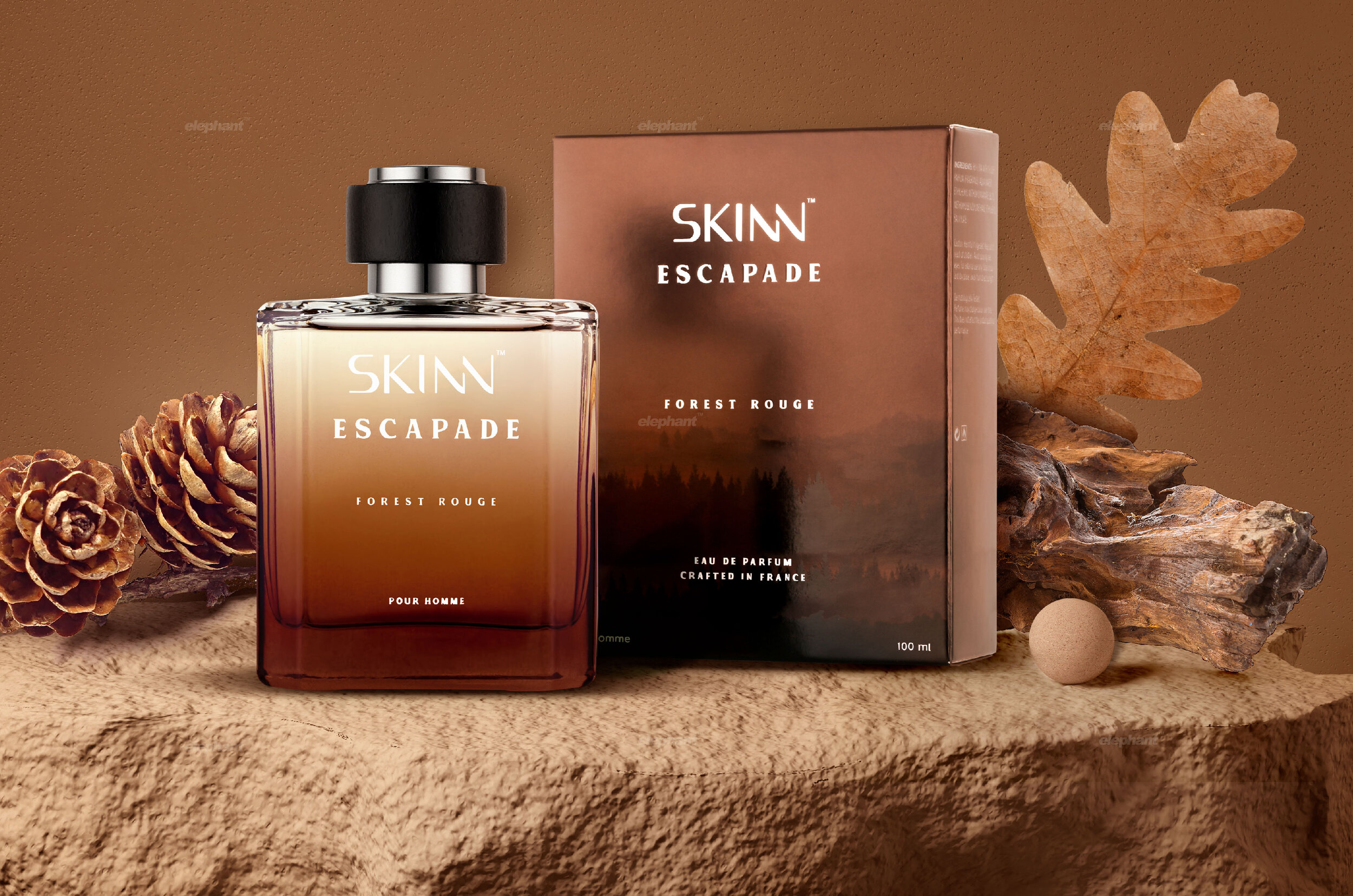
The outdoorsy cues are clearly highlighted throughout the packaging. Color changes occur with changes in the sub-brands, but a clean, minimalistic treatment dominates the entire collection. The color palette is subdued, not striking or gaudy: greys, olives, browns are utilized liberally.
Since our team consulted on how the bottle structure looks, it took on a form that mixed smooth treatment with rough edges, balancing the entire feeling of ruggedness that is also sophisticated at the same time.
The typeface adheres to this theme, where a classic, thick serif-style font that is often found in westerns was adopted. These elements also resulted in a certain homogeneity across the board for their various products – but differentiation came through
in other forms.
Apart from a color being associated with the core emotion for each sub-category, the iconography also changes. The outdoors has several climes where a man can connect with nature, which is purely based on preference.
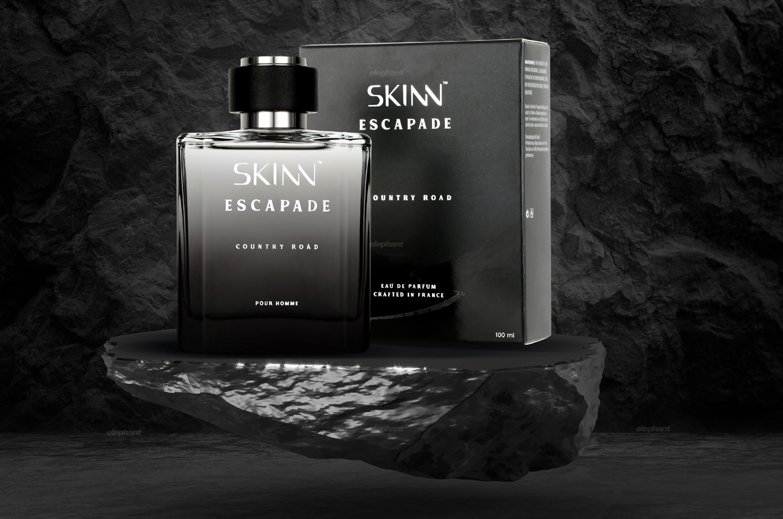
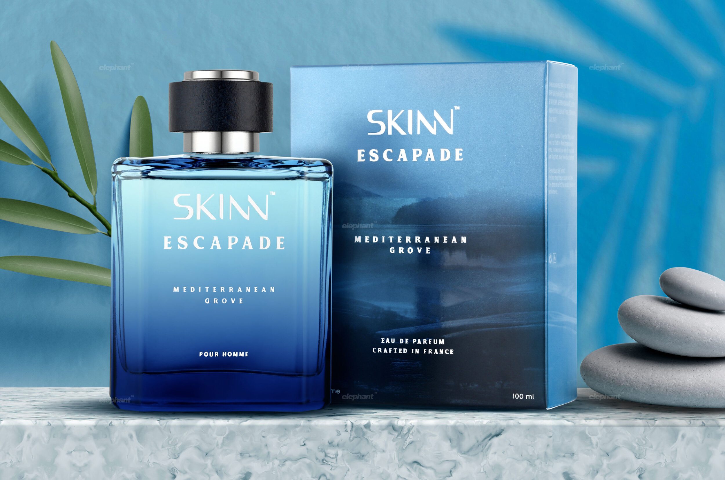
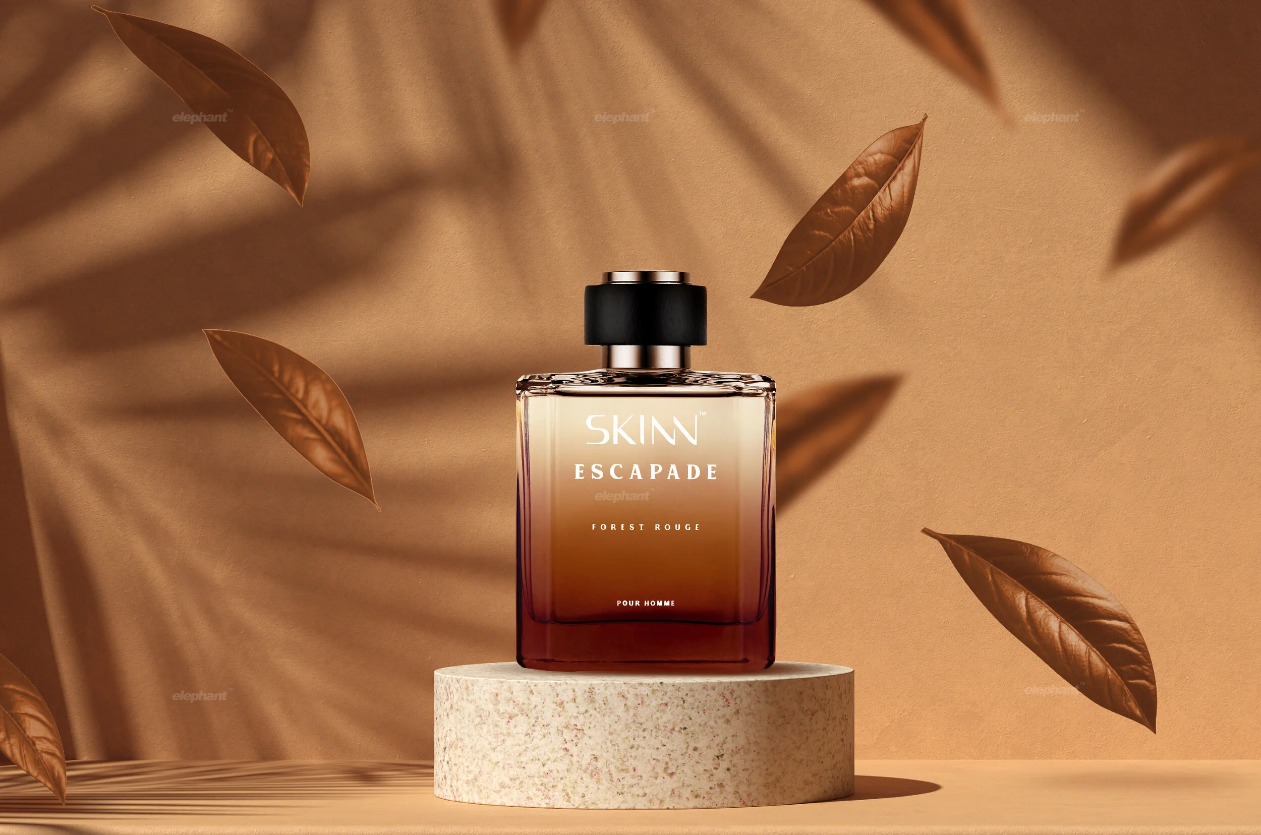
For instance, “Country Road” depicts a snaking, serpentine road eventually disappearing into the grey wilderness, indicating a thirst for getting lost within the rugged, mountainous terrain. “Forest Rouge”, on the other hand, subtly depicts elements of the wilderness with a somber wood-brown tone in the background, for those who find themselves more at home within lush, mysterious trees as opposed to naked, harsh mountaintops. Lastly, we have “Mediterranean Grove” that takes us to one of the most freeing ideas of nature – an eternally blue sea, with its fathomless depths.
“A Design isn’t finished until somebody is using it”
All of these packaging elements create a harmonious system that can attract several kinds of the ‘outdoorsy-yet-urban’ man, depending on their preferences and the nature of the scent contained within.
Since the price point for this perfume is mid-range, the premium feel is an added bonus for consumers who will definitely be getting their money’s worth. Approachability and exclusiveness can both coexist, as we have illustrated with this
packaging – which was received favorably by Titan, and implemented seamlessly.