
The Design
Elephant devised a total UI/UX revamp after undertaking a usability survey and a brand to business workshop to understand on-ground pain points for restaurants already using these apps in their day-to-day operations
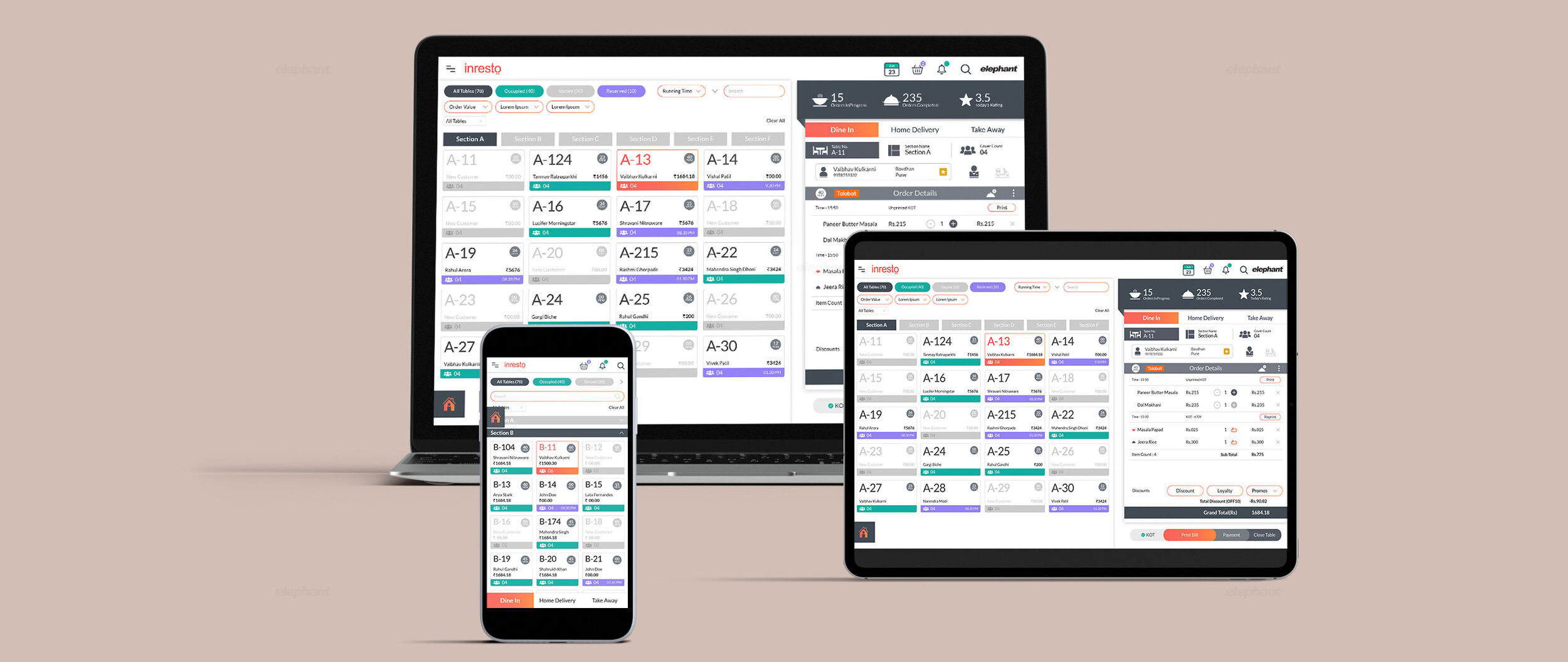
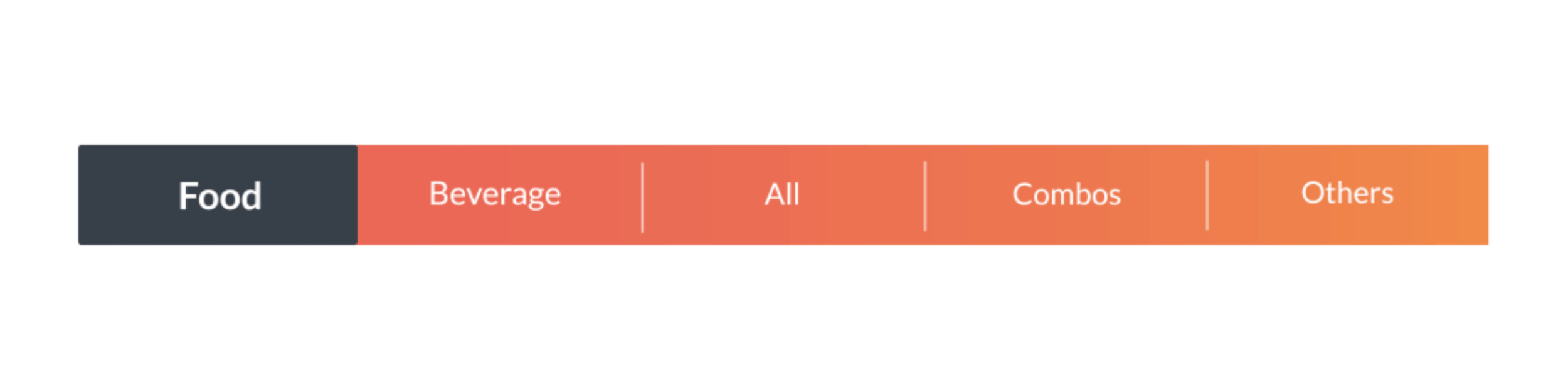
The visual language was streamlined with 3 distinct suites, i.e., the POS app, the SCM app and the Edge app being integrated seamlessly into one harmonious whole.
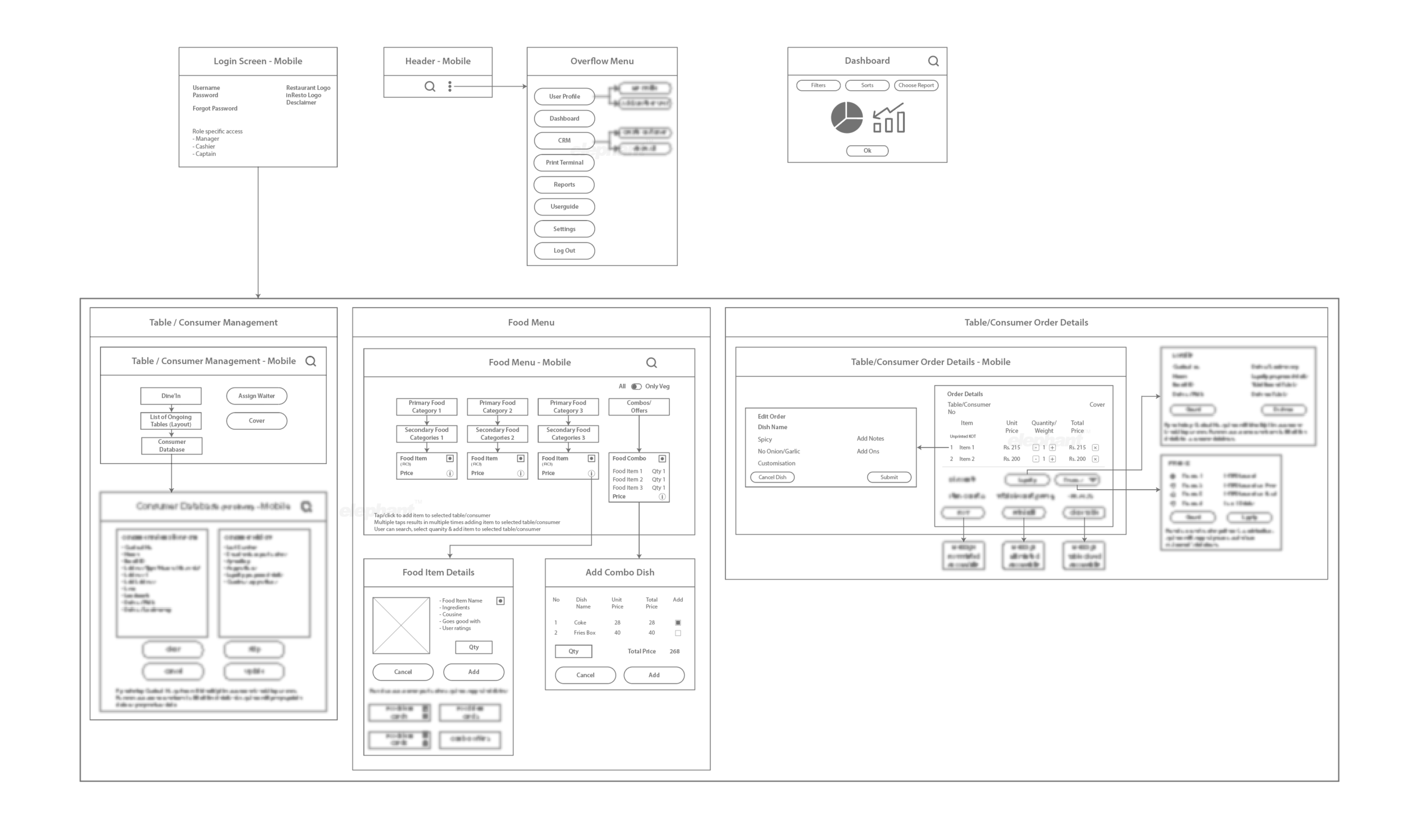
The revamp resulted in an interface that was intuitive, easy to use with minimal onboarding time and prioritized a lean, text-based approach with clever iconography as opposed to a heavy, image-based one – optimized for all platforms.
The Focus
Torqus, an extensive SaaS based B2B restaurant management platform, merged with Inresto, a B2C restaurant booking app to provide a holistic suite of front and back-end offerings and solutions
The merger demanded the creation of a new brand identity, which would be reflected in the form of a complete UI/UX revamp
The need was to ford several extant challenges like inconsistent brand language, lack of content hierarchy and general information overload - amongst other key aspects, which was compromising on the entirety of the product experience.

The Story
Dineout, a stalwart in the realm of restaurant reservation, began acquiring several auxiliary platforms to become a “full-stack technology service provider” in the restaurant booking, loyalty program management and operation-optimization departments. With this goal in mind, they acquired inResto, a B2C restaurant booking/food delivery platform in 2015. Determined to not stop there, they successfully acquired Torqus, a B2B platform that optimized restaurant backend operations.
Armed with these platforms, the integration of inResto and Torqus was but inevitable, as it would become a complete, holistic bundle of solutions on both the front and back end. However, the merger was not a seamless one. Faced with a host of challenges plaguing the UI, there was a serious concern when it came to the intuitiveness and ease-of-use – apart from other aspects like information hierarchy, the inconsistency in visual language and the overall look and feel of the suites in question.
Identifying Vulnerabilities
Our preliminary stages involved a very research-focused approach towards the usability of the suites.
“Faced with a host of challenges plaguing the UI, there was a serious concern with the merger when it came to the intuitiveness and ease-of-use – apart from other aspects like information hierarchy, the inconsistency in visual language and the overall look and feel of the suites in question”
We undertook a survey for over 8 restaurants with 14 restaurant owners and several back-end users in tow to understand the functionality, ease of use and operational hurdles in day-to-day use. In addition, we also designed a brand workshop to identify personality types for the users so that targeted improvements in the UI as well as the brand architecture could be realized.

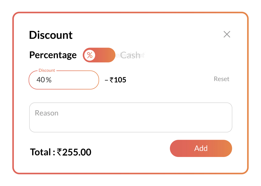
After this phase, a few insights came to light. Primarily, there was a chronic need to simplify the app. Users also wished for a host of other features that would make operating the app easier, which in turn would make streamlining all back and front-end aspects of the restaurant easier too. The number of steps needed to execute certain functions, real-time tracking of table bills, auto-discounting, tracking tips, simpler icons and imagery and an exhaustive performance evaluation chart – were but some of the concerns underscored.
The brand language had some gaps, there was a general information overload, the lack of dynamic content was noticeable and visual consistency was not necessarily adhered to. Overall, the app’s usability was being hampered despite its key purpose – which was making the tasks of its users easier while handling a chaotic, highly situational business that is restaurant management.

The Aesthetics of Utility
The merger of these platforms was far from simple as it involved three distinct suites that were to be utilized by different types of restaurant personnel.
“The team at Elephant put forth a UI that incorporated the use of vibrant colors but with a minimalist touch that aimed to declutter the screen. The UX was designed for longevity, which demanded a futuristic treatment that wouldn’t let this app become outdated and obsolete in the constantly evolving technological domain”
Colour Palette


For instance, the POS (Point of Sale) app was to be used by cashiers, captains and so on. The SCM (Supply Chain Management) suite was to be used by inventory managers, which would synchronize with the POS app and lastly, Edge, which would be used by business owners, allowing them to keep an eye on overall restaurant performance via several, detailed indicators.
The challenge was to develop an overarching visual language for all three suites while remedying the host of yet other loopholes and fault lines that had been identified in the preliminary stage.
The team at Elephant put forth a UI that incorporated the use of vibrant colors but with a minimalist touch that aimed to declutter the screen. The UX was designed for longevity, which demanded a futuristic treatment that wouldn’t let this app become outdated and obsolete in the constantly evolving technological domain.
“At the core of this sales enhancement framework lies a hashtag system, which was developed for hot-demand items. This enables personnel to keep track of what needs to be pushed and in turn, lets them create new, targeted offers on the fly. Adding product information to this interface, was a feature we retained on the phone during the optimization stage”
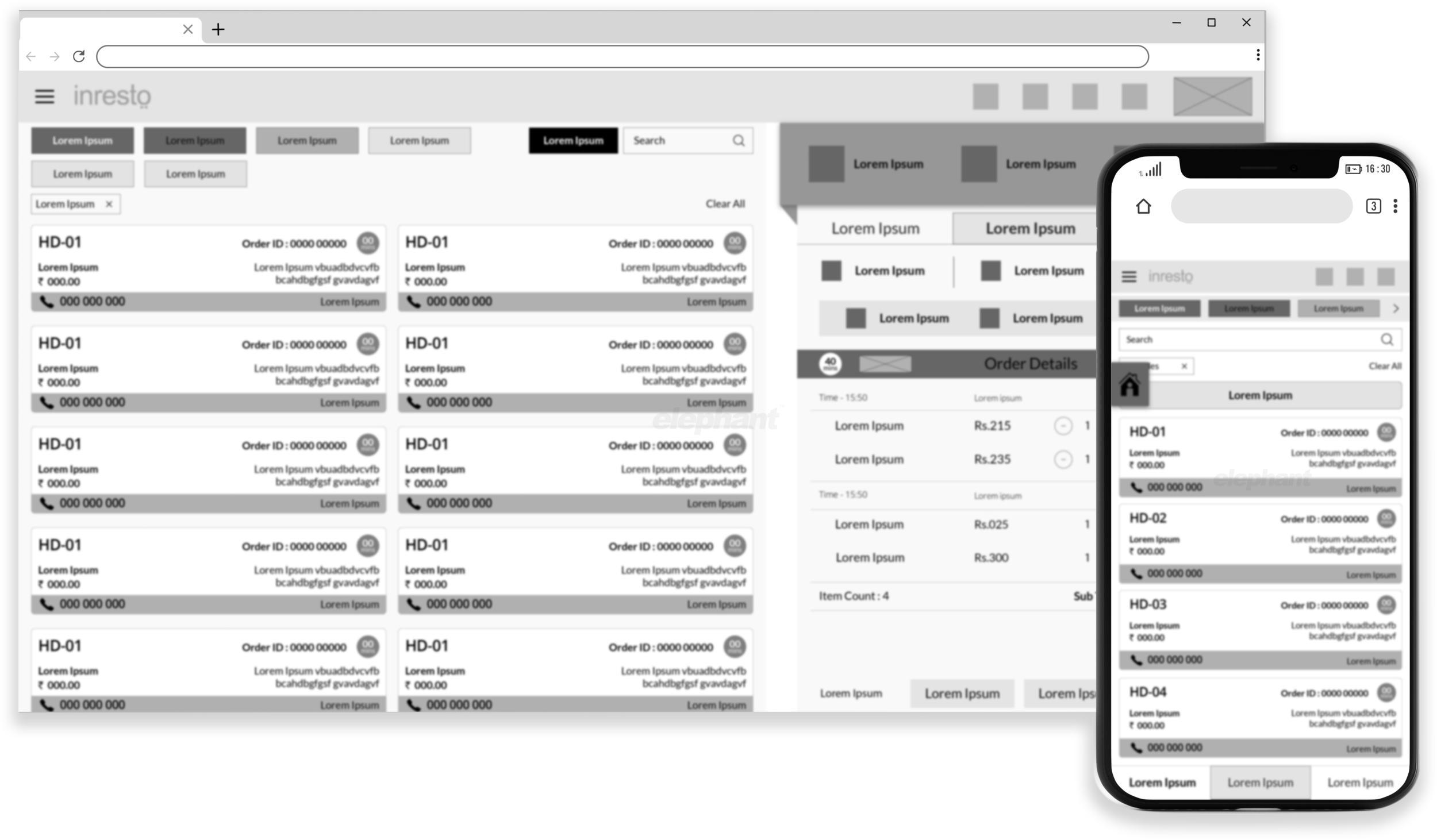
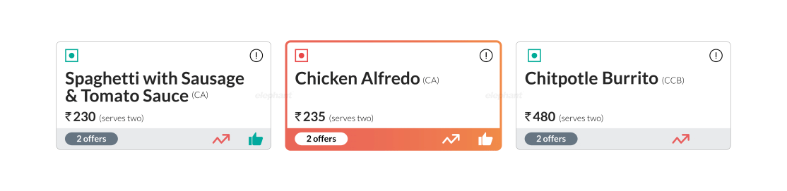
The hierarchy of information and readability on various screens was underscored. This can be observed especially in the card-style format the team laid out for online orders which had several viewing options and more importantly, color coding which eliminated the need for a clunky, image-based layout. Restaurant captains preferred an array of shortcuts and wanted to distinguish between dishes and their status from varying distances – prompting a visual design that catered to this need.
Going above and beyond the standard gamut of offerings, the team incorporated a customization feature that enabled easy use for both left and right-handed people, as well as light and dark themes as per individual preference.
Optimizing Sales
While the entirety of the suite is geared towards making operations efficient, our team managed to integrate key features that allowed for real-time sales optimization.
At the core of this lies a hashtag system, which was developed for hot-demand items. This enables personnel to keep track of what needs to be pushed and in turn, lets them create new, targeted offers on the fly. Adding product information to this interface, was a feature we retained on the phone during the optimization stage. This way, the staff could implement upselling and suggest items that complemented the main course – amongst other useful features.
““Truly elegant design incorporates top-notch functionality into a simple, uncluttered form” ”
All in all, while each suite has a distinct level of differentiation that caters to those who would ideally be utilising it most, there is now a seamlessness when it comes to switching between the suites. Torqus + inResto now both look and function like one unified entity, providing consolidated offerings to all stakeholders and users.