
Ultimate Table Tennis
Branding and Visual language for India’s first Pro TT League
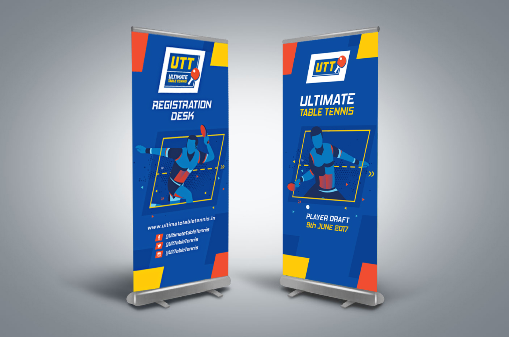
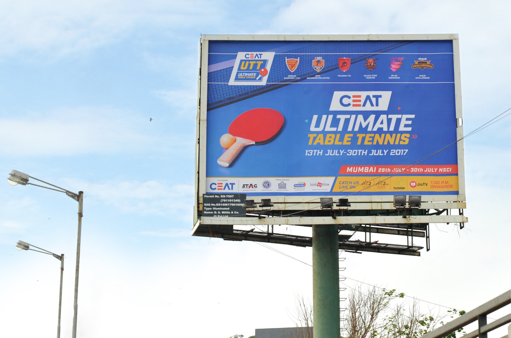
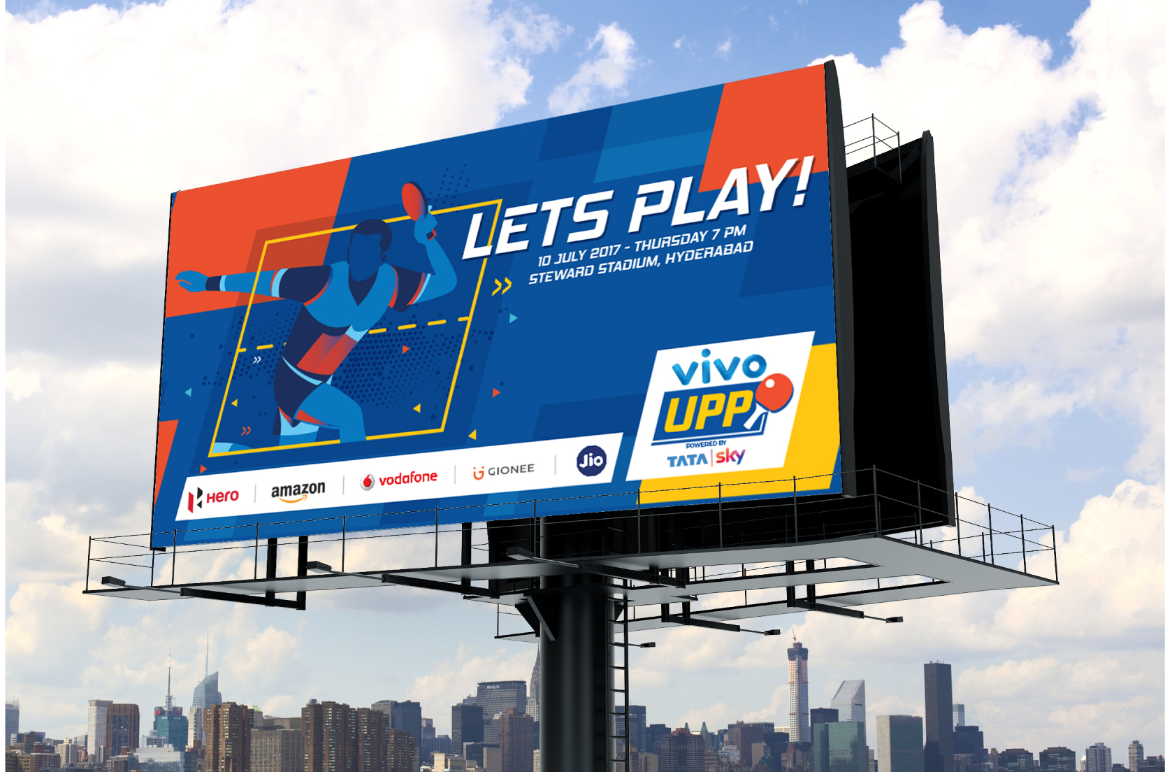
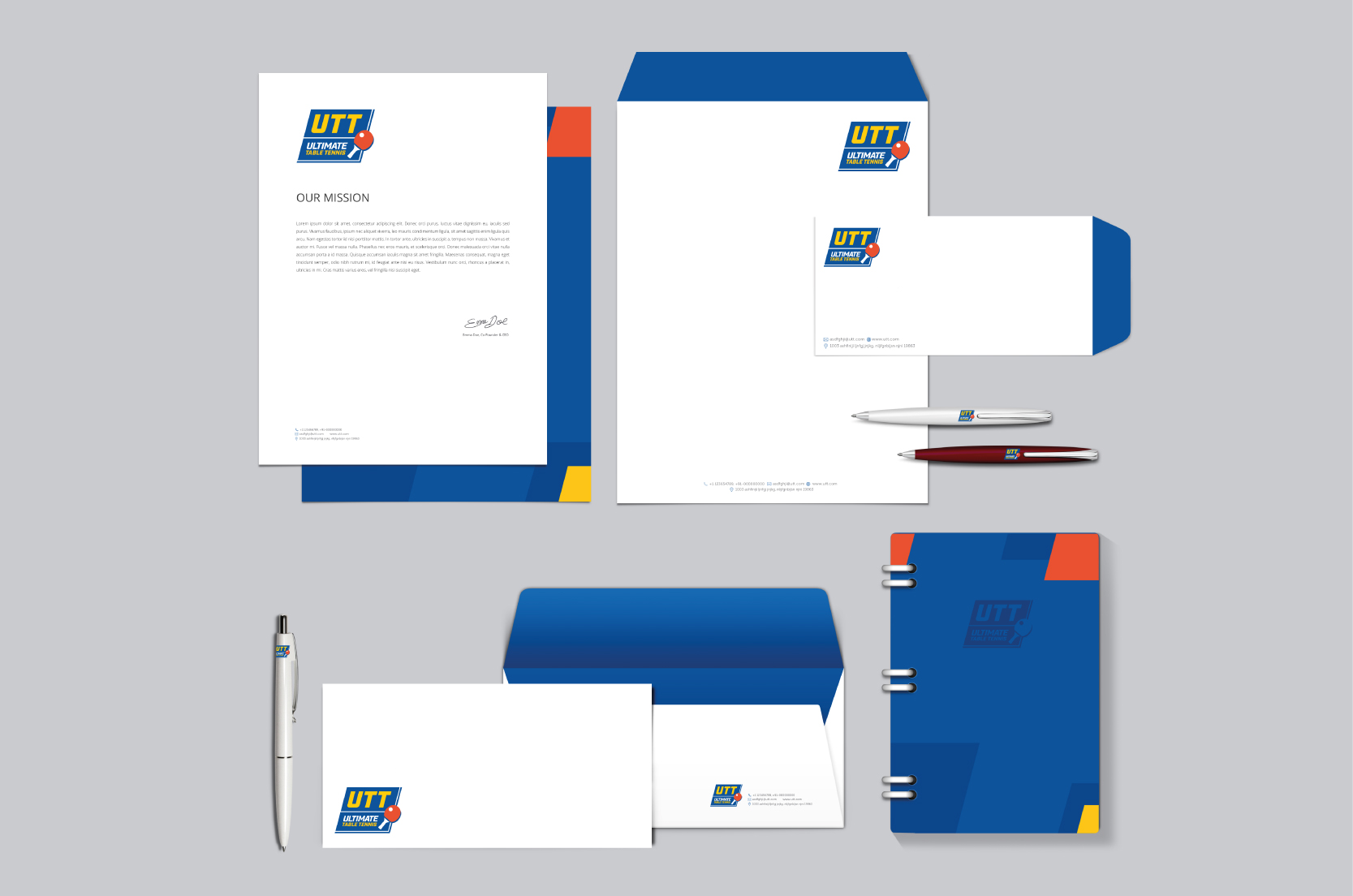
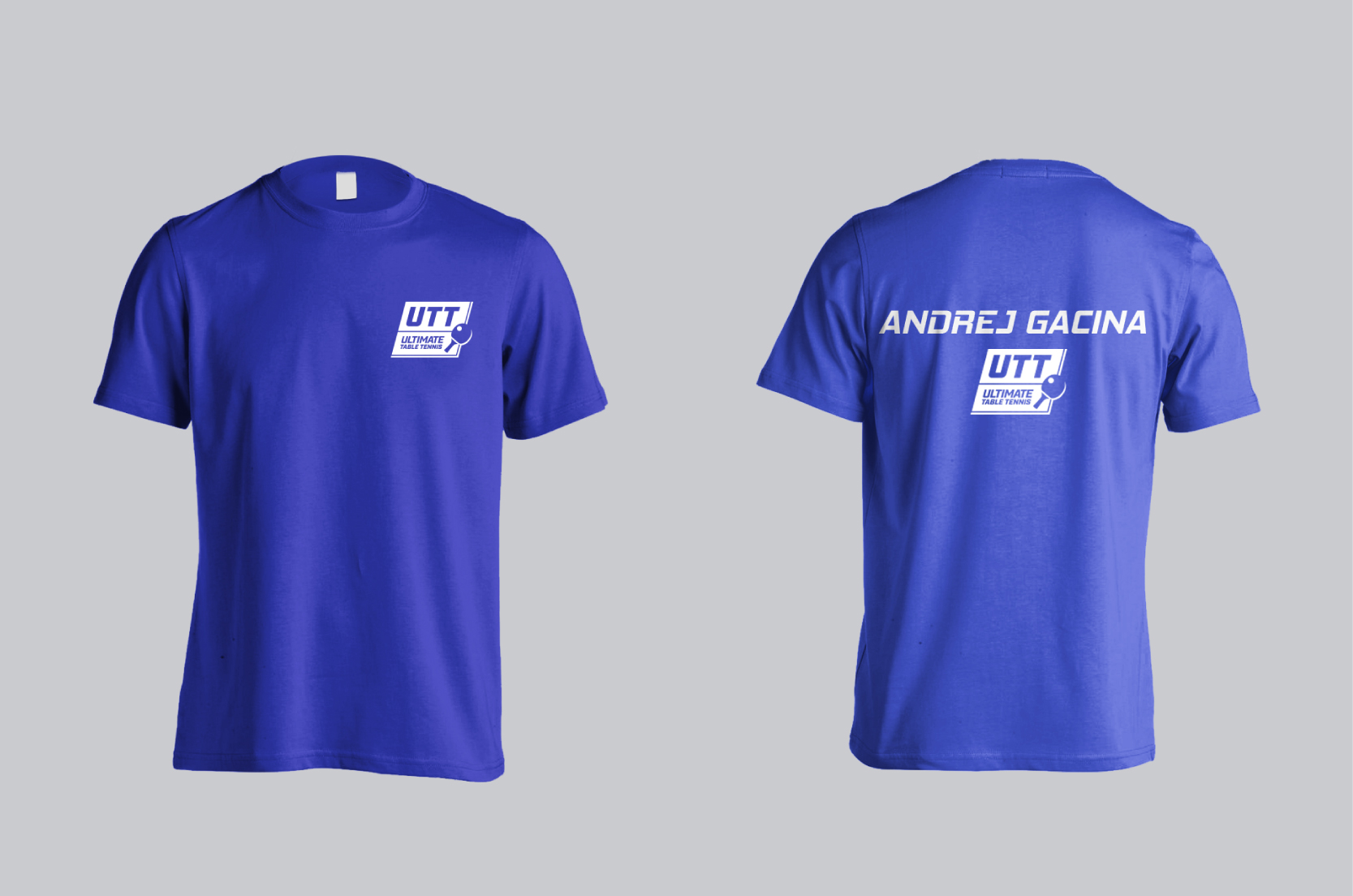
Table tennis, ping pong or anything else you might know it by, there’s no denying the popularity of this game as a popular sport worldwide. With the first Indian professional table tennis league launching last year, we were more than excited to team up with the professionals to work on the branding and visual identity.
For a sport shadowed by cricket & football, this league was an attempt to give it its due popularity and stature. The name needed to align with the tournament’s pivotal role in bringing this sport to the forefront in India. To convey the superlative nature of top ranked international players, we proposed to name it Ultimate Table Tennis .
The visual identity needed to connote fast paced action characteristic to the sport while staying simple and flexible for multiple applications across print, outdoor, online, stadiums, uniforms, television, etc. Since the idea was to popularise the sport, our design team decided to use the blue table tennis table with white lines dividing the typography. Slanted logotype & yellow type symbolise dynamism and fast paced nature of the game while the ball & bat become playful identifiers. The red accent was added for its energy and passion.
While working on the visual language, we incorporated graphics of players in action which were used on access cards, scoreboards and other elements. Our team created a system of typefaces and a colour palette corresponding with the logo, which was adapted to all forms of communication.
The first year of Ultimate Table Tennis in 2017 was met with a great response from the public. The league has established itself as a respectable competition platform, with players from around the world signing up.