
Voot
Sharing Happiness, Digitally
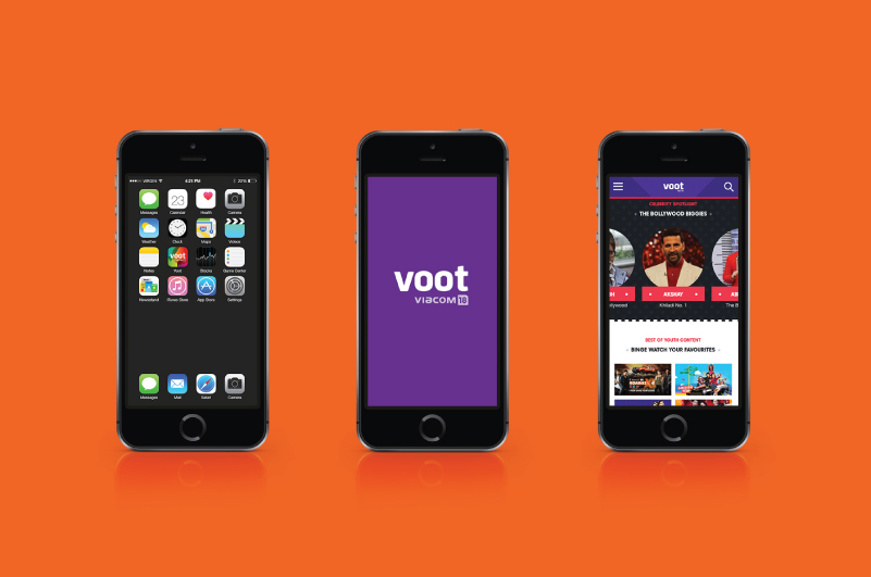
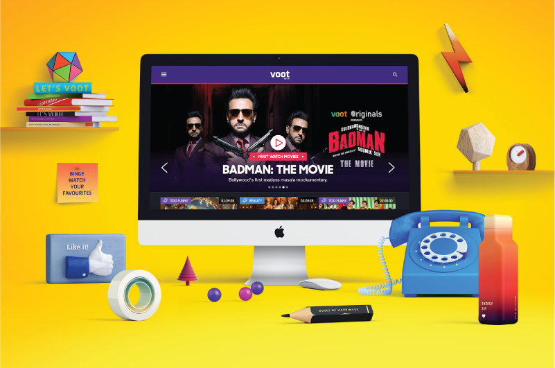
Viacom 18 approached us to create visual identity for their online entertainment brand. With a variety of channels ranging from MTV to Colors to Pogo forming the content of this brand, we were faced with creating a unique offering for a very diverse target audience.
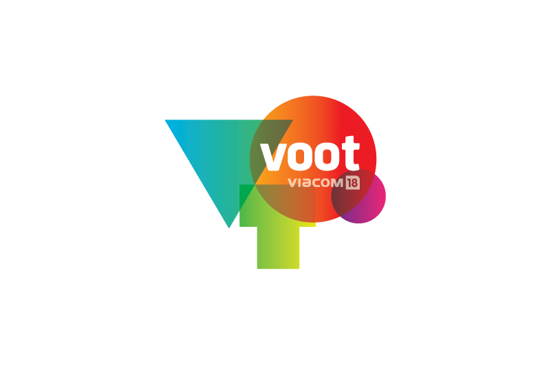
Setting happiness as the premise for the brand, “VOOT” evolved from “Woot," capturing the spirit of celebration. With Voot, we wanted to promote collective viewing with Viacom 18 believing entertainment is about sharing. Positive emotions formed the core inspiration for Voot’s identity design.
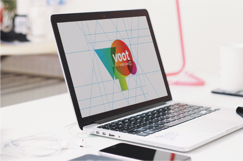
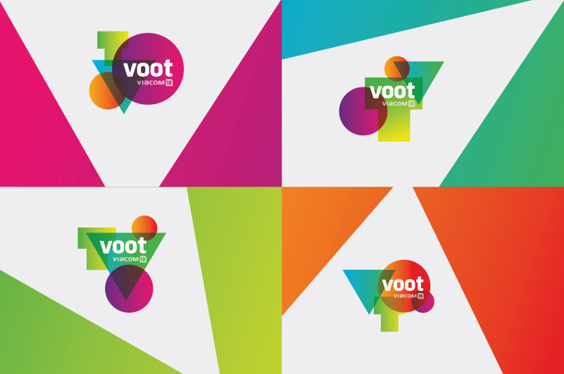
Colors and dynamism being feasible for a digital brand it was not necessary to create one static logo for replication. We took this as an opportunity to develop a dynamic identity that changes with every screen refresh.
Simple geometric shapes infused with bright colour gradients were used for the alphabets VOOT to connote an effortless, approachable brand. With the simplistic approach, the logo was made customisable and could be played around with on digital screens.
The brand identity was created to connote happiness across spectrums of age, geography and gender.
Since its launch, Voot’s popularity has been on the rise in the Indian digital entertainment space. This project won an international award at A’Design Awards (Italy) in May 2017