The Focus
Revamping the packaging for Glenmark’s clinically advanced product range for Intimate Feminine Hygiene
Devising packaging graphics and systems that could familiarise women with this new category of product
The system also had to encapsulate other products in the V Wash range and give it an air of dispensing modern solutions for the modern woman
The Design
Elephant decided to position the product to be somewhere between an approachable, over the counter (OTC) product and a scientific innovation
Typical feminine codes like ‘gentleness’ weren’t overt in this case, as the focus was strategically kept on ‘expertise’ and ‘efficiency’
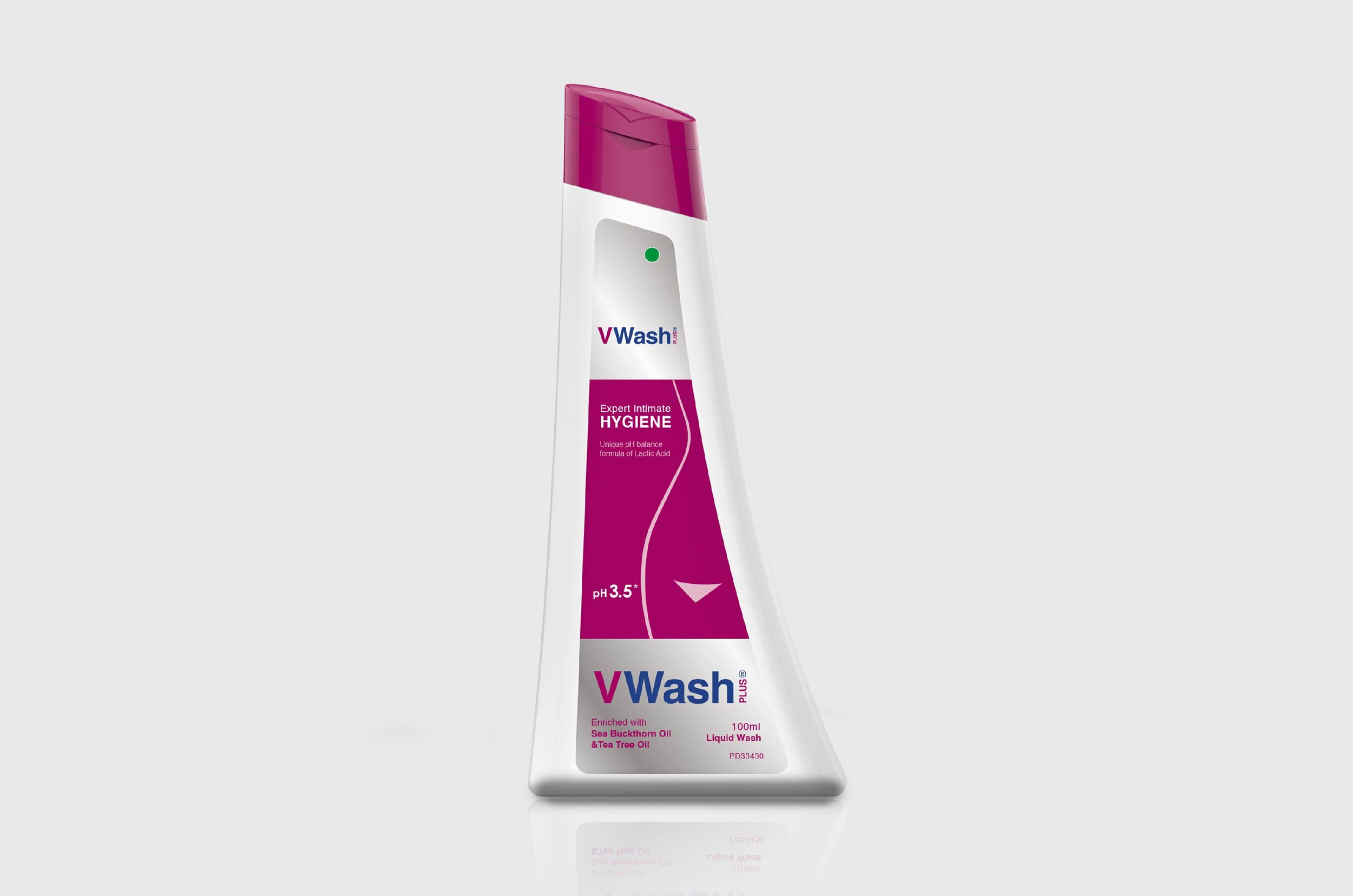
Out team also created unique graphics and mnemonics to help women understand the need for this innovative solution; while also designing a bottle to match the stance for the modern woman – poised and strong
The Story

Glenmark Pharmaceuticals Ltd. (GPL) is a pharmaceutical company headquartered at Mumbai, but has a global presence. It is ranked among the top 100 Pharma & Biotech companies of the world in terms of revenues. Naturally, pioneering expertise and cutting-edge research are Glenmark’s strengths.
When V Wash was launched by Glenmark in 2013, its presence was unrivalled. V Wash, in effect, was a product that provided special care for a woman’s intimate parts through its landmark lactic acid formula. Since most issues and discomfort stemmed from a deviation in vaginal pH levels, V Wash manages to maintain and keep it in its naturally acidic state.
“V Wash approached the team at Elephant because primarily, their product was too novel and alien for their target audience – i.e. the contemporary, modern woman. They weren’t exactly motivated to pick it up because the need for a product like this was obstructed by a general lack of awareness.”
V Wash approached the team at Elephant because their product was unfamiliar and alien to their target audience – i.e. the contemporary, modern woman. This category of product, in fact, had to be created within the intimate feminine hygiene space.
Sure, this product was now meant for OTC sale, but the fact of the matter was that certain myths needed to be broken so that women would pick it up without any second thoughts. To summarise, we simply needed to find a way to educate consumers about the need for intimate feminine hygiene.
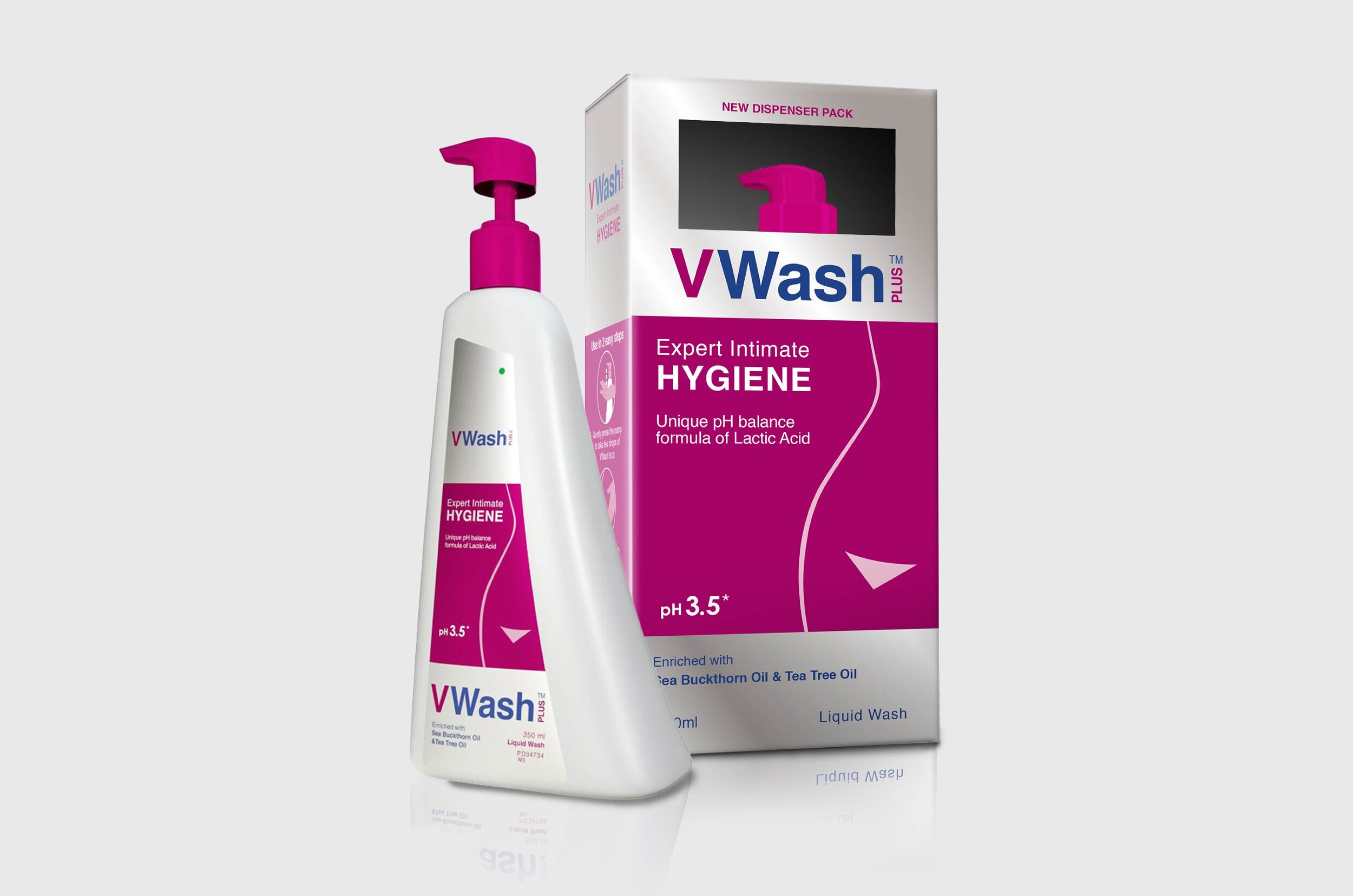
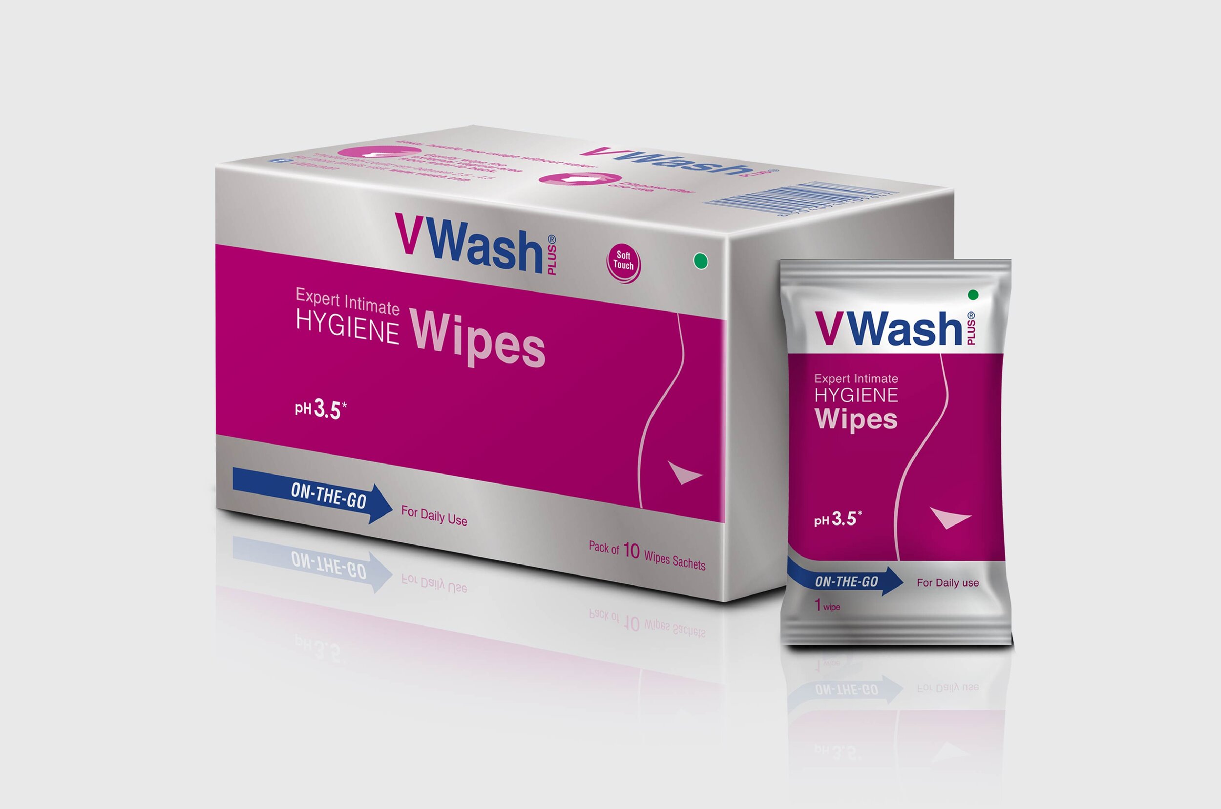
Subsequently, V Wash developed an entire product range with sub-brands that catered to different hygienic needs. For example, there is WOW, that sells sanitary pads. Encapsulating these within the main packaging system, while also retaining their own codes was another key requirement.
Lastly, V Wash needed to be positioned as the ideal brand for the modern, strong, independent woman who deserves only the best of intimate care.
“To illustrate V Wash’s key benefits, Elephant designed a pH meter, marking a healthy pH range that clearly brought out its product benefits. We did this to avoid overwhelming the consumer with medical jargon.”
Balancing Expertise and Familiarity

When a product is overtly specialised, or its purpose difficult to grasp, it runs the risk of alienating its consumers. On the other hand, V Wash definitely did not want to deviate from its ‘expert’, ‘technological’ feel because that engineered trust.
To illustrate V Wash’s key benefits, Elephant designed a pH meter, marking a healthy pH range that clearly brought out its product benefits. We did this to avoid overwhelming the consumer with medical jargon. Mnemonics that illustrated product use cases were added on the side of the pack to further build brand connect.
While standard product category codes often incorporate the colour pink to illustrate femininity, we interspersed that with silver to convey the ‘expert’ nature of the product. Everything else about the graphics gives off the impression of efficiency and medical expertise, which is what engenders trust.
“We designed a new bottle dispenser for V Wash, which was asymmetrical and streamlined in form. While this makes it ergonomically viable, it also embodies the ‘new feminine’, which is slender, elegant and poised with her head held high.”
The Modern Woman
The modern woman is also a mixture of the familiar and the archaic ideas of femininity – mainly caregiving, nurturing and gentle in her essence – but also fierce, independent and not confined to gender roles or stereotypes. Thus, we kept feminine codes to a minimum in the packaging graphics: this is evident through the use of Pink and the female silhouette on the front.
However, we designed a new bottle dispenser for V Wash, which was asymmetrical and streamlined in form. While this makes it ergonomically viable, it also embodies the ‘new feminine’, which is slender, elegant and poised with her head held high. Even the dispensing cap is shaped like a crown to bring the product away from its clinical roots and confers an air of regality often found in personal care products.
The message is clear: V Wash is an integral product that fits perfectly in the routine of the modern woman that seeks expert – yet now familiar – solutions for her personal care and hygiene.