
MTR
Modernising Homeliness for The New Age Woman
Changing times bring with them a change in roles. Not just a woman’s role in the kitchen but also the Indian consumer and the market has seen a huge shift over the last few years. The consumer is now exposed to a wider array of cuisines & products while the woman of the house is more assertive and independent as well as pressed on time.
MTR has been in the business of offering masalas, ready-to-cook mixes and ready-to-eat meals for the larger part of a century. MTR approached us with need to present their portfolio in a more meaningful way to this new consumer set. Also a part of the challenge was to infuse emotional connect into their existing range of packaging system.
Working with a legacy brand like MTR that had such a strong visual equity we decided to work on a rooted transformation, whereby we retained some of the key elements and wove a new language around it.
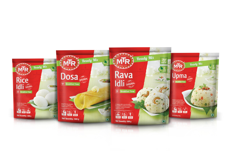
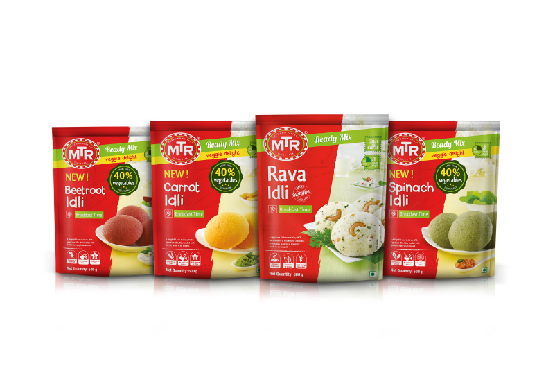
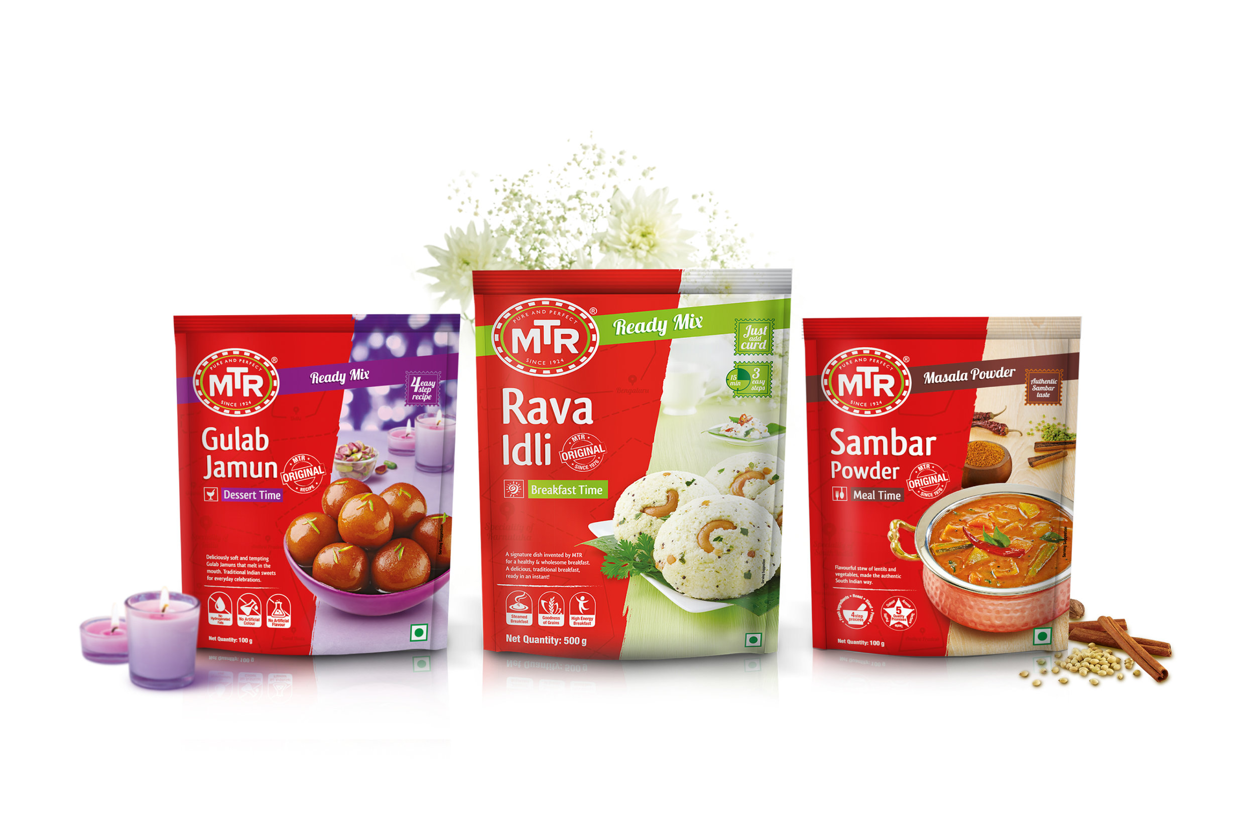
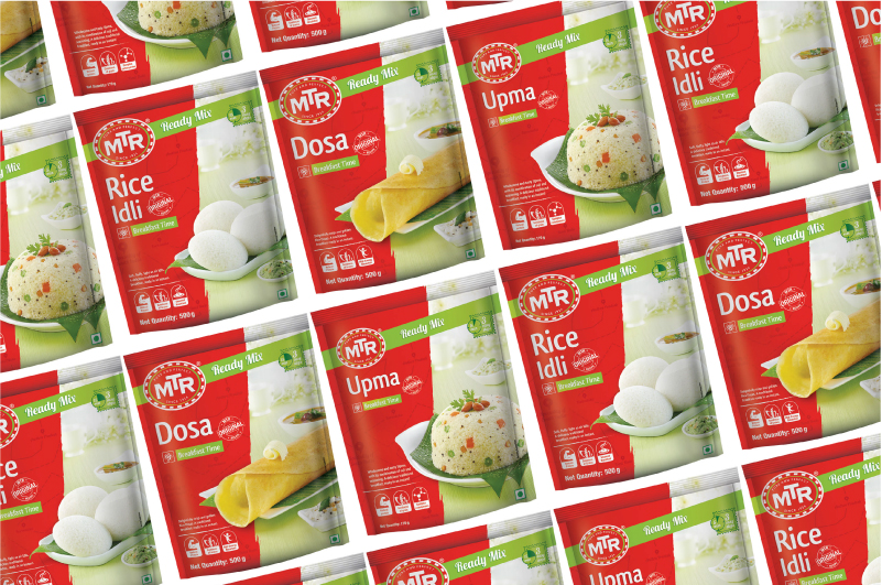
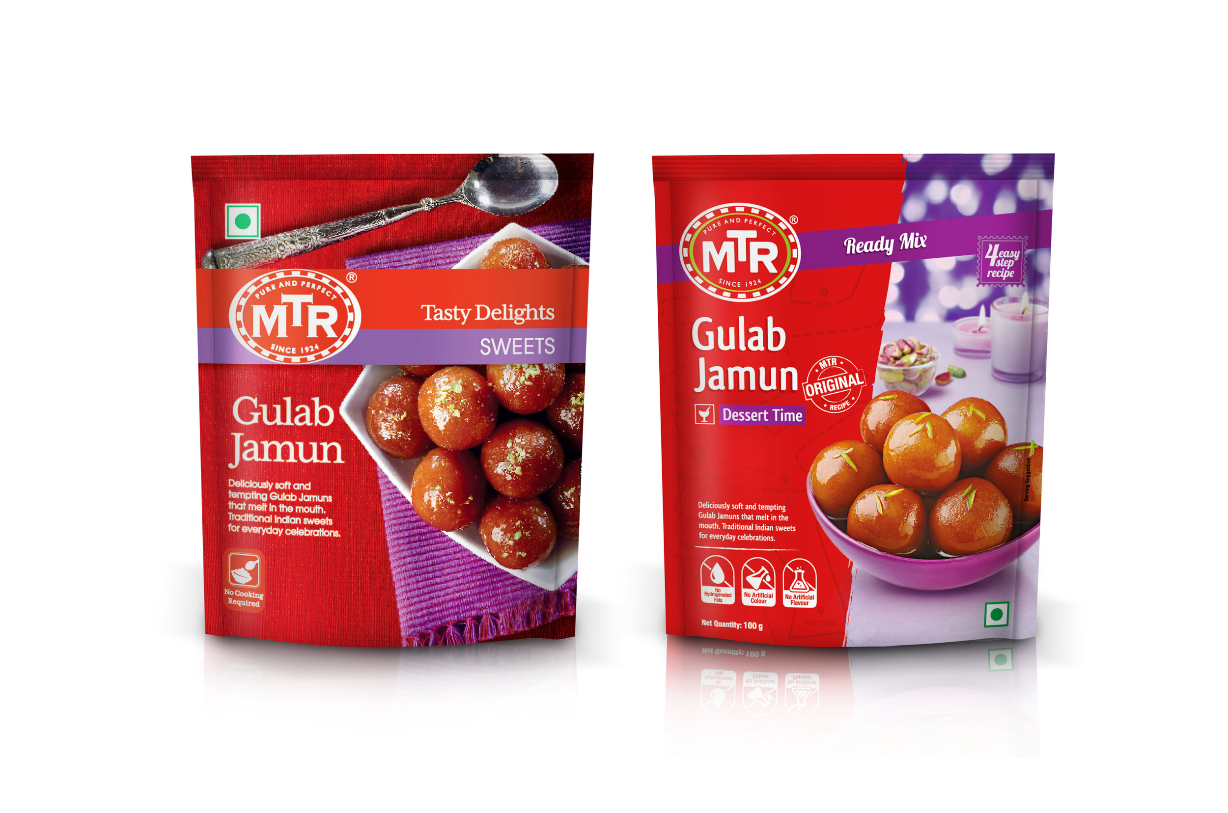
Keeping the customary red colour, the brand mark was changed to a bold sans-serif for a more contemporary look. Natural ingredients being the core of all MTR products, a fresh green was added to the roundel to announce meaning & mission of the brand.
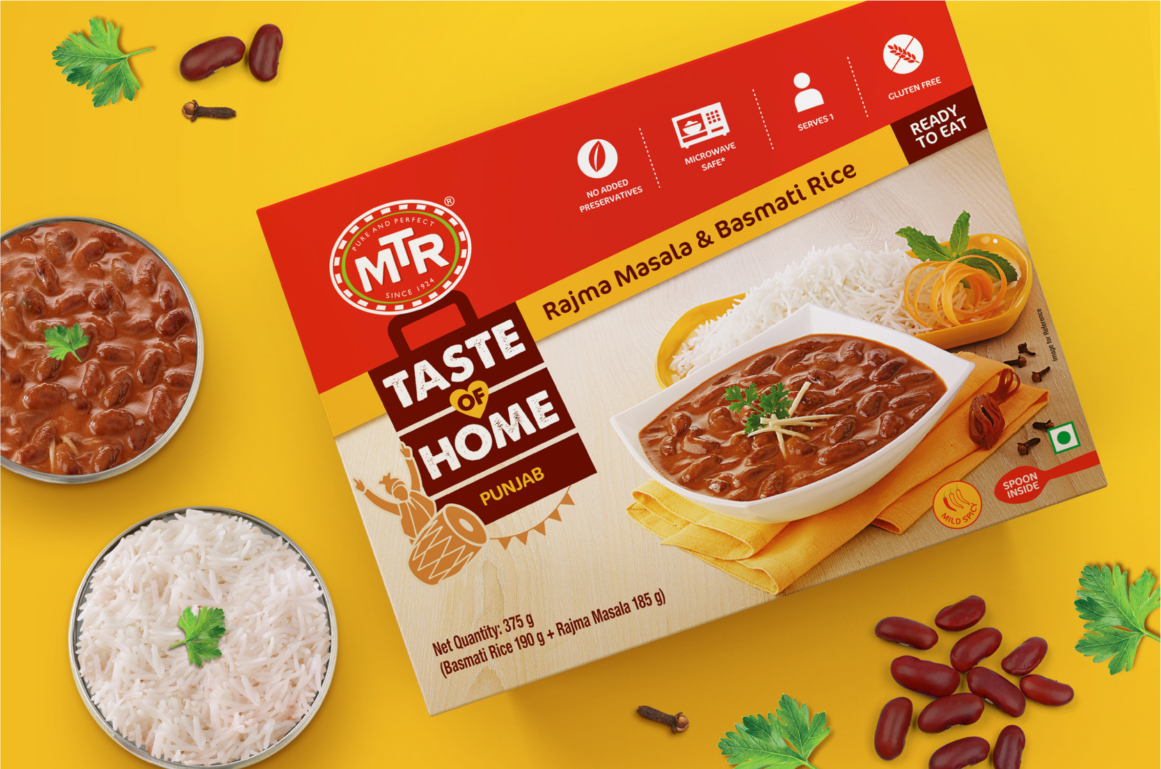
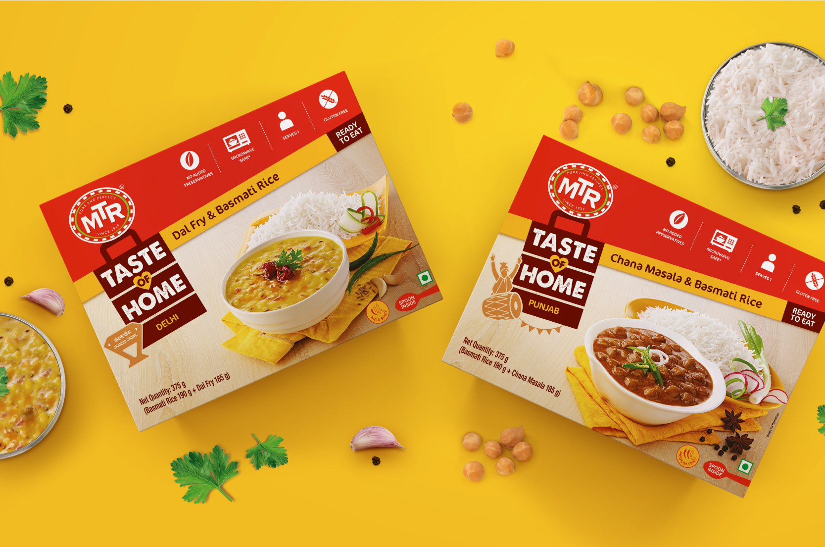
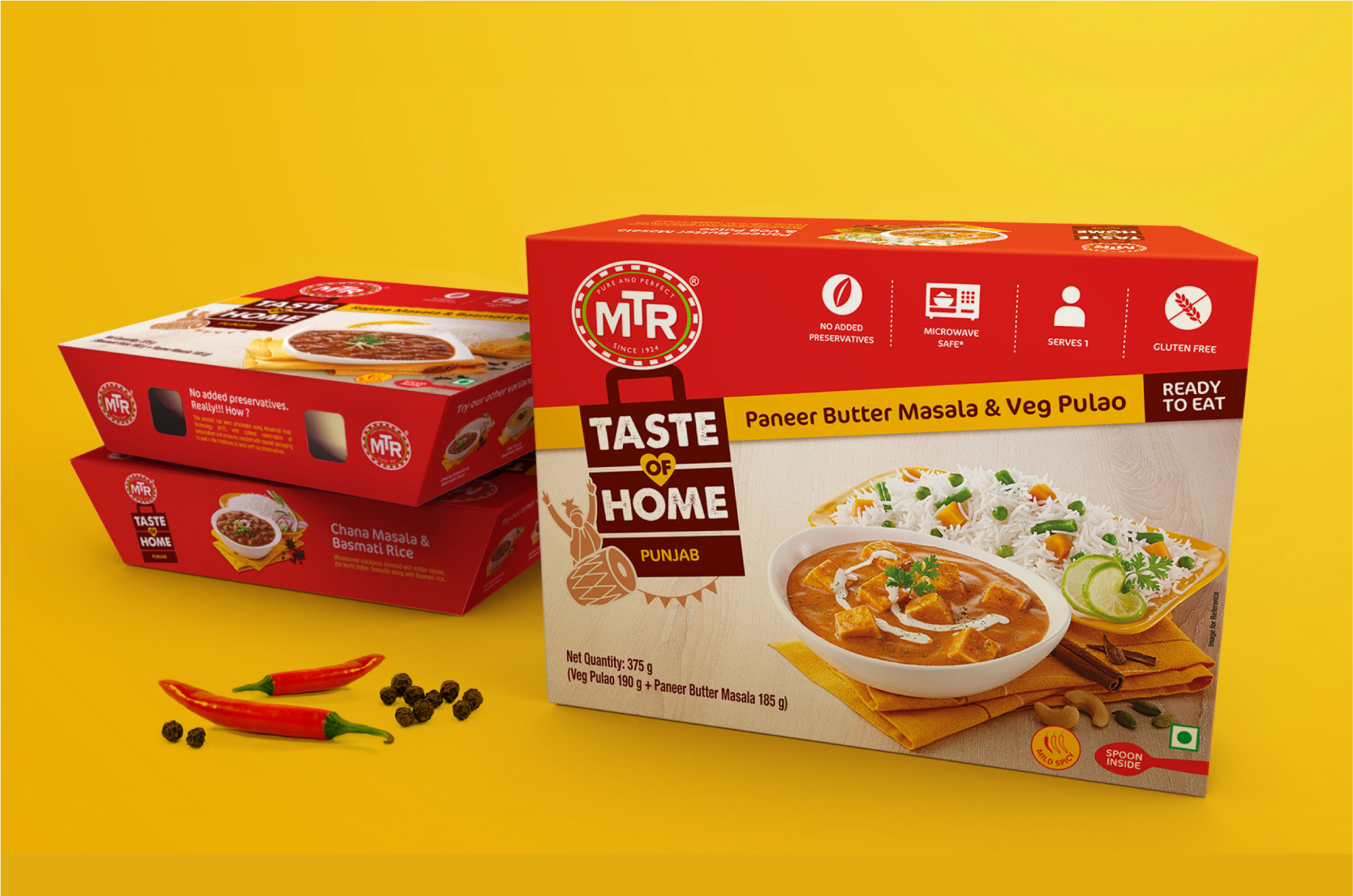
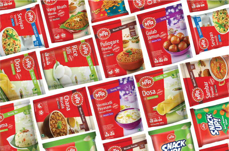
A colour code was created for each product category, along with a category descriptor upfront, for easier connect and identification. To establish more of a pan-India connect, a subtle line map of the region of origin was added in the background of each pack.
The product shots were one of the most important aspects, that would build the mood for each category and were carefully thought out and executed, keeping in mind the occasion and accompaniments. This added a great deal of authenticity and the required emotional connect to the entire portfolio.
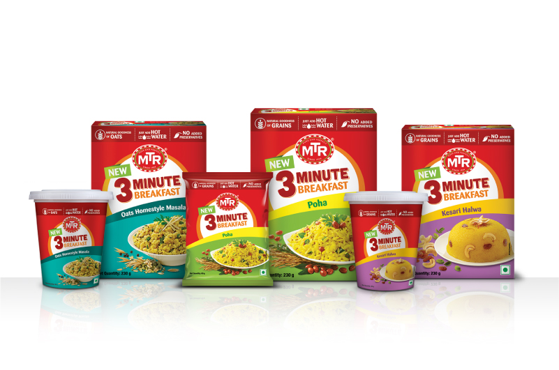
The revived packaging made a huge impact on the consumers and the market alike. It also helped build a cohesive system for the brands newer ranges.