
Most often, we give less-than-due credit to iconic Indian brands. And there are quite a few, in every category of the FMCG sector. Tata Salt, Thums up, Parle G, Santoor, Good Knight, Britannia Marie Gold, Bisleri, Saffola, Real – the list can go on.
These brands have a large market share. In most cases, they have remained in a leadership position despite the entry of competing international brands and changing consumer preferences. These brands can, therefore, be called ‘legacy brands’. They have managed to have loyal consumers for a sustained period; they are a part of their users’ lives, and they are irreplaceable for those who opt for them.
What is rarely discussed, however, is the way these legacy brands transform their visual identity to align with young, progressive Indians and their high-lifestyle aspirations today. How often do they change, and to what extent?
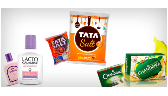
While Lacto Calamine had established credence with the woman who equated beauty with simplicity, it was time to ladder up to a larger and aspirational space; It was time to connect with a ‘self-assured’ woman who makes informed decisions. The brand needed alignment with the new positioning, without losing its core of simplicity. The challenge for Elephant was to create packaging that carried forward the simplicity from the past, but also looked believable as an advanced skincare solutions expert with a growing portfolio.
Packaging is the first moment of truth for any FMCG brand, and the transformation or alignment basically starts with visual identity and packaging change. It is a huge responsibility when legacy brands like Good Knight or Wagh Bakri tea ask us to redesign their brands’ packaging experience, so that they stay relevant to their existing and intended audience. In such cases, the migration needs to be evolutionary, perceptible and must conform to their leadership status. And then there are the legacy brands like Chandrika or Lacto Calamine, that need to transform themselves, either to get back in the reckoning or reach a completely new audience altogether, without alienating their loyalists.
Chandrika has been a trusted Ayurvedic soap for generations in India. The brand needed to reach out to a younger audience, while staying true to Ayurveda as its core story. Here, the challenge was multi-fold. Ayurveda was not associated with a contemporary lifestyle. And, as a concept, has been dogged by several misconceptions, one of them being slower efficacy. ‘Active Ayurveda’ as a proposition, resolved some of these issues. Ingredients like neem, lemon oil, patchouli oil etc were showcased to help demystify Ayurveda. Colours were changed to a fresher, more natural palette.
Packaging is the most crucial link of closing the loop between maintaining legacy and getting a new conversion going. However short, packaging lives its moment of glory. Great packaging design makes that moment meaningful and relevant to the consumer. It is very exciting to know that you might be reaching a billion hands if you do it right. Or you may just get discarded if the evolution is not based on relevant insights. The approach to packaging design is, therefore, always viewed through several lenses: That of users, of shoppers, of non-buyers, of trends, of technology and so on. Most importantly, discovering and defining what kind of dialogue the brand needs to have at that point in its existence, becomes the pivotal clause. A client once told me we must believe that every square millimetre on the pack can do the job of a billboard. How true!
Whether you decide to add a message, icon, colour or image on every available surface, or you decide to leave breathing space, you land up communicating something one way or another. So one has to be extremely careful about adding or removing elements. Because what matters is the story you are telling.
Great design aims to delight the user ahead of expectations. If we use a simple tool of three questions that need to be answered by packaging design — Who am I? What do I do? And how do I do it? — we are mostly home in terms of communication.
Tata Salt, an undisputed leader and pioneer in the category, was ready for change as the brand needed to align with the progressive homemaker. We set out to solve two major challenges. One was to take up the position of being a ‘friendly’ expert, and another was to shake off the ‘me-too’ players who had completely emulated all the codes of Tata Salt packaging over years. First, the typography of the word ‘salt’ was humanised to add a layer of warmth to the trusted Tata logo. To reiterate confidence of the leader, images of food, people and such were removed from the earlier packaging, and a fresh outlook of a modern lifestyle was depicted through visuals of a modern kitchen setting. The colour palette was made more vibrant, but in alignment with its earlier portfolio. Graphics and mnemonics were designed to communicate relevant benefits in a clean and contemporary manner. This has clearly been very well accepted, as is evident from the market success as well as rankings of a recent survey of Most Trusted Brands, where Tata Salt has gone from No 16 to No 2.
While on the one hand, the quest is to get more legacy brands to stay relevant, on the other it is to help more start-up brands like Paper Boat establish a legacy. Indeed, it gives you an amazing rush when you see carefully-crafted packaging find its rightful place – in the shopper’s basket!
Ashwini Deshpande is an author and co-founder/Director of Elephant, a leading multidisciplinary design consultancy with offices in India and Singapore. A part of this article first appeared in dna of brands and mxm portal in December 2015.