Packaging design for breakfast cereal market
Elephant Design created distinctive cereal packaging through texture-focused visual cues, delivering shelf differentiation in a crowded category.

“Crunch” Personified
texture-based, graphically versatile cues
Consumer and Competitor Analytics
Visual Identity & Language
Packaging System
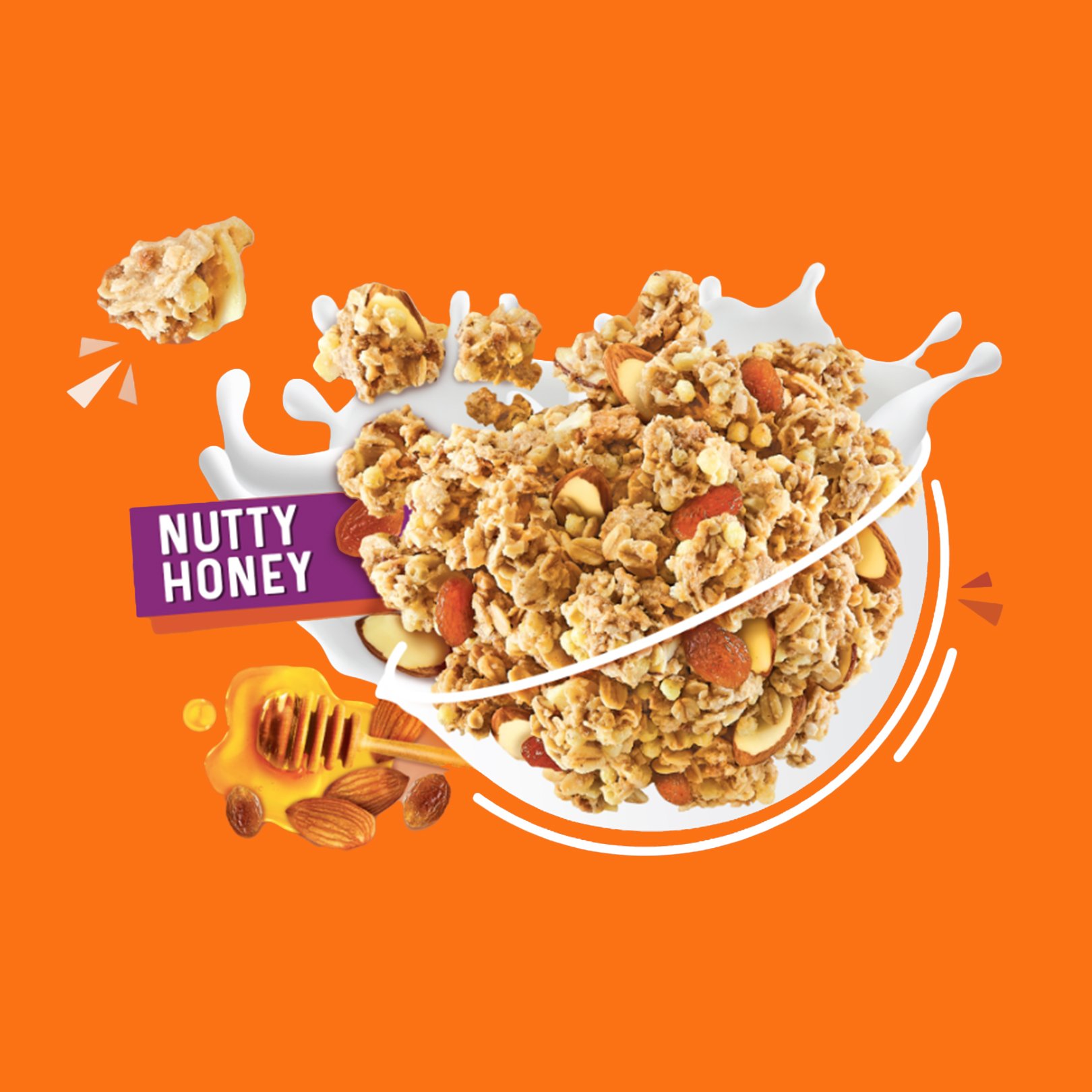
SKU Adaptation

Developed a vibrant packaging system for Nestle's entry into India's competitive breakfast cereal market, emphasizing unique crunch factor through multiple sensory cues while balancing nutritional credibility and family appeal.
Expanding Nestle’s Presence
Nestle, already a powerful force in Indian households through iconic products like Maggi, sought to expand their presence into the fiercely competitive breakfast cereal category. They needed packaging that would help their new multi-grain NesPlus cereals stand out against well-established competitors who had dominated the category for decades. The challenge was significant: create a distinctive visual identity that would communicate the product's unique crunch factor while simultaneously appealing to health-conscious parents and excitement-seeking children.
Champions of Crunch
NesPlus aspires to redefine the Indian breakfast experience by positioning itself as the crunchy, energizing, and nutritionally complete option that appeals to the entire family. By balancing vibrant, playful elements that attract children with clear nutritional information that reassures modern parents, the brand aims to bridge the gap between taste and health considerations. Through distinctive visual language that emphasizes its unique multi-grain crunch, NesPlus seeks to create immediate shelf recognition and product differentiation in a highly saturated market.Visualizing Appetizing Textures
The packaging communicates the product's signature crunch through multiple reinforcing visual cues including breaking letterforms, hyper-realistic product photography, and dynamic "bursting" elements emerging from the central bowl.

Balancing Excitement and Assurance
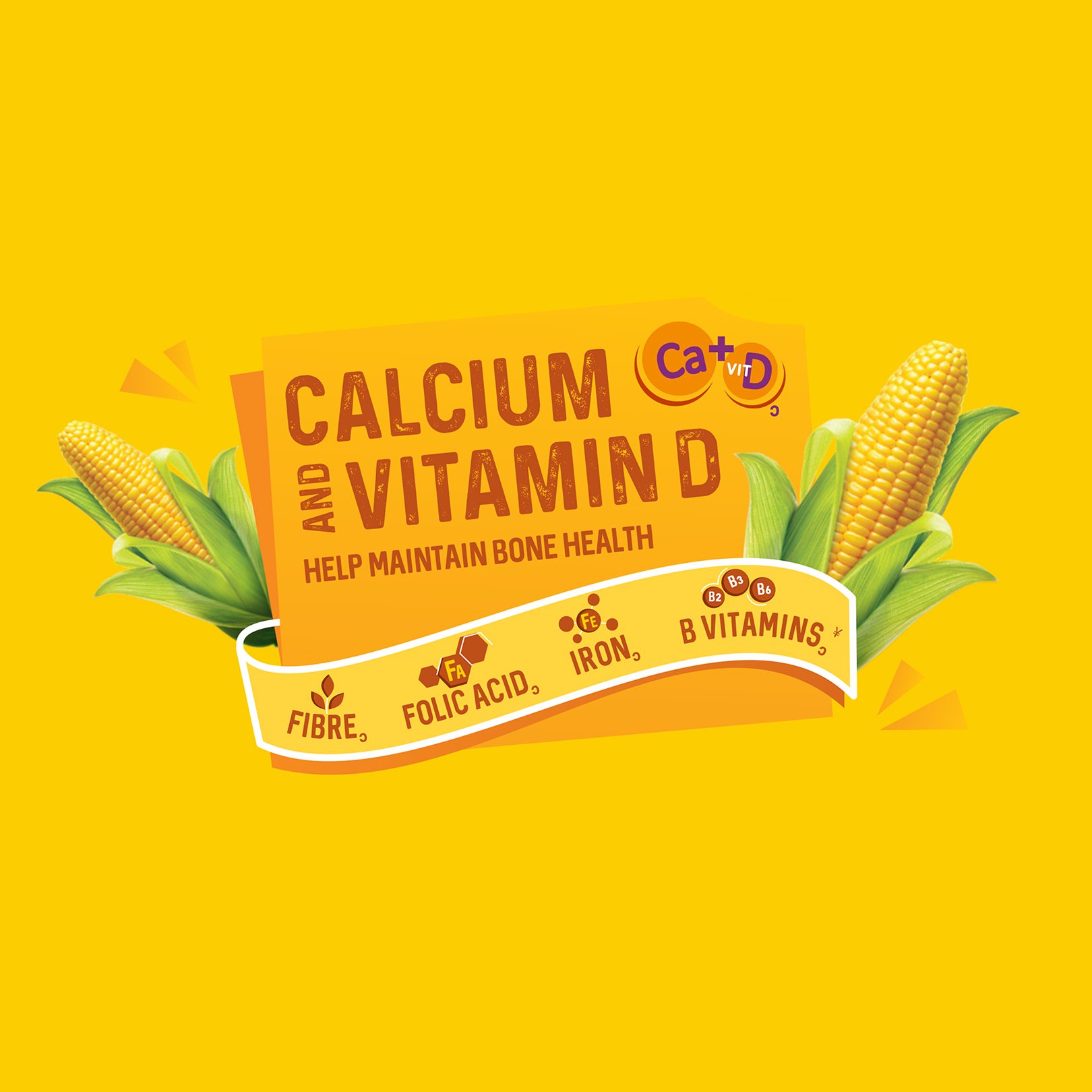
The packaging system carefully balances front-of-pack excitement with rear-panel nutritional reassurance, addressing different family decision-makers.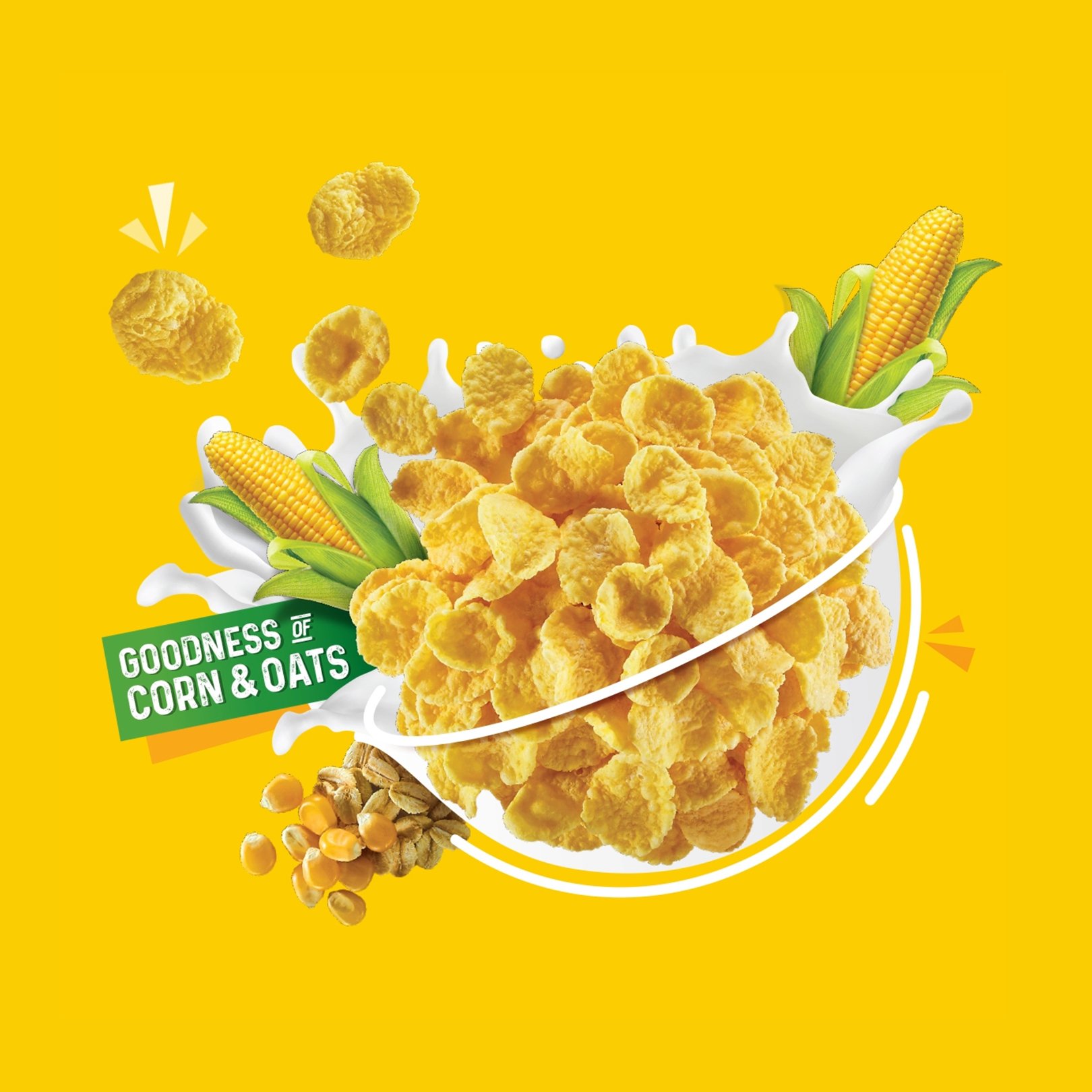
Colour Selection for Maximum Impact
A consistent, highly visible green banner across the top establishes immediate brand recognition, while a strategic colour palette of blue, white and yellow creates vibrant shelf presence. These colours weren't chosen arbitrarily—they represent a fresh morning (blue and white) and energizing sunshine (yellow), connecting the product experience to the breakfast moment.The central bowl element serves as both a familiar cultural reference point and functional showcase for the product. This iconic form immediately communicates "breakfast" while providing a canvas to display the multi-grain product in its most appetizing form. By merging photographic and illustrative techniques within this bowl element, the packaging effectively communicates both sensory appeal and ingredient benefits.
Similar Project