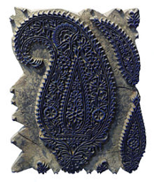
Graphic Design

Keep Calm and Make Art

Keep Calm and Make Art

We at Elephant decided to make the most of being away from each other yet feel connected and be part of a meaningful cause during these unprecedented times.

Every team member was reacting to the new change around them in their own way and had their own thoughts about coping with it. We just gave it a creative outlet by letting them bring their ponderings alive in a poster dedicated to this very unusual phenomenon we’re going through.

Our journey was through reflection, empathy and a touch of wit. We hope our thoughts & feelings align with yours. Because if not anything else, art is always a great healer. Stay safe everyone!

Disclaimer : These posters are created as an expression about the current situation. They have no commercial value. Some of them may be based on an inspiration from popular culture. Ideas expressed are those of their individual creators.

Typefacets: My life measured in fonts

Typefacets: My life measured in fonts

Typeface_Blog_Elephant Design.jpg

Nayantara Pande, Graphic Designer, www.elephantdesign.com

People associate certain things from the past with a particular fragrance, or a place, sometimes food. You taste something and it reminds you of your mother and your childhood, get a whiff of some perfume that reminds you of your long lost love. My love for typography makes me associate my past with fonts.

I have always had a keen interest for Type. Even as a kid, unknowingly, I used to sit on MS Word browsing through fonts, exploring. Typing out some of my story books on Word using these fonts thinking I was doing some extremely important work.

Confession: Comic Sans was my preferred choice for a greeting card or something fancy. Papyrus and Chiller were my go-to fonts for something “exotic”. Precisely the fonts that I cringe at if I see them used somewhere in a poster now, thinking to myself ‘Oh God! What were these people thinking?’ 

So what changed that made me realise the good from bad, the beautiful from ugly, the wrong from right? Going to Design School being the most obvious answer, the gruelling assignments, research, books and sharing knowledge played a big roll.

Which brings me to my first love,

1. Helvetica : The Clichéd Choice

How unoriginal of me to like something that every designer is “supposed to like”. But my first ever type assignment was working with Helvetica - The back breaking job of tracing the font in a sentence to understand mechanical and optical kerning, that too from a Typolog. Which means tracing each and every alphabet separately to form a word and then a sentence. That is tedious!

But I loved it. It is then when I realised typography is what I want to be associated with in future, in one way or the other. When you’re working on something so intensely, you do predominantly tend to notice things related to that in your surrounding. So I started noticing Helvetica used in posters, hoardings, ads, logos. I learnt how to recognise a typeface! One achievement unlocked! That thrill of being able to recognise a typeface is kind of addictive. Gives you an ego boost. So I started digging deeper and reading more, observing more using the typeface more and at the same time exploring new typefaces.

This is when I met my muse,

2. Baskerville : The Classic Beauty

This memory is synonymous with my mentor and teacher Manasi Keni, who realised my love for typography right from the beginning of my first year. Very strict but equally rewarding, I was very lucky to have such a dedicated teacher who went out of her way to help and strive for our betterment. Out of the many fun assignments she gave us, one of them was to present our favourite font. 

I had moved on from Helvetica by then and fallen in love with Baskerville. It’s beautiful curves, contrast and it’s elegance. A serif font with gentle transitions. The serifs gliding into the stems was a treat for the eye. Two of my favourite letters were the uppercase ‘Q’ because of the unapologetically bold yet elegant backward slash and the lowercase ‘G’ for it’s ear and loop. 

This was the first presentation I ever gave in college. I have a very bad stage fright. I was absolutely dreading the day even though I had to present in front my own classmates and friends. I was thinking, why did my teacher put me through this task?! I’d rather go through the agony of tracing the entire Typolog than do a presentation! It is when my knees were shaking and heart pounding that I remembered, while researching for the presentation I found out that John Baskerville, the creator of this font was illiterate. His knack for calligraphy and penmanship and a strong urge to learn about type made him quit his job and start his own press which ultimately gave birth to the first transitional typeface which later was an inspiration for Bodoni and Didot. 

I thought to myself, if an illiterate could achieve such a feat and design his own font, I can most certainly give a presentation. It gave me courage and I got through it. I still get scared to present in front of people, but now I know that, I can do it anyway. This font taught me that where there is passion and dedication, nothing seems impossible. All the qualities that got me through design school and to where I am now. Constantly evolving, constantly searching.

3. Museo and Brandon Grotesque: My 3AM Friends

Your first job is like finally diving into the ocean after swimming in the pool for four years. It is when you find out that most of the things you learnt in college do not apply in “real life”. The basic design sense is there, aesthetics and principles apply, but the rest? In that moment you realise you have SO much to learn still. 

All that ego about being one of the brightest students in class is shattered by the slap of reality that life gives you. Everything is unclear again. But that’s okay! Remember what Baskerville taught you? Perseverance and dedication! Also, some good friends are just what you need! It is here where I came across Museo and Brandon Grostesque. I was aware of Museo back in college but never really got to explore it. These two fonts have proved to be my pillars in tricky situations like a creative block a day before a deadline. 

The have made my logos look sleek and my packaging clean and contemporary. Museo is like a flexible companion providing solutions to all your problems with its Serif, Sans, Cyrillic and Slab Family. Brandon Grotesque is a total hunk with it’s strong yet friendly appearance sitting next to you saying encouraging words while you burn the midnight lamp.

On this quest of life I look forward to many more adventures with my Type friends. I thank those which have taught me important life lessons, some which have disappointed me and some which have supported me.   :)

<  Back to Blog

Mango

Mango

Come summer and we think Yellow! Ever wondered about the inspiration & meanings drawn from this king of fruits in the visual world?  

By Pratyancha Puri

Mango_Blog_Elephant Design.jpg

It’s summer and it’s hot like never before. The one thing that we really love about summers is mangoes1. Yes! mangoes found in different shapes, sizes, colours, and their significance in the vast culture of India and around the world. Well, wondering why I am giving all this gyan2 on a mango that which we already are aware? I am not going to talk about mangoes and its benefits or how good a fruit it is in reality. This article talks about its significance in different cultures and how one of the most familiar motifs that we see around us has a much deeper meaning.

A mango look alike motif composed of two or three concentric compartments, embellished with flowers and other organic elements are called ‘Paisley’. Its name is derived from a town in west

Scotland, Paisley, hub for textiles where Paisley designs were first used, so much that there is a Paisley Museum3embellished with paisley’s first ever used artefacts & paintings.

The symbolic ‘kairi’4 shaped motif, known internationally as paisley continued its appearance in the Indian sub continent even during the fourth period culture or the age of foreign invasion 500 BC – 500 AD. People from west brought their diverse culture and with their culture came Paisley, which later became popular in Kashmir5 and wove its way into the Pashmina6 shawls. Inspired by Persian7 art, the Mughal8 emperor Humayun9 brought in Paisley as a vibrant piece of art & design, which is still seen embedded within different crafts around the Indian sub continent.

Paisley in Art & Design

Wood handstamp for textile printing traditional paisley designs, Isfahan, Iran.

Wood handstamp for textile printing traditional paisley designs, Isfahan, Iran.

Block printing

An ancient art still being practised in different parts of India witnesses the use of Paisley vividly.

Chikankari – Lucknow10

The word Chikankari has been derived from a Persian word Chakin or Chakeen, which means creating delicate patterns on a fabric and creating cloth, shaped with needlework. Paisley is common to block prints and Lucknow embroidery.

Kalamkari – Rajasthan11

Kalamkari is an ancient style of hand painting done on cotton or silk fabric with a tamarind12 pen, using natural dyes. The word Kalamkari is derived from a Persian word where ‘kalam‘ that means pen and ‘kari‘ refers to craftsmanship. Motifs used in Kalamkari vary from flowers, peacock, Paisleys to sacred characters of Hindu epics like Mahabharata13 & Ramayana14.

Kantha – Bangladesh

This type of embroidery is done on old saris stacked on each other and hand-stitched to make a thin piece of cushion & bed covers. Well I guess, that’s what inspired traditional handcraft artisans to come up with furnishing solutions with elegant mango shaped paisley patterns layered onto the fabric.

Handcraft in India is vast. The use of paisley is seen everywhere from Kashmiri Pashminas to Amritsiri Phulkari15 toJuttis16 in Punjab to Khandi17 printing in Nepal. If one notices it is clear that the extensive use of Paisley in Indian art & design is inspired by the Persian culture, and Mughal influence played a big role in introducing paisley to the Indian culture, so much so that we don’t even notice its presence in our day to day life. I am sure I have missed a few but you see, Paisley has so extensively proliferated across the Indian sub continent that it’s not easy to cover everything in one article. I just have one more fascinating story about Paisley to share.

Psy Paisley

Paisley became popular with the gypsies & hippies in the mid and late 1960’s under overt influence of The Beatles18. The style was popular during the Summer of Love 1967. Also, Fender Guitars made a Pink Paisley version of their guitar. Prince19 paid tribute to the Rock & Roll history of Paisley when he fashioned Paisley Pack Records and established Paisley Park Studio, named after his song Paisley Park 1985. Paisley’s significance with growth, fertility and ‘ The Tree of Life’ is probably why it is associated with travel, spirituality & psy, made popular in the 1960’s. The decade moved culturally towards a Rock & Roll swag in terms of fashion and also music, sparking the love affair of Paisley with The Beatles travels during their travel to India with the Guru Maharishi Mahesh Yogi 20 - with John Lennon21 famously having his Rolls-Royce painted all over in Paisley.

Filming a sequence for “I Am the Walrus”

 
John Lennon’s 1965 Phanton v

elecaster in Pink Paisley

Cover art for the single Paisley Park by the artist Prince. 

The cover art copyright is believed to belong to the label, Paisley Park, or the graphic artist(s). Prince & The Revolution “Paisley Park” single 1985.

Filming a sequence for “I Am the Walrus”

John Lennon’s 1965 Phanton v

 
elecaster in Pink Paisley

Rock the Paisley

The famous 1986 revolution was an avalanche of this tremendous fashion trend and Hippies created their own counter culture founded on psychedelic rock and the Hippie dress, which they believed was part of the statement of who you were, included brightly colored, printed  ragged clothes, tie-dyed t-shirts, beads, sandals (or barefoot), and jewellery, all of which served to differentiate them from the “straight” or “square” mainstream segments of society.

So next time you see someone wearing this leaf-like ‘ambi’ as we all call it, decorative colorful pattern, take a moment and think about its rich symbolism and rebellious aura which has kept the charm of this mango look alike motif prevail through the generations and making a strong impact on the culture (more like counter- culture). But the secret behind Paisley s journey through the centuries is its rebellious attitude and its diverse interpretation in our culture and around the world.

References & Notes

1.     Mangoes is the plural for Mango, a tropical pulpy fruit
2.     Gyan, Indian, noun, meaning knowledge, esp. spiritual or religious knowledge
3.     Paisley Museum and Art Galleries, High St, Paisley PA1 2BA, UK (Renfrewshire)
       Kairi is unripe mango, Indian reference, https://en.wikipedia.org/wiki/Kairi
5.     Kashmir, Region in the northern part of India
6.     Pashmina is a shawl made from fine quality goats wool
7.     Persian, relating to ancient Persia or modern Iran or its people, culture or language
8.     Mughal, belonging to Muslim dynasty of Mongol origin founded by the successors of Tamerlane, which ruled much of India from the 16th to the 19th century
9.     Humayun was the second emperor of the Mughal empire
10.   Lucknow is the state capital of the state of Uttar Pradesh in India
11.   Rajasthan, a state in western part of India
12.   Tamarind, the tropical tree which yields tamarind pods, cultivated throughout the tropics and also grown as an ornamental and shade tree or used in Asian cooking
13.   Mahabharata, an India epic
14.   Ramayana, an Indian epic
15.   Amritsari Phulkari is embroidery technique from the Punjab region of India
16.   Juttis is a type of footwear common in North India and neighboring regions
17.   Khandi, coarse cloth from Nepal region
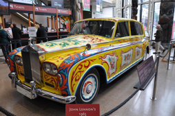
18.   The Beatle are an English Rock Band, 1960’s
19.   Prince, Rogers Nelson, American Singer, song writer, dancer
20.   Mahesh Yogi, the guru who introduced the Beatles to transcendental meditation
21.   John Lennon was an English singer and songwriter who co-founded the Beatles

·       Handemade In India- Aditi Ranjan/ M P Ranjan

·       https://en.wikipedia.org/wiki/Fender_Telecaster

·       https://en.wikipedia.org/wiki/Paisley_Park_(song)

·       https://en.wikipedia.org/wiki/Magical_Mystery_Tour

·       https://en.wikipedia.org/wiki/Rolls-Royce_Phantom_V

Acknowledgments

Ashwini Deshpande, Mayuri Nikumbh, Meenakshi aka menu, Nayantara aka billo, Book- Handmade In India- Aditi Ranjan/ M P Ranjan

PRATYANCHA PURI is an alumnus of Srishti Institute of Art, Design and Technology, Bangalore and is a Graphic Designer at Elephant, a multi disciplinary Design Consulting firm. The views expressed in this article are her own and supporting material provided by her for this blog article.

<  Back to Blog