Identity

Rebranding a business with hundred years of legacy!

Incorporated in the year 1917 as a composite textile mill, Ruby Mills wanted to enter the next century with clear brand positioning, well defined values and a refreshed visual identity.

Ruby Mills teamed with Elephant to showcase its transformation with a new brand identity system.

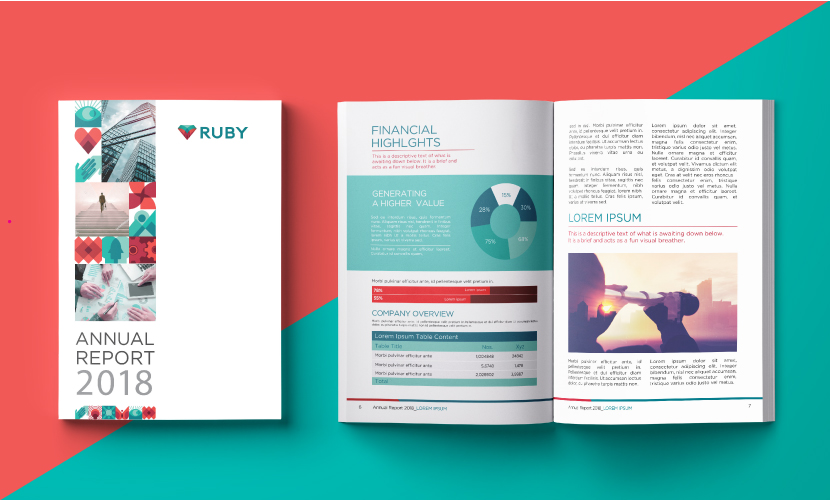
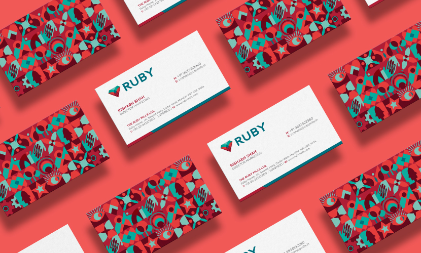
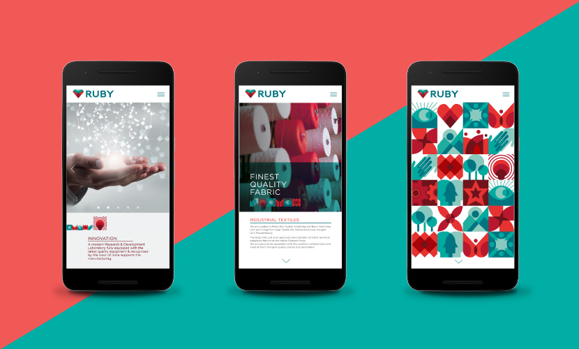
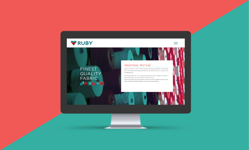
Rebranding a legacy that has been a significant part of India’s journey from fighting for #Swadeshi to proudly #MakeInIndia for over a century was a huge responsibility. We were tasked with realigning the brand for today’s progressive aspirations while keeping the heritage & dignity intact. We drew inspiration from the brand’s core values of innovation, sustainability, ethical and responsible manufacturing and excellence in quality to build an ownable palette of visual expressions for various online & offline communication needs.

We designed a dynamic and vibrant brand-mark that was rooted in heritage yet had a very ownable & contemporary flair. The red heart in the logo stands for passion, one of the brand’s core principles. As per our advice, the brandmark retains only the name ‘Ruby’ while doing away with the full form “The Ruby Mills Ltd” that was present in the earlier visual identity.

New brand-mark and visual language were recently launched at a trade event. Ruby team is in the process of implementing the newly designed language throughout their portfolio and intends to complete the transformation in 2018.

Relaxo Rebranding

Relaxo brings alive the wave of transformation

In the highly dynamic world, Relaxo is one brand that has made steady inroads into the world of emerging India. Whether it is through basic flip-flops that they pioneered in India or the active & young brands like Sparx & Bahamas, Relaxo has led the way for about 40 years. 

To align with the evolving consumer & state-of-the-art offerings, Relaxo has unveiled its rebranding.  

Explaining the reasons behind the rebranding exercise, Gaurav Dua, Executive Director, Relaxo Footwear Ltd said, “ With a strong legacy of success & leadership, it was our responsibility to build a future-ready brand Relaxo. We are an ever-evolving brand that has stayed true to the core values of being reliable & approachable across India. With the rebranding exercise, we have also infused youthful & transformational spirit that is important for the growth of internal & external stake holders of the brand. Elephant, our brand building partners have played an immensely significant role in bringing our core values to life. I can proudly say that we collaborated with the right partners who understood our ethos and our brand's value proposition. They will continue to help us deliver seamless brand experience to our customers in times to come.” 

Ashwini Deshpande, co-founder & director of Elephant, the rebranding agency says “Relaxo rebranding exercise involved validation of current values of being reliable & approachable while seeking newer dimensions to reiterate the brand’s leadership. In keeping with the evolving consumers & new-age products, we have built the new Relaxo visual identity with a wave of positive transformation. 

Brand’s dynamism is embodied by forward slanting letters in Berry Blue with Sunny Yellow swoosh flowing across. The swoosh stands for wave of transformation, optimism and positive growth. 

All brand applications are being created with an ownable visual language and will be evident in the coming weeks across products, print, retail & online presence"

"The new Relaxo visual identity signifies effortless movement towards progress. ” added Mr Dua. 

<  Back to Blog

Tata CLiQ - Branding in Ecommerce

And this is how a contemporary ecommerce brand gets launched! 
Tata CLiQ selfie moment of Mr Cyrus Mistry, Mr Noel Tata & Mr Ashutosh Pandey. 

Brand naming, brand identity, visual language, visual assets by Team Elephant!
 

MTR foods - new identity, packaging & story

About the refreshed MTR visual identity: 

MTR, the brand with the outstanding legacy, global outlook and millions of happy consumers was looking at realigning its visual identity to the core purpose of rooted transformation. 

We decided to retain the basic visual equity of red roundel with white fence and worked on improving the typography for ease & clarity in reproduction across variety of substrates & sizes. We created a bold sans serif brand-mark for cleaner & contemporary presence. We also reduced the picket fence elements around the logotype to de-clutter the identity. Natural ingredients being the core of all MTR products,  a fresh green was added to the roundel to announce meaning & mission of the brand.

About the packaging strategy & design: 

With changing roles within new family structures and new working patterns, women are not burdened by the need to prove their expertise in kitchens. They see their role as a family manager & look for ways to keep the family happy & healthy. Buying ready to cook, ready to eat & even ordering-in food is seen as a great way to ensure quality time with family. They are open to experimentation & introduce their family to new cuisines with ease. But they want to do this with knowledge. They want to be aware. They want to know the source, the ingredients, quantities, accompaniments, consumption occasions? basically everything. 

So when we were given the responsibility of designing packaging for the entire range of MTR products, we decided to dive deep into finding out what the changing consumer will be delighted with. 

With a portfolio as large as 140+ products, first thing to do was to discover what works as an equity for MTR and preserve or even enhance that. Next step was to question & evaluate existing information architecture & remove redundancies to make way for cleaner, user-focused bytes. Though it sounds like the most obvious thing to do, we brought in a strong product nomenclature that would catch the eye and remove any ambiguity. We decided to retain the strong red associated with the brand and build upon that by devising a colour code for each category for ease of purchase. We created three strong visual pillars for the product portfolio ? pure authentic, confident contemporary and everyday celebrations. These moods were created within the master visual template to further accentuate the brand expertise and its involvement at every need and stage of the modern consumers' life. Since products like Sambar are available in multiple formats like masala powders, ready-to-cook mixes & ready-to-eat meals, we brought the category descriptor right up followed by the consumption occasion & announcements like time for cooking, whether anything needs to be added etc. A product shot is one of the most important factors for an impulse purchase in foods and our team planned each shot meticulously, keeping in mind time of the day, occasion and accompaniments. Authenticity was built through right serving sizes, ingredient depiction and serving bowls. 

Since there is lot of curiosity about food from other regions, we have added a very interesting background of region of origin for every dish. It is a subtle addition, but one we hope will be discovered to the delight of consumers and strengthen the brand's expertise pan India. 

http://www.campaignindia.in/Article/401709,mtr-foods-adopts-a-new-identity.aspx

Sanjay Sharma – CEO, MTR Foods, said, “Today’s consumers have evolved quite a bit – both in terms of their food preferences as well their consumption patterns. They prefer Indian food but perceive it to be cumbersome and time-consuming. Our brand is the flag bearer of innovative, easy-to-make, nutritious and authentic-tasting products that take away the time dimension from cooking and make Indian food more accessible to consumers."

He added, “However, as a brand we needed to change to reflect who our key consumers are today. While the new brand identity better represents where the company is today, our detailed growth strategy will make MTR ready for the future. This is the new beginning for MTR Foods and we are confident that the changes we have undertaken and our new brand identity will make us a part of our consumers’ everyday lives.”

Ashwini Deshpande, co-founder and director, Elephant Design, noted that the re-branding exercise involved defining renewed purpose, creating visual identity and packaging communication, evolving portfolio strategy and packaging design for over 120 products, sold as 350 SKUs. 

<  Back to Blog

Automotive brands in India : Matter of pride, passion & purpose


Automotive brands in India : Matter of pride, passion & purpose

What should be the attitude of an automotive brand in the context of Indian sub continent? Regional economy and people needs drive the way automotive brands emerge & behave.

By Ashwini Deshpande along with Ashish Deshpande

World over automotive brands have stood for finesse, luxury, hi end functions, if not more than often, for speed, power & vitality. In India, majority of transportation solutions serve the purpose of work commutation, people & goods transporters, and most importantly as a means of livelihood. Whether global or Indian, automobile brands get a cult following and people take pride in the badge of their choice.

It is important that brands are targeted towards the people who are going to be experiencing them as products & services. Brands need to reflect their aspirations, connect on an emotional level and build confidence by associating positively.

When a vehicle becomes your lively hood, people look for answers on more than one axis of their lives. The design team was faced with a challenge to create the visual identity with all its manifestations for Eicher Polaris, who recently launched India’s first multi-purpose personal utility vehicle. The answers lay in understanding people who would use these vehicles. The progressive Indian entrepreneur has no concept of boundaries as he is often multi-tasking personal chores with business needs. He is living every moment & making the most of it.

This range of vehicles is named “Multix” reflecting its extreme versatility aligned with the users’ lives. As a ground-up innovation, Multix is designed as a concept that brings about a positive multiplier in the owner’s life, be it home, business or power.

Multix brand is inspired by the local regional concept of zindagimultiplied” (translates as life multiplied) as a visual language clue. The badge has been designed as a perfect geometry, and has layers to discover & identify with the person for who the vehicle will be a livelihood partner. At the first glance it is a happy bloom in cheery yellow, which is also the primary brand colour. It also serves as an elegant enclosure to the multiplier symbol, which really is the essence of this brand. Multix brand is designed to be an enabler for unlocking & multiplying potential opportunities resulting in prosperity for the target consumer.

The answer again lay with the way people saw the brand highlight over a score of well-settled existing truck brands. The word, “Bharat” (India ) brought around a sense of pride with the commercial vehicle operators, made them feel special that a truck has been created for Indian needs. “Benz” infused that sense of technical expertise & confidence of a global brand.

Bharat Benz typestyle demonstrates expertise, and is contemporary with an emphasis on the word BENZ. The badging is a balance of legacy of shield & wreath from the older Benz identity and clean circular forms representing the global nature of the brand.

Adding to the Benz palette of black, grey & steel, the design team decided to bring in warmth to connect with people through a brilliant deep red. This also helped pushed the style & power quotient across retail & communication.

Old Bajaj Auto Ltd Identity

Old Bajaj Auto Ltd Identity

 People like change not due of its novelty but because the change speaks to them. When brands connect, they tend to ease into the mind space of the users. Connect in such cases is not just a seasonal trend, rather, an endearing sense of attachment.

Next time you re-look at an automotive brand in India, look from the eyes of its users’, feel from their heart and understand how they see their future reflected in the brand of their choice.

ELEPHANT is India’s Best Design Practice (ET-Brand Equity 2012-2014 ranking) with a multi-disciplinary experience of 25+ years having presence in India & Singapore and has been transforming brands, organizations & businesses using Design led Innovation.

Elephant has helped build two significant automobile brands in its rich history of 25 years; rebranding of Bajaj Auto and then a distinction of being the only design consultancy outside Germany to have created a new brand for Daimler Group called Bharat Benz for their India-centric trucks. Multix by Eicher Polaris is the newest bloom and makes Elephant perhaps the only team in India to have three automobile brands on the road.

ASHWINI DESHPANDE is a Visual Communication Designer, Co-founder & Director at Elephant. An alumnus of National Institute of Design, Ahmedabad, she is a prolific speaker at several international conferences & workshops on design. Ashwini has been a jury on Spikes Asia, Design Lion Cannes and Design for Asia Awards. She is a subject expert on Brand Identity Programs & Package Design and known for her highly effective work for Britannia, Paperboat, Nirlep, Grandmaster, P&G and Piramal Industries.

ASHISH DESHPANDE is an Industrial Designer, Co-founder & Director at Elephant. An alumnus of National Institute of Design, Ahmedabad, he is a keen Design Thinker, a member of India Design Council & Jury for India Design Mark. He has worked on several design programs, notably, Titan Eye+, Bajaj Auto, Probiking, Ceat Tyres, Axis Bank, ICICI Bank, Krusty's, Symphony, Paperboat amongst others

<  Back to Blog

Creating New Auto Brand

Creating new auto brand_Blog_Elephant Design.jpg.jpg

Automotive brand for India’s first Personal Utility Vehicle

While developing India’s first multi-purpose personal utility vehicle, Eicher Polaris approached Elephant to create the visual identity, it’s 3D avatar & livery.

The range of vehicles is named “Multix” after its extreme versatility and is being launched across 30 cities in India starting Jaipur this month.

As a ground-up innovation, Multix is designed as a concept that brings about a positive multiplier in the owner’s life, be it home, business or power.

Multix brand is inspired by the Indian concept of zindagi multiplied” aesthetics. The badge has been designed as a perfect geometry, and has layers to discover & identify with. At the first glance it is a happy bloom in cheery yellow, which is also the primary brand colour. But if you look again, it is an elegant enclosure to the multiplier symbol, which really is the essence of this brand. Multix is designed to be an enabler for unlocking & multiplying potential opportunities resulting in prosperity.

Typography is clean & contemporary, yet the lower case “m” starts the conversation on a friendly note with emphasis on technology & ending by reiterating the multiplier effect.

Colour palette is largely built around bright colours evident everywhere in India.

Elephant has helped build two significant automobile brands in its rich history of 25 years; rebranding of Bajaj Auto and then a distinction of being the only design consultancy outside Germany to have created a new brand for Daimler Group called Bharat Benz for their India-centric trucks. Multix by Eicher Polaris is the newest bloom and makes Elephant perhaps the only team in India to have three automobile brands on the road. 

MultiX4.png

Elephant is India’s Best Design Practice (ET-Brand Equity 2012-2014 ranking) with a multi-disciplinary experience of 25+ years having presence in India & Singapore and has been transforming brands, organization & businesses using Design led Innovation.