Designing for Indian RTE and RTC foods in western markets.
Elephant Design reimagined Tata Raasa packaging via a culturally-rich-yet-modular visual system, delivering authenticity, clarity, and regional differentiation for Indian consumers abroad.

Customer Appreciation
for the team's authentic, atypical pack design
A typographic logo

Competitor and industry analytics 
Elephant Design developed a differentiated packaging system for Tata Raasa that communicated the complexity of Indian regional cuisine while breaking away from clichéd Indian food category codes in global markets.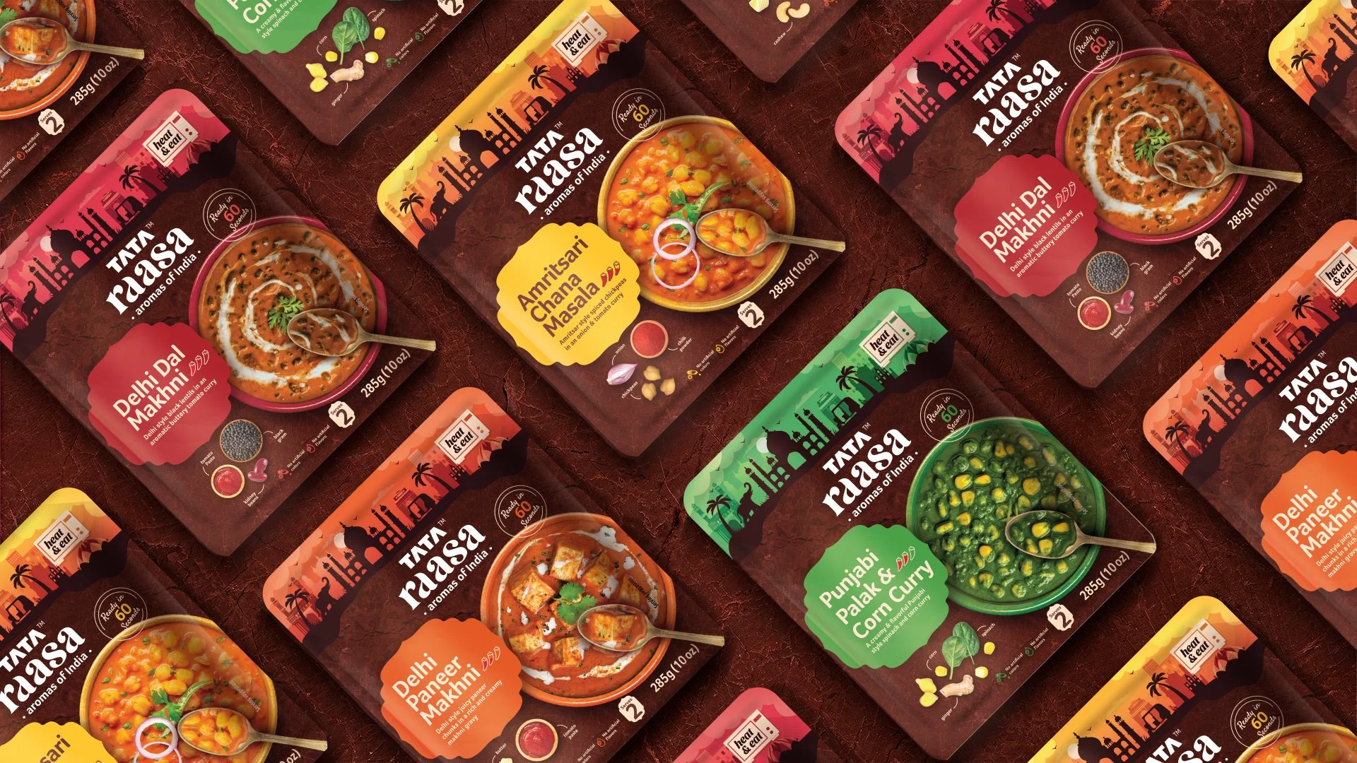
The Raasa Theory
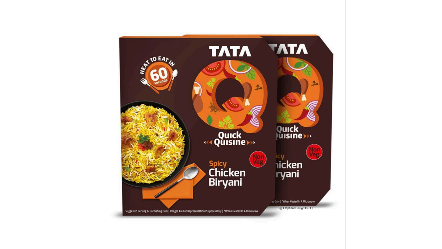
Tata Raasa is a ready-to-eat and ready-to-cook food brand from Tata Consumer Products, created to bring the depth, nuance, and authenticity of Indian regional cuisine to international consumers. Entering a fast-growing yet homogenized global Indian foods segment, the brand sought to showcase real recipes, preservative-free cooking, and culinary complexity without resorting to stereotypical visual cues. The initial challenge was to establish credibility, distinctiveness, and clarity across a wide range of regional dishes while building a scalable packaging system suitable for global retail environments.Redefining Convenience for nostalgic Indian delights
Tata Raasa aspired to reposition Indian convenience food as rich, nuanced, and culturally grounded rather than simplified or generic. These aspirations translated into a design strategy that foregrounded regional storytelling, ingredient authenticity, and ease of navigation without visual clutter. The resulting packaging elevated the brand’s global positioning, reinforced trust in quality and provenance, and created a distinct shelf presence that set Tata Raasa apart from conventional Indian ready-food offerings.A Rooted Globalism
The design language deliberately moved away from overused Indian motifs and ornamentation, opting instead for a refined, contemporary aesthetic rooted in cultural cues rather than clichés.
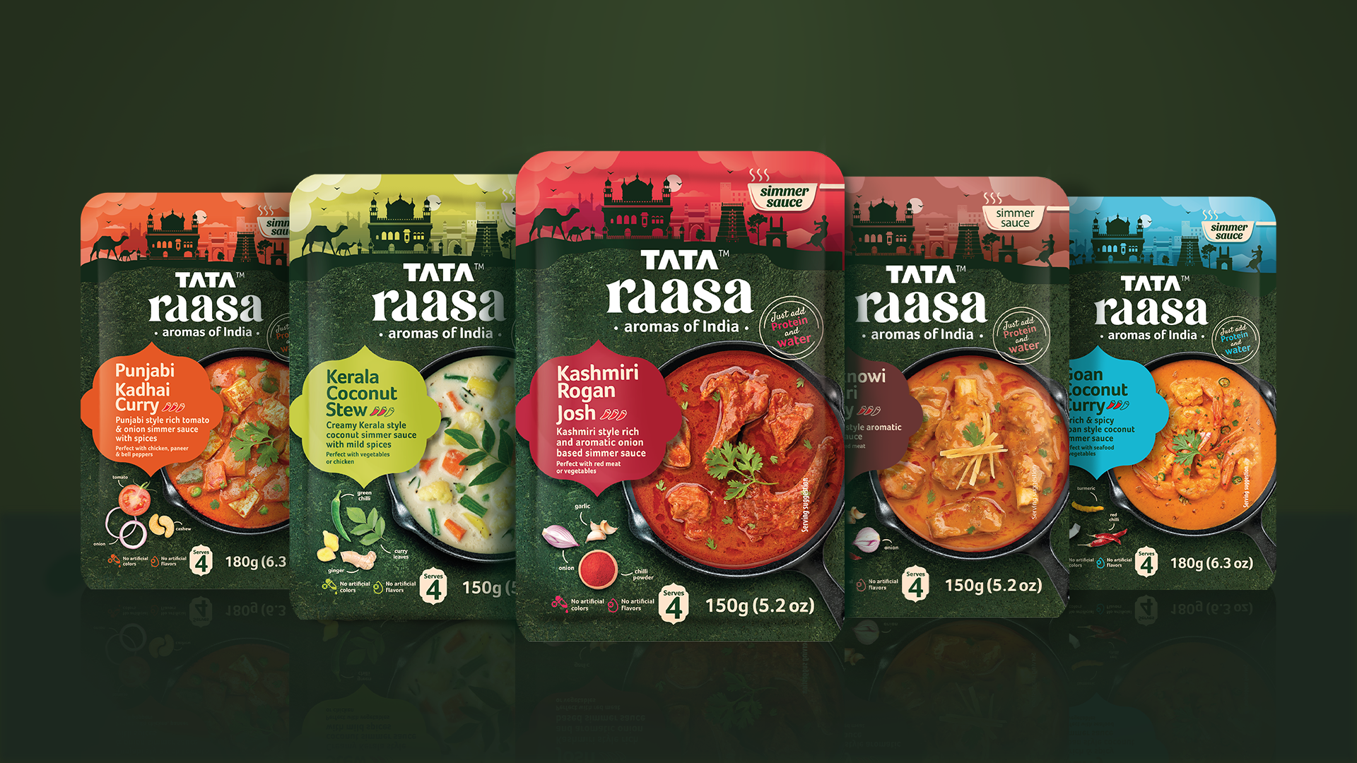
Colour became a primary structuring tool, with brown anchoring the RTE range through associations of warmth, readiness, and Indian kitchens, while green signified freshness and ingredient-led cooking for the RTC range.
Typography, layout, and framing worked together to balance authenticity with modernity, creating a system that felt globally relevant yet unmistakably Indian. Packaging That Echoes Clarity
Each flavour variant was assigned distinct visual cues derived from the dish itself, allowing for easy differentiation while maintaining overall brand cohesion. Colour accents, titles, and hierarchy ensured quick recognition without overwhelming the pack.

Variant markers were placed strategically to aid shelf navigation, helping consumers intuitively identify flavours, spice levels, and preparation styles at a glance. This approach balanced storytelling with functional clarity.
Beyond Mainstream ‘India’
Regional stories were embedded directly into the packaging system, highlighting India’s culinary diversity beyond mainstream perceptions.

Architectural enclosures and naming conventions reinforced authenticity.

Each pack subtly educated consumers through regional cues, ingredient highlights, and preparation icons.

Together, these elements transformed the packaging into a guided journey across Indian cuisines. 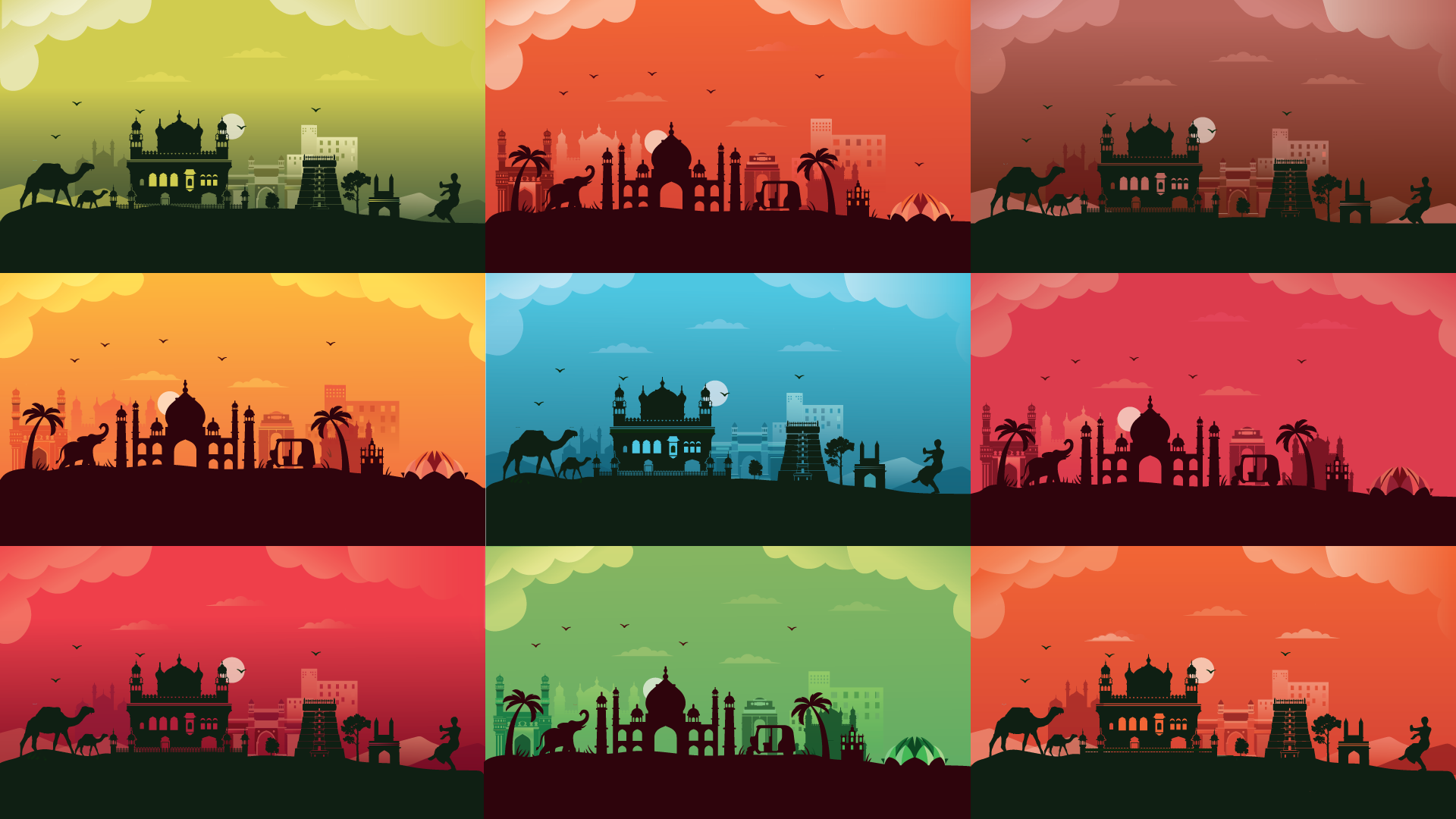
Similar Projects