Establishing a robust RTE packaging structure
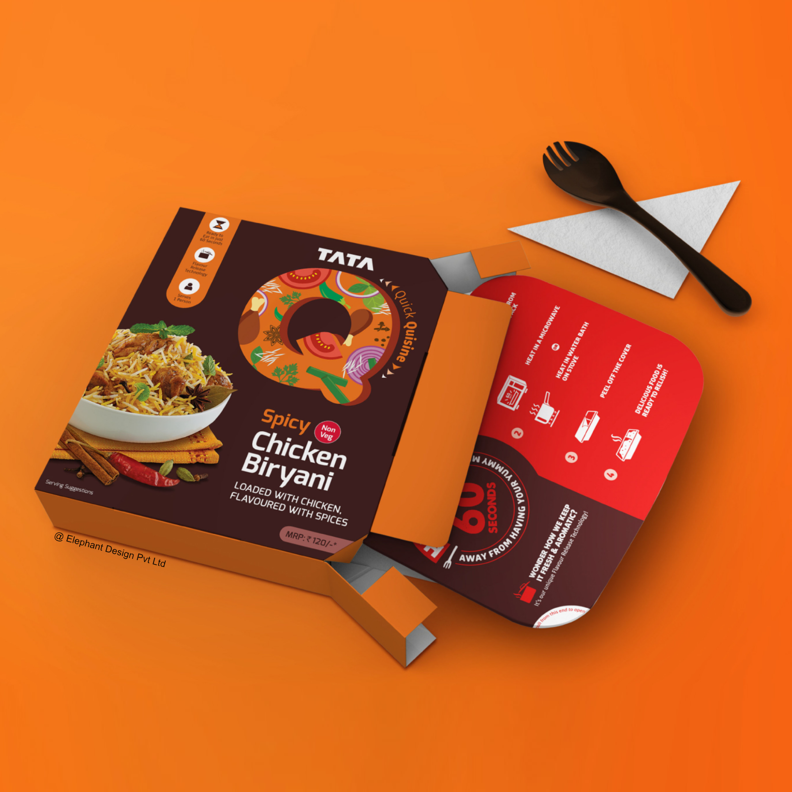
Elephant Design created a functional carton-based packaging system, delivering distinctive brand recognition with enhanced convenience features.
Shelf Breakthrough
Rapid category expansion
Developed flexible brand identity system

Created color-coded variant differentiation

Integrated eating functionality elements

Designed intuitive preparation instructions

Established adaptable visual architecture
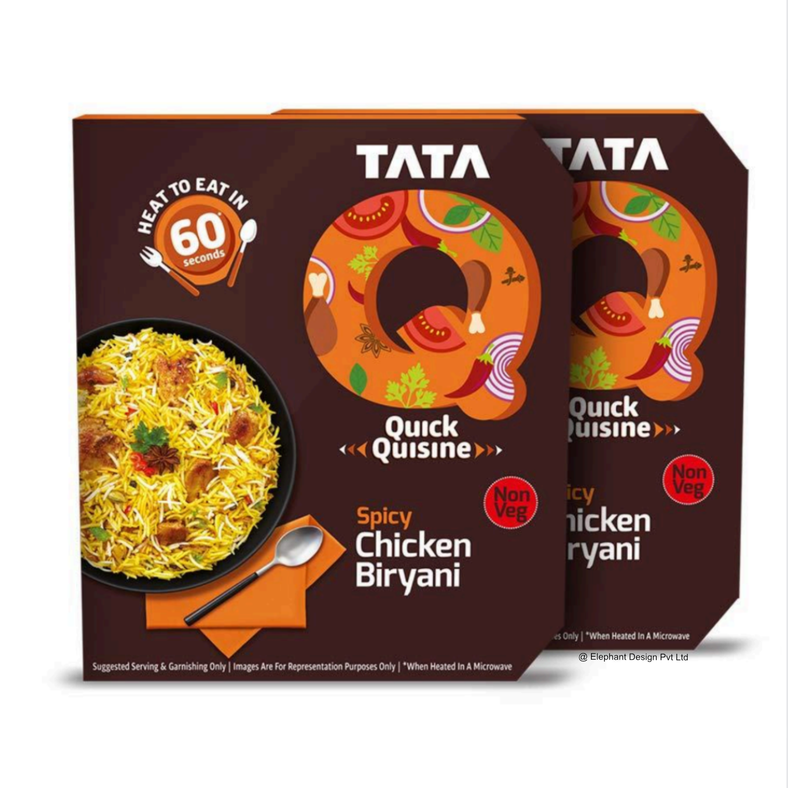
The comprehensive packaging system leverages a distinctive 'Q' element that adapts to each variant while maintaining clear brand recognition, combining restaurant-style food imagery with functional features that enable eating directly from the packaging.RTE Revolution Challenge
The ready-to-eat (RTE) food segment has historically faced unique challenges in the Indian market despite global success elsewhere. Cultural attachments to home-cooked meals, widespread availability of delivery options, and stigma around convenience foods created significant market barriers. Ratan Tata envisioned entering this space as early as 2009, and by 2012, Tata Q moved beyond concept stage. The brand aimed to overcome industry challenges around packaging, taste authenticity, and freshness through innovative technology and design approaches. Tata Q approached Elephant Design to develop a packaging system that would break from conventional "home-style" messaging to focus instead on functional benefits and transparent ingredient communication. A Millennial Meal Solution
Tata Q positioned itself directly toward time-constrained millennials and working mothers seeking convenience without sacrificing quality. The brand aspired to create an alternative to quick-service restaurants through packaging that would be engaging, functional, and distinctly contemporary. The strategy embraced transparent communication about preparation and ingredients while focusing on the "restaurant-style cuisine at home" promise. As the COVID-19 pandemic dramatically shifted dining habits and accelerated home consumption, Tata Q aimed to rapidly expand its product portfolio while maintaining consistent brand recognition across diverse food categories—from pasta dishes to kebabs and rotis. The Q Quotient
The flexible 'Q' design element transforms for each variant by incorporating ingredient-specific colors and imagery, creating a dynamic yet consistent brand marker. This distinctive approach enables immediate product recognition while clearly differentiating between flavor variants through visual cues. 


Similar Project


