Visual identity redesign for legendary Indian beverage
Elephant Design revitalized Campa Cola through contemporary visual identity system, delivering a legacy brand ready for modern markets.
10% market share
Within 18 months in several Indian States
Brand strategy development and consumer research

Visual Identity

Marketing Collaterals

Packaging System

Revived an iconic Indian soft drink brand acquired by Reliance Consumer Products, balancing nostalgic heritage with contemporary appeal for today's ambitious young Indian consumers.Indian Cola Legacy
Campa Cola emerged when multinational brand Coca-Cola was expelled from India, quickly becoming a cultural icon with its distinctive red and white logo and "The Great Indian Taste" slogan. Despite its popularity throughout the 1980s, the brand faded during the 1990s liberalization when multinationals returned. Recently acquired by Reliance Consumer Products, Campa Cola needed a comprehensive rebrand to reclaim its position in the competitive beverage market while honouring its 50-year legacy.
Contemporary Indian Pride
The revitalized Campa Cola aims to connect with young, resourceful, and ambitious Indian consumers who seek brands reflecting their drive and purpose. The brand aspires to represent modern Indian identity—unapologetic, confident, and globally ambitious while remaining authentically local. By balancing nostalgic elements with contemporary design, Campa positions itself as a homegrown challenger that celebrates Indian taste preferences while offering the flexibility to expand into new product variants for today's health-conscious market.Typographic Impact
The team chose marker font for the logotype, which solidifies Campa’s image of a rebellious brand stepping into the big leagues. The arrowhead element on the ‘A’ evokes this feeling of an uplifting beverage.
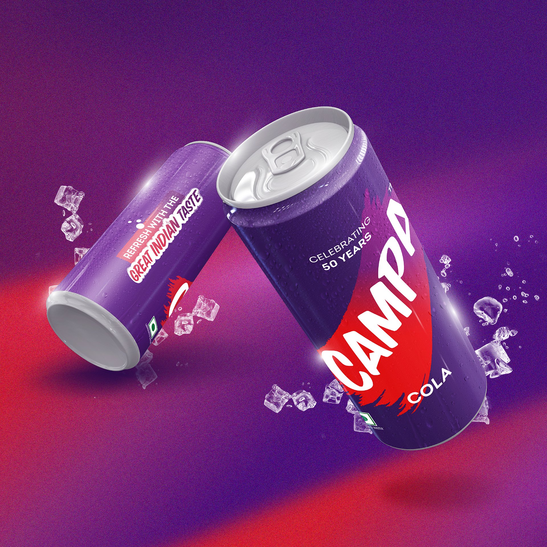
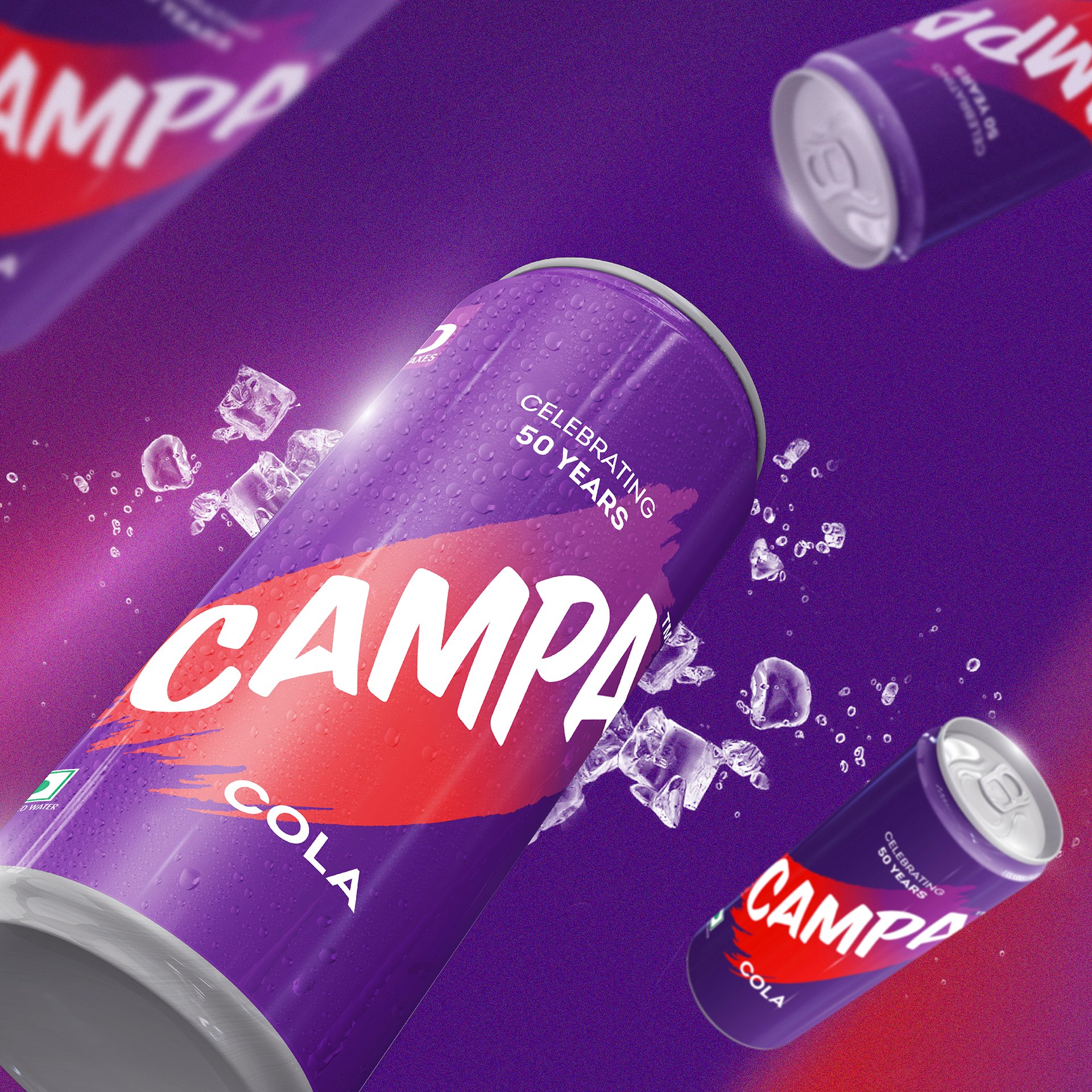
Purple Rebellion Meets Red Heritage
Our re-design echoes the brand’s hero archetype, where the use of unconventional deep purple is complemented by a streak of bold, category-defining red – something we call the ‘swoosh’. The use of purple strikes a balance between category-dominant blues and reds, while its transition toward red is included to not alienate regular cola consumers that resonate with conventional options. Purple’s associations with power, ambition, creativity and magic tie into the theme, while giving the packaging a premium look-and-feel.
Celebrating Contemporary Indianness
Breaking category conventions, Campa Cola adopts a deep purple primary palette complemented by a streak of category-defining red. This strategic colour choice positions the brand between traditional cola colours while imbuing it with associations of ambition, creativity, and distinction: qualities that resonate with the target audience.

While the visual identity revamped the brand, key messaging ties it firmly into the story of an emergent India. Campa’s revival shows Indian consumers the power of heritage brands and why they’re loved, illustrated by the presence of ’50 years of celebration’ and ‘great Indian taste’ in the same organic type.
Flexible System for Future Growth
The visual language creates an adaptable framework allowing seamless expansion across variants like Campa Orange and Lemon, each with distinctive color swooshes that maintain brand cohesion. This systematic approach enables the introduction of contemporary options like healthier variants while preserving the core brand identity that celebrates "50 years of The Great Indian Taste.
Similar Project