
Refreshing identity and signage for India's leading retail brand.
redesigned the brand's identity to improve legibility and visual appeal across diverse media formats, by introducing an adaptive facade logic and rigorous system. the polished identity is consistent across 1,000 stores and counting.
Elevated the Brand
Across 1000+ Stores
Logo refinement and proportion system
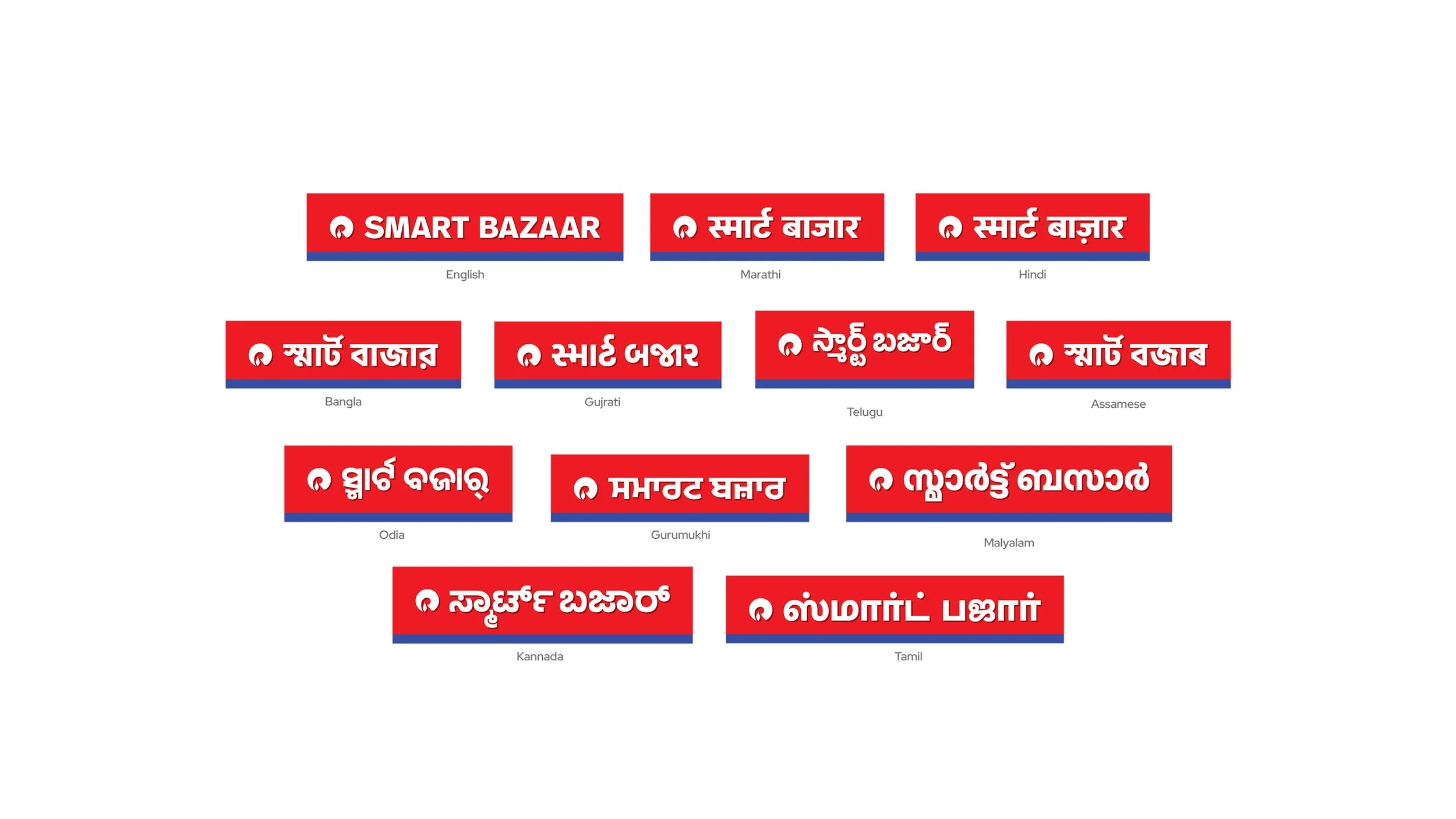
Harmonizing Signage Across Different States, Languages and Regulations
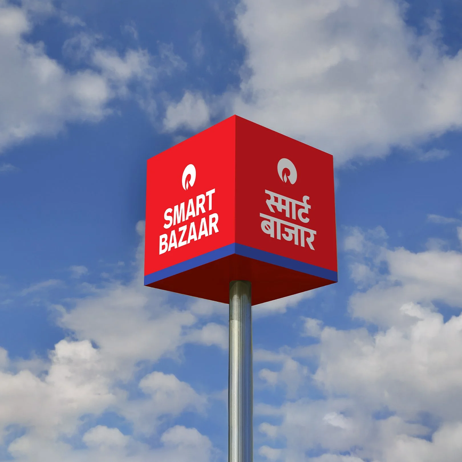
Multi-format signage guidelines 
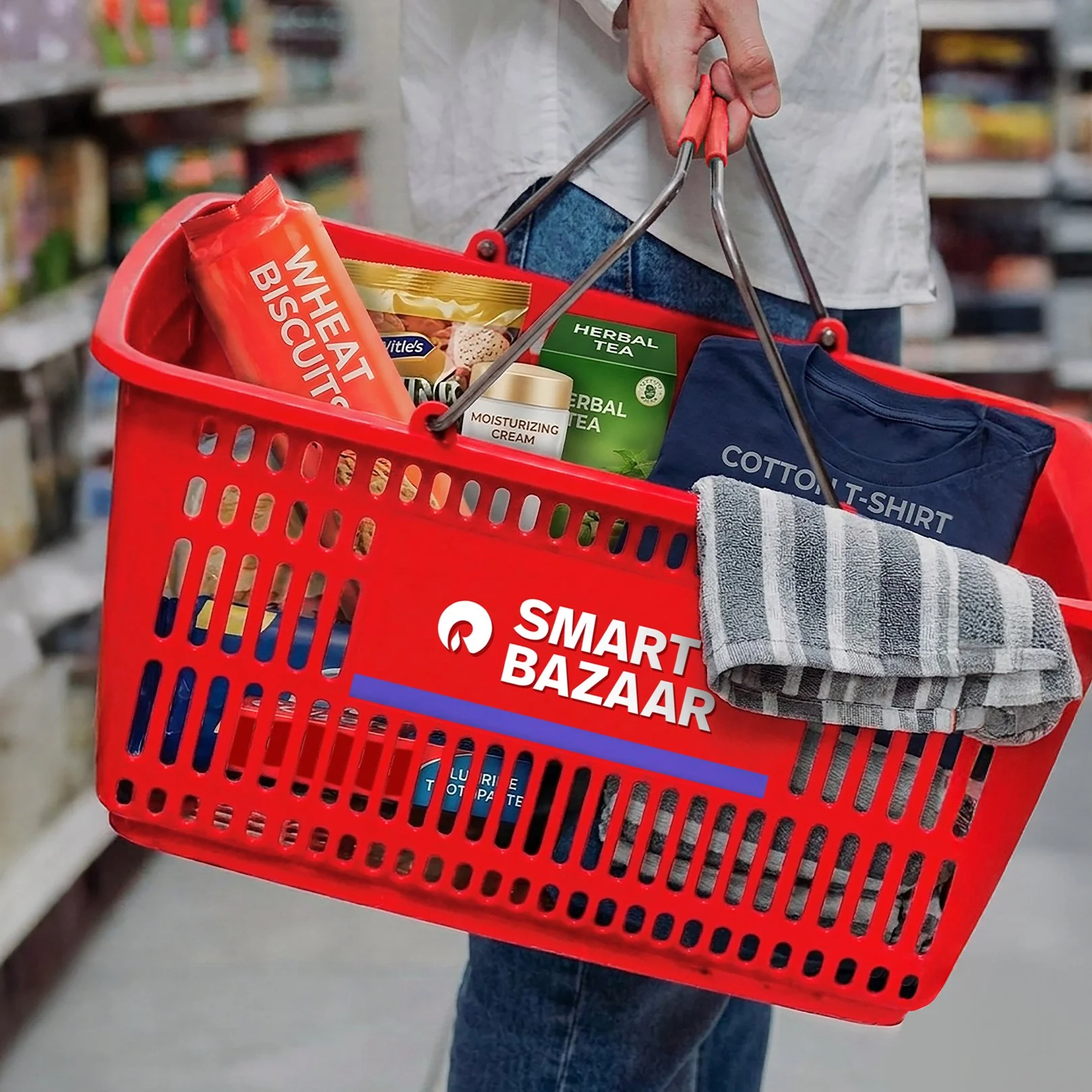
Across stores, the refreshed identity reads sharper and more controlled, turning inconsistent storefronts into a unified, high-visibility retail presence that works at real-world scale.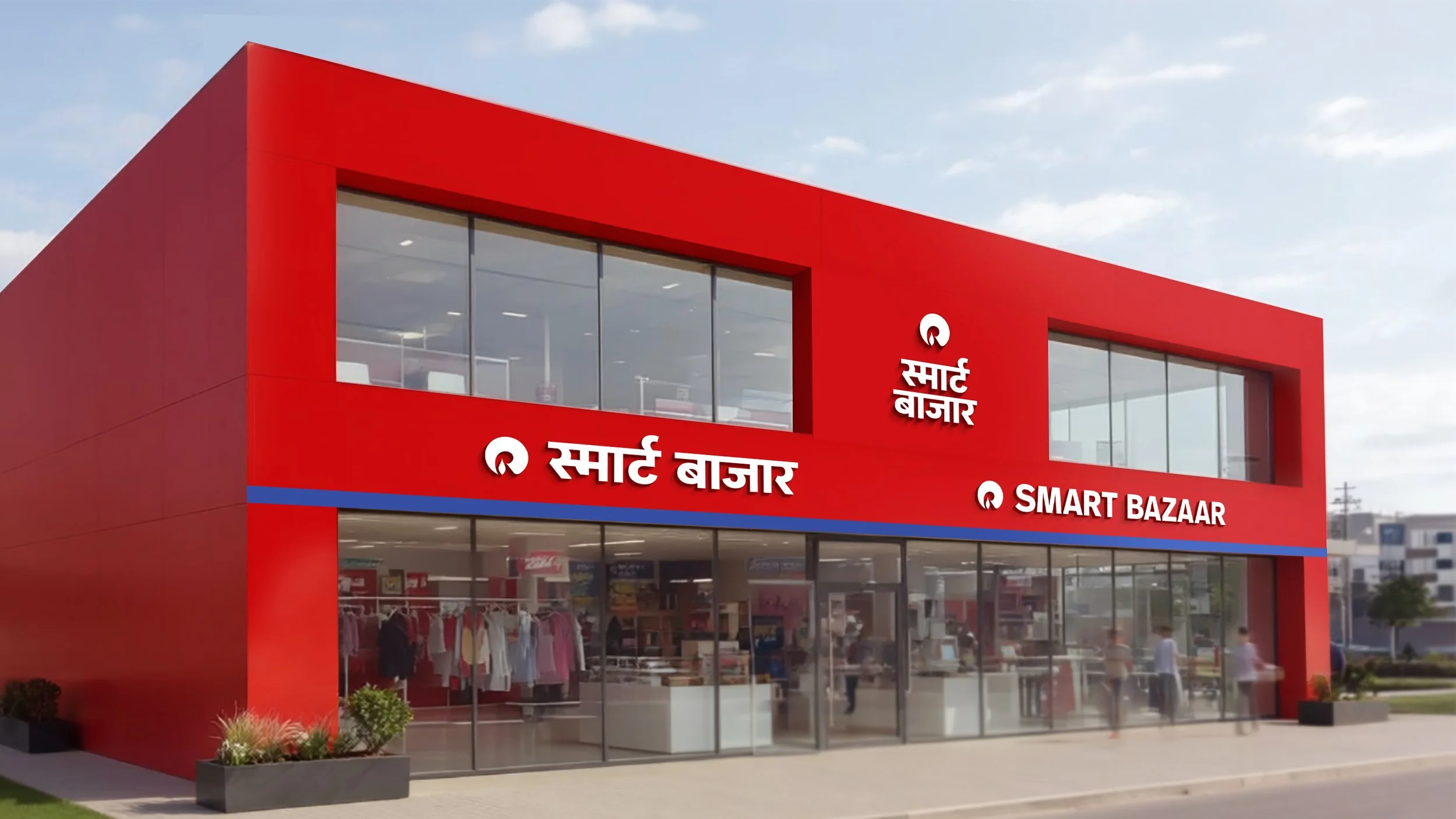
Retail at Tremendous Scale
Reliance Smart Bazaar is part of Reliance Retail, one of India’s largest and fastest-growing retail networks, serving millions of customers across formats, categories, and geographies. At this immense scale, the brand lives across thousands of storefronts, each shaped by local architecture, regional language requirements, and distinct on-ground constraints.

Positioned as a value-driven hypermarket, Smart Bazaar brings together groceries, daily essentials and general merchandise in a single, accessible destination for Indian households. The core identity had strong recall, but its execution needed a more robust system to perform consistently across diverse environments while retaining familiarity for returning customers.. 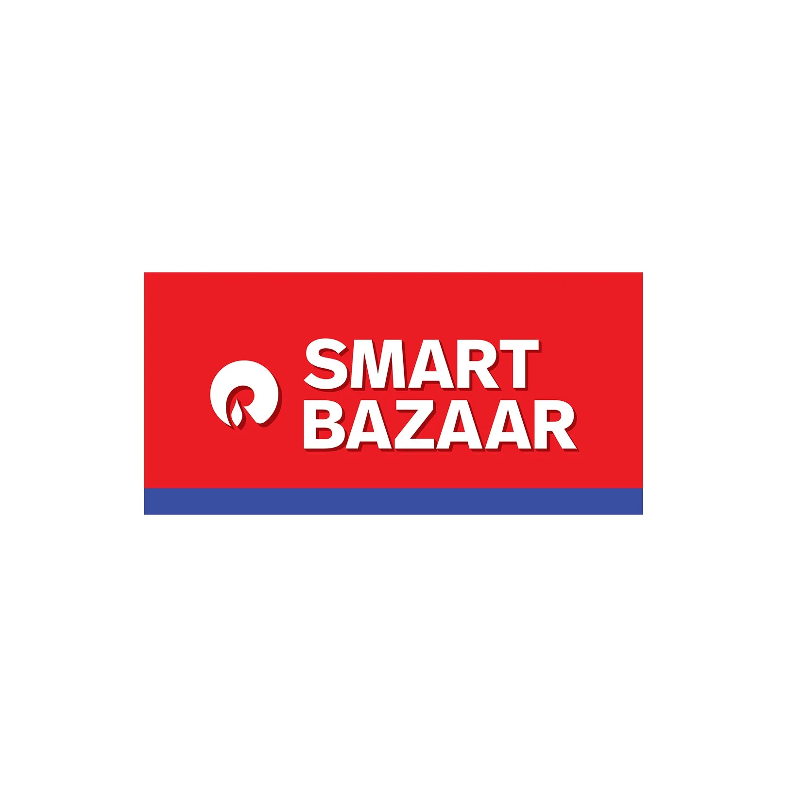
One Brand, Everywhere
The objective was to strengthen Smart Bazaar’s presence across its expanding network without disrupting what customers already recognise. We approached this as a systems problem, building a façade and identity framework that adapts to different formats while maintaining a consistent visual core.

The solution balances flexibility with discipline. The logo responds to proportion, regional scripts integrate seamlessly and the blue band anchors every storefront with clarity. Together, these elements ensure the brand remains legible, visible and cohesive across locations, reinforcing trust through consistency while supporting continued growth.
When Contrast Starts Working
The colour system was recalibrated to perform in real retail conditions. The blue band anchors the identity across façades instead of fading into the background. For legibility, we aligned typography across English and regional scripts in weight, spacing and proportion. The system removes friction and lets the brand register instantly across environments without losing familiarity.
From Feed to Facade
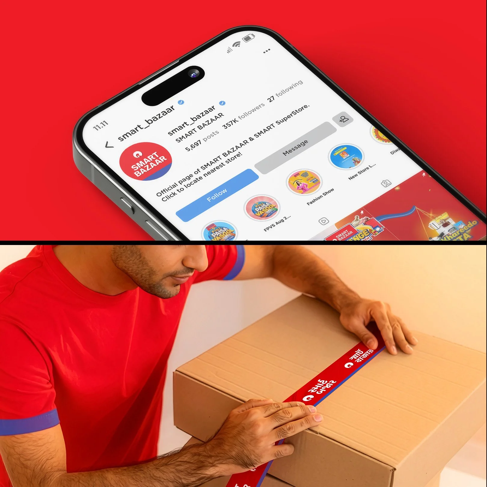
We treated every touchpoint as part of a single, fluid system rather than separate executions. The refreshed logo is flexible but maintains consistent proportions between symbol and logotype. It adapts: whether on an Instagram feed, a delivery vehicle, or a roll of packaging tape. It’s instantly legible across surfaces without losing shape or intent.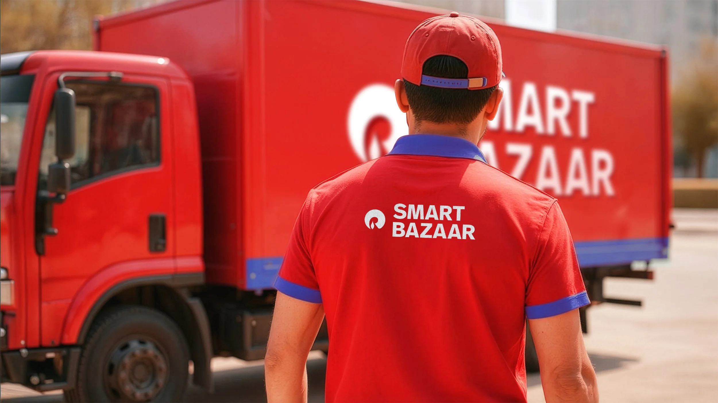
Sharpening What Already Exists
Instead of looking at this from a lens of replacement, we simply brought the identity back into focus. The roundel feels tighter. The spacing breathes better.

The balance holds across sizes. You recognise it instantly, but it no longer struggles in application. That same thinking carries into the façade system.

The logo shifts intelligently between formats depending on structure, while the blue band runs consistently across every storefront. The brand adapts to its environment, but never loses itself.
Insight-Driven Hierarchy
Consumers are constantly moving, scanning, deciding. The identity had to meet them at that pace. We strengthened contrast, tightened proportions and gave the blue band a clear role so the brand locks in faster. On a moving cart or a digital screen, it cuts through the noise long enough to register. That split second matters.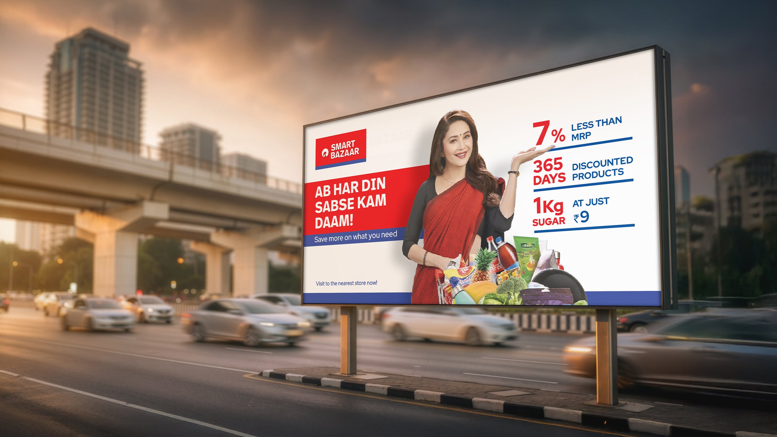
Similar Projects

