
Brand refresh and collaterals for Asian Paints Berger's international forays.
Elephant Design created a Middle East specific identity using the Artelier concept, elevating the brand’s perception and premium appeal.
Brand Morphosis
Commands Regional Attention
The Asian Paints-Berger UAE design system

Grid and layout frameworks

Shade cards, finish books, inspiration and WPCC books

Category brochures and decor cards

Visual language, photography direction and narratives 
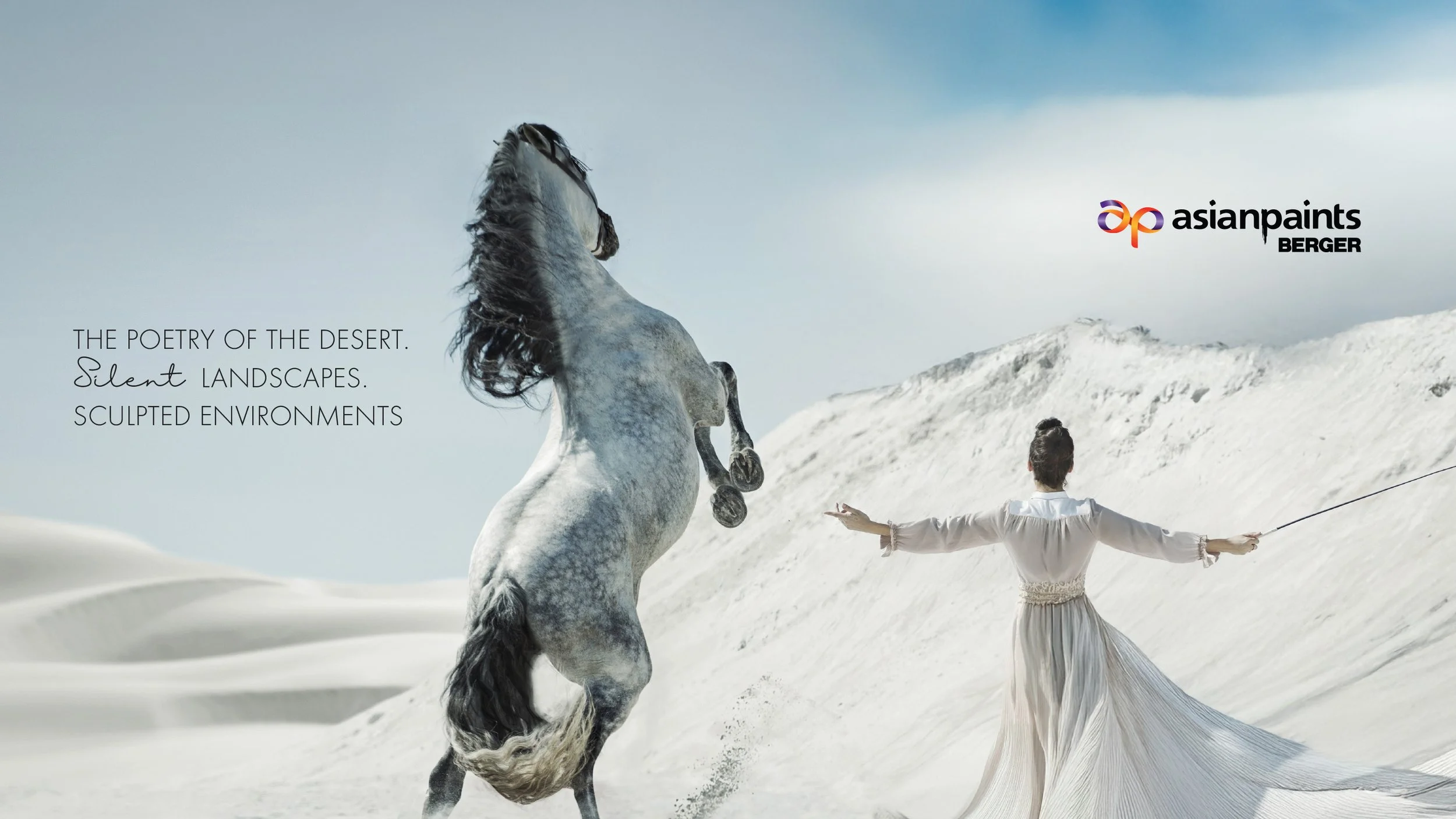
Stories borne of sand, sky and silence.Charting New Courses
Asian Paints has a legacy of leadership in colour expertise, surface finishes and decor understanding. Its entry into the Middle Eastern market, following its association with Berger, required a refreshed identity that resonated with contemporary Emirati sensibilities. The region favours modern interiors, quiet luxury, controlled metallics, warm neutrals and a strong narrative connection to nature and culture.

Our research across stores, homes and consultant interactions revealed a clear shift toward products with compelling stories and an appreciation for spaces that balance simplicity with presence. The Artelier concept was created to ground this transition. It positions colour as composition informed by architecture, fashion, interiors and material intelligence, supported by the manual’s focus on cultural fluency, consumer intuition and material mastery. 
A Culturally Fitting Identity
Asian Paints aimed to establish credibility and desirability among Emirati homeowners and the consultant ecosystem. Consumers rely on trusted brands, informed recommendations and a sense of assurance when making home related decisions. They seek reliability, personalised guidance and a refined aesthetic that communicates confidence without excess.

Our work translated these expectations into a design language that feels premium, calm and assured. Through a flexible textured logo system, a region aligned palette, structured templates, clear category logic, expressive yet composed patterns and refined editorial writing, we created an ecosystem that supports both functional decision making and emotional expression. This identity presents Asian Paints as a partner in creating beautiful and meaningful homes in the Gulf.
The Structure Behind Every Page
The grid system establishes the foundation for all Middle East collaterals. It supports inspiration books, shade cards, Smartcare books (WPCC), finish books and brochures with a consistent rhythm. The grid draws from the manual’s guidance on proportion, spacing and clarity.

Portrait and landscape formats use unified safe space rules, allowing imagery and text to sit with a composed editorial presence. The grid is the underlying architecture that holds the system together. 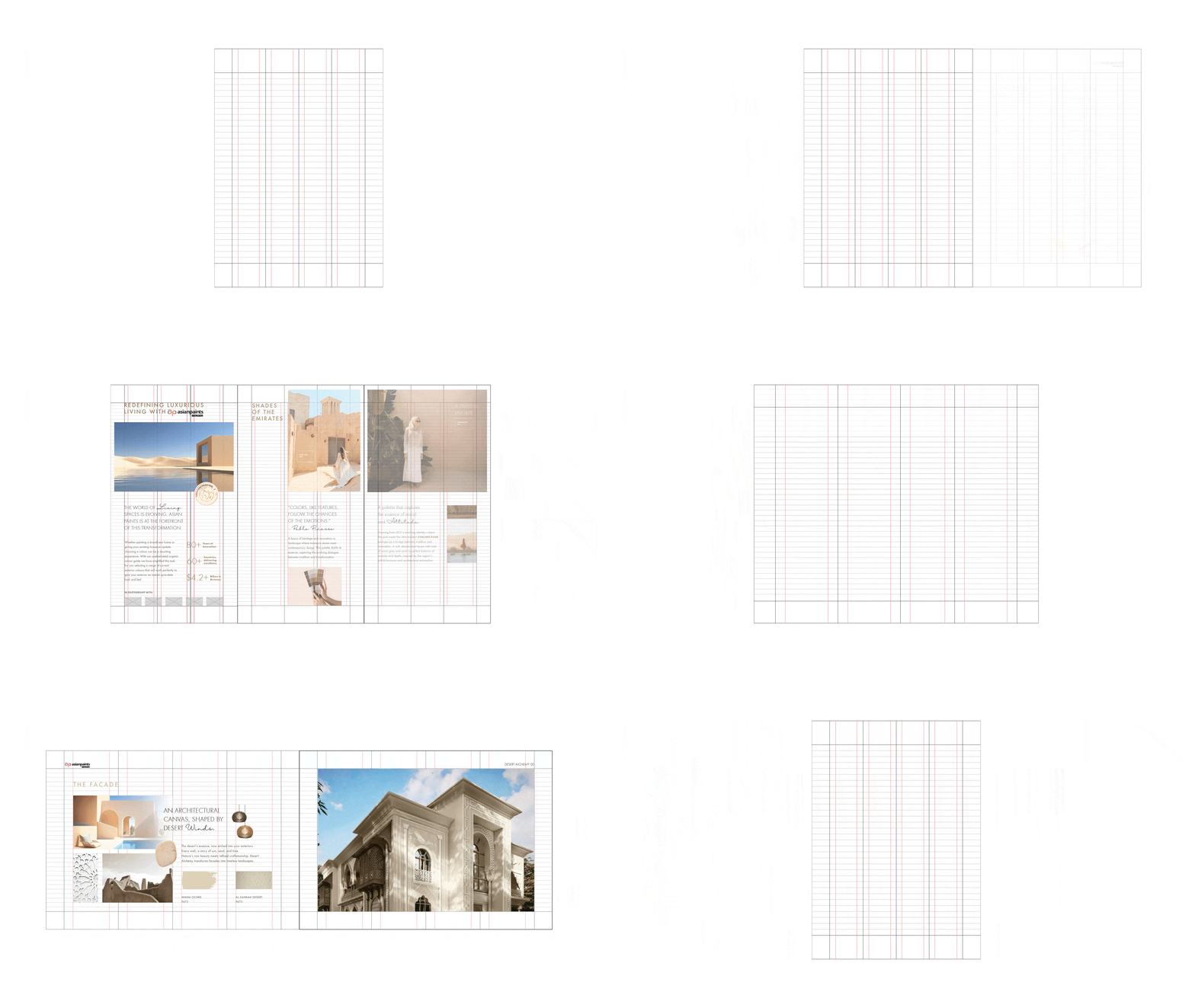
Regionally-Rooted Forms
The pattern system is rooted in Gulf landscapes and materials. Textures inspired by dunes, matte metallics, soft stone and light flows appear within the brand's enclosure.

This aligns with the manual’s framing of Asian Paints UAE as an evocative and immersive world where colour is linked to culture, emotion and space.

Each pattern works as a cue that elevates covers, category flags and dividers. The forms demonstrate versatility and adaptability across interior, exterior and WPCC categories.. 
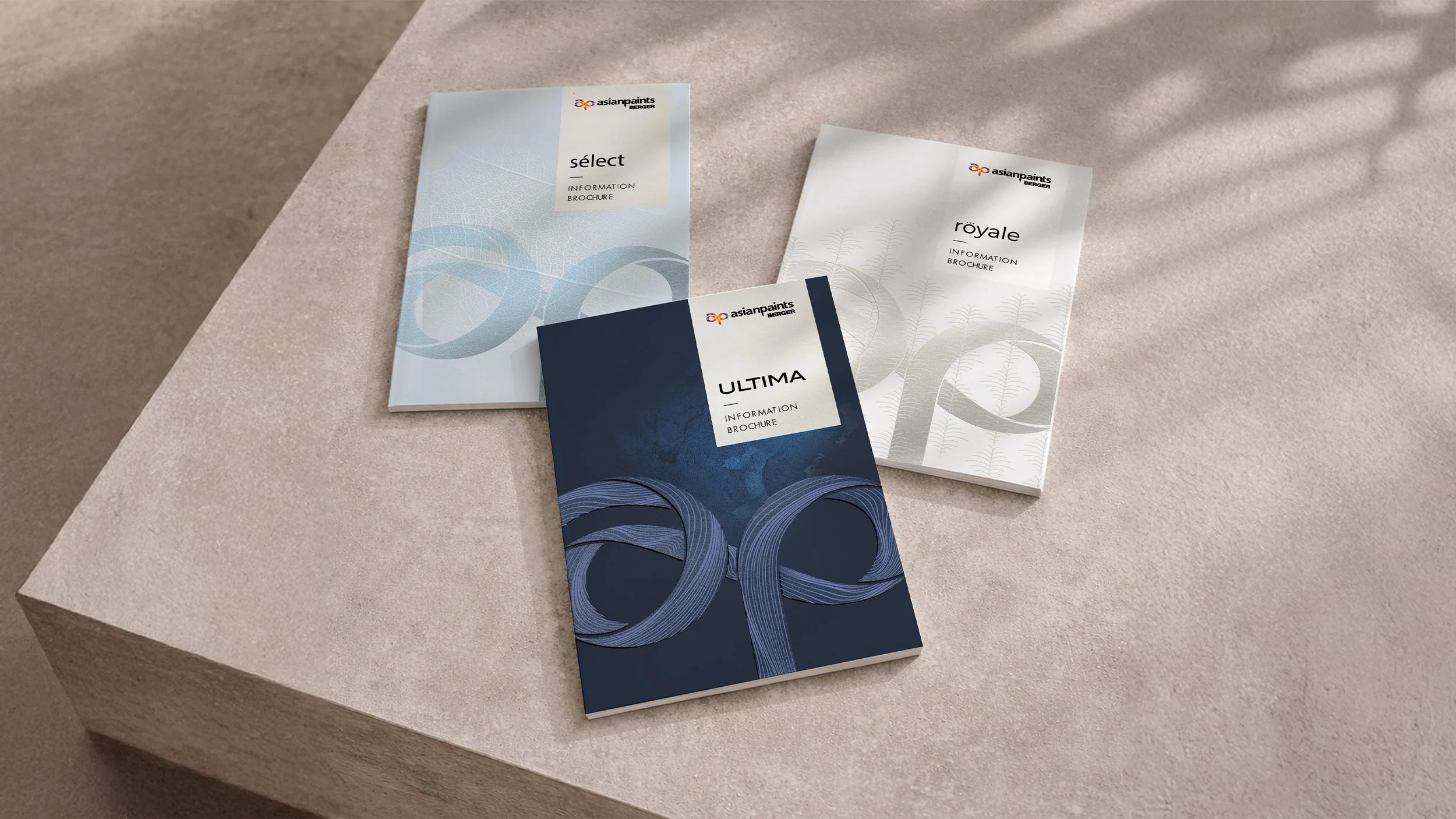
A Unified Family of Brochures
The three tiers of Luxury, Premium and Value maintain a single visual voice. Light direction, palette choices, textures and material cues shift delicately between tiers to communicate hierarchy without losing cohesion.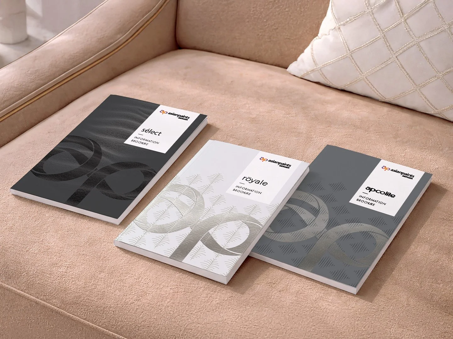
Design That Reflects Emirati Living
Our collateral direction draws from the life of rooted progressive Emirati families who blend modernity with cultural pride. Homes carry muted luxury, neutral palettes, contemporary silhouettes and occasional sculptural accents.

Photography uses natural materials, soft daylight, precise compositions and lived in warmth. This reflects research insights about the region’s preference for clean and elegant environments that avoid visual noise. Layouts maintain a friendly and assured tone. The collaterals feel native to the region and aligned to its evolving design codes.. 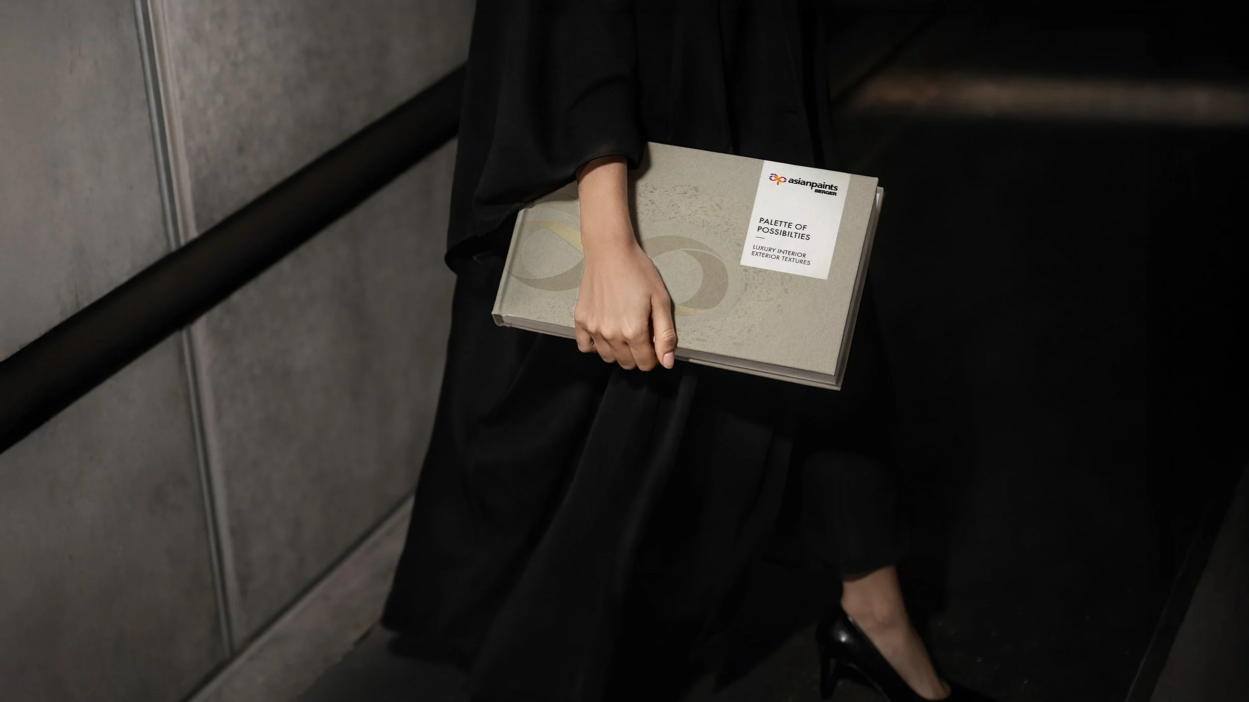
Colour Narratives for Real Homes
Shades, finishes and swatches appear in structured grids beside inspiration drawn from villas, textures, fabrics and natural formations. This reflects the region’s growing interest in nature inspired design.

The manual’s combination of expressive strokes and clean comparison blocks helps consumers visualise texture depth, light behaviour and material finish with ease. Editorial writing positions colour as both a functional choice and a personal expression that brings identity and comfort to the home. These tools guide consumers toward confident and creative decisions. 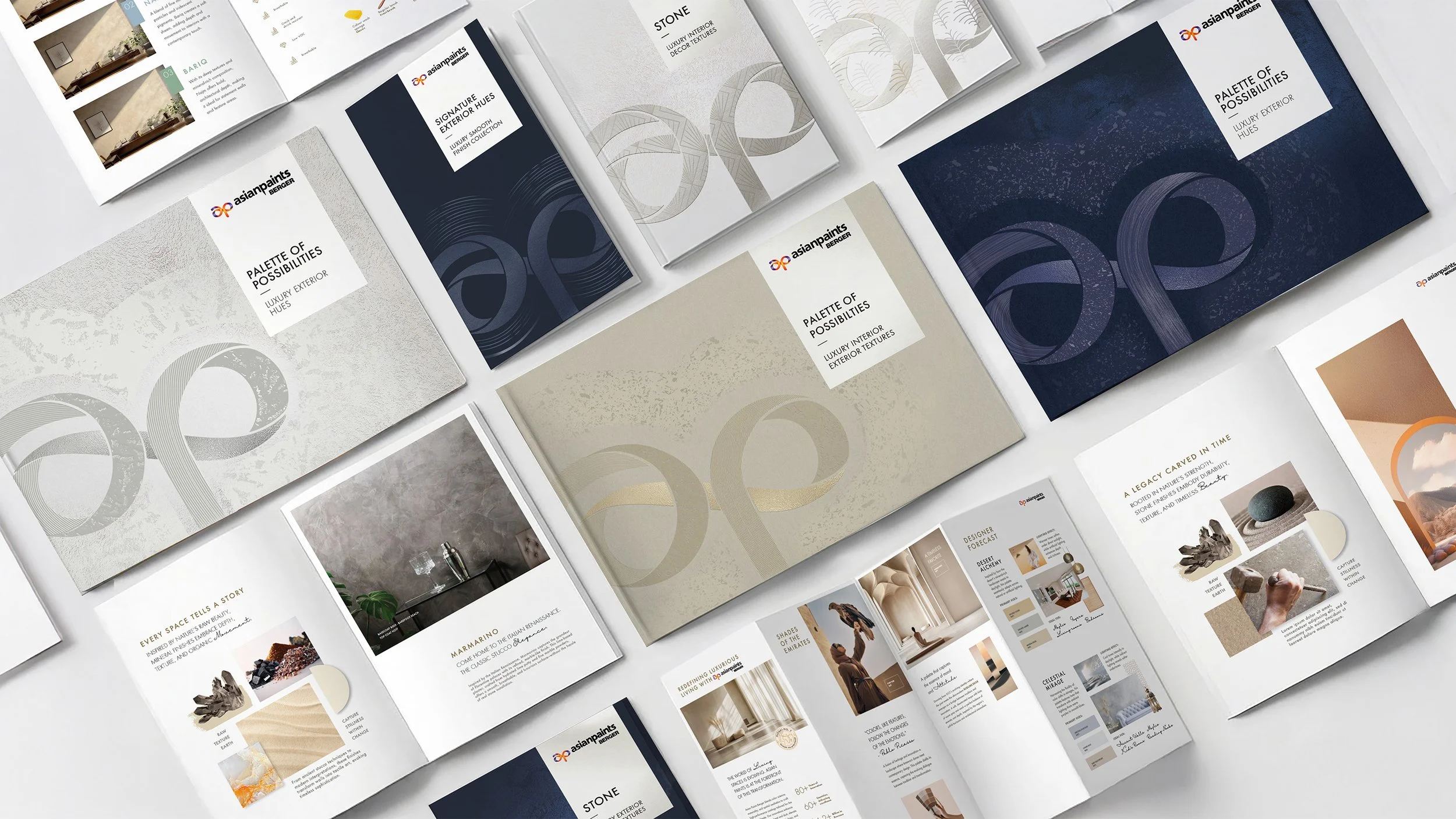
Similar Project


