Creating a youthful beverage brand via identity, naming & packaging design.
Elephant Design crafted OJI’s bold visual identity using expressive packaging, delivering instant Gen Z appeal..
Youth connect,
shelf standout
Competitor and market analytics

Creating a new visual and content-focused tone 
Elephant Design created OJI, a vibrant iced tea sub-brand under Esah, with bold visual identity, confident tonality, and fluorescent packaging to engage Gen Z consumers.
Tea Origins
Esah Tea, a boutique Assam-based startup, set out to transform tea into an honest, health-driven experience. Crafted with passion and balance, its teas embody both cultural richness and global appeal. Esah usually caters to discerning connoisseurs aged 30–45, but identified a gap within younger audiences.

They challenged us to design a bold iced tea sub-brand that resonates with Gen Z and Millennials while maintaining Esah’s credibility as endorser. 
Youthful Hydration
OJI was envisioned as a bold, refreshing iced tea brand that connects instantly with Gen Z through fearless visual identity, expressive typography, neon-led packaging, and a sticker-based design language. With Esah endorsing quality, OJI confidently redefines iced tea as smart hydration: an honest alternative to sugary, carbonated options while standing out as a youthful, influencer-inspired lifestyle choice on the shelves. Design made Sticky
OJI’s design language takes inspiration from the sticker culture that dominates youth-driven digital spaces. Packs are layered with badges, icons, smileys, and playful cues that make the brand look interactive and approachable. Neons in green, yellow, and pink have been intentionally chosen to break out from the blues that dominate the iced tea category. Fruit images have been smartly placed to create natural story cues around hydration and refreshment.

At the heart of the identity lies the name itself—OJI. Born in Assam, brewed for today, OJI celebrates originality: original taste, original energy, original you. More than just tea, it represents smart hydration, powered by antioxidants and Vitamin C, designed to refresh differently. Unlike conventional iced teas that lean heavily on health messaging or safe design codes, OJI thrives in its originality, embodying confidence and authenticity for the new generation. 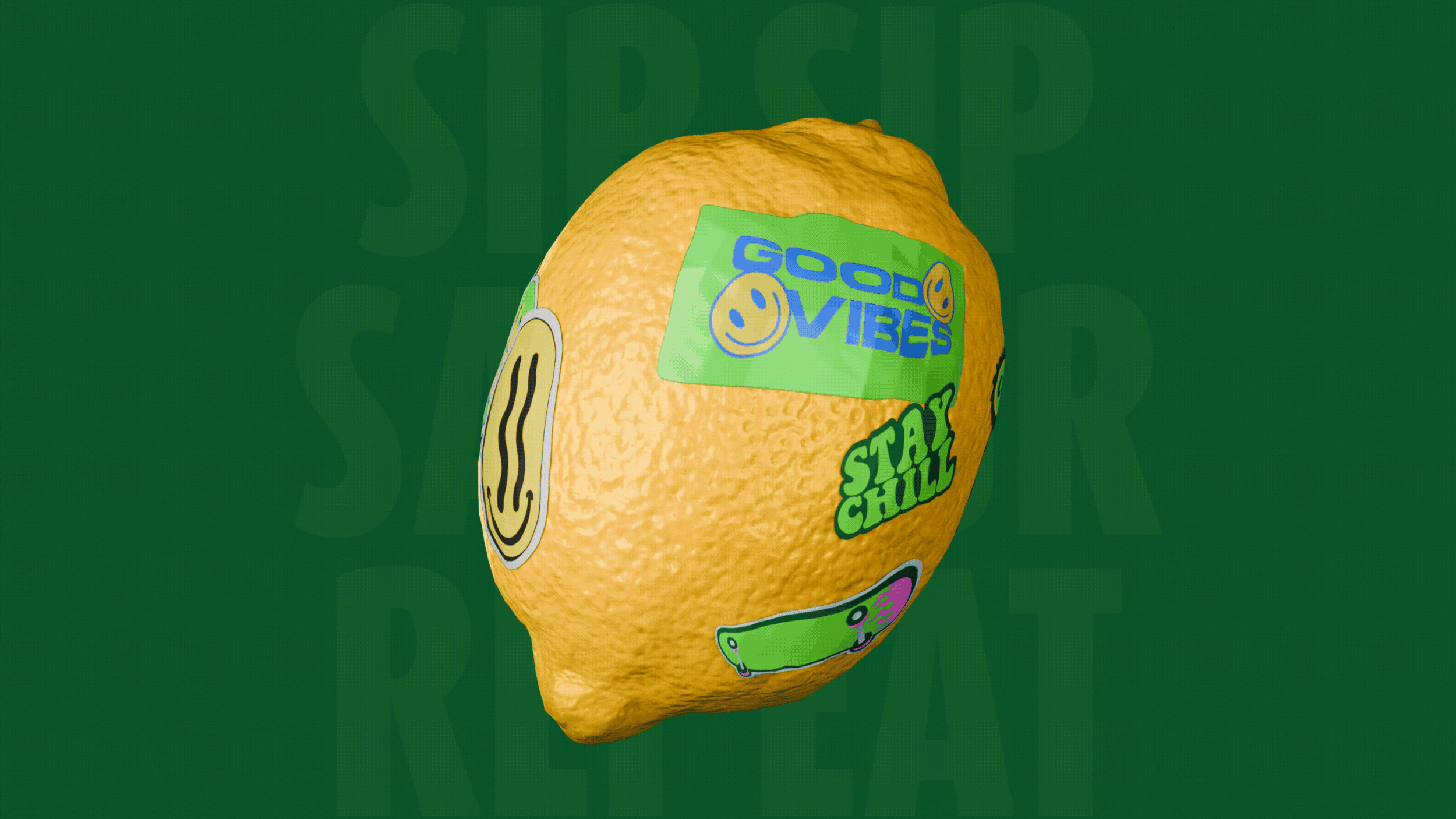
A Vibrant Lineup
The entire range arranged together presents a bold, unified statement, each flavour standing out confidently while aligning under one strong identity. Across flavours, the distinct neon palette ensures quick readability and shelf presence. Together, the lineup embodies energy, cohesion, and youth focus, setting OJI apart in a crowded category. 
A Bold Shelf Statement
The OJI pack confidently integrates neon tones with bold type. Greens, yellows, and pinks flood the surface, bringing vibrancy to a category otherwise coded by safe blues.

Beyond its visual palette, the pack features an expressive arrangement of emojis, stickers, and playful design details that mirror the way Gen Z communicates online. This creates a sense of authenticity, making OJI feel like a natural extension of youthful digital culture. With Esah’s endorsement in place, the sub-brand manages to be fun and lively without losing trust or credibility. 

The close-up shots highlight the striking neon tones that instantly appeal to younger audiences. The fruit placement has been carefully designed to align with the straw, creating a fun and intuitive connection. Bold typography rises tall, imbuing the pack with unapologetic confidence that jumps out on shelves.Similar Project