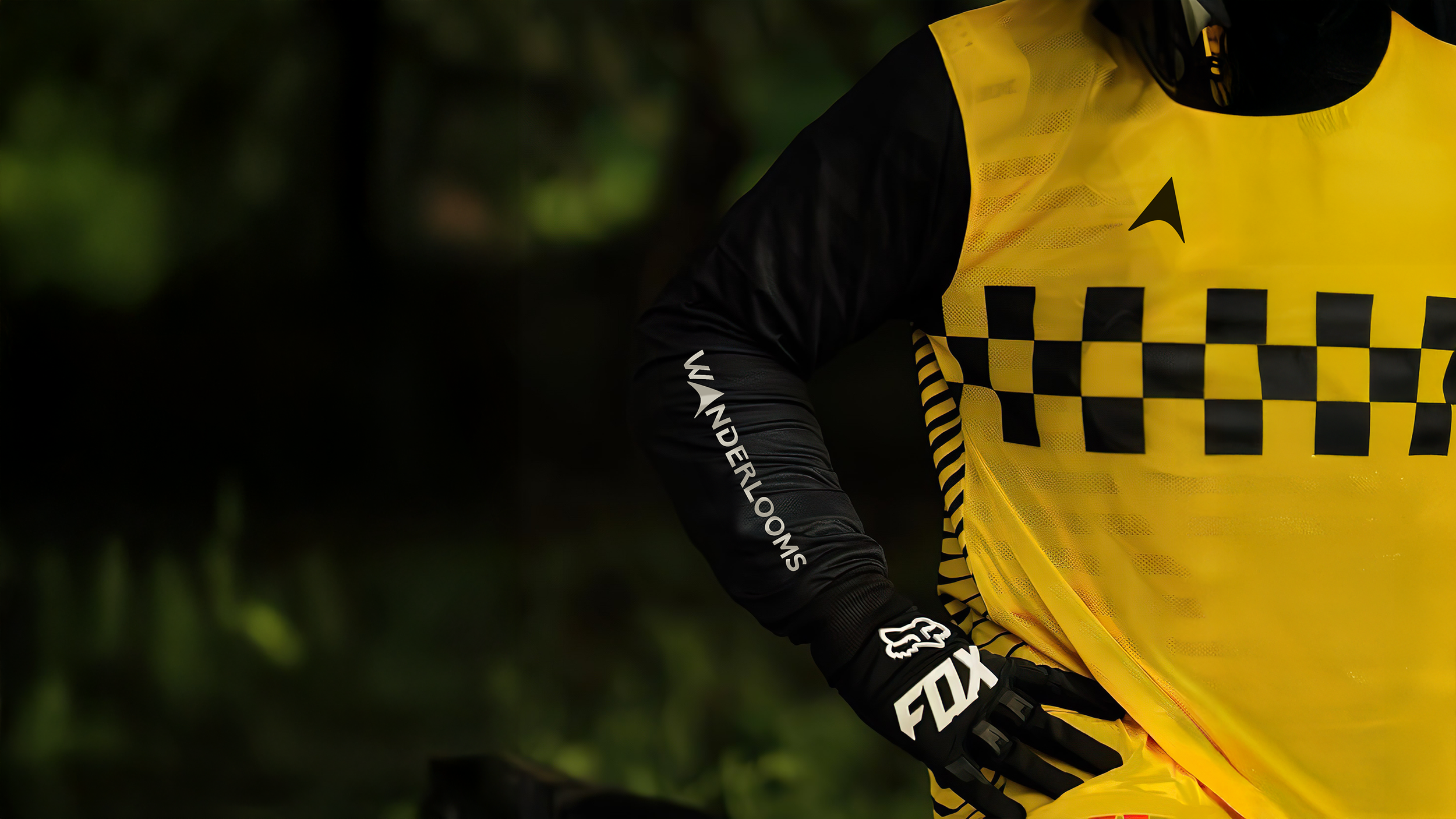
A visual identity refresh for an adventure lifestyle brand.
Elephant Design reimagined Wanderlooms' brand identity through versatile symbolism and dynamic typography, delivering memorable brand recall across diverse formats.
Reimagined Identity
Built for Movement and Memorable Impact
Logo adaptation for their premium range, Wanderlooms ADV

Look and feel ideation for brand merch showcases on Shark Tank India

Logo Reveal Ideas
A brand identity refresh for a premium travel-gear company, creating adaptable visual systems that resonate with adventure enthusiasts while ensuring seamless application across riding jerseys, jackets, and lifestyle merchandise.For Full-Time Adventurers
Wanderlooms was founded by two engineers-turned-adventure enthusiasts, Prateek Vats and Deepesh Srivastava. They transitioned from their technical careers to pursue their passion full-time, eventually securing an investment from Shark Tank. The brand specializes in unisex lifestyle and utility products for thrill-seekers, including riding jerseys, motorbiking gear, oversized apparel, waterproof dry bags, and accessories. Operating in the premium segment, Wanderlooms caters to well-off hobbyists aged 22-45 through e-commerce and D2C channels. The brand faced a critical challenge: their existing logo's intricate details proved unsuitable for print applications, necessitating a comprehensive visual identity overhaul to support their aspirations of becoming a smart destination with physical pop-up stores. The Adventure Enthusiast’s Companion
The brand envisioned establishing itself as "The Traveler's Companion" across all touchpoints, requiring an identity system that could seamlessly adapt to mountain-inspired themes, Buddhist prayer flag aesthetics, and defence-pattern influences. The revamped identity needed to balance bold category codes with unique differentiation, moving beyond typical adventure brand styling while maintaining instant recognizability. Wanderlooms aimed to capture the growing market of urban adventure travellers, including the expanding female rider demographic, through versatile applications that work with and without the brand symbol across varied materials and formats. Compass-Driven Typography
The new identity centres on "The Traveler's Companion" concept, embedding a compass pin directly into the Wanderlooms wordmark by replacing the "A" with a north direction symbol. Built on the Railway typeface foundation, the design team introduced dynamic flourishes that subtly evoke movement and terrain.

The "W" resembles an inverted mountain, while other letterforms suggest motion through carefully crafted strokes. This bold, stylized approach distinguishes Wanderlooms from competitors using simplified sans-serifs or overly aggressive extreme-sports fonts. The colour palette evolved from the original identity, refining saturated yellows and complementary tones to optimize print performance while maintaining brand continuity.

Every element prioritizes versatility, ensuring the identity performs consistently across riding gear, packaging, digital platforms, and merchandise.
Flexible Adaptation
The identity system is designed to remain versatile across formats, with the compass element functioning as an independent graphic device. While the wordmark always retains its integrated compass-pin, the standalone symbol can be deployed throughout different touchpoints to reinforce the brand’s directional theme. This approach ensures flexibility in layouts and compositions without compromising the core logo structure.


Using Watermarks To Communicate Adventure
The visual language extends beyond the logo through a modular watermark-style system that maximizes storytelling potential. This framework layers travel-related imagery, souvenir-inspired badges, and flag motifs to create infinitely expandable patterns across merchandise.

The watermark approach evokes stamp collections and travel journals, reinforcing the adventure narrative while remaining subordinate to product functionality. Each application, whether on riding jerseys, dry bags, or key tags, tells a visual story that prompts riders to recall past journeys and imagine future expeditions.

The system allows flexibility for seasonal variations, limited editions, and specialized product lines targeting the brand's tier-1 urban consumer base.
Print-Ready Brand Impact
The refined identity solves the original brief's core challenge: print adaptability. Where the previous logo's fine details disappeared or blurred on fabric and small-format applications, the new bold letterforms maintain clarity at any size. The compass symbol registers cleanly on clothing labels, reinforcing brand presence at intimate touchpoints.

The Railway-based typeface's substantial weight ensures legibility whether embroidered on jackets, screen-printed on hoodies, or heat-transferred onto waterproof bags. We ensured consistent vibrancy across different materials and printing techniques, from dye-sublimation on synthetic riding gear to traditional methods on cotton apparel.

This technical rigor supports Wanderlooms' premium positioning, delivering professional execution that matches the quality expectations of their adventure-focused clientele while establishing visual equity for future retail expansion.
Similars Project


