
Modern wellness brand identity and packaging design
Elephant Design created contemporary wellness packaging through lifestyle-oriented mnemonics, delivering a proactive pain management experience.

New Age Wellness
Proactive and Gentle
Competitor and Customer Analytics

SKU Adaptation

Digital Applications

Visual Language

Packaging Design systems

Developing a millennial-focused pain management brand that transforms healthcare from clinical to enjoyable, with a system accommodating current and future offerings.
Modern Pain Solutions
Hedso Health And Wellness created Hoop to build a contemporary wellness-based pain management brand targeting millennials who seek to "be the best version of themselves." In contrast to traditional clinical options dominating Indian markets, Hedso envisioned Hoop as a proactive lifestyle brand making healthcare enjoyable and relatable, addressing modern issues like stress, sleeplessness, and workout-induced pain with effective on-the-go solutions.
Proactive Wellness Champion
Hoop aimed to position itself as a trusted companion rather than a clinical advisor in the wellness journey, bridging the gap between proactive and reactive healthcare. The brand sought to connect with younger audiences through subtlety and neutrality while highlighting powerful natural ingredients. By creating unique mnemonic symbols for each product and integrating storytelling elements, Hoop aspired to stand out in the competitive wellness landscape while maintaining reliability and trustworthiness.Energy in Motion
Brand identity reflects "Live Active" positioning. Visual language maintains consistency across digital touchpoints.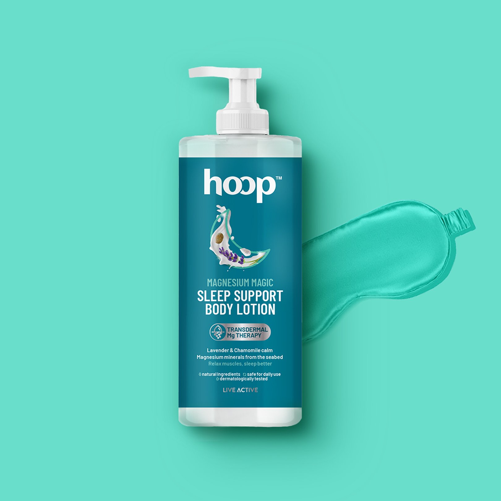
Social Wellness
Our collaboration with Gitam University resulted in a transformative visual identity, reinforcing their commitment to knowledge, compassion, and future growth..

: Breaking Convention
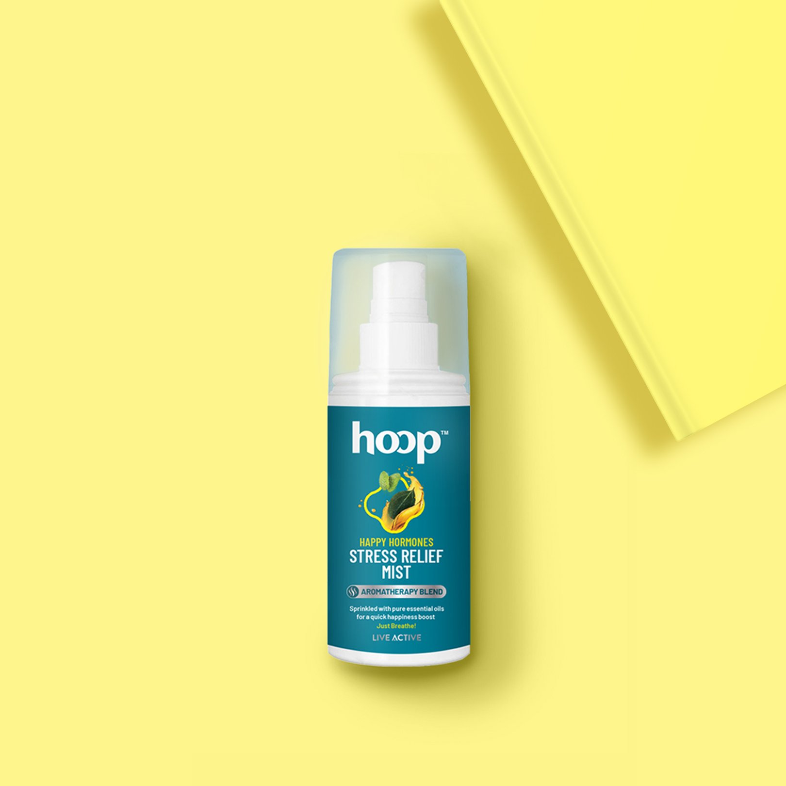
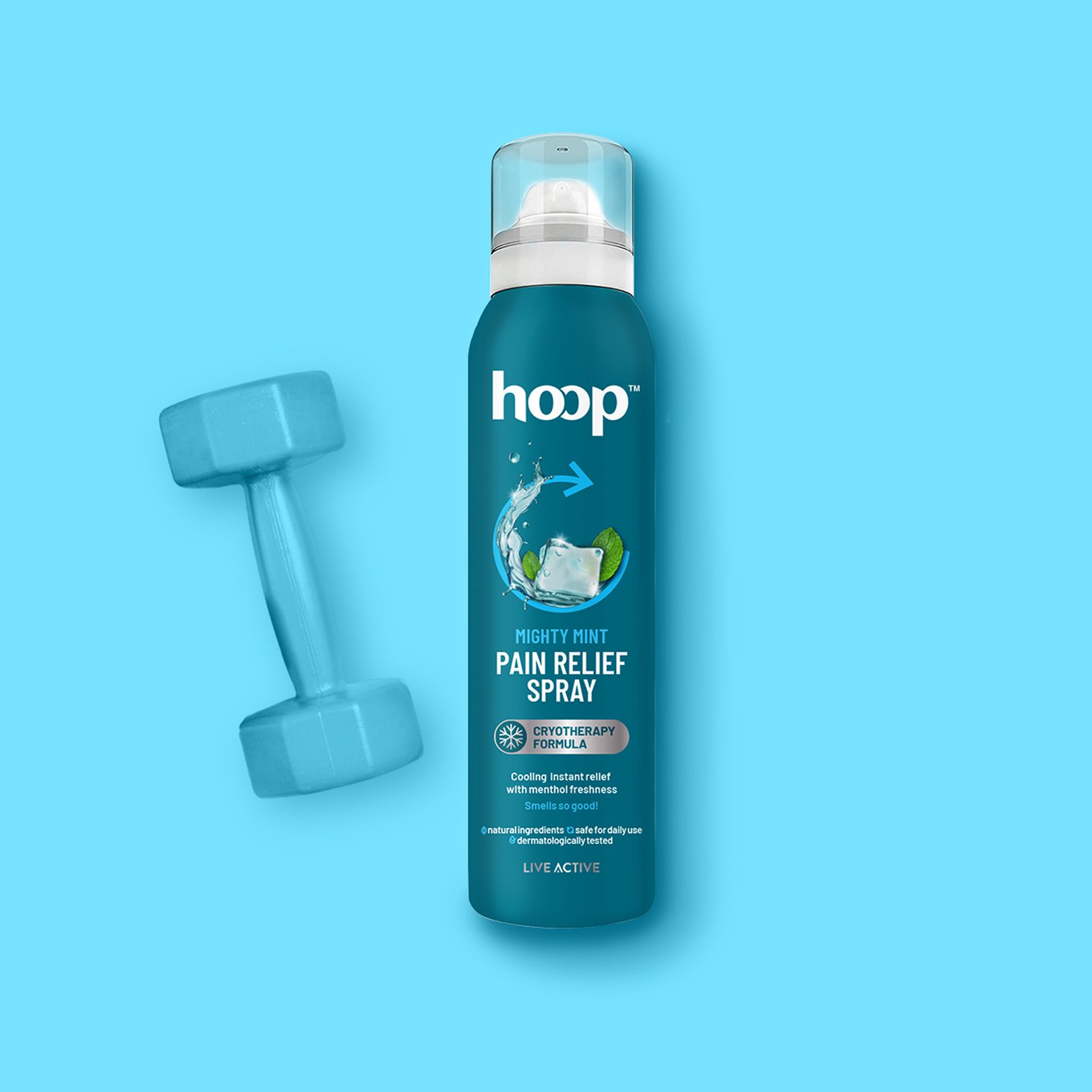
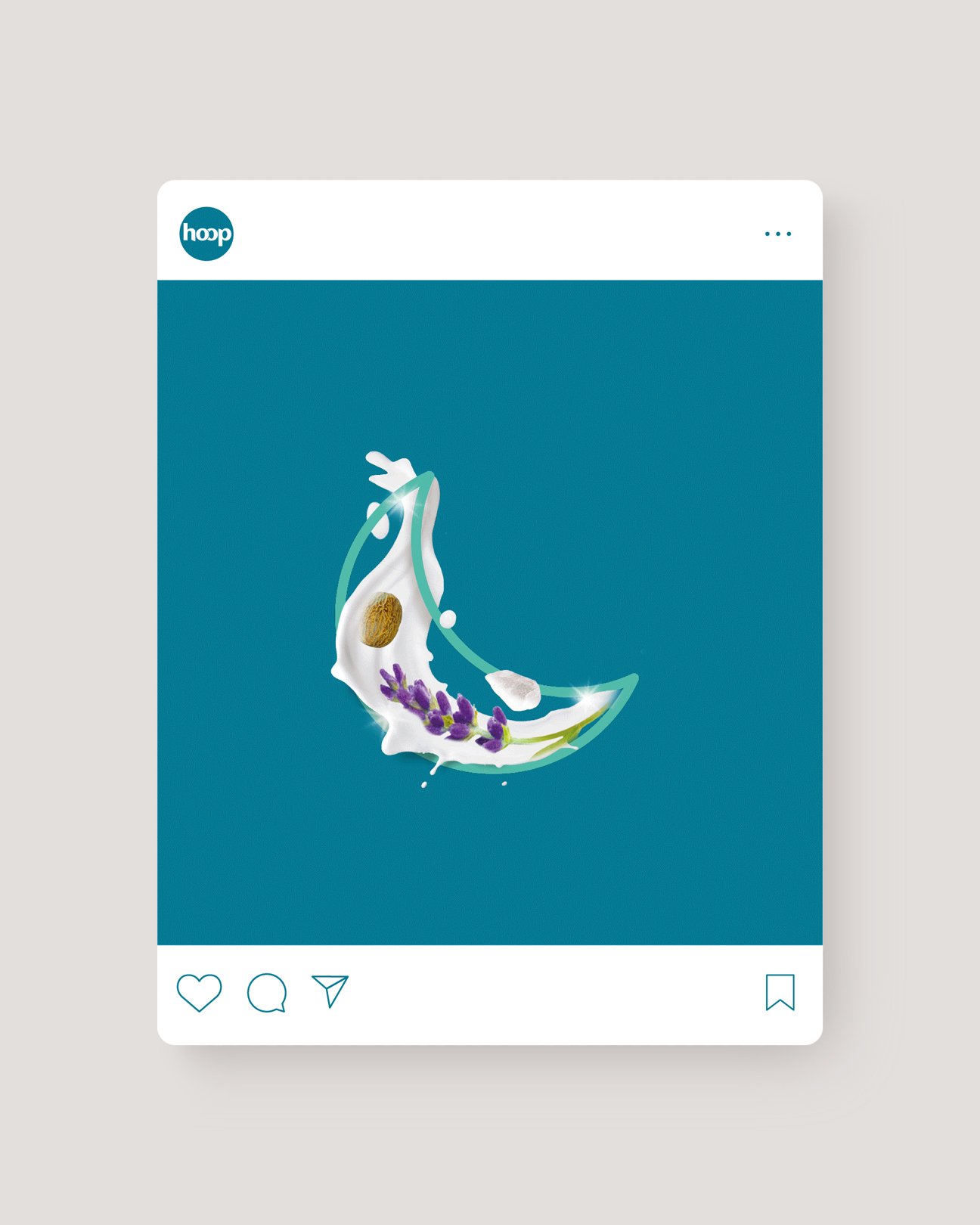
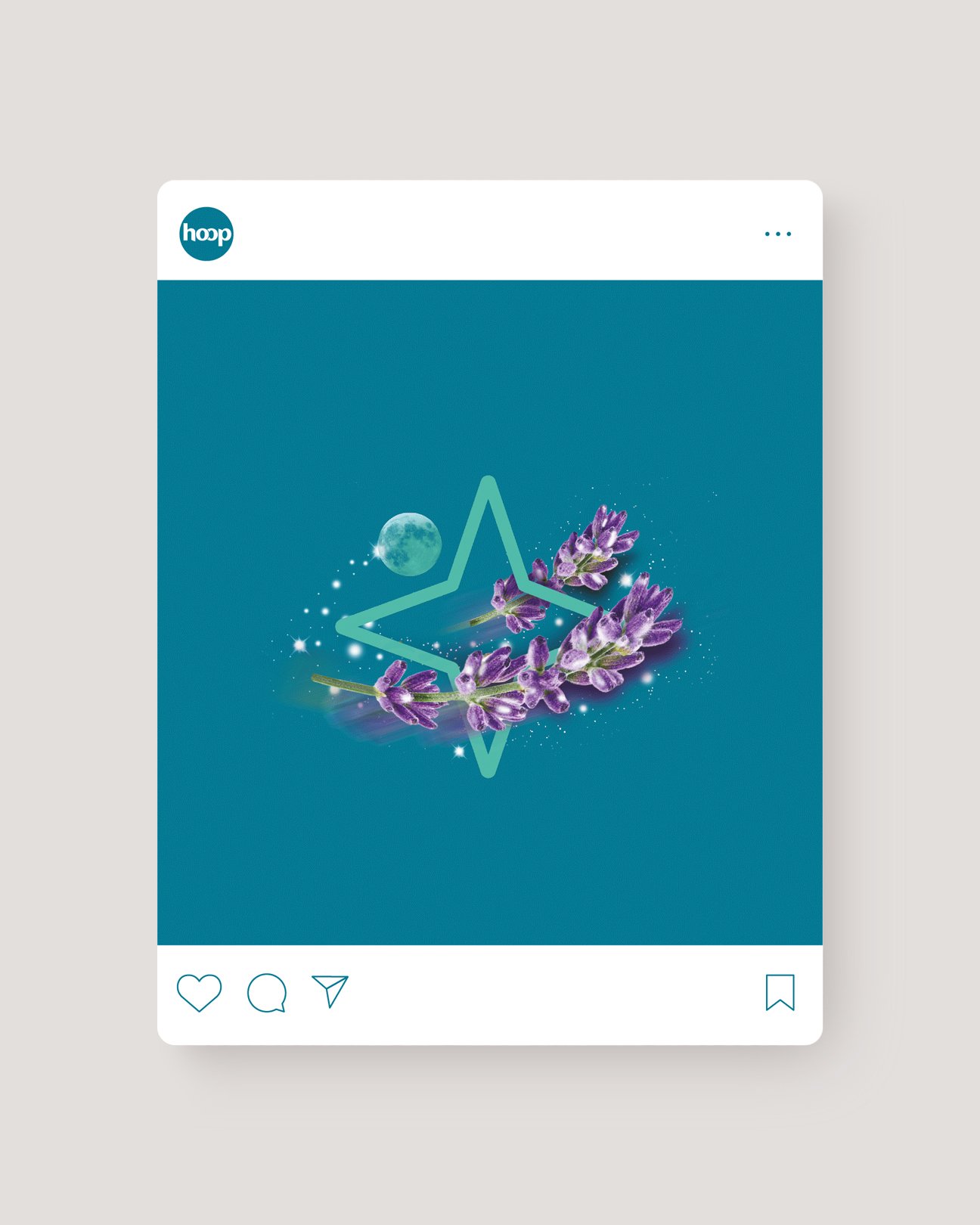
The packaging system deviates from typical problem-solution codes in pain management. Negative pain-filled depictions are completely avoided to align with younger audience expectations. Creative mnemonics specific to each product benefit create unique visual identifiers. Metallic inserts highlight efficacy and premium positioning throughout the range. Active natural ingredients take prominence in the hierarchy of communication. Dark Teal base creates category distinction while appealing to target demographics. Symbols inspired by energy and movement reinforce the brand name's connotations. Each product tells its story through thoughtfully designed visual language.
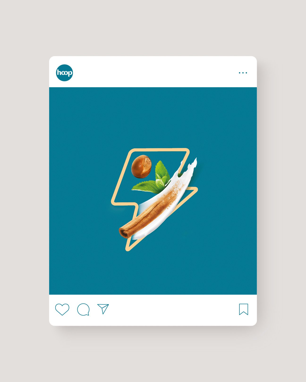
Symbolic Wellness Language
Unique mnemonic symbols were developed for each product benefit. Pain Relief features blue arrows curving inward, representing transition from pain to relief. Sleep assistance product uses calming circular patterns suggesting restfulness and relaxation. Body wash incorporates flowing elements suggesting purification and rejuvenation. All symbols maintain consistency through the brand's distinctive style and color palette. Icons work at various sizes across packaging and communications. Mnemonics create instant recognition within the diverse product portfolio. Symbols reflect modern, clean aesthetic appealing to millennial sensibilities. Visual system allows for expansion as new products join the lineup.
Similar Project


