Brand identity and packaging for food essentials
Elephant Design created a holistic identity system centered on the "handi" concept, delivering a versatile framework adaptable across diverse product categories.

Re-oriented Positioning
accessing restaurant-style food safely
Consumer and Competitor Analytics
Brand Expansion Strategy
Packaging Design System
Visual Identity
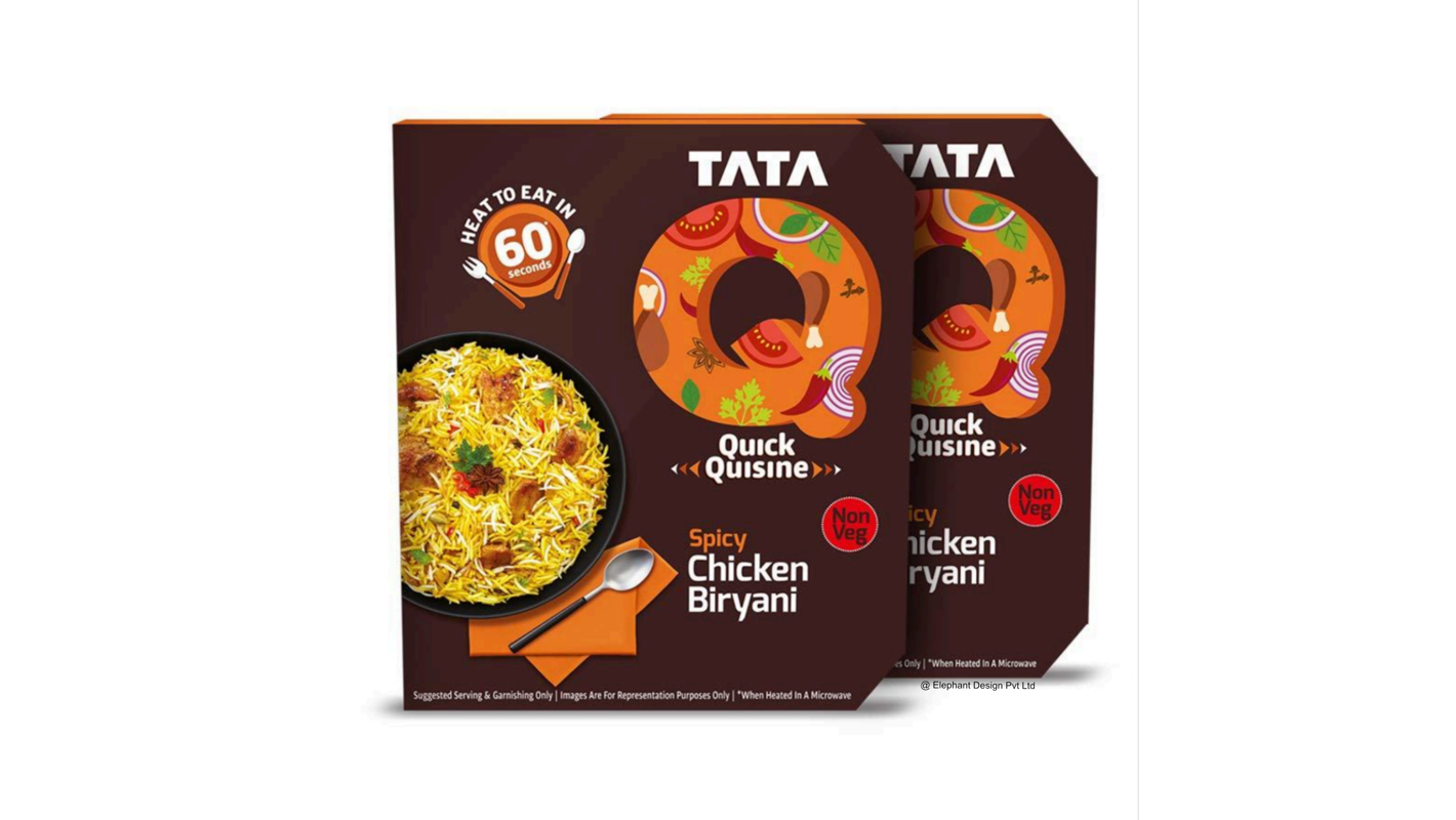
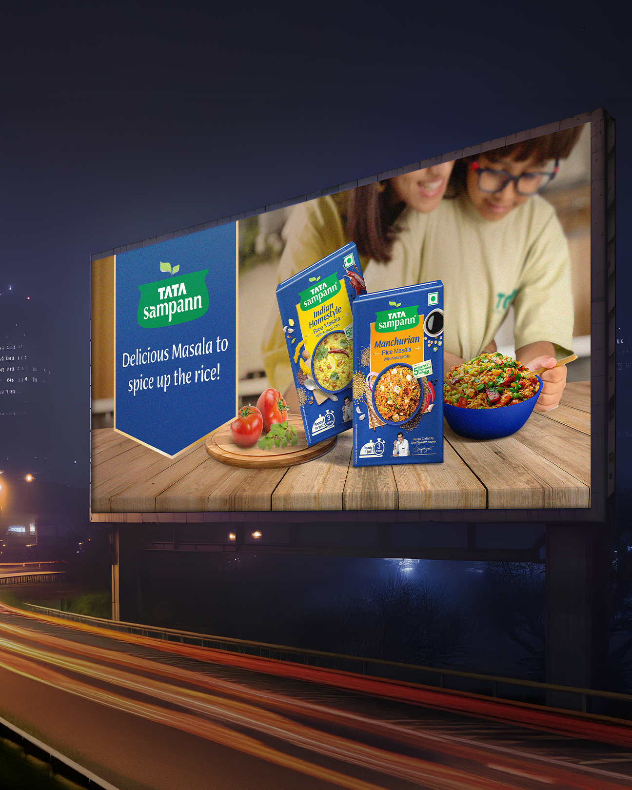
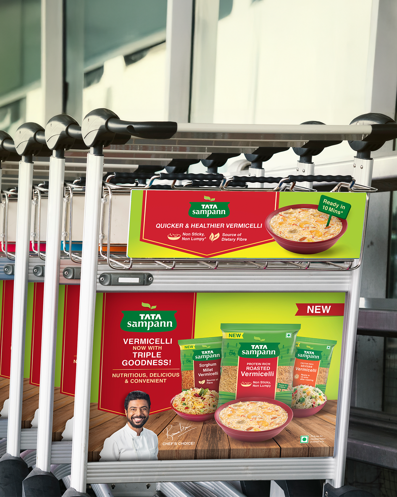
RTC / RTE Products 
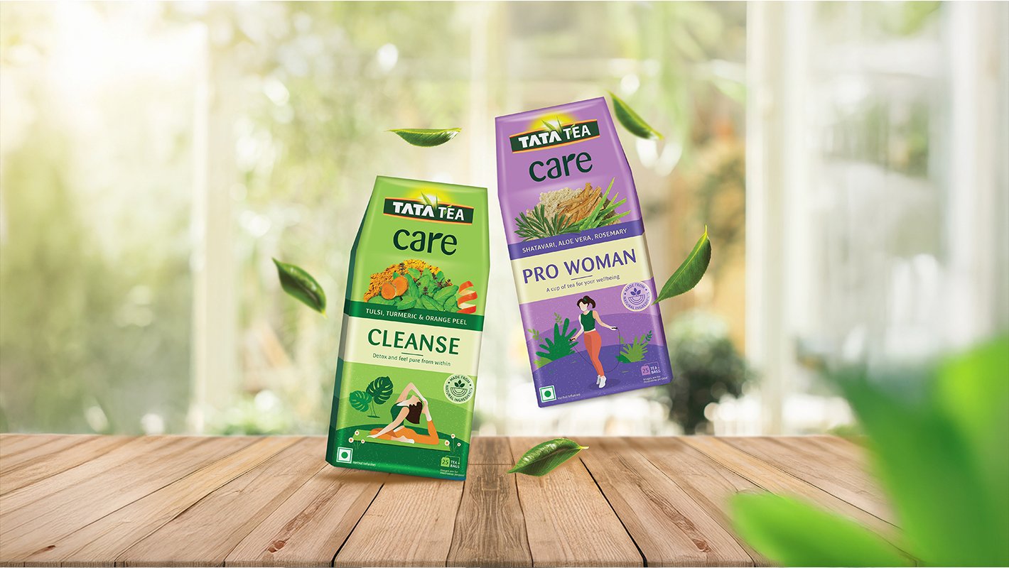
Holistic Indian Nourishment
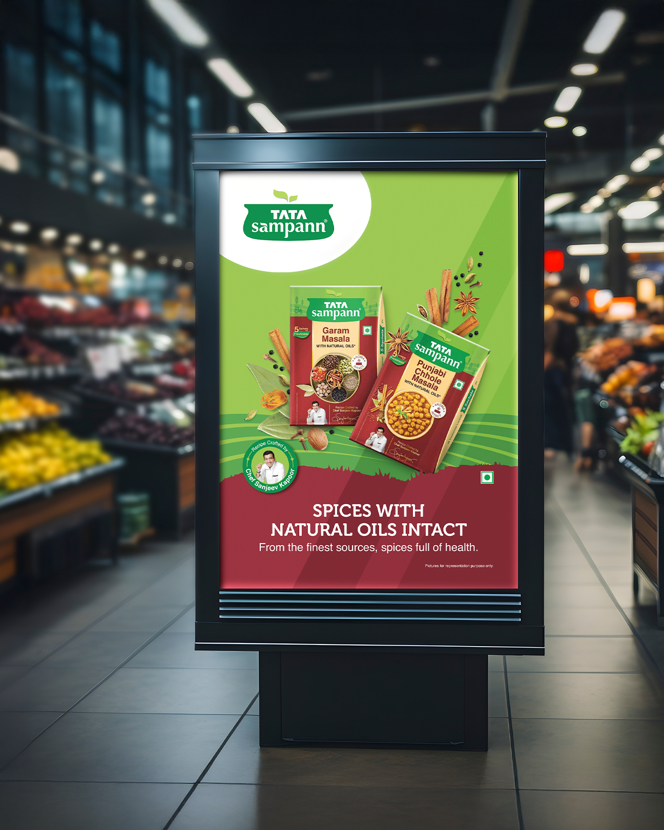
Tata Sampann was launched as Tata Consumer Products' entry into the domestic food essentials market, with "Sampann" meaning "all-encompassing" in Hindi. The brand was founded on the distinctly Indian philosophy of inclusion rather than exclusion in nutrition—embracing a "sampoorna aahar" (complete diet) approach contrary to Western diet trends that often focus on eliminating food groups. Initially offering staple products like unpolished dals and blended spices, Tata Sampann approached Elephant Design with ambitious expansion plans requiring a scalable identity system that could grow with their evolving product portfolio. 
Earthy Wholesome Authenticity
Tata Sampann aspired to celebrate Indian nutritional wisdom by positioning itself as a "centre-of-plate" brand focused on wholesome, authentic ingredients. The brand sought to encourage consumers to embrace traditional food wisdom while meeting contemporary expectations for quality and responsible sourcing. By emphasizing the inherent goodness of minimally processed ingredients, Tata Sampann aimed to differentiate itself in a market increasingly dominated by processed alternatives. The brand required a flexible system that could maintain coherence across diverse product categories while accommodating future extensions. The Iconic Handi
The identity system centres around the traditional Indian cooking pot as the primary brand symbol. The leaf motif reinforces the freshness of ingredients. 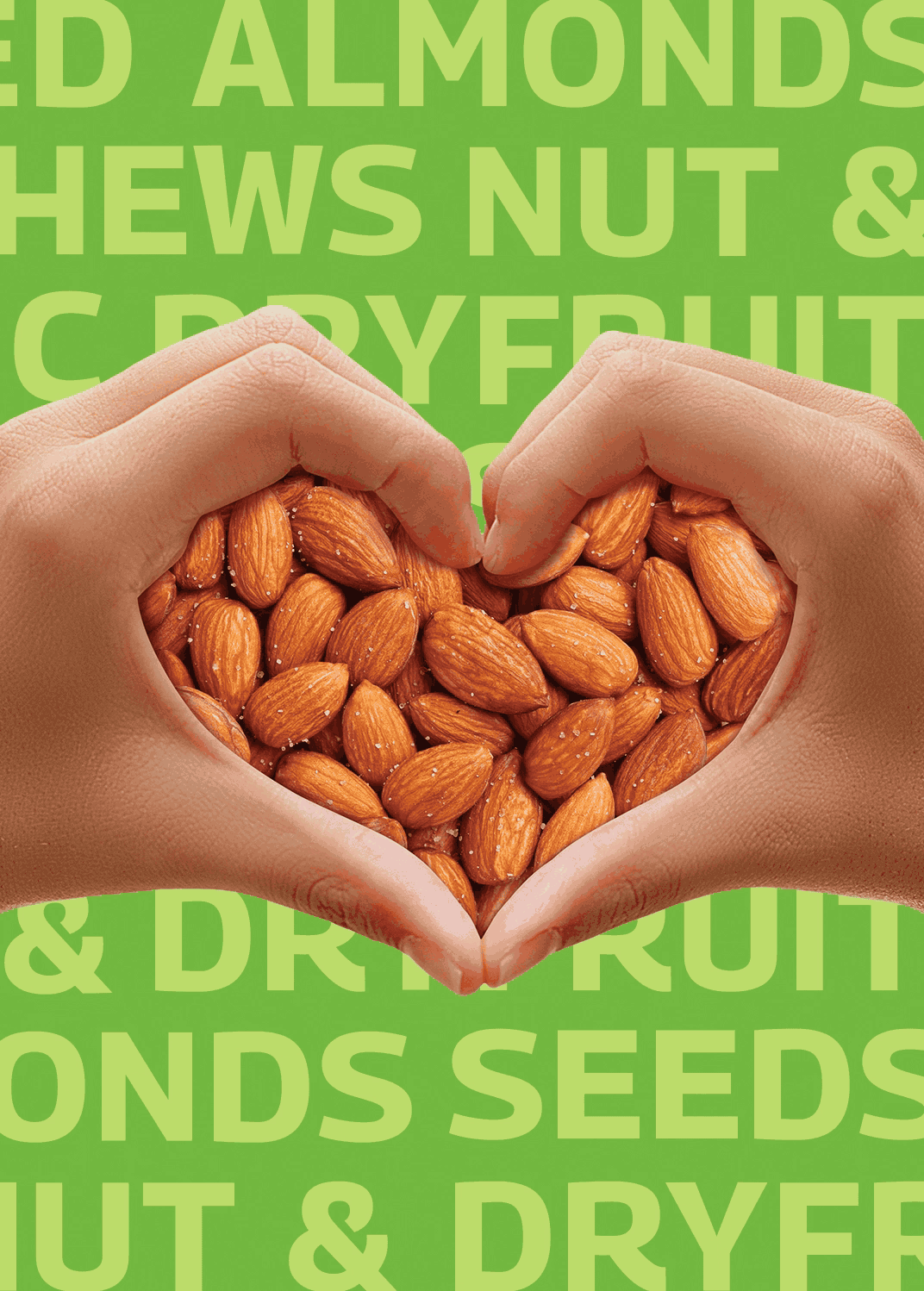
The Heart of the Indian Diet
The circular central element in the packaging system symbolizes Tata Sampann's position as a core component of the Indian meal. This visual approach reinforces the brand's philosophy of "sampoorna aahar" (complete nourishment) by placing wholesome ingredients at the centre of the eating experience. The system allows for category-specific customization while maintaining brand consistency. Category mnemonics change to reflect product types, with colour coding and imagery tailored to each range. Windows in packaging for organic products demonstrate transparency and confidence in ingredient quality. 
Similar Project