
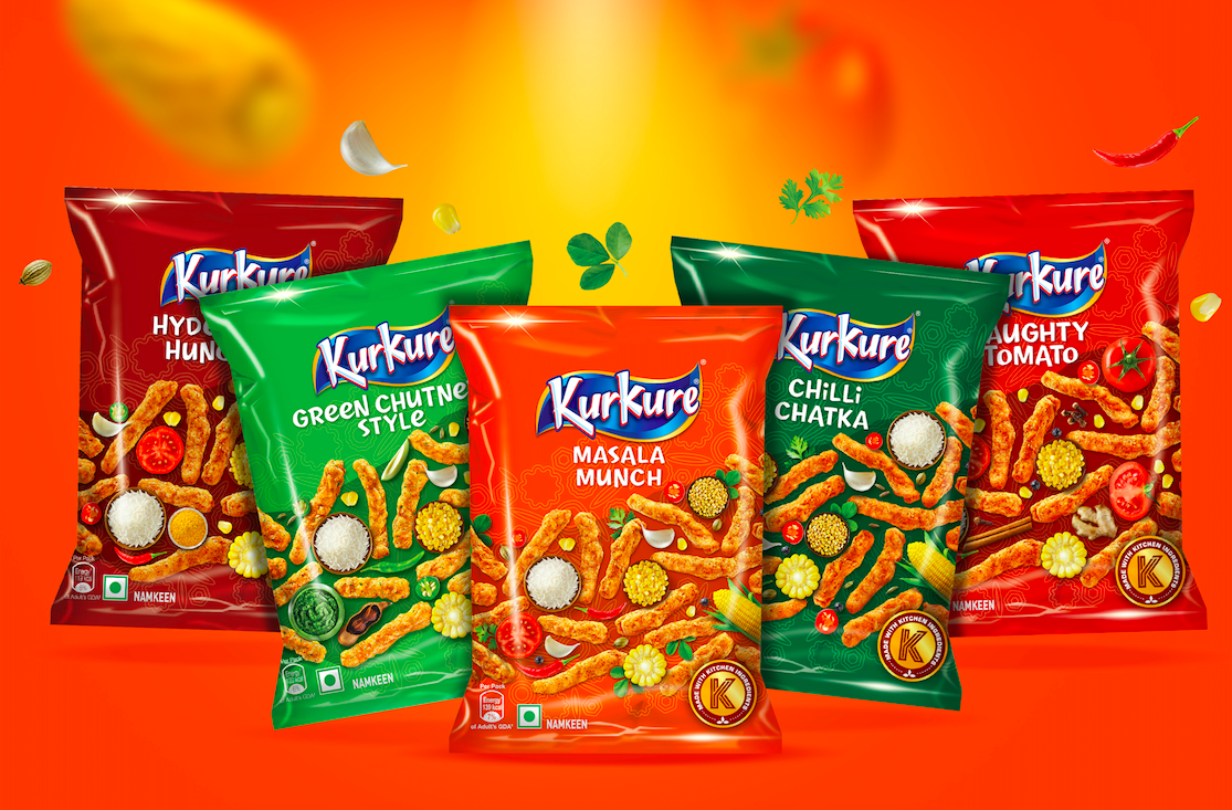
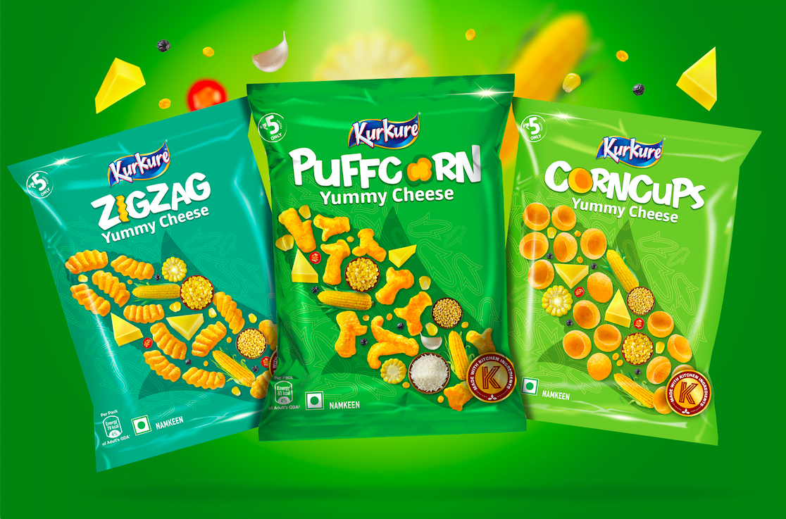
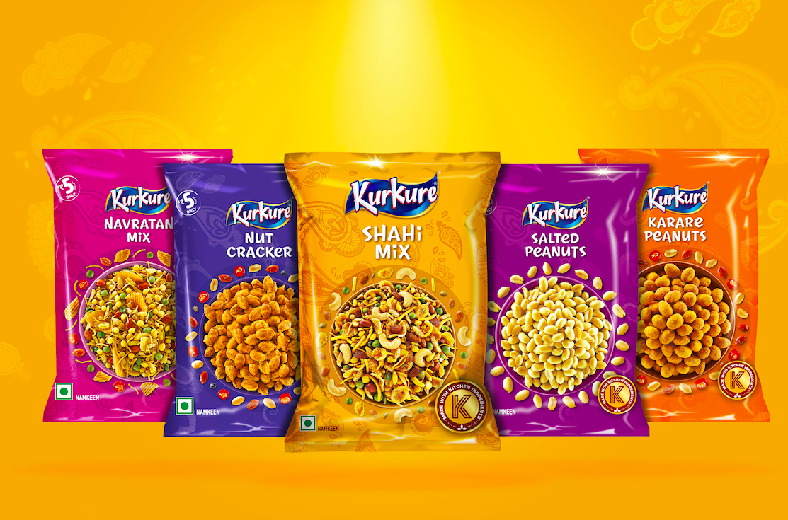
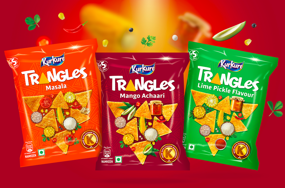
Kurkure has a vast portfolio of multiple categories, flavours & sizes with varying preferences of tastes & shapes across the country.
As some of the innovations in shapes & flavours had happened organically, this hugely popular brand needed a cohesive brand architecture and visual language. Indian snacks had added to the complexity of portfolio even further.
There were 3 significant tasks for this redesigning exercise:
- Enhance brand leadership, relevance & distinctiveness.
- Build an architecture that is able to create strong differentiation for categories
- And most importantly, help consumers navigate the shelf & pick the right snack of their choice
As echoed by consumers everywhere, Kurkure being the brand of abundance, crunch & quirk, design team decided to highlight these three axes on the packs.
The concept was built around getting the ingredients in focus to enhance taste appeal with a larger than life shape of the product providing backdrop for play between products & ingredients. Every variant is called out in custom designed typography that also makes it ownable. Back of packs are brought to life with custom drawn illustrations of turning mundane encounters into fun moments by sharing the tasty crunchy snack.
While harmonising the entire portfolio in terms of messaging, tone of voice and visual language the team was successful in creating clear distinction within categories of collets, puffcorns, trangles and Indian savoury snacks; taking the shelf visibility & excitement to next level.
Time to grab India’s favourite Masala Munch!