Modern identity for accessible home essentials
Elephant Design reimagined Reliance Retail's home essentials brand through strategic visual system development, delivering clarity and aspiration for modern Indian consumers.
30%
Increased consumer engagement
Consumer segment analysis

Packaging hierarchy development

Strategic colour system 
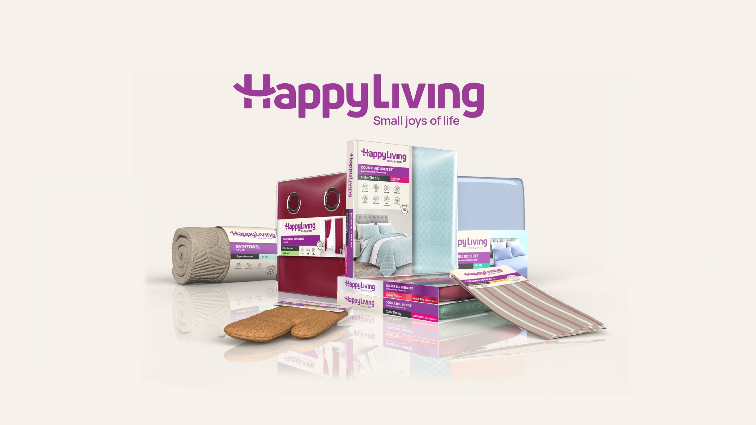
Revitalized Reliance Retail's Happy Living brand with a fresh identity balancing premium appeal with accessibility, enabling confident purchase decisions for house-proud consumers seeking quality home improvements.
A Balanced Approach for Premium Accessibility
Reliance Retail approached Elephant Design to transform Happy Living from a standard home essentials brand into a lifestyle statement. Spanning bed-tops, bath linens, kitchen linens, and other home essentials, the brand needed to connect with modern Indian consumers who aspire to enhance their living spaces but may lack interior design confidence. The challenge was creating an identity that would feel both premium and approachable—sophisticated enough to elevate living spaces yet accessible enough for everyday consumers.
Joy Through Simplicity
Happy Living aimed to simplify modern living by demystifying home décor choices for two key consumer segments: "Progressive-Traditional" customers seeking trendy interpretations of Indian culture while maintaining traditional values, and "Modern-Rooted" consumers focused on individual expressions through contemporary lenses. By creating a system that balances aspiration with accessibility, the brand positioned itself as a trusted guide helping consumers make confident decisions about their living spaces, ultimately delivering small moments of joy through thoughtful home essentials. Easy Navigation
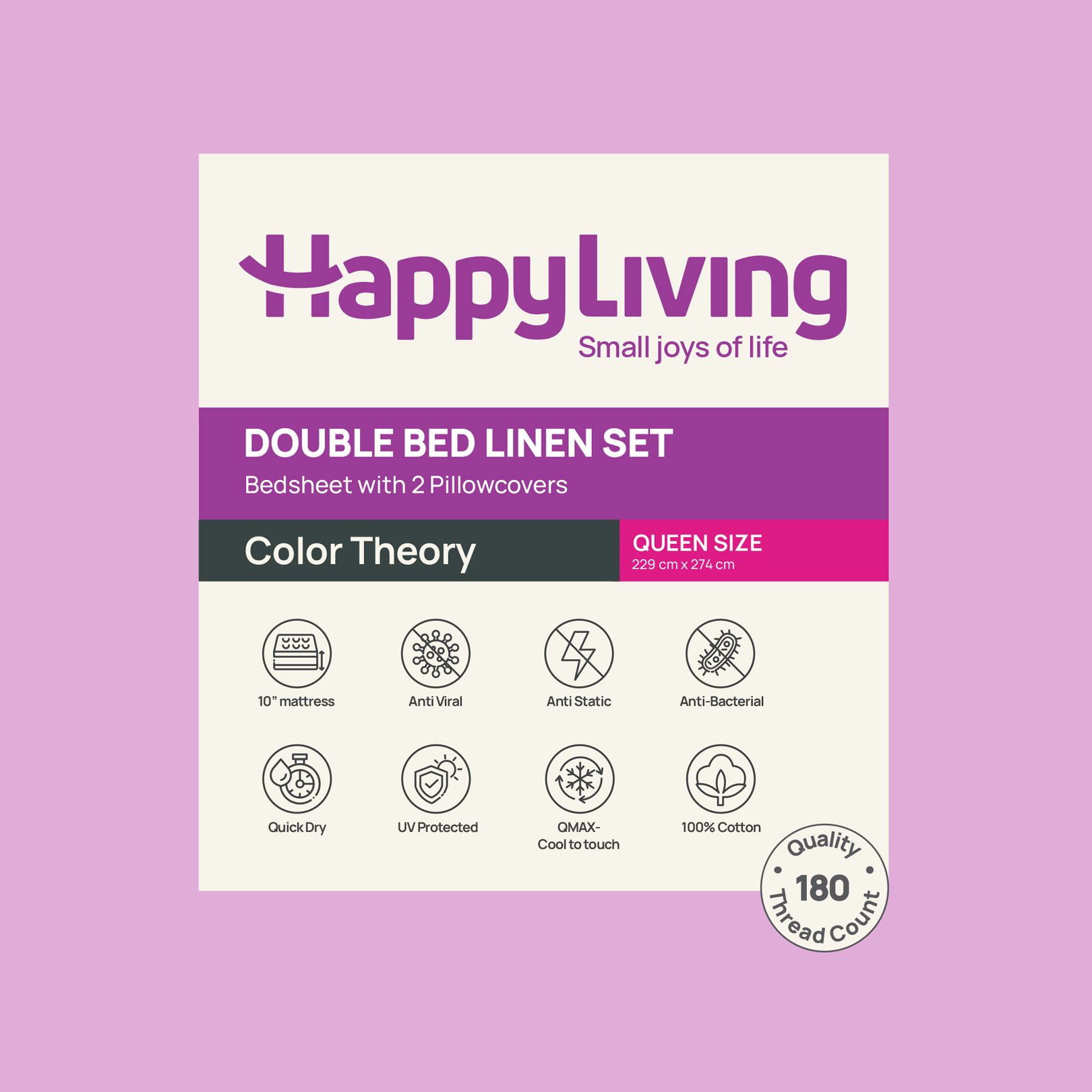
Different categories are distinguished through specific eye-catching colours, with metallic substrates denoting premium ranges for easy differentiation. 

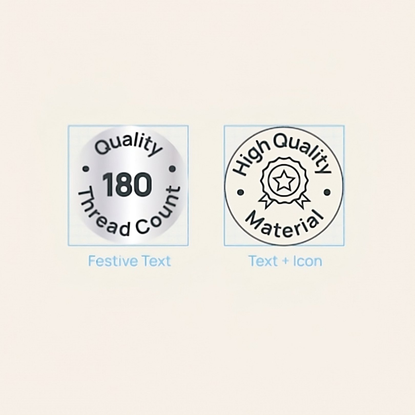
Iconic Enclosures
The icon system employs minimal, functional designs enclosed in circles to balance the otherwise rectangular and linear elements of the packaging.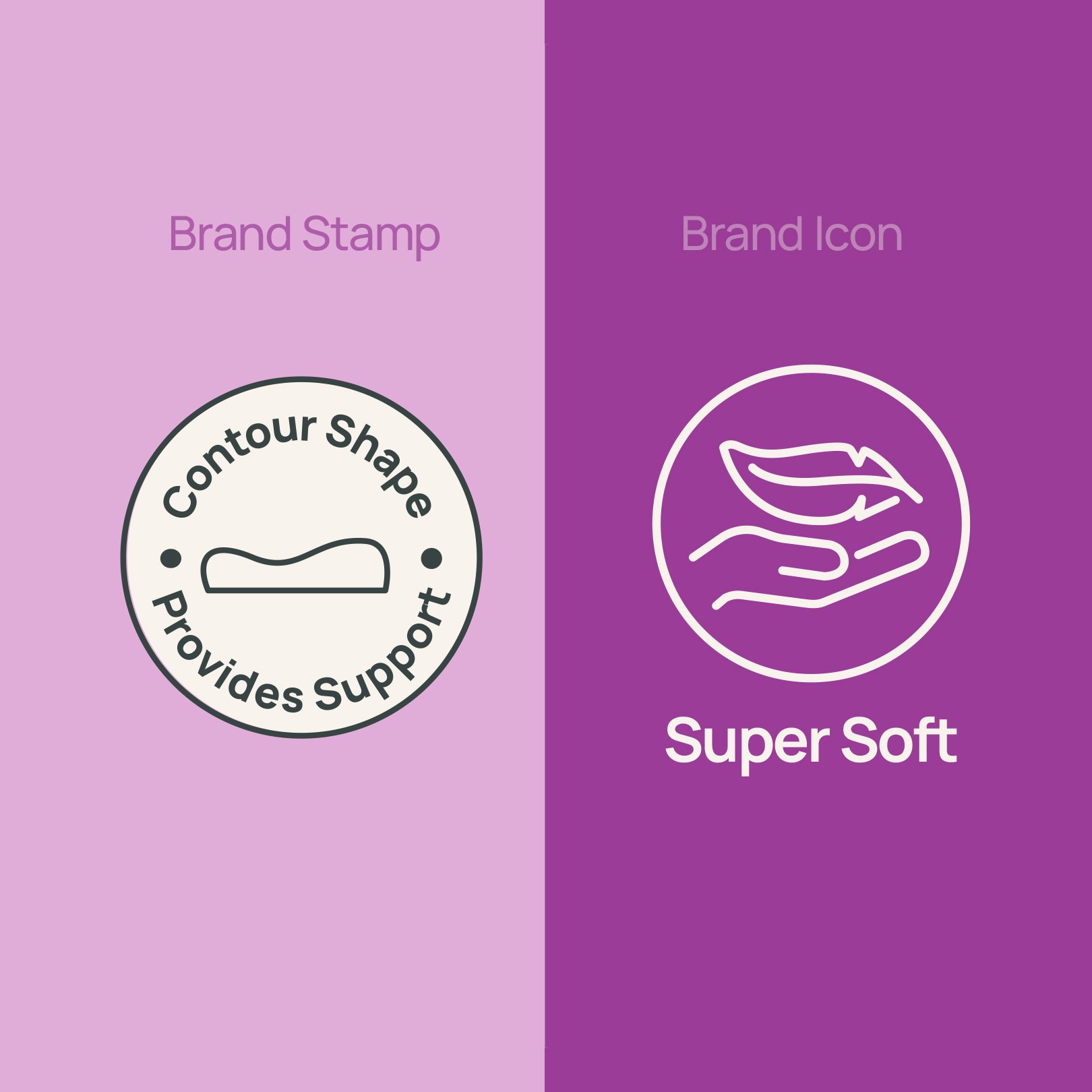
The Strategic Catalyzation of Purchases
The packaging system prioritizes clarity and confident decision-making with a carefully structured information hierarchy. Brand presence remains unobtrusive, allowing product names and specifications to take centre stage. Collection information and product features appear as easy-to-understand icons, completed by aspirational lifestyle imagery that helps consumers envision products in their homes.

The colour palette combines warm, inviting tones with deep purple to convey premium value while remaining approachable. Different categories are distinguished through specific vibrant colours, with metallic substrates denoting premium ranges for easy differentiation during the shopping experience. 
Simplifying Modern Living
The text ‘Happy Living’ is crafted using the “Uni Neue” typeface, which reflects the modern, warm, friendly and impactful brand presence. For the sub brand, a diverse selection of typeface styles from MANROPE helps to effectively communicate the brand message and content hierarchy across all materials. 

A New Chapter in Home Essentials
The layout highlights the product name boldly while keeping the brand unit unobtrusive. Colour patches with sizes are displayed upfront, with size details enclosed for specific products like curtains. The collection name follows, along with product size and specifics shown through easy-to-identify icons. 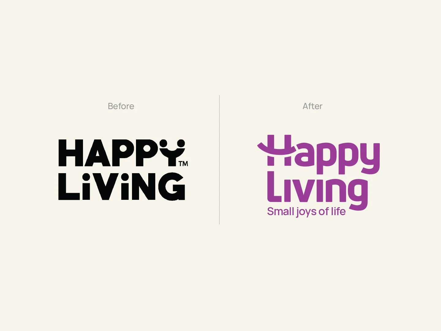

Similar Project