Premium packaging for for a healthy snacking alternative
Elevated snack branding with a premium color strategy, ensuring strong shelf presence and clear health cues

Award-winning
India Star Packaging Excellence
Visual Identity

Packaging Design

Brand Positioning
Striking pop colors and minimalistic design created strong shelf presence and instant recognition.

Snack Smart, Snack Right
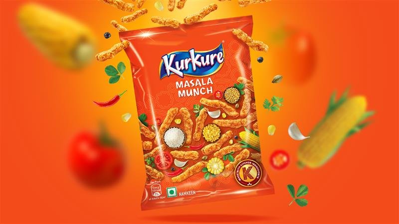
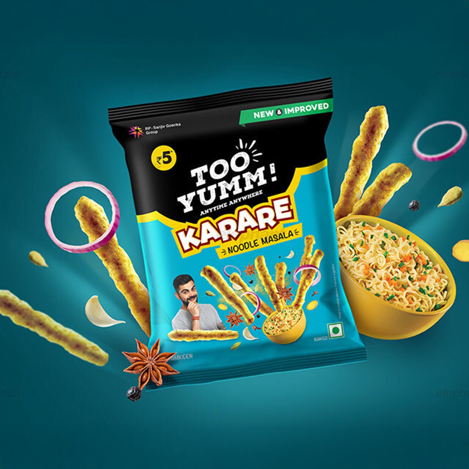
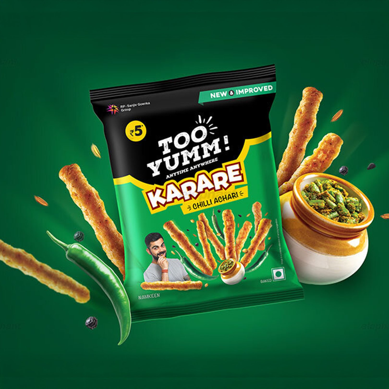
Too Yumm was born out of a need for guilt-free snacking without compromising on taste. With a modern twist on traditional Indian snacks, it blends indulgence with health. Our design ensured Too Yumm stood out in the crowded snack aisles, reinforcing its premium and wholesome promise.
A Healthier Future
Too Yumm aspires to redefine snacking by making healthy choices accessible, exciting, and stylish. Through bold design, innovative flavors, and impactful branding, it encourages consumers to indulge mindfully while savouring every bite.Vibrancy made premium
Too Yumm’s bold matte black packaging signaled premiumness while allowing vibrant accents to pop. This balance of sophistication and energy elevated its positioning in the healthy snacking space.
Maximizing Visual Impact for the Shelf
Design plays a crucial role in influencing consumer choices, and Too Yumm’s packaging was crafted to be both eye-catching and engaging. A distinctive bite mark separating colors subtly hinted at the irresistible taste within, creating an instant visual connection with snack lovers.

Minimal yet striking product imagery, combined with handwritten messaging, reinforced the brand’s personality while ensuring strong shelf appeal. These elements worked together to trigger impulse purchases, making Too Yumm stand out in the competitive snacking aisle.
Revolutionizing Snack Packaging
The snacking industry is saturated with options, making differentiation crucial. Too Yumm’s matte black packaging set a new standard for healthy snacks, giving it a premium, modern edge while ensuring bold shelf presence.

A strategic mix of pop colors, minimal product shots, and engaging handwritten messaging brought the brand’s fun-yet-healthy appeal to life, driving strong consumer engagement.
Designing Temptation: Crafting Shelf Appeal with Subtle Elegance
A bite mark dividing colors subtly hinted at irresistible taste. With minimal yet striking product imagery and handwritten messaging, we ensured strong shelf appeal and impulse purchase triggers.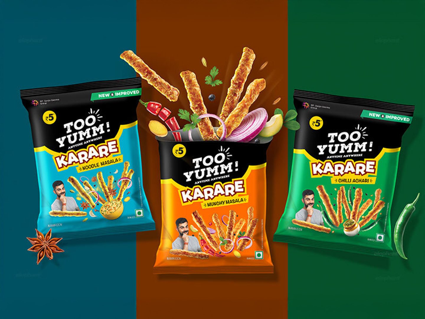


Launched during IPL 2017, Too Yumm gained massive visibility with the Pune team sporting its logo, while cementing its lead in the healthy snacking category.Similar Project