Revitalize iconic ayurvedic brand while preserving legacy
Elephant Design reimagined Vicco’s identity, future-proofing its presence while honoring core traditions.
Rekindled Trust
Via a Contemporary Legacy Transfer
Conducting deep consumer and competitor analysis

Aligning Vicco’s diverse portfolio under a robust visual and brand architecture

Building frameworks to ensure the brand’s visual identity remains consistent over time 
Vicco has earned Indian households’ confidence for over seven decades, thanks to a steadfast commitment to Ayurvedic principles and efficacy. We needed to strategically but sensitively reaffirm Vicco’s roots, repositioning it for a new era of discerning consumers.
Trusted Since 1952
Vicco’s story is synonymous with trust. It pioneered Ayurveda-based skincare, building equity around turmeric’s healing power and accessible purity. Over decades, Vicco’s presence became a silent reassurance in Indian homes. But the brand landscape had changed; static imagery risked making Vicco invisible to new generations. Transformation now meant more than just looking modern; it meant proving that heritage remains timeless, not dated. 
Legacy Forward
The task was to reposition Vicco as Ayurveda’s perennial leader timeless, yes, but also resonant with today’s aspirations. The partnership with Elephant Design channeled renewal into every element: evolved symbols, fresher colorways, and a dynamic architecture. The new identity communicates both continuity and relevance, ensuring Vicco inspires confidence in both loyalists and the next generation, laying a platform for innovation and sustained growth. Contemporary Classics
Elevated legacy motifs now sit at the intersection of trust and trend, proving that classic elements can lead a contemporary narrative.

Heritage Transformed, Relevance Restored
We approached Vicco’s reinvention by immersing ourselves in its history, and in their consumers’ evolving needs. Instead of discarding familiar cues, we extracted their underlying equity and reinterpreted them.
The signature orange, for example, became not just a color, but an anchor point for brand recall. The V-shaped split on every pack - sharp, bold, proprietary - translates Vicco’s initial into an unmistakable visual signpost.

This reassures existing customers through its continuity, while inviting modern shoppers with its clarity and stand-out presence. The range, unified yet variant-led, now communicates reliability and dynamism across the shelf.
Behind this transformation lay a core principle: great design doesn’t compromise between past and future; it builds a bridge that is stronger than either alone. 
Sensory Signifiers
Ingredient closeups like turmeric roots, sandalwood oil and aloe create immediate, intuitive connection. Each aspect of the new graphics system signals Vicco’s commitment to visible benefit and trusted heritage, recast for today’s discerning audience.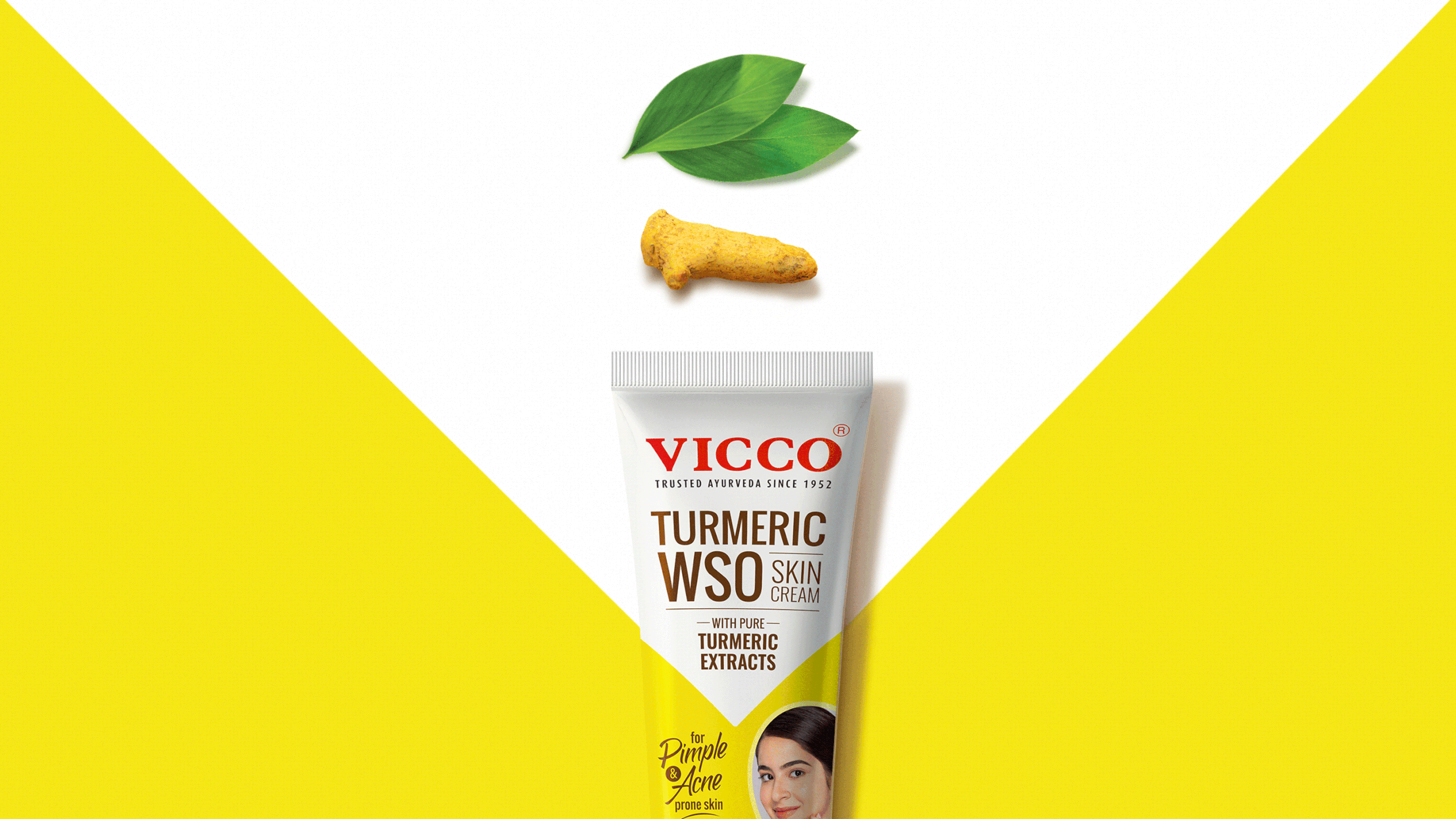

Tradition, packaged for Tomorrow
Our design process fused analysis with imagination. We began by mapping consumer pain points like outdated imagery, unclear hierarchy, and diluted differentiation. This ensured the specific goals for the redesign: Instant recognition, emotional continuity, and adaptive flexibility. The V-shaped motif powers category stand-out and unifies the full portfolio, down to the smallest variant.

Each pack leverages simplified information hierarchy and optimized logo placement, making usage and efficacy front-and-center. Color-coding cues clarify product choice, while stylized ingredient graphics deliver benefit cues without visual clutter. This isn’t just a “look”; it’s a scalable design language built to endure market change, to grow with the portfolio, and to help Vicco reclaim its status as the everyday skin care choice across generations.
Similar Projects