Packaging

Startups are the best!

Another year. Our 30th actually. 

We were a startup once. And in a sense we still are. Because almost every challenge that lands on our laps feels like a fresh start. Old constraints ready to be busted with new ideas. 

Honestly, ever since paper boat happened in 2013, startups and established brands alike reach out and ask us to work up the same magic for their brands. But being a notoriously stubborn team that we are, we start with a strong refusal. We refuse to repeat. We are against “same same”.  But we promise to match your passion & appetite for “new” if you have it. We believe brilliance of our work is directly proportionate to the faith you place in us. It always works that way. 

In 2018, we saw brands being far more inclined towards health & sustainability. What’s in it became a bigger concern for the consumer and food thus became more engaging even before it got consumed. 

Some of them are taking their first steps as you read this and some have spread their wings rather wide. 

So here is a list of five fresh brands we helped build in 2018.

Swing 

A fresh, fun & approachable fruit juice for the joy of its pure & unadulterated taste is how we would describe swing from paper boat! Packaged in signature doy packs, swing promises to bring alive the wind in your hair & spring in your step with its juicy fruity beat. 

Elephant_Swing.jpg

On the Run 

As they say, there is only one life! Our big insight? We need to maximize and shine through every role we play. Be it work or relationships, travel or entertainment, we need to be able to give our best. Because life is a sport and we can all be winners. On The Run packaging is a reflection of multiplicity of our lives and how to stay positive through it all by consuming food made with conventional wisdom & goodness.
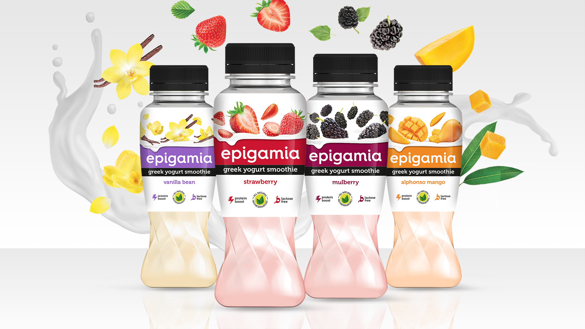
Elephant_On_the_Run.jpg

Epigamia Smoothies

After the stupendous success of epigamia greek yogurts, it was time for smoothies on popular demand. What makes these greek yogurt smoothies remarkable? They are all natural, lactose free & above it all, very very tasty! The bottles are designed to practically twirl & emulate churning of smoothies. Globular shoulder & wider mouth makes it easy to grip & gulp from, whereas loaded fruit visual does justice to what’s inside the bottle. So if you are looking for a tasty protein boost, you know what to reach out for. 

Elephant_Epigamia_Smoothies .jpg

&me 

51% of Indian women are anemic and 70% risk getting osteoporosis due to various deficiencies! This happens because women always put others’ needs before their own & land up neglecting their health. Sad but true. 

&me as the name suggests, is a trigger to remind women that with everything else that is important in life, they need to give themselves equal priority. &me is a brand of Bio-active Beverages for Women. Developed with ancient Ayurveda and modern science to meet the fast-paced lifestyle of modern women, these beverages focus on specific needs. &me professes self-love & self-care. With strong imagery and stories, we intend to start a conversation and help break stereotype.
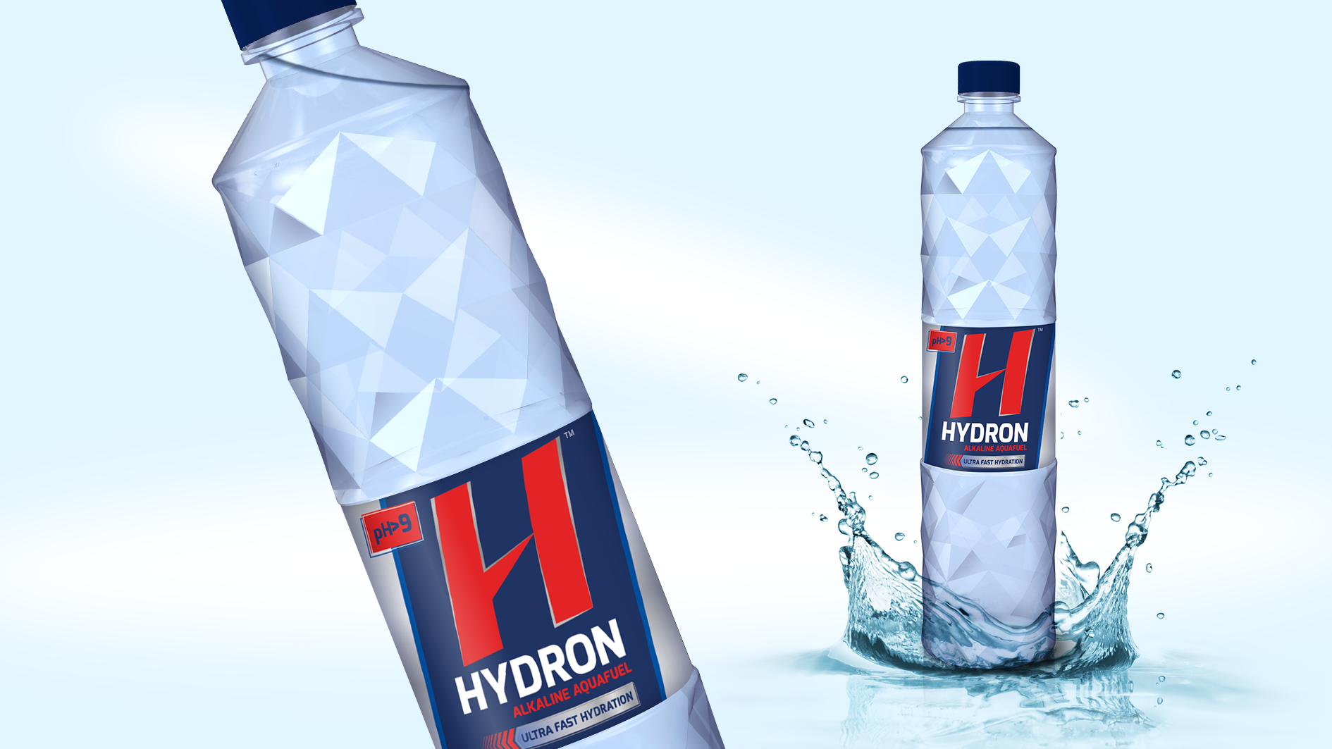
Elephant_&me.jpg

hydron 

Its clear that functional nutrition needs of men & women are different. Here was our opportunity to turn that into a powerful hydration brand that helps men unleash their potential to the fullest in a healthy way. Hydron as we named it is not your regular thirst quenching water. It is hydrogen rich, anti-oxidant and and simply put, hydrates seven times faster. A highly functional beverage, Hydron alkaline water helps one recover from strenuous activity like workouts or sports very quickly. This is exactly what we brought to life on its packaging. Potency & science. 

Elephant_Hydron.jpg

We are in an Interesting Era of Creating Multi-sensorial, Multi-media Experiences

Printweek India talks to the co-founder of Elephant, a design led innovation company that’s been around for three decades

Ashwini.JPG

2019 would mark the 30th birthday of Pune based Elephant which laid its foundation in 1989 with three NID (National Institute of Design) graduates as its co-founders– Ashwini Deshpande, Ashish Deshpande and Partho Guha. Elephant has had a truly phenomenal journey, marked by its work for some of the biggest brands in the country, various awards, and presence in some of the biggest forums about design across the world. 

For this month’s Design Dialogue, we have a conversation with Ashwini Deshpande about Elephant’s trajectory so far, some of their key projects including their recent branding and packaging work for Kurkure and Witlinger, their experience of working with start-ups, the benefits of having interns from different countries, and their Singapore operation. 

Edited excerpts:

Q :

Elephant has been in the Indian design landscape for three decades now. What are some of the most crucial changes you have seen over the years? 

It has been a long and exciting journey, every step of the way. We started Elephant with a dream to create the ‘big picture’ of design in India. 

When we started out in 1989, the Indian creative industry was limited to advertising agencies. The most challenging task was to demonstrate a genuine professional design practice that helps businesses grow. 

There was no organised, scalable, and professionally managed design consulting at that point. There were just two design schools (NID Ahmedabad and IIT-IDC Mumbai). The fact that ‘design’ and ‘design thinking’ could add value to a bottom-line was not experienced by any business house. 

I believe there are over 75 established design schools in India now and the number is growing as we speak. Every global media network has brought their design consulting arm to India; some of them have been around for over ten years now. Every communication agency has an in-house design team, all IT giants have large in-house design teams, and many conglomerates have design teams as part of their R&D set ups. There are hundreds of boutique design agencies mushrooming all around. However, even after 29 years since the start of Elephant, there are only a handful of design practices with any scale. So despite all our consistent efforts to demonstrate the value of design intervention for business growth, design is yet to become a mandatory, nation-wide phenomenon. 

I remember the fascinating lessons in blocks, typesetting and letterpress printing at NID in the 80s. A lot of the stationery used to be screen printed in the early days. Even short run brochures or exhibition panels used to be screen printed. Then came the large format digital printing in the mid-90s. From the time of cut and paste artworks to limited editions to personalised print-runs, one has seen a complete transformation of the print business. With digital distribution replacing a lot of print communication, we are in an interesting era of creating multi-sensorial, multi-media experiences. 

Paperboat

Q :

As the studio finishes its 30th year next year, what has been the biggest achievement of Elephant so far according to you? 

I think our consistent efforts to establish the business of design in India for a sustained period is an achievement in itself. The large economic changes, liberalisation, recessions, presence of global agencies, mushrooming of boutique agencies, and rapid changes in technology and media – we have made the most of all these and have managed to create a positive impact through design in almost every business domain we have worked in. 

Q :

How do you choose brands/projects to work for? Are there any particular criteria you follow? 

We have a very simple method. Earning, learning and excitement form the three most important principles for selection. When we get a project or an engagement query, there must be a resounding nod against at least two of the three principles. Because we are a ‘learning’ organisation and we believe feeling excited about solving a certain problem directly reflects on the creative quotient of the solution. 

Q :

Packaging design has always been a very strong part of Elephant's portfolio. This year too, you did some interesting packaging design revamp for Witlinger beer and Kurkure. Tell us a bit about both these projects. 

To rebrand a craft beer was like a dream project for the creative team. While many craft beers try to keep their origins ambiguous, Witlinger wanted to convey its British origin unabashedly. We decided to leave the clichéd British iconography of the Tower Bridge or Big Ben and found a true hero in the British bulldog. To highlight the distinct personality of each crafted brew, we decided to bring various facets of the Bulldog's persona to life. The new design with British bulldog as a mascot characterises Witlinger's true British origin and conveys a message of being bold - with a lot of attitude and honest fun. 

Kurkure team handed us three significant tasks through the packaging revamp exercise. The first one was to enhance brand leadership, relevance and distinctiveness. The second was to build an architecture that can create a strong differentiation for categories. The last one was to help consumers navigate the shelf and pick the right snack of their choice. When you are working on one of India’s most loved brands, you have to listen to the fan base and understand the degree of shift possible. You also have to understand the nuances involved in designing for a very large print run at multiple locations with varying infrastructures. 

The concept was built around focusing on the ingredients to enhance the taste appeal with a larger than life shape of the product, providing the backdrop for a play between products and ingredients. Every variant is called out in custom designed typography that also makes it own-able. The back of the packs are brought to life with custom drawn illustrations about turning mundane encounters into fun moments by sharing the snack. Such large impact exercises become more interesting as we get to interact and learn from global brand custodians. 

1-01_.jpg
1-01 copy.jpg

Q :

Could you tell us a bit about your Singapore operations? What kind of brands do you work with there? 

Our business model in Singapore is very different. In India, we have a mix of design research, brand and design consulting, product design and innovation consulting. In Singapore, however, we mostly take up consulting projects around insights farming leading to innovation strategy. Many of them don’t require pure design input. And the ones that do culminate into design projects are handled at our Pune studios.

(L-R) Partho Guha, Ashwini Deshpande & Ashish Deshpande

(L-R) Partho Guha, Ashwini Deshpande & Ashish Deshpande

Q :

You were recently announced as a jury member of the Young Guns 16 competition. What are you most looking forward to while judging? Also, in general, what are some of the key qualities you look for in the work of young designers/interns who approach Elephant for mentorship? 

I am always curious to know what young designers are thinking or doing. While judging any work, I am more focused on the idea. Is it outstanding, aligned to brief, original, and feasible? Once I am satisfied with these, I look for the degree of detailing and the quality of execution. 

While looking at portfolios of young designers, I like to find passion bordering on obsession to convey the idea in its most powerful form. If I find someone with extraordinary skills, I may get impressed, but I rarely hire anyone for just their skill. 

Britannia Breads_Packaging Design_Elephant Design, Pune, Singapore.jpg

Q :

Elephant has interns from different countries. In what specific ways, is that beneficial?

Yes. We have had interns from France, The Netherlands, USA, Singapore, Mexico, Turkey, and of course every Indian state. The interns bring immense positive energy and manage to enliven the entire team. They also bring a taste of their culture, their educational ethos, and a sense of exploration. 

In turn, we believe that Elephant is like an institution that changes the way they think about the profession and creativity. Going forward, we offer full-time positions to some of our brightest interns once they complete their education as there is a familiarity that reduces their adjustment time.

Q :

Elephant also works with a lot of startups. How is the experience different from working with established brands? Personally, which one do you enjoy more? 

The Indian start-up landscape is very vibrant at the moment. And the founders who understand ‘design’ as a crucial differentiating factor tend to approach design consultants at an early stage. We have worked with quite a few start-ups in the past four to five years, including Paper boat beverages, Fingerlix ready-to-eat foods, Too Yumm snacks, Epigamia Greek Yogurt, ASAP Bars, Witlinger Beer, Plezmo intelligent play-blocks, SynPhNe stroke recovery system, and Healthcube Diagnostics. 

Start-ups are nimble, so they take quick decisions and are not worried about failing and starting again. On the other hand, established businesses tend to think in a linear but robust way; they take fewer risks and have long launch cycles. Both are rewarding learning experiences in their own way and we tend to transfer our knowledge to both sides as well.

Britannia Breads_Packaging Design_Elephant Design, Pune, Singapore.jpg

MTR foods - new identity, packaging & story

About the refreshed MTR visual identity: 

MTR, the brand with the outstanding legacy, global outlook and millions of happy consumers was looking at realigning its visual identity to the core purpose of rooted transformation. 

We decided to retain the basic visual equity of red roundel with white fence and worked on improving the typography for ease & clarity in reproduction across variety of substrates & sizes. We created a bold sans serif brand-mark for cleaner & contemporary presence. We also reduced the picket fence elements around the logotype to de-clutter the identity. Natural ingredients being the core of all MTR products,  a fresh green was added to the roundel to announce meaning & mission of the brand.

About the packaging strategy & design: 

With changing roles within new family structures and new working patterns, women are not burdened by the need to prove their expertise in kitchens. They see their role as a family manager & look for ways to keep the family happy & healthy. Buying ready to cook, ready to eat & even ordering-in food is seen as a great way to ensure quality time with family. They are open to experimentation & introduce their family to new cuisines with ease. But they want to do this with knowledge. They want to be aware. They want to know the source, the ingredients, quantities, accompaniments, consumption occasions? basically everything. 

So when we were given the responsibility of designing packaging for the entire range of MTR products, we decided to dive deep into finding out what the changing consumer will be delighted with. 

With a portfolio as large as 140+ products, first thing to do was to discover what works as an equity for MTR and preserve or even enhance that. Next step was to question & evaluate existing information architecture & remove redundancies to make way for cleaner, user-focused bytes. Though it sounds like the most obvious thing to do, we brought in a strong product nomenclature that would catch the eye and remove any ambiguity. We decided to retain the strong red associated with the brand and build upon that by devising a colour code for each category for ease of purchase. We created three strong visual pillars for the product portfolio ? pure authentic, confident contemporary and everyday celebrations. These moods were created within the master visual template to further accentuate the brand expertise and its involvement at every need and stage of the modern consumers' life. Since products like Sambar are available in multiple formats like masala powders, ready-to-cook mixes & ready-to-eat meals, we brought the category descriptor right up followed by the consumption occasion & announcements like time for cooking, whether anything needs to be added etc. A product shot is one of the most important factors for an impulse purchase in foods and our team planned each shot meticulously, keeping in mind time of the day, occasion and accompaniments. Authenticity was built through right serving sizes, ingredient depiction and serving bowls. 

Since there is lot of curiosity about food from other regions, we have added a very interesting background of region of origin for every dish. It is a subtle addition, but one we hope will be discovered to the delight of consumers and strengthen the brand's expertise pan India. 

http://www.campaignindia.in/Article/401709,mtr-foods-adopts-a-new-identity.aspx

Sanjay Sharma – CEO, MTR Foods, said, “Today’s consumers have evolved quite a bit – both in terms of their food preferences as well their consumption patterns. They prefer Indian food but perceive it to be cumbersome and time-consuming. Our brand is the flag bearer of innovative, easy-to-make, nutritious and authentic-tasting products that take away the time dimension from cooking and make Indian food more accessible to consumers."

He added, “However, as a brand we needed to change to reflect who our key consumers are today. While the new brand identity better represents where the company is today, our detailed growth strategy will make MTR ready for the future. This is the new beginning for MTR Foods and we are confident that the changes we have undertaken and our new brand identity will make us a part of our consumers’ everyday lives.”

Ashwini Deshpande, co-founder and director, Elephant Design, noted that the re-branding exercise involved defining renewed purpose, creating visual identity and packaging communication, evolving portfolio strategy and packaging design for over 120 products, sold as 350 SKUs. 

<  Back to Blog

How does Design affect business ?

How does Design affect business ?
 

"Design is as much craft as it is insightful thought."


Like we say at elephant, doing a cool design for "limited edition" is alright, but what can we do it for a mainstream product that sells in excess of a million every single day! 

Britannia breads packaging needed to reflect the positive & healthy change in recipes. With misconceptions around brown, wheat, whole wheat & so on, we wanted to give each variant a distinct identity so that consumer is fully aware of what she/ he is picking up. With a conversational tone and cheerful illustrations, this sure is a welcome change for these loaves… about 1.5 million of them are selling like hot breads now...

How does design affect business?_Blog_Elephant Design.jpg.jpg

Bready affair... 

Centre of Excellence, Elephant, Team, Pune.


Packaging Emotions

packaging emotions_Blog_Elephant Design.jpg.jpg

Creative Gaga Magazine published by Open Bracket Publication celebrates good design. And is a great reference for techniques, insights and inspiration. Their latest issue is a "Packaging Design" special. And they invited Team Elephant to design the cover! (who else?)... with Mayuri NikumbhSuraja AcharekarRimpy BatraPartho Guha


<  Back to Blog

New Woman - Elephant Trends Watch 2014

 Read at http://issuu.com/ashwinielephant/docs/elephant_trendswatch_2014.  


Elephant is celebrating 25 years of being a pioneering strategic design consultancy of India. As leading multi-disciplinary experts on emerging markets, our teams based out of Pune, Delhi & Singapore get to work in variety of domains including FMCG, Healthcare, Banking, Energy, Automobile & Lifestyle products. No matter what the domain, our approach is always user-centric and always starts with design research. We observe, meet and farm life-stories with users and turn our understanding into insights that lead to innovative design solutions. Usually, rich insights lead to two significant sets. The first set gives an overview of shifting mindsets, transitions, beliefs and emerging aspirations. This typically can be called Trends-Watch. The other set comes out of analyzing the observed trends along with visualization of future. This is called Trends Forecast. 

We believe our insight-led work has reflected positively on the users. But we want to share the benefits of these insights with more users, marketers, brand owners as well as students of design & branding. So we decided to publish what we learnt in the last year and make it an open source by publishing Elephant Trends Watch 2014 online.  

<  Back to Blog

Impact with Food

Elephant contributed to this award winning Design Impact project with a couple of workshops at the early stage and created visually appealing and cost effective packaging for the laddoos once the recipes were finalised. Pro bono of course http://worlddesignimpact.org/projects/project2013/18/

<  Back to Blog